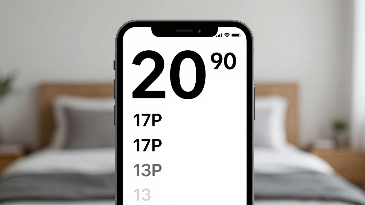
Wolf and Hare

Tag: text hierarchy

Typography Hierarchy in Apple Apps: Sizes, Leading, and Contrast Strategies

Typography Hierarchy in Apple Apps: Sizes, Leading, and Contrast Strategies
  • Elias Voss
  • Elias Voss

20/01
0

Apple's typography hierarchy uses San Francisco font, Dynamic Type, and precise sizing to guide users through apps. Learn how size, leading, weight, and contrast work together to create clear, accessible interfaces.

Read More...

Categories

  • Design & Technology (147)
  • Retail Design (8)
  • Design Tools (4)
  • Design & Development (4)
  • Technology (2)

Popular Articles

Learning Zones in Apple Stores: How Layouts Drive Hands-On Education

Mar 14 2026

Building Apple Widgets: Sizes, Layout Grids, and Legibility Standards

Jan 3 2026

Motion and Depth in Apple Interfaces: How Spatial Design Communicates State Without Noise

Mar 4 2026

Color Accuracy on MacBook: Why Factory Calibration Matters for Everyday Users

Jan 3 2026

How Apple Builds Brand Trust Through Design Consistency

Mar 16 2026

Tags

  • Apple design
  • Apple ecosystem
  • Apple typography
  • Liquid Glass
  • unboxing experience
  • Apple packaging
  • user experience
  • San Francisco font
  • iOS 26
  • Apple design philosophy
  • Apple Human Interface Guidelines
  • Apple Intelligence
  • inclusive design
  • Apple accessibility
  • Jony Ive
  • industrial design
  • Apple retail design
  • Dynamic Type
  • Apple interface design
  • Apple Watch design
Wolf and Hare

© 2026. All rights reserved.