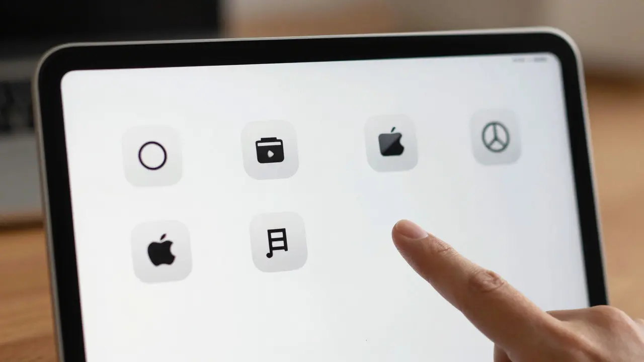

Ever stared at a crowded iPad app interface and wondered why you can’t find the one button you need? You’re not alone. iPad toolbar design is the strategic arrangement of action buttons, navigation elements, and controls within the top or bottom bar of an iOS application to facilitate user interaction. Unlike mobile phones, where space is tight and gestures are primary, the iPad offers a real estate advantage that designers often waste by cramming too many icons into a single row. The core problem isn’t just aesthetics; it’s cognitive load. When users scan a toolbar, they aren’t reading labels-they’re pattern-matching shapes. If your icons are ambiguous or your labels are missing, discoverability drops sharply, leading to frustration and dropped tasks.
The Physics of Space: Why Density Matters on iPad
Icon density refers to the ratio of interactive elements to available horizontal space in a user interface component. On an iPhone, you might squeeze five icons into the tab bar because the screen is small. On an iPad, especially the 12.9-inch Pro models, that same density feels cramped and unintuitive. Apple’s Human Interface Guidelines (HIG) suggest keeping toolbars clean, but “clean” is subjective. A good rule of thumb? Limit your primary toolbar to no more than four to six distinct actions. Anything beyond that should be grouped under a “More” menu or moved to a contextual secondary bar.
Consider a photo editing app. If you have separate icons for crop, rotate, filter, adjust brightness, and add text all lined up, the user has to process five different visual symbols before acting. But if you group “Adjust” and “Filter” under a single “Edit” icon with a dropdown, you reduce the immediate cognitive burden. This doesn’t mean hiding features-it means prioritizing frequency. High-frequency actions get direct access; low-frequency actions get tucked away. This hierarchy is what makes a toolbar feel effortless rather than cluttered.
Labels vs. Icons: The Discoverability Trade-off
This is where most designs go wrong. Developers often assume that a recognizable icon doesn’t need a label. They’re half right. Standard icons like a gear for settings or a magnifying glass for search are universally understood. But custom icons? Not so much. If you create a unique glyph for “Export as PDF,” will a new user know what it does without hovering or tapping? Probably not.
UI labels are textual descriptors attached to interface elements to clarify their function, reducing ambiguity and improving first-time usability. On iPad, you have the luxury of space. Use it. Always pair non-standard icons with short, clear labels. Even for standard icons, consider adding labels in dense contexts. For example, in a music production app, a “waveform” icon might mean “edit audio,” “view spectrum,” or “mute track.” Without a label, it’s a guess. With a two-word label, it’s a command.
However, don’t overdo it. Long labels break the visual rhythm of the toolbar. Keep them to one or two words maximum. If you need three, your icon is probably doing too much work. Split the action. This balance between visual shorthand and textual clarity is the sweet spot for discoverability.
Discoverability: Making Features Findable
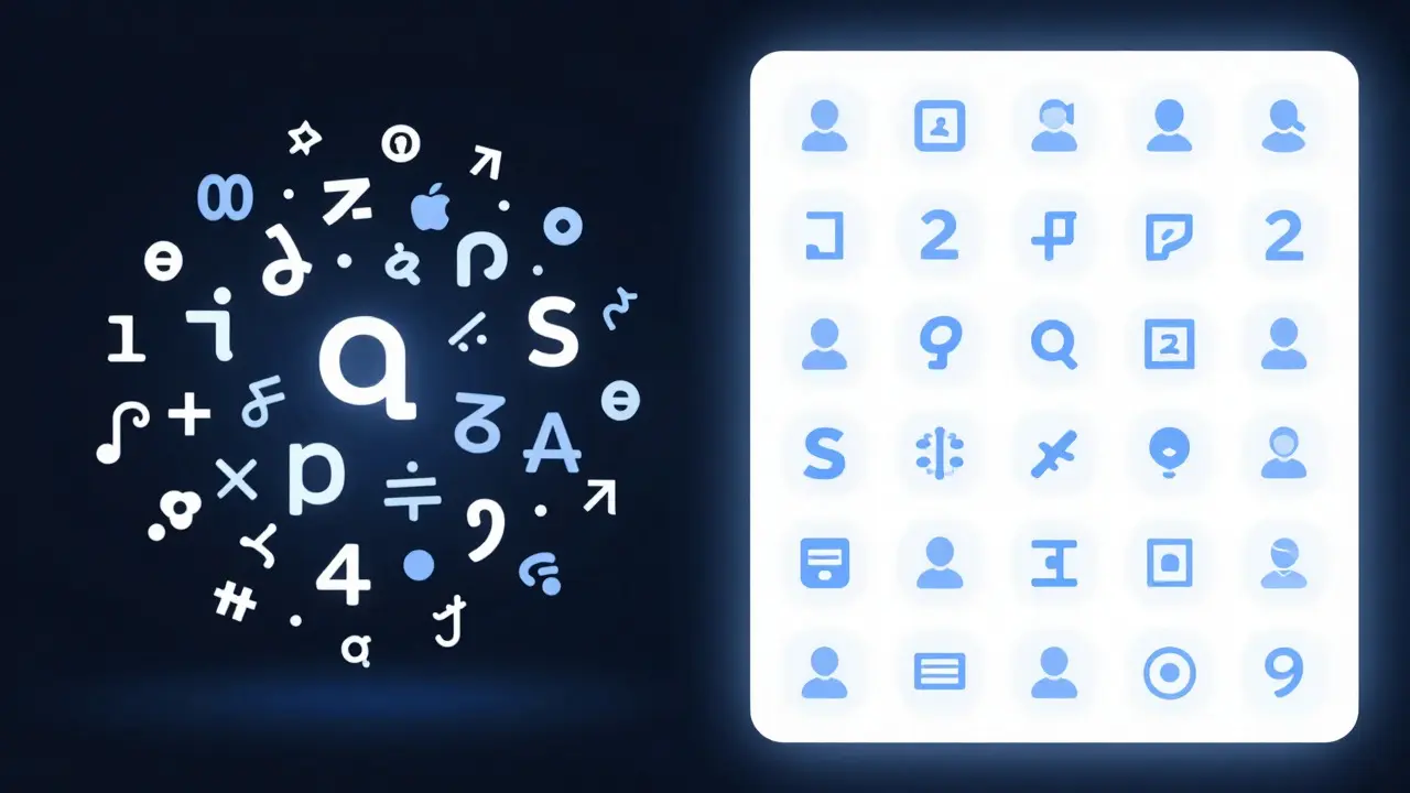
Discoverability is the ease with which users can locate and understand how to use specific features within an interface without external help. It’s not just about seeing the button; it’s about knowing what it does when you see it. Poor discoverability leads to feature abandonment. Users stop using advanced tools because they never realized those tools existed.
To boost discoverability on iPad, leverage context. Toolbars shouldn’t be static. In a word processor, the toolbar might show “Font,” “Bold,” and “Align” when text is selected, but switch to “Insert Image” and “Link” when a cursor is active. Dynamic toolbars guide users through workflows, making features appear exactly when they’re relevant. This reduces the mental effort required to remember where things are.
Also, consider onboarding. If you have complex toolbar actions, introduce them with subtle tooltips or a brief tutorial overlay on first launch. Don’t rely on users to figure it out. Show them the value immediately. A well-designed toolbar teaches itself through consistent placement and clear affordances.
Comparison: iPhone vs. iPad Toolbar Strategies
Understanding the differences between platforms helps avoid common pitfalls. Here’s how key aspects compare:
| Attribute | iPhone | iPad |
|---|---|---|
| Max Recommended Icons | 3-4 (Tab Bar) | 5-6 (Toolbar) |
| Label Usage | Optional for standard icons | Recommended for all non-obvious icons |
| Interaction Model | Thumb-reach focused | Eye-tracking and precise touch |
| Dynamic Behavior | Limited due to space | Highly contextual and adaptive |
| Error Tolerance | Low (small targets) | Medium (larger targets) |
Notice how the iPad allows for more complexity because the user’s attention is less constrained by physical reach. You can place important actions further from the center if needed, as long as they’re visually prominent. On iPhone, everything must be within thumb range, forcing a stricter hierarchy.
Practical Tips for Better iPad Toolbars
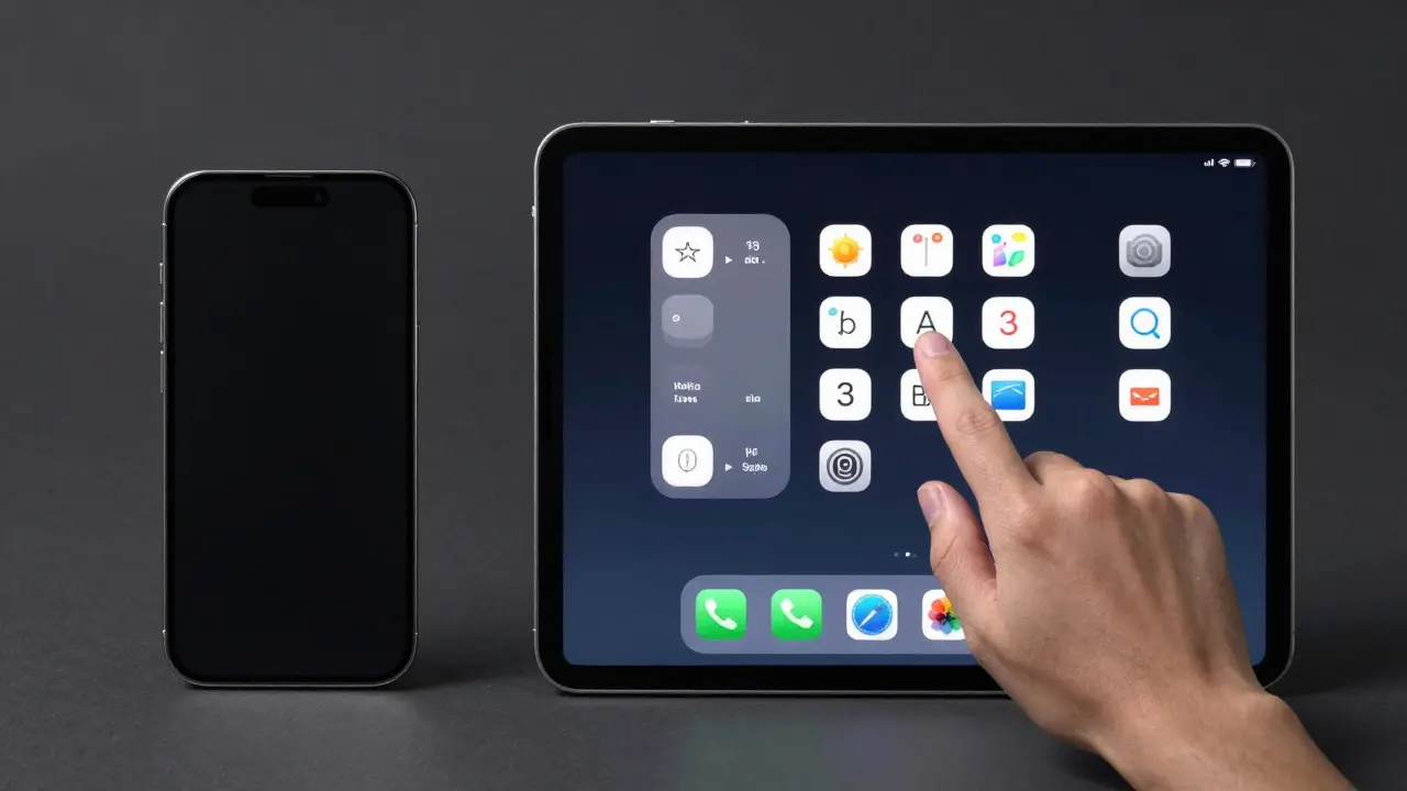
Here are actionable steps to improve your current or upcoming iPad toolbar design:
- Audit your icon set: Are any icons ambiguous? Test them with users who haven’t seen your app. If more than 20% misinterpret an icon, add a label or redesign the glyph.
- Group related actions: Use overflow menus for less frequent commands. Keep the main toolbar reserved for high-value, high-frequency tasks.
- Use consistent spacing: Uneven gaps between icons create visual noise. Maintain equal padding between elements to ensure a clean, professional look.
- Leverage state changes: Change icon color or opacity to indicate disabled states. This gives users immediate feedback on what’s currently possible.
- Test on multiple devices: What works on a 10.9-inch iPad may feel sparse on an 8.3-inch model. Ensure your layout scales gracefully across all supported sizes.
Frequently Asked Questions
How many icons should be in an iPad toolbar?
Aim for 4 to 6 primary icons. More than that creates cognitive overload. Move additional actions to a secondary menu or contextual bar.
Do I need labels for standard icons like 'Settings' or 'Search'?
Not strictly, but it’s beneficial in dense interfaces. For custom or industry-specific icons, always include a label to ensure clarity.
What is the biggest mistake in iPad toolbar design?
Cramming too many actions into one row without grouping. This reduces discoverability and makes the interface feel cluttered and hard to navigate.
Should toolbars be dynamic or static?
Dynamic is preferred. Changing the toolbar based on user context (e.g., selected object, active mode) improves workflow efficiency and feature discoverability.
How do I test if my toolbar is easy to use?
Conduct usability tests where users complete specific tasks without guidance. Measure time-on-task and error rates. If users hesitate or ask questions, your discoverability needs improvement.