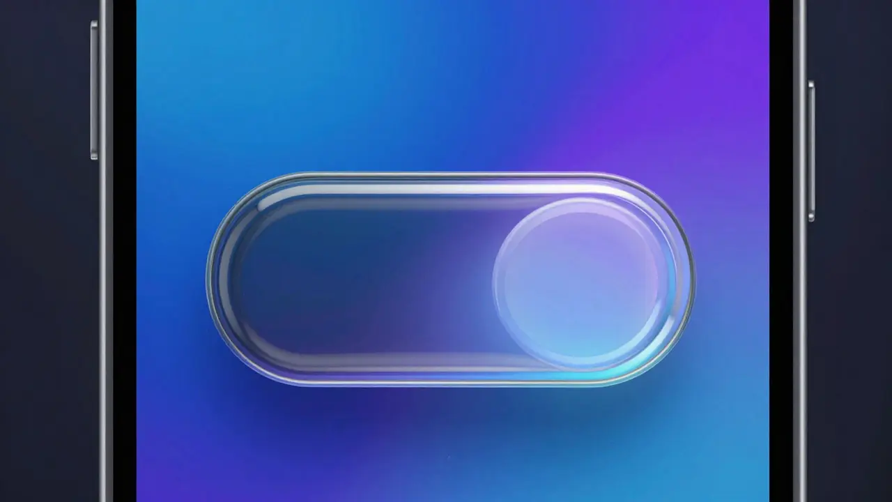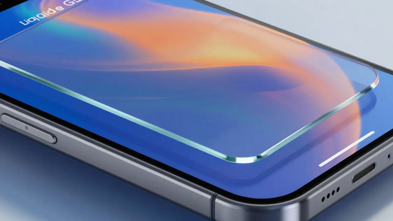

You know that feeling when you’re deep in Xcode trying to make a UI feel alive, but the icons look flat and dead? You’ve got your layout perfect, your colors matched, but that little arrow or heart just sits there like a brick. It breaks immersion. For years, we hacked around this with Lottie files or custom vector assets, bloating our app size and complicating maintenance. Then came SF Symbols, which changed the game by integrating system icons directly into SwiftUI. But SF Symbols 7 takes it further. It’s not just about more icons; it’s about making those icons behave like living elements of your interface through native animations, sophisticated gradients, and the cleverly named "Magic Replace" feature.
If you are an iOS developer or designer working in 2026, ignoring these updates means falling behind on polish. Users expect micro-interactions now. They tap a button and expect feedback beyond a simple color change. This guide cuts through the marketing fluff to show you exactly how to implement SF Symbols 7 features in your codebase, what pitfalls to avoid, and why this update matters for performance and accessibility.
The Evolution from Static Icons to Dynamic Assets
To understand why SF Symbols 7 is significant, you have to look at where we started. Version 1 gave us static glyphs. Version 3 introduced layers, allowing partial coloring. Version 5 brought animation support via SwiftUI. SF Symbols 7 refines this ecosystem by reducing the friction between design intent and code execution. The central entity here is the SF Symbol itself, defined as a scalable vector icon set designed specifically for Apple platforms. Its key attributes include variable weights, hierarchical rendering modes, and now, advanced motion capabilities.
The shift isn't just aesthetic. It's architectural. By keeping animations within the symbol framework, you reduce dependency on external libraries. This impacts load times and memory usage-critical metrics for apps targeting older devices or users with limited data plans. When you use native SF Symbol animations, the OS handles the rendering pipeline efficiently, often offloading work to dedicated graphics hardware without the overhead of a third-party renderer.
Mastering Native Animations in SF Symbols 7
Animations used to be the hardest part of using SF Symbols. You’d either stick to basic scale effects or dive into complex Core Animation layers. SF Symbols 7 introduces a suite of predefined animation types that integrate seamlessly with SwiftUI modifiers. Think of it as having a built-in animator for every icon.
Here is how you actually use them. In SwiftUI, you apply the .symbolEffect() modifier. But in version 7, the options expand significantly. You aren't limited to just bouncing or pulsing. New effects include:
- Bounce: Ideal for notifications or new messages appearing.
- Pulse: Great for loading states or active selections.
- VariableColorScroll: Allows color to flow across the symbol, useful for progress indicators.
- Replace: Smoothly transitions between two different symbols (more on this later).
Let’s look at a concrete example. Imagine a "Like" button. Previously, you might swap a heart outline for a filled heart. With SF Symbols 7, you can animate the fill process itself. The heart doesn’t just appear; it swells and fills with color. This subtle detail makes the interaction feel tactile. To achieve this, you combine the .symbolEffect(.bounce) with a state change in your view model. The system interpolates the transition, handling the easing curves automatically so you don’t have to tweak bezier curves manually.
One common pitfall? Over-animating. Just because you can animate every icon doesn’t mean you should. Use animations to draw attention to state changes, not to decorate static content. If an icon is purely informational, keep it static. Reserve motion for interactive elements where user input triggers a response.
Gradients That Respect Design Systems
Color has always been tricky with monochrome icon sets. You could tint them, sure, but gradients required masking tricks or exporting PNGs with baked-in gradients, which lost scalability. SF Symbols 7 solves this with native gradient support. This allows you to apply linear or radial gradients directly to symbol layers without breaking their vector nature.
This feature relies on the hierarchical rendering mode. Each symbol is composed of multiple layers (primary, secondary, tertiary). In SF Symbols 7, you can assign a gradient to any of these layers independently. For instance, a cloud icon could have a blue-to-white gradient on the main body while retaining a solid gray shadow layer. This depth adds realism without increasing asset complexity.
| Rendering Mode | Gradient Support | Layer Control | Best Use Case |
|---|---|---|---|
| Monochrome | No | Single Color | Minimalist UI, Accessibility High Contrast |
| Hierarchical | Limited (Opacity only) | Multiple Layers | Standard System Icons |
| Palette | Yes (Per Layer) | Full Customization | Brand-specific Icons, Rich Visuals |
| Multicolor | Fixed Colors | Pre-defined | Emoji-style Icons |
To implement gradients, you use the .foregroundStyle() modifier combined with a LinearGradient or RadialGradient. The key is ensuring your symbol supports palette mode. Not all symbols do, so check the SF Symbols app before committing to a design. If a symbol lacks sufficient layers, the gradient will apply uniformly, which might not give you the depth you want.

Magic Replace: The Power of Seamless Transitions
The most buzzworthy feature in SF Symbols 7 is "Magic Replace." Despite the name, it’s not magic-it’s intelligent interpolation. Normally, switching between two different icons (like a play button turning into a pause button) involves a cross-fade or a hard cut. This looks jarring. Magic Replace analyzes the geometry of both symbols and morphs one into the other smoothly.
This works best with symbols that share structural similarities. For example, transforming a "heart" into a "broken heart" or a "lock" into an "unlocked lock." The system calculates the path differences and animates the points along those paths. This creates a continuous visual narrative rather than a disjointed switch.
How do you trigger it? In SwiftUI, you use the .contentTransition(.symbolEffect(.replace)) modifier on the image view. When the underlying symbol name changes based on state, SwiftUI handles the morphing animation. No extra code needed for the transition logic.
However, there are limitations. Complex symbols with vastly different shapes won’t morph well-they’ll look like they’re collapsing and expanding chaotically. Stick to related pairs. Also, ensure both symbols exist in the same weight and scale configuration. Mixing a thin weight with a bold weight during replacement can cause jittery animations as the stroke width adjusts mid-transition.
Performance Implications and Best Practices
With great power comes... slightly higher CPU usage if you’re careless. While SF Symbols are optimized, running dozens of simultaneous animations can drop frame rates, especially on older iPhones like the iPhone SE (3rd gen). Here are some rules of thumb to keep your app smooth:
- Batch Updates: Avoid triggering animations on scroll events unless necessary. Use debouncing techniques to prevent rapid-fire re-renders.
- Limit Concurrent Animations: On lists, try to limit animated symbols to visible cells. Reusing views helps, but excessive motion can still tax the GPU.
- Test on Low-End Devices: Always profile your animations on the oldest device you support. What looks buttery-smooth on an iPhone 15 Pro might stutter on an iPhone 12.
- Respect Reduce Motion: Check the
reduceMotionEnabledenvironment value. If users prefer reduced motion, disable complex animations and fall back to simple fades or instant switches. This is crucial for accessibility compliance.
Memory footprint is another consideration. Because these are vector-based, they scale perfectly without pixelation, meaning you don’t need multiple resolution assets. However, storing many unique symbol configurations in memory can add up. Cache frequently used symbol styles if you find yourself recreating the same gradient-heavy icons repeatedly.

Integrating SF Symbols 7 into Your Workflow
For designers, the workflow shifts from exporting SVGs to selecting symbols in the SF Symbols app and defining parameters. You no longer send static images to developers. Instead, you provide a spec sheet listing the symbol name, weight, scale, and preferred rendering mode. Developers then implement these parameters in code.
Collaboration tools like Figma now support SF Symbols natively. You can drag and drop symbols directly into designs, adjusting layers and colors in real-time. This ensures parity between design and development. When the handoff happens, the developer sees exactly which layers need gradients or animations, reducing back-and-forth communication.
For developers, updating to SF Symbols 7 requires Xcode 16 or later. Ensure your deployment target supports iOS 18 or macOS 15. If you need to support older versions, you’ll need fallback strategies. Use conditional compilation to check availability. For example, if the device runs iOS 17, skip the gradient effect and use a solid color instead. This graceful degradation keeps your app functional across versions.
Frequently Asked Questions
Can I create custom SF Symbols?
Yes, Apple provides tools to create custom symbols that adhere to the SF Symbols grid and weight system. These can be exported and imported into projects, allowing you to maintain brand consistency while leveraging native animation and gradient features. However, custom symbols may require additional testing to ensure animations render correctly compared to standard system symbols.
Do SF Symbol animations impact battery life?
Minimal impact for short, triggered animations. Continuous background animations (like a pulsing status indicator) can consume more power. It is best practice to stop animations when the view is not visible or when the app enters the background to conserve energy.
Is Magic Replace supported on watchOS?
Support varies by platform version. As of late 2026, full Magic Replace functionality is primarily targeted at iOS and macOS. WatchOS implementations may be limited due to processing constraints. Always check the latest Apple Human Interface Guidelines for specific platform support details.
How do I handle dark mode with gradients?
Define your gradients using semantic colors or asset catalog entries that adapt to light and dark appearances. You can also conditionally adjust gradient opacity or hue based on the current color scheme to ensure contrast ratios meet WCAG guidelines in both modes.
What if my symbol doesn't support gradients?
Not all symbols have enough layers for distinct gradient application. If a symbol appears to ignore your gradient settings, it likely defaults to monochrome rendering. Check the symbol's metadata in the SF Symbols app to see its available layers. If insufficient, consider choosing a different symbol or applying the gradient to the container view instead.