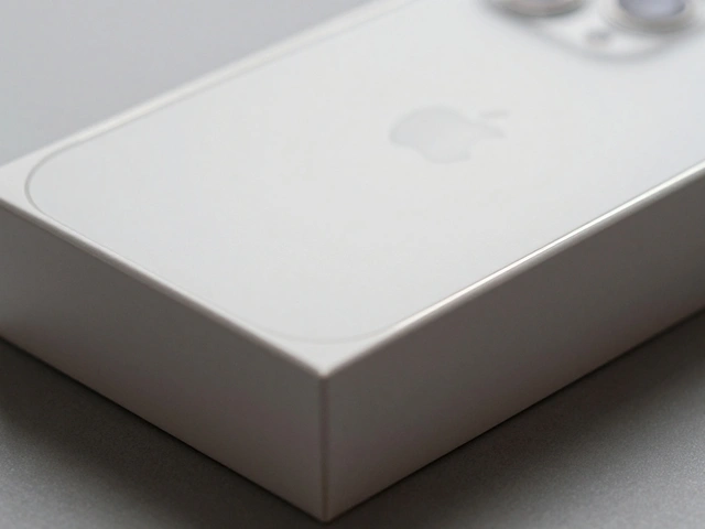

Have you ever held an iPhone and felt that strange sense of calm? It’s not just the smooth glass or the cool aluminum. It’s the absence of clutter. There are no unnecessary buttons, no confusing menus, no visual noise screaming for your attention. This feeling didn’t happen by accident. It is the direct result of a German designer from the 1950s whose work was decades ahead of its time.
The phrase less but better isn’t just a catchy slogan; it is a rigorous design philosophy created by Dieter Rams, a legendary industrial designer who worked at Braun in Germany. Born in 1932, Rams grew frustrated with what he saw as a decline in quality and honesty in consumer products. He believed that good design should solve problems without adding complexity. Today, this mindset defines the look and feel of almost every major tech company, but none embraced it more completely than Apple Inc., the American multinational technology company founded by Steve Jobs and Steve Wozniak.
The Ten Principles That Changed Everything
Rams didn’t just have a vague idea about simplicity. In the 1970s and 80s, he codified his thoughts into ten specific principles. These rules became the bible for modern product design. If you want to understand why your devices look the way they do, you need to look at these guidelines.
- Good design is innovative.
- Good design makes a product useful.
- Good design is aesthetic.
- Good design makes a product understandable.
- Good design is unobtrusive.
- Good design is honest.
- Good design is long-lasting.
- Good design is thorough down to the last detail.
- Good design is environmentally friendly.
- Good design is as little design as possible.
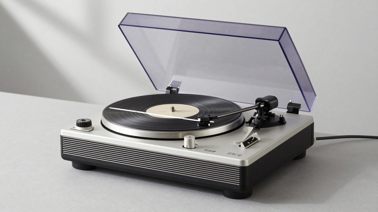
The last principle-"as little design as possible"-is the most radical. It means stripping away everything that doesn’t serve a function. When Rams designed the Braun SK4 record player, a iconic 1956 audio device known for its clean lines and transparent lid, he removed ornate wood casings and decorative knobs. The result was a machine that looked like it belonged in a laboratory, not a living room. But it worked perfectly. And it looked beautiful because it was honest about what it was.
Jonathan Ive and the Apple Connection
If Rams provided the blueprint, Jonathan Ive, former Chief Design Officer at Apple responsible for the iMac, iPod, iPhone, and iPad built the house. Ive joined Apple in 1992, during a time when computers were bulky beige boxes filled with floppy disk drives and tangled cables. He was obsessed with Rams’ work at Braun, a German manufacturer of consumer electronics and personal care products. In fact, Ive has openly stated that Rams was a primary influence on his thinking.
This influence became visible in 1998 with the launch of the iMac G3, Apple's all-in-one desktop computer released in 1998 featuring a translucent blue casing. Before the iMac, computers were serious business tools. The iMac was playful, colorful, and simple. It had no internal expansion slots for average users, no floppy drive (initially), and a single mouse button. It forced users to rely on the internet and USB ports, pushing technology forward while simplifying the user experience. This was Rams’ principle of innovation meeting usability.
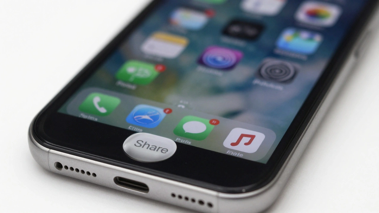
The partnership between Ive and Rams’ philosophy peaked with the iPhone, Apple's line of smartphones launched in 2007, revolutionizing mobile computing in 2007. Competing phones had physical keyboards, multiple navigation buttons, and styluses. The original iPhone had one button. Just one. The rest was touch. This was "less but better" in action. By removing physical keys, Apple reduced manufacturing complexity, increased screen real estate, and created a universal interface that could change based on the app you were using.
Honesty in Materials and Form
Rams’ sixth principle states that good design is honest. It shouldn’t make a product seem more innovative, powerful, or valuable than it really is. It shouldn’t attempt to manipulate the consumer. Apple took this seriously with materials.
In 2008, Apple introduced the MacBook Air, an ultra-thin laptop released in 2008, notable for its wedge-shaped aluminum unibody construction. Instead of covering plastic with fake metal textures or using cheap veneers, Apple used a single piece of aluminum milled into shape. You could see the precision of the cut. You could feel the weight. The material told the truth about the engineering inside. This honesty builds trust. Users know they aren’t buying a cheap imitation; they are buying a carefully crafted object.
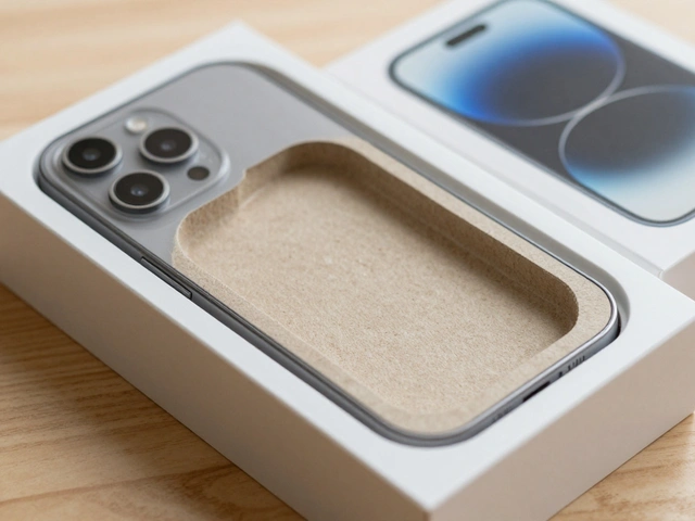
This approach extends beyond the device itself. Think about the box. Apple’s packaging is famous for its minimalism. It uses less material than competitors-often 60-70% less cardboard-and relies on precise folding and tension rather than glue or tape. The unboxing experience feels like a ritual. Every detail, from the placement of the manual to the spacing of the cable, follows Rams’ rule of being thorough down to the last detail.

The Industry Followed Suit
Apple wasn’t alone in adopting this mindset, but they were the loudest voice. As Apple gained market share, other companies realized that complexity didn’t sell. They started copying the minimalist playbook.
| Company | Design Language | Key Application of "Less but Better" |
|---|---|---|
| Microsoft, American multinational technology corporation producing software and hardware | Fluent Design | Emphasis on light, depth, and motion to reduce visual clutter in Windows 11 interfaces. |
| Google, American multinational technology company specializing in Internet-related services | Material Design | Use of whitespace, hierarchy, and bold colors to create intuitive, layered digital experiences. |
| Samsung, South Korean multinational conglomerate known for electronics and semiconductors | Minimalist Hardware | Reduction of bezels and physical buttons in Galaxy smartphones to maximize screen space. |
Even Microsoft, once known for complex, feature-heavy operating systems, shifted toward Fluent Design, Microsoft's design language introduced in 2017 focusing on light, depth, motion, material, and scale. Google’s Material Design, Google's design system launched in 2014, inspired by print design and paper metaphors explicitly prioritizes hierarchy and whitespace. These systems acknowledge that users are overwhelmed by information. Simplification isn’t just aesthetic; it’s cognitive relief.
The Environmental Argument for Simplicity
There is a practical reason to embrace "less but better." It’s better for the planet. Rams’ ninth principle emphasizes environmental friendliness. When you design a product that lasts longer, you waste less resources.
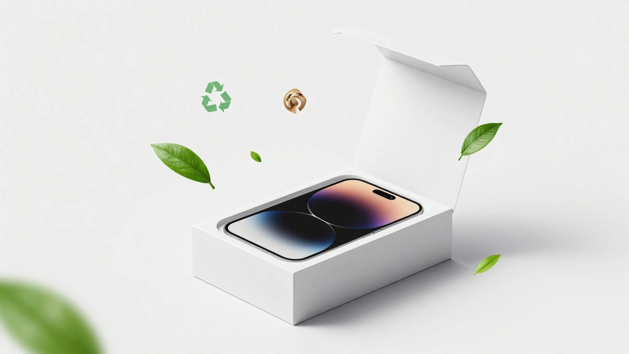
Apple has faced criticism for making devices that are hard to repair, which seems to contradict longevity. However, their strategy of extending software support-some iPhones receive iOS updates for seven years or more-keeps devices in use longer. Additionally, the reduction in packaging waste and the move toward recycled materials in products like the Apple Watch, A smartwatch series developed by Apple, featuring health tracking and connectivity features show progress. Manufacturing waste per unit dropped by approximately 75% between 2008 and 2020. Minimalism reduces the amount of raw material needed, which directly lowers the carbon footprint.
Challenges in the Age of AI
But is "less but better" still relevant today? We are entering an era of artificial intelligence, augmented reality, and increasingly complex algorithms. Some argue that minimalist interfaces hide too much. If an AI is making decisions for you, shouldn’t you see how it works?
This tension is real. Designers now talk about "adaptive minimalism" or "inclusive minimalism." The goal is still reduction, but it must accommodate accessibility needs. Users with disabilities may require larger text, high contrast, or tactile feedback-elements that pure minimalism might strip away. The challenge for modern designers is to keep the interface clean while providing transparency where it matters. Rams’ core insight remains valid: honesty is key. If the technology is complex, don’t lie about it with flashy graphics. Explain it simply.
Why Less Still Sells More
From a business perspective, simplicity is a premium feature. Studies from firms like McKinsey show that design-focused companies command price premiums of 15-25% over competitors. Apple maintains a 25-30% global smartphone market share despite pricing devices significantly higher than rivals. Why? Because consumers value clarity. In a world of constant notifications and ads, a device that respects your attention is worth extra money.
When you buy a product designed with Rams’ principles, you aren’t just buying functionality. You are buying peace of mind. You are buying a tool that disappears into the background, letting you focus on your life, not the machine.

Categories
Popular Articles