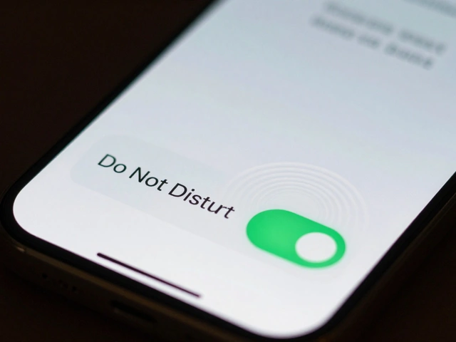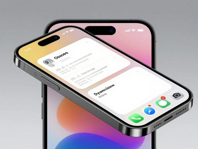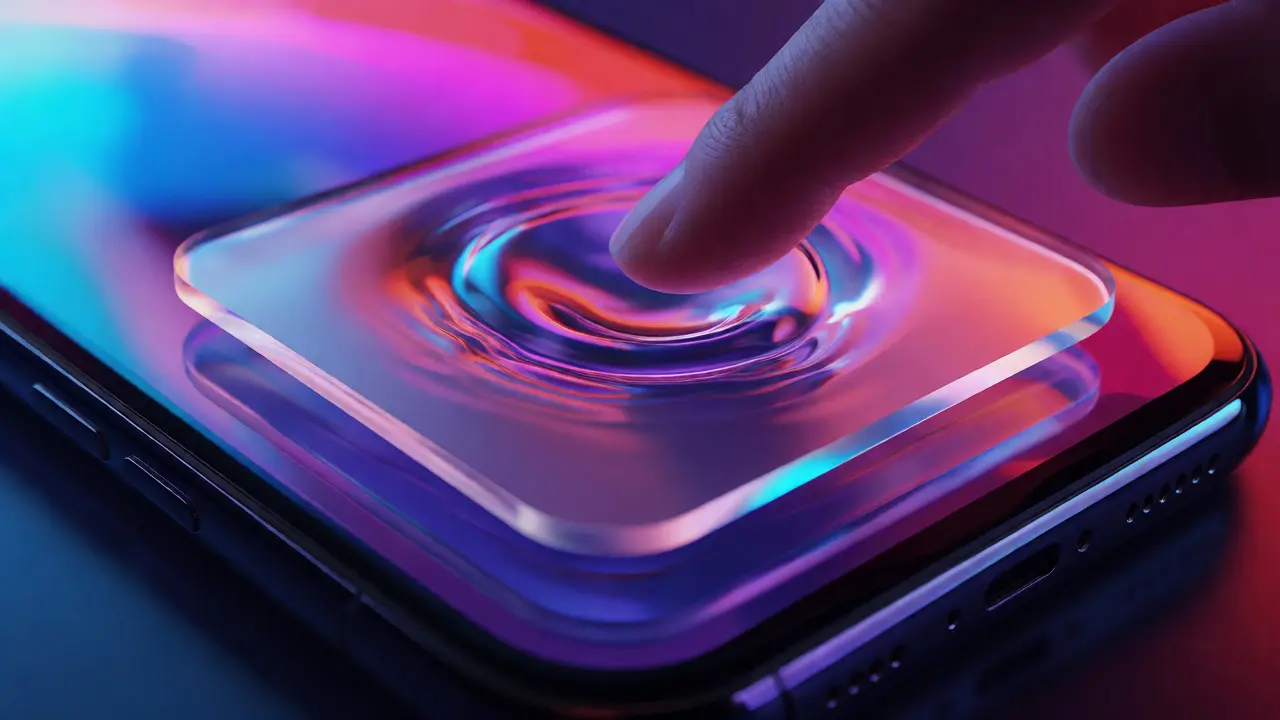

You know that feeling when you scroll through a menu and it feels like sliding across ice? Or when a button press doesn't just click, but ripples out like a stone dropped in a pond? That’s not just fancy animation. That’s Liquid Glass, the emerging aesthetic language Apple is weaving into its latest interface updates. It’s about making pixels feel alive. If you’ve felt your device getting stiffer or more static over the last few years, this shift is Apple’s answer to bringing back tactile energy without adding visual clutter.
Why does this matter to you? Because interfaces aren’t just pictures anymore; they’re interactions. When a UI moves with weight and physics, it tells your brain something happened. It confirms your action. This article breaks down exactly how this "vitality" works, why Apple chose glass as the metaphor, and what it means for the apps you use every day.
The Shift from Flat to Fluid
For a decade, we lived under the reign of flat design. It was clean, efficient, and easy to build. But let’s be honest-it could feel cold. Flat Design prioritized clarity over depth, stripping away shadows and textures to focus on content. While effective, it often lacked emotional resonance. The problem wasn’t the minimalism; it was the lack of feedback. You tapped a button, and it changed color. Done. No sense of physical engagement.
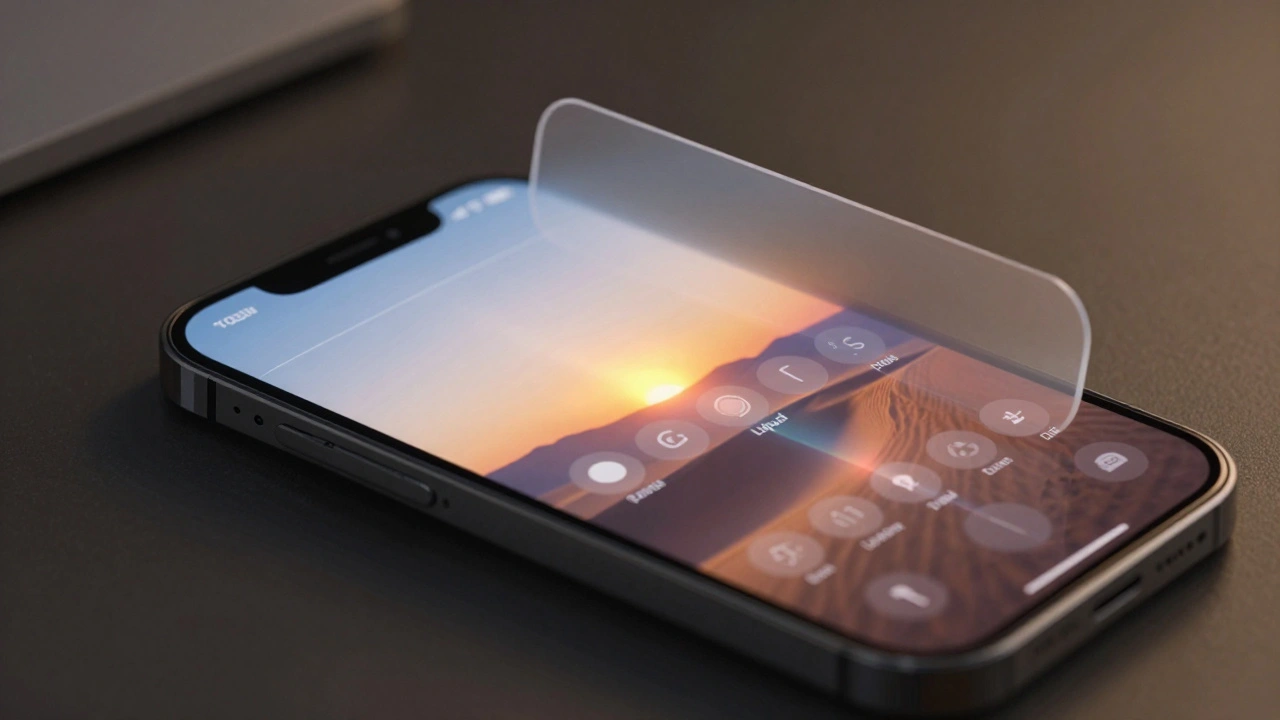
Enter the era of depth. Apple didn’t abandon minimalism; they evolved it. They kept the clean lines but reintroduced light and refraction. This is where Liquid Glass comes in. It’s a design philosophy that treats UI elements as translucent, refractive surfaces rather than solid blocks of color. Think of it less like looking at a painting and more like looking through a window. The background isn’t hidden; it’s distorted, blurred, and colored by the element in front of it. This creates a sense of space and layering that flat colors simply can’t achieve.
This transition isn’t accidental. As screens get brighter and resolutions higher, our eyes crave nuance. Hard edges feel digital. Soft, refractive edges feel organic. By mimicking the behavior of real-world materials like frosted glass or water, Apple bridges the gap between the digital screen and physical reality.
How Motion Creates Trust
Motion in UI isn’t just decoration. It’s communication. When an element slides in with momentum, it shows direction. When it bounces slightly upon landing, it shows impact. This is called Kinetic Feedback. It’s the principle that user actions should trigger immediate, physically plausible responses from the interface.
Consider a standard notification. In older designs, it might pop up instantly. With Liquid Glass aesthetics, it glides in, perhaps expanding slightly as it settles. Why? Because instant appearance can startle. Gradual, weighted entry allows your peripheral vision to catch the change without triggering a fight-or-flight response. It’s subtle, but it reduces cognitive load.
Moreover, motion provides continuity. If you swipe away a card, it shouldn’t just vanish. It should fly off-screen, maintaining its size and perspective until it leaves the viewport. This preserves spatial memory. Your brain knows where the object went because it saw it leave. Without this motion, you lose track of the hierarchy. Did I close the app? Did I minimize it? Motion answers these questions before you even ask them.
| Feature | Classic Flat Design | Liquid Glass Aesthetic |
|---|---|---|
| Visual Depth | Minimal or None | High (via blur and refraction) |
| Motion Style | Instant or Linear | Elastic, Weighted, Fluid |
| User Feedback | Color Change Only | Haptic + Visual Ripple |
| Cognitive Load | Low (but low context) | Medium (high context/clarity) |
| Perceived Quality | Functional | Premium/Vital |
The Physics of Translucency
So, how do you actually make glass look alive? It’s all about light. Real glass doesn’t have a fixed color; it reflects and refracts what’s behind it. Apple’s implementation uses dynamic blurring techniques. When a menu overlays a photo, the menu doesn’t turn gray. It samples the colors behind it, blurs them heavily, and applies a slight tint. This ensures contrast while keeping the context visible.
This technique relies on Real-time Rendering. Modern processors, like the A-series chips in iPhones, are powerful enough to calculate these blur effects on the fly without draining the battery excessively. In the past, designers used pre-rendered images for backgrounds. Now, the system calculates the blur based on what’s currently scrolling underneath. If you scroll a bright red image under a white menu, the menu takes on a pinkish hue. Scroll a dark blue image, and it turns navy. This dynamic adaptation makes the UI feel integrated with the content, not floating above it.
But there’s a catch: performance. Heavy blurring can tax the GPU. Apple mitigates this by limiting the complexity of layers. Usually, only one or two layers of glass effect are active at once. This keeps the frame rate steady at 120Hz on ProMotion displays. If you notice stuttering, it’s often because too many transparent layers are stacked, forcing the processor to work harder to composite the scene.
Vitality Through Micro-Interactions
The term "vitality" implies life. In UI terms, this means micro-interactions-tiny animations that happen during specific user actions. These are the details that separate good apps from great ones.
- The Press: When you touch a button, it shouldn’t just darken. It should depress slightly, perhaps shrinking by 5%. This simulates physical pressure.
- The Release: When you lift your finger, the button shouldn’t snap back instantly. It should rebound with a slight overshoot, then settle. This mimics elasticity.
- The Drag: When dragging a slider, the thumb should lag slightly behind your finger, creating tension. When released, it snaps to the nearest value with a spring-like bounce.
These interactions rely on Spring Animations. Unlike linear animations that move at a constant speed, springs accelerate and decelerate based on virtual mass and stiffness. This non-linear movement feels natural because nothing in the real world moves in straight, constant lines. Objects have inertia. By programming this inertia into the software, Apple makes the digital world obey physical laws, which our brains intuitively understand.
Accessibility and Readability Challenges
All this beauty comes with a cost: readability. Translucent backgrounds can make text hard to read if the content behind it is busy. Imagine trying to read black text on a semi-transparent white bar that sits over a patterned wallpaper. It’s messy.
Apple solves this with adaptive contrast. The system analyzes the brightness and saturation of the background. If the background is dark, the glass overlay becomes lighter and more opaque. If the background is bright, the overlay darkens or increases its blur radius. This ensures that text always maintains a sufficient contrast ratio against its backdrop.
However, users with visual impairments might still struggle. For them, iOS offers accessibility settings to reduce transparency. Turning this off replaces the Liquid Glass effects with solid, opaque backgrounds. This trade-off sacrifices aesthetic vitality for maximum legibility. It’s a reminder that design must serve function first. If the pretty glass makes you squint, it’s failed its primary job.
Implementing the Look in Your Projects
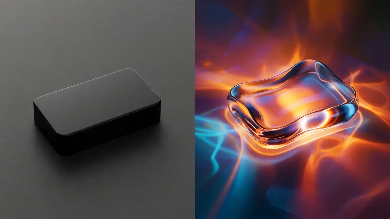
If you’re a designer or developer, you don’t need to wait for Apple to release new SDKs to try this. You can emulate the vibe today. Start by using high-blur values on overlays. Don’t just set opacity to 50%; add a Gaussian blur of 20px or more. This separates the foreground from the background cleanly.
Next, focus on easing curves. Avoid linear transitions. Use cubic-bezier functions that mimic ease-out-ease-in patterns. For example, when opening a modal, start fast and slow down as it reaches its final position. When closing, start slow and accelerate out. This asymmetry feels more natural than symmetric timing.
Finally, respect the hardware. Test your animations on older devices. If the frame rate drops below 60fps, simplify the effects. Reduce the blur radius or limit the number of animated elements. Vitality shouldn’t come at the cost of responsiveness. A laggy interface feels dead, no matter how shiny it looks.
Frequently Asked Questions
What is Liquid Glass in Apple's UI?
Liquid Glass is an aesthetic approach that uses translucency, dynamic blurring, and realistic motion physics to make interface elements appear like physical materials. It aims to create depth and vitality, moving beyond the static nature of traditional flat design.
Does Liquid Glass affect battery life?
Yes, rendering real-time blurs and complex animations requires more GPU power. However, modern Apple silicon chips are optimized for these tasks. On newer devices, the impact is negligible, but on older models, heavy use of transparency may cause faster battery drain.
Can I disable transparency effects?
Absolutely. Go to Settings > Accessibility > Display & Text Size and toggle on "Reduce Transparency." This replaces the glass effects with solid backgrounds, improving readability and potentially boosting performance on older hardware.
Why does my text look blurry on glass backgrounds?
This usually happens when the contrast between the text and the blurred background is too low. Apple’s system tries to adapt automatically, but custom apps might fail to adjust text color dynamically. Ensure your text has a strong shadow or a darker/lighter backing plate to maintain legibility.
Is this trend exclusive to Apple?
While Apple popularized it recently, other platforms like Windows (with Fluent Design) and some Android skins also use acrylic or blur effects. However, Apple’s integration of haptics with these visuals sets it apart, creating a more cohesive sensory experience.
Categories
Popular Articles