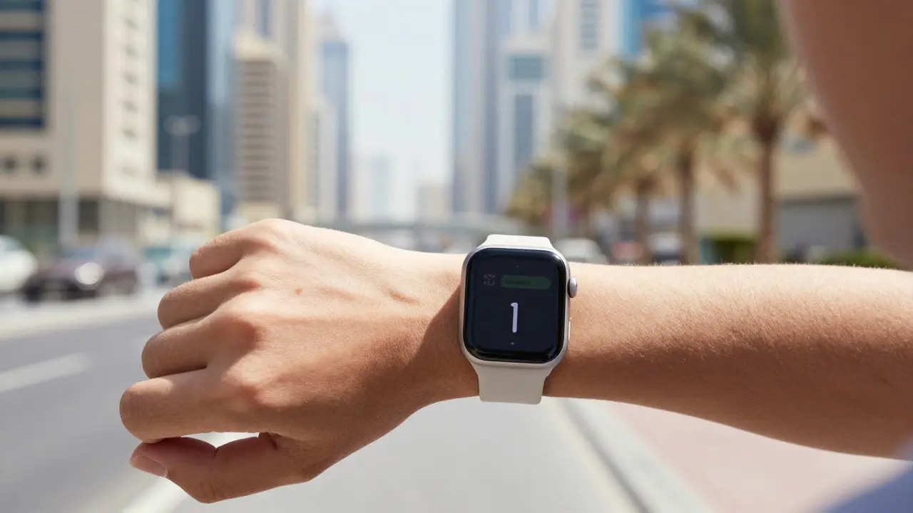

Ever tried to reply to a long email on your Apple Watch? You probably gave up after thirty seconds. That frustration isn't an accident; it's a deliberate design choice. Task Duration Design is a user experience strategy that limits the complexity of interactions on small screens to ensure users complete tasks in under 30 seconds. Unlike desktop interfaces that encourage deep focus and multi-step workflows, wearable interfaces prioritize speed and immediacy. If you've ever wondered why the Apple Watch feels so different from your iPhone, this is the core reason.
The Physics of Glanceability
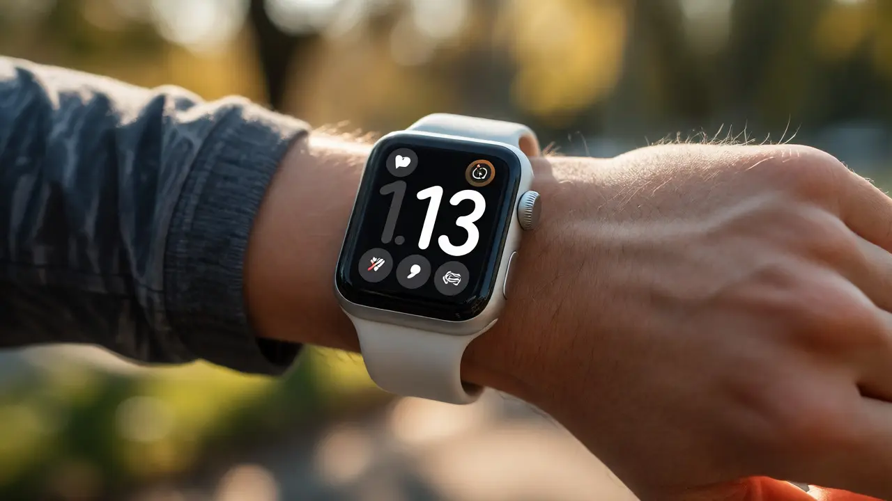
To understand why short sessions are mandatory, we have to look at how humans actually use watches. We don't sit down with a watch; we glance at it. This behavior dictates the entire architecture of the operating system, watchOS. The screen is too small for dense text, and the battery life constraints mean we can't keep high-resolution displays active for minutes on end. Therefore, every app must be optimized for what designers call "glanceability."
Glanceability means the information must be legible and actionable within one or two seconds. Think about checking a ride-share ETA. On a phone, you might open the app, wait for it to load, check the map, and close it. On the Watch, you tap once, see the time, and move on. If that process takes more than ten seconds, the user will likely switch to their phone. This creates a hard ceiling on task complexity. You cannot fit a complex form, a detailed spreadsheet, or a long-form article into a glanceable interface without breaking the user's flow.
Cognitive Load and Attention Spans
Beyond physical size, there is a psychological barrier. Wearing a device on your wrist changes the context of attention. When you pull out your phone, you signal to the world (and yourself) that you are stopping what you're doing to engage with digital content. A watch, however, is ambient. It sits there, waiting. Because the transition cost is low, the expectation for immediate value is high.
This is where Cognitive Load comes in. Cognitive load refers to the mental effort required to process information. On a large screen, we have room to scan, compare, and analyze. On a watch, our working memory is limited because we are often multitasking-walking, cooking, or driving. If an interaction requires holding three pieces of information in your head simultaneously, you will fail. Designers mitigate this by reducing steps. Instead of asking you to select a recipient, type a message, and choose a tone, the Watch offers pre-set replies. This reduces the decision tree from a branching maze to a simple fork in the road.
| Attribute | iPhone Interface | Apple Watch Interface |
|---|---|---|
| Primary Goal | Deep engagement and productivity | Rapid confirmation and notification triage |
| Typical Session Length | 5-15 minutes | < 30 seconds |
| Input Method | Full keyboard, touch gestures | Digital Crown, tap, voice (Siri) |
| Error Tolerance | High (easy to undo/correct) | Low (mistakes are disruptive) |
| Content Density | High (lists, grids, text) | Low (single card, key metric) |
The 3-Second Rule in Wearable UI
While "under 30 seconds" is the general goal, the gold standard for critical actions is even tighter: the 3-second rule. If a user needs to know if a timer has finished, they should know it instantly. If they need to approve a payment, it should take no longer than a double-tap. This rule drives several specific design patterns found in Human Interface Guidelines for wearables.
- Progressive Disclosure: Show only the most important data first. Details are hidden behind a second tap or scroll. For example, a weather app shows the current temperature immediately. Precipitation chance and wind speed appear only if you dig deeper.
- Pre-filled Context: The Watch knows who you are talking to or where you are going. It doesn't ask "Who do you want to call?" It assumes you want to call the person who just texted you. This saves two or three steps.
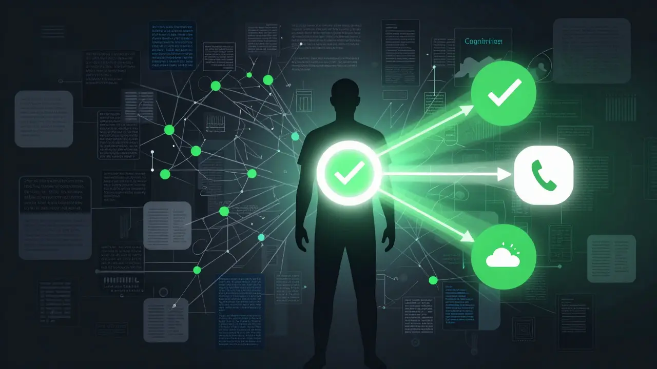
- Visual Hierarchy over Text: Icons and colors convey status faster than words. A green checkmark means success. A red exclamation mark means error. You don't read "Operation Successful"; you see the color and move on.
Hardware Constraints Shape Software Logic
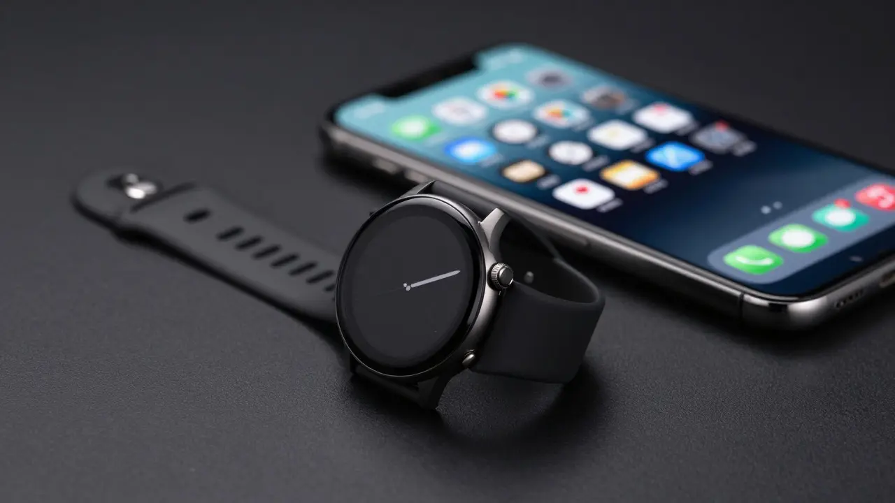
You can't separate software design from hardware reality. The Apple Watch uses an OLED display that burns through power quickly when bright. To save battery, the screen dims automatically after a few seconds of inactivity. This forces apps to be lightweight. Heavy animations or constant background processing are discouraged because they drain the battery and heat up the small chassis.
Furthermore, the input mechanism-the Digital Crown-is precise but slow for typing. Typing a full sentence with the crown is tedious. So, the OS pushes users toward quick replies, emojis, or voice commands via Siri. This isn't just a preference; it's a constraint-driven solution. The hardware dictates that typing is a last resort, not a primary mode of interaction. Consequently, developers build features that minimize text entry entirely. Health tracking, for instance, relies almost exclusively on passive data collection and simple confirmations, rather than manual logging.
Designing for Interruption
Most watch interactions happen during interruptions. You are walking to the store, and your phone buzzes. You glance at the Watch. You are in a meeting, and a calendar alert pops up. You check the Watch. In these moments, the user is not "using" the device in a dedicated sense; they are reacting to it. This requires the interface to be non-intrusive yet clear.
If an interaction fails here-if the button is too small, the text is too dim, or the response is laggy-the user abandons the Watch and reaches for the phone. Once that habit forms, the Watch loses its utility. Therefore, Latency is a critical design metric. Every millisecond of delay between tapping the crown and seeing the result counts against the short session budget. Developers optimize code paths specifically for wearables to ensure instant feedback. This includes pre-loading assets and simplifying logic trees to avoid heavy calculations on the wrist.
Common Pitfalls in Long-Form Watch Apps
Despite these guidelines, many apps still try to force phone-like experiences onto the Watch. This usually results in poor user retention. Here are the most common mistakes designers make when ignoring task duration principles:
- Nested Menus: Requiring users to go three levels deep to find a setting. On a watch, depth equals friction. Keep everything one or two taps away.
- Small Tap Targets: Buttons smaller than 44x44 points. Fingers are clumsy, especially when wearing gloves or moving. Small targets lead to missed taps and frustration.
- Text-Heavy Screens: Paragraphs of text are unreadable on a 1.7-inch screen. Summarize information into bullet points or single metrics.
- Ignoring Voice Input: Failing to integrate Siri shortcuts for common actions. If a task involves typing, it likely belongs on the phone unless it can be solved with a voice command.
Best Practices for Developers and Designers
If you are designing for wearables, start by asking: "Can this task be done in less than 15 seconds?" If the answer is no, consider if it belongs on the Watch at all. Sometimes, the best feature is a companion link that opens the full experience on the iPhone. Use the Watch as a remote control or a status dashboard, not a primary workspace.
Test your prototypes with real users in motion. Have them walk around while using the app. Notice where they hesitate. Watch where their eyes dart. If they struggle to find the next step, simplify. Remove options. Reduce choices. The fewer decisions a user has to make, the faster they can complete the task and return to their day. Remember, the goal of a watch app isn't to keep the user engaged; it's to get them back to their life as quickly as possible.
Frequently Asked Questions
What is the ideal maximum time for an Apple Watch interaction?
The ideal target is under 30 seconds for any complete task. For critical notifications or status checks, aim for under 5 seconds. If a task consistently takes longer than 30 seconds, users will likely switch to their iPhone.
Why does Apple Watch discourage typing?
Typing on a small screen with a Digital Crown or touch surface is slow and error-prone. To maintain short session times, designers prefer pre-set replies, voice commands via Siri, or passive data entry methods like heart rate tracking.
How does battery life influence UI design?
Battery constraints limit screen brightness and processing power. This encourages minimalistic interfaces with low animation usage and efficient code. Complex graphics or continuous video playback are avoided to preserve energy for essential functions.
What is progressive disclosure in wearable design?
Progressive disclosure is a technique where only the most essential information is shown initially. Additional details are revealed only when the user explicitly requests them through a tap or scroll. This keeps the initial view clean and fast to process.
Should every iPhone app have an Apple Watch version?
No. Only tasks that benefit from quick access, passive monitoring, or hands-free operation should be moved to the Watch. If the core functionality requires deep engagement or complex input, it is better served on the larger iPhone screen.
Categories
Popular Articles