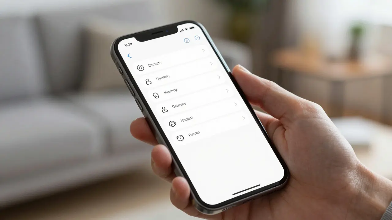

Opening the Settings app on an iPhone often feels like walking into a library with no librarian. You know what you need-maybe you want to change your wallpaper or fix a Bluetooth issue-but finding it requires navigating through layers of menus that seem designed by committee. The core challenge for designers working on system-level interfaces is balancing discoverability without overwhelm. If options are too hidden, users feel stuck. If they are all exposed at once, users feel paralyzed. This tension defines modern mobile UX.
The Psychology of Choice Paralysis
When a user opens a settings menu, their brain is already in a problem-solving mode. They are not browsing; they are hunting. According to research on decision fatigue, the more options presented simultaneously, the longer it takes to make a choice and the higher the chance of regret. In the context of iOS, Apple has historically leaned toward minimalism. However, as features have accumulated over decades, the minimalism has turned into complexity. A single "General" tab can contain dozens of sub-items. The goal is not to show everything, but to surface the right thing at the right time.
Structural Hierarchy and Information Architecture
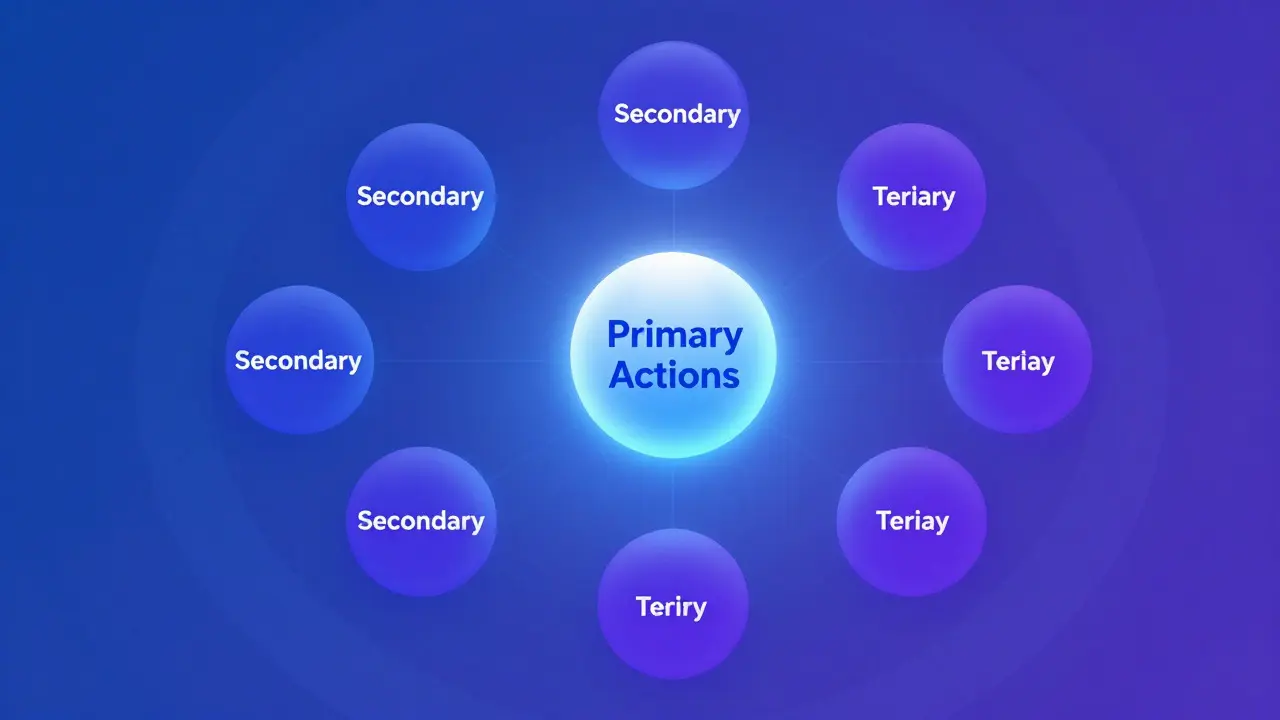
Effective settings design relies on a clear information architecture. Think of it as a filing cabinet. You don't put every document on the top shelf. Instead, you group related items into folders.
- Primary Actions: These are high-frequency tasks like adjusting brightness, toggling Wi-Fi, or changing volume. These should be accessible via quick controls (Control Center) or top-level tabs.
- Secondary Actions: Medium-frequency tasks like managing storage, updating software, or configuring accounts. These belong in main category headers.
- Tertiary Actions: Low-frequency, deep-configuration tasks like resetting network settings or enabling developer mode. These should be buried deeper, requiring intentional navigation.
The Role of Search in Reducing Friction
Search is the ultimate safety net for complex systems. In macOS and iOS, the search bar in Settings allows users to bypass the entire hierarchy if they know exactly what they want. But search only works if the underlying data is structured correctly. Each setting needs a clear name and relevant keywords associated with it. For example, if a user types "battery," the system should return not just "Battery Health" but also "Low Power Mode" and "Background App Refresh." This semantic connection between query and result is what makes search a viable alternative to manual navigation. Without robust tagging, search becomes a dead end, forcing users back to the frustrating maze of tabs.
Visual Cues and Microinteractions
Text alone is not enough. Visual cues guide the eye and signal interactivity. In Apple's design language, subtle animations indicate state changes. When you toggle a switch, the color shifts instantly. When you enter a sub-menu, the previous screen slides away smoothly. These microinteractions provide feedback that confirms the user's action was registered. More importantly, they reduce anxiety. If a button does nothing when tapped, users wonder if the app is broken. Smooth transitions reassure them that the system is responsive. Additionally, iconography plays a vital role. A universal icon for "Airplane Mode" is recognized globally without needing text labels. This visual shorthand speeds up navigation for both new and experienced users.
Comparison of Design Approaches
Different platforms handle settings discovery differently. Understanding these contrasts helps highlight why Apple's approach stands out in terms of consistency, even if it isn't always the fastest.
| Platform | Primary Navigation Model | Discoverability Mechanism | User Effort Level |
|---|---|---|---|
| iOS | Tab-based hierarchy | Consistent placement + Search | Medium |
| Android | Flat list with categories | Aggressive search + Quick tiles | Low-Medium |
| Windows | Left-sidebar navigation | Deep nesting + Search | High |

Common Pitfalls in Settings Design
Even well-intentioned designs can fail. Here are some common mistakes that increase cognitive load:
- Inconsistent Naming: Using "Wi-Fi" in one place and "Wireless Network" in another confuses users. Stick to standard terminology.
- Hidden Critical Features: Burying essential functions like "Screen Time" or "Privacy" too deep frustrates users who need them frequently.
- Lack of Context: Showing a technical term like "DNS Configuration" without explaining what it does leaves non-technical users unsure whether to touch it.
- Too Many Toggles: Presenting 20+ switches on a single screen leads to decision paralysis. Group related toggles into sub-menus.
Future Trends in System Settings
As devices become more intelligent, settings interfaces are evolving. Machine Learning is beginning to influence how options are presented. Imagine a settings app that learns your habits. If you frequently adjust brightness in the evening, the app might suggest a schedule automatically. Personalization reduces the need for manual configuration. Furthermore, voice assistants are becoming secondary entry points for settings. Asking Siri to "turn on Do Not Disturb" bypasses the GUI entirely. The future of settings design is less about perfect static hierarchies and more about dynamic, context-aware interfaces that adapt to the user's current task. The goal remains the same: get out of the user's way while ensuring everything needed is within reach.