
Remember when building an app meant writing separate logic for iPhone, iPad, and Mac? Those days are officially behind us. With the release of iPadOS 18, which is Apple's operating system update that fundamentally redesigned navigation patterns across its ecosystem, the way we handle tabs, sidebars, and toolbars has shifted from a rigid set of rules to a fluid, user-driven experience. If you are still hardcoding bottom tab bars for every landscape view on an iPad, your app feels outdated before it even launches.
The core change isn't just visual; it's structural. Apple wants users to choose how they navigate. Some want the compact efficiency of a top-aligned tab bar. Others crave the expansive hierarchy of a sidebar. Your job as a developer is not to decide for them, but to build a navigation system that adapts seamlessly between these two modes without breaking the user's workflow. This guide breaks down exactly how to implement this new standard using both SwiftUI and UIKit, ensuring your app feels native on every screen size.
Understanding the New Adaptive Navigation Model
Before touching code, you need to understand the philosophy driving this change. In previous versions of iOS and iPadOS, navigation was often device-dependent. You might have had a tab bar on portrait mode and a sidebar on landscape mode, hardcoded into your layout constraints. That approach created jarring transitions when users rotated their devices.
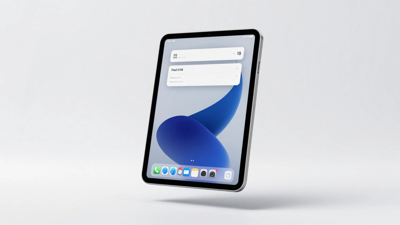
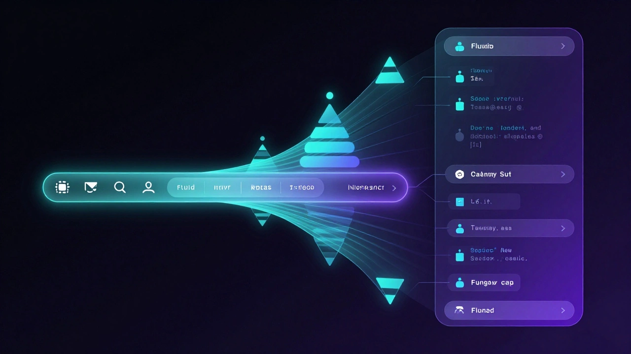
iPadOS 18 introduces a unified model where the Tab Bar and Sidebar are treated as interchangeable representations of the same data structure. The key insight here is that the tab bar is no longer just a list of buttons at the bottom. In landscape orientation on larger screens, it can morph into a sidebar. Even more importantly, in portrait orientation on iPads, the tab bar now sits at the top of the interface, sandwiched between other navigational controls.
Why does this matter? It saves vertical space. By moving the primary navigation up, you give content more room to breathe. It also brings navigation closer to the user’s thumb reach on handheld devices while maintaining ergonomic consistency with other system apps like Podcasts, Apple TV, and Music. When designing your app, assume that your navigation will live in this flexible zone. Do not anchor critical actions to the bottom of the screen unless they are contextual toolbar items.
Implementing Adaptive Navigation in SwiftUI
If you are building with SwiftUI, which is Apple's declarative framework for building user interfaces across all Apple platforms, the transition is surprisingly straightforward. The secret sauce lies in the .tabViewStyle(.sidebarAdaptable) modifier. This single line tells the system to evaluate the available screen width and user preferences to determine whether to show a tab bar or a sidebar.
Here is how you structure your main view:
- Define your tabs: Use the standard
Tabviews within aTabView. Each tab should represent a top-level section of your app, such as "Home," "Search," or "Library." - Apply the style: Attach
.tabViewStyle(.sidebarAdaptable)to the rootTabView. This enables the adaptive behavior. - Group related items: Use
TabSectionto group tabs. For example, if you have multiple playlists, wrap them in aTabSection("Playlists"). This creates a secondary navigation layer within the sidebar, allowing for deeper hierarchies without cluttering the main tab bar.
When the sidebar is hidden, it doesn't just disappear. It animates back into the tab bar, preserving focus on the content represented by the active tab. This animation is crucial for usability. It ensures that users who prefer the compact tab bar can navigate without needing to reopen the sidebar manually. The system handles the state management for you, so you don't need to write complex animation code.
For developers who want to control which tabs appear in the sidebar versus the tab bar, you can use the .tabItemPlacement() modifier. Setting a tab to .sidebarOnly ensures it never appears in the compact tab bar, forcing users to access it through the expanded sidebar. This is perfect for settings, help pages, or deep archival content that doesn't need immediate access.
Migrating UIKit Apps to the New Standard
If your codebase relies on UIKit, which is Apple's traditional imperative framework for iOS and iPadOS application development, you aren't left behind. The UITabBarController has been updated to support this new paradigm through the mode property.
To enable adaptive navigation, set your tab bar controller's mode to .tabSidebar. This allows the system to automatically switch between a tab bar and a sidebar based on the context. Unlike SwiftUI, where you define sections explicitly with TabSection, UIKit uses UITabGroup to create similar hierarchical structures. A UITabGroup acts as a container for related tabs, enabling secondary navigation within the sidebar.
One critical difference in UIKit is how you handle customization. You need to configure the customizationConfiguration of your UITabBarController to allow users to drag and drop items. This mirrors the SwiftUI approach but requires explicit setup. Make sure to test your implementation on both iPad and Mac, as the default behaviors can differ slightly due to platform-specific conventions.
Customization: Letting Users Personalize Their Experience
One of the most powerful features introduced in iPadOS 18 is user-driven customization. Users can now drag tabs from the sidebar into the tab bar, or vice versa. They can reorder items, hide rarely used sections, and prioritize their most frequent destinations. As a developer, you must support this flexibility.
In SwiftUI, you attach a TabViewCustomization object to your TabView. This object tracks the user's preferences and persists them across app sessions. If your app has other UI elements that mirror the sidebar-such as a floating action menu or a search filter-you can bind those elements to the same customization data source. This ensures consistency throughout the app.
Consider the implications for your information architecture. If a user moves a "Settings" tab into the main tab bar, does it make sense? Probably not. Use the .sidebarOnly placement to protect critical but non-primary navigation items from being dragged into the high-visibility tab bar. Conversely, allow frequently accessed content categories to be customizable. This respects the user's mental model and reduces friction.
| Feature | SwiftUI Implementation | UIKit Implementation | User Benefit |
|---|---|---|---|
| Adaptive Style | .tabViewStyle(.sidebarAdaptable) |
mode = .tabSidebar |
Seamless transition between compact and expanded views |
| Hierarchical Grouping | TabSection |
UITabGroup |
Organizes deep content hierarchies without clutter |
| Customization Tracking | TabViewCustomization |
customizationConfiguration |
Persists user preferences across sessions |
| Placement Control | .tabItemPlacement(.sidebarOnly) |
isSidebarOnly property |
Prevents critical items from appearing in compact views |
Platform-Specific Nuances: iPad vs. Mac
While the underlying API is shared, the user expectations differ between iPadOS and macOS Sequoia, which is The latest version of Apple's desktop operating system featuring integrated sidebar navigation. On iPad, users expect to use the built-in edge swipe gesture to reveal sidebars. Your app should support this out of the box; do not add custom swipe gestures that conflict with system behavior.
On Mac, however, users rely on mouse and keyboard interactions. You should include a dedicated "Show Sidebar" button in the toolbar, typically represented by a sidebar icon. Additionally, provide "Show Sidebar" and "Hide Sidebar" options in the View menu. These small touches make your app feel native to Mac users who are accustomed to precise control over their window layout.
Another key difference is the appearance of the sidebar itself. On Mac, the sidebar adopts the standard Aqua styling with distinct selection highlights and typography. On iPad, it blends more seamlessly with the rest of the interface. Ensure your assets and icons scale appropriately for both contexts. A 24x24 point icon might look crisp on Mac but too small on iPad; use SF Symbols' adaptive sizing capabilities to handle this automatically.
Toolbars: Contextual Actions vs. Top-Level Navigation
A common mistake developers make is mixing navigation controls with action buttons. Toolbars are for actions; tabs and sidebars are for navigation. Keep this separation clear.
In the new adaptive model, toolbars sit above or below the content area, independent of the tab bar/sidebar state. Use them for contextual actions relevant to the current view, such as "Edit," "Share," or "Filter." Do not put navigation destinations in the toolbar. If a user needs to go to a different section of the app, they should use the tab bar or sidebar. This clarity reduces cognitive load and prevents accidental taps.
When the sidebar is visible, the toolbar may shrink or shift position to accommodate the narrower content area. Test your toolbar layouts in both narrow (tab bar only) and wide (sidebar + content) configurations. Use ToolbarItem priorities in SwiftUI to ensure important actions remain visible while less critical ones collapse into overflow menus.
Best Practices for Content-Focused Apps
This new navigation system shines brightest in content-rich applications. Think news aggregators, media libraries, productivity suites, and social platforms. If your app has fewer than three top-level sections, a simple tab bar might suffice. But if you have dozens of categories, playlists, or projects, the adaptive sidebar becomes essential.
Start with a tab bar. Apple's guidance suggests beginning with the simplest pattern and evolving toward complexity. A tab bar can easily morph into a sidebar as your app grows. This forward-compatible approach saves you from rewriting navigation logic later. As you add more sections, introduce TabSection or UITabGroup to organize them. Finally, enable customization to let power users tailor their experience.
Pay attention to performance. Loading a large number of tabs simultaneously can slow down your app. Lazy-load content within each tab. Only fetch data when the user actually navigates to that section. The system provides callbacks when a tab becomes active; use these hooks to optimize resource usage.
Should I use sidebars for all my apps?
Not necessarily. Sidebars are best for apps with rich hierarchies and many top-level sections. For simple apps with 2-4 main destinations, a standard tab bar is cleaner and more intuitive. Start with a tab bar and migrate to adaptive navigation only if your app's complexity demands it.
How do I handle backward compatibility for older iOS versions?
These APIs are specific to iPadOS 18 and macOS Sequoia. For older versions, you must maintain legacy navigation implementations. Use conditional compilation or runtime checks to apply the new adaptive styles only on supported devices. This ensures your app remains functional on older hardware while offering enhanced experiences on newer systems.
Can users customize the order of tabs in the sidebar?
Yes. Both SwiftUI and UIKit support drag-and-drop reordering. Users can rearrange tabs in the sidebar and move items between the sidebar and tab bar. Ensure your app persists these changes using the provided customization configuration objects to maintain consistency across app launches.
What happens to the tab bar in portrait mode on iPad?
In portrait mode on iPad, the tab bar moves to the top of the interface, positioned between other navigational controls. This design choice saves vertical space and brings navigation closer to the user's hand, improving ergonomics compared to the traditional bottom-aligned tab bar.
Do I need to implement separate navigation for Mac?
No. The same SwiftUI or UIKit code works across iPadOS and macOS. However, you should respect platform-specific conventions, such as adding a "Show Sidebar" button and menu options on Mac, while relying on edge-swipe gestures on iPad. The underlying adaptive logic remains consistent.

Categories
Popular Articles