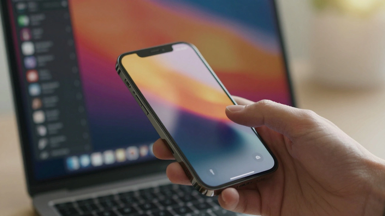

You open your iPhone. The screen is clean. No cluttered menus screaming for attention. Just a few icons, some whitespace, and maybe a subtle animation when you swipe. It feels effortless, almost invisible. But behind that simplicity lies a massive engineering machine. Apple doesn’t just make pretty things; they make complex systems feel simple. That’s the core of their design philosophy: balancing strict visual restraint with deep functionality.
Most tech companies choose one side. They either give you a flashy, feature-dense interface that overwhelms you, or a bare-bones tool that lacks power. Apple tries to do both. They hide the complexity under a calm surface. This approach isn’t accidental. It’s rooted in decades of iteration, from the original Macintosh to the current Vision Pro. If you’re a designer, developer, or just curious about why your phone feels different, understanding this balance helps you see what’s actually happening on the screen.
The Core Idea: Less Noise, More Signal
Think about the last time you used a poorly designed app. Maybe it was a banking app or a flight tracker. You had to hunt for buttons. Colors clashed. Fonts were inconsistent. Your brain worked hard just to find the "Pay" button. Now think about Apple’s native apps. Weather, Notes, Photos. You don’t think. You just act. This is intentional reduction.
Visual restraint means removing anything that doesn’t help the user achieve a goal immediately. It’s not about having fewer features. It’s about hiding features until you need them. When you tap a photo in the Photos app, the editing tools slide up. They aren’t there by default because most people just want to view photos. By keeping the initial view clean, Apple reduces cognitive load. Your brain doesn’t have to filter out irrelevant options.
This strategy relies heavily on hierarchy. Size, color, and spacing tell you what matters. On an iPhone home screen, the dock stays at the bottom. Why? Because it’s reachable with your thumb. The background is often blurred or dimmed when you open an app. This creates depth. It tells you, "This new layer is active. The old stuff is still there, but it’s secondary." These tiny cues guide your eyes without using text labels. That’s the magic. The interface speaks through visuals, not instructions.
Hiding Complexity Behind Simple Interfaces
Underneath the calm exterior, Apple’s operating systems are incredibly complex. Take iOS. It manages memory, security, network connections, and thousands of background processes simultaneously. Yet, you never see a progress bar saying "Defragmenting disk." You don’t manage files in folders like you did on Windows XP. You search. Or you use tags. Or you rely on iCloud sync.
Apple abstracts the technical details. This is called progressive disclosure. You only see advanced options if you dig deeper. In Settings, the main list shows common toggles: Wi-Fi, Bluetooth, Notifications. To change DNS settings or configure email servers, you have to navigate three levels down. Most users never go there. But power users can. This dual-layer approach satisfies two groups at once.
Consider the Dynamic Island on newer iPhones. It started as a workaround for a hardware cutout. Instead of hiding the notch, Apple turned it into a live activity hub. Music controls appear when you play audio. Timer countdowns show when you cook. Delivery status updates pop up when you order food. The hardware constraint became a software feature. This is classic Apple: turning a limitation into an experience enhancement. It keeps the screen clean when idle, but rich when active.
Hardware and Software: One Brain, Two Bodies
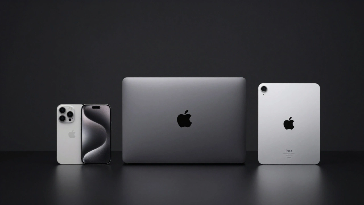
You can’t talk about Apple’s design without mentioning hardware. The company designs its own chips, screens, and sensors. This vertical integration allows tight coordination between physical form and digital function. For example, the haptic feedback on the trackpad of a MacBook Pro isn’t just vibration. It’s synchronized with visual animations. When you click, you feel a crisp snap, and the cursor moves instantly. This synchronization tricks your brain into believing the glass surface is physically moving.
This unity extends to materials. Aluminum, glass, and titanium aren’t just aesthetic choices. They affect thermal performance and durability. The unibody construction of older MacBooks allowed for precise internal component placement, which reduced fan noise. Quieter fans meant you could focus better. The material choice influenced the user experience directly.
Compare this to Android manufacturers who often use off-the-shelf components. They might have similar specs on paper-same processor speed, same camera megapixels-but the experience differs. Apple tunes every element together. The display refresh rate matches the animation frame rate. The touch sampling rate matches the input latency. This holistic tuning creates a sense of fluidity that competitors struggle to replicate consistently.

Accessibility as a Design Constraint
Many designers treat accessibility as an afterthought. Add alt text later. Fix contrast ratios before launch. Apple treats it as a primary driver of innovation. Features like VoiceOver didn’t just help blind users; they changed how everyone interacts with devices. When you ask Siri to send a message, you’re using voice control, a technology refined for accessibility needs.
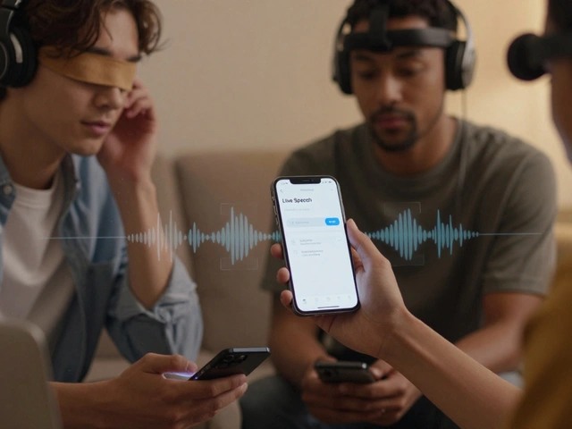
Live Captions on AirPods Pro transcribe conversations in real-time. This helps deaf users, but also helps anyone in a loud bar or trying to hear a quiet podcast. AssistiveTouch lets you control your iPhone with head movements or external switches. These features expand the market. They prove that good design for edge cases improves the core experience.
Apple’s Human Interface Guidelines explicitly state that clarity, deference, and depth are key principles. Clarity means text is readable at all sizes. Deference means content takes center stage, not chrome (buttons, bars). Depth means layers provide context. Accessibility forces designers to stick to these rules. If a low-vision user can’t read the text, the design fails. So, Apple pushes for larger fonts, high-contrast modes, and clear iconography. Everyone benefits from this rigor.
The Cost of Restraint: What Gets Left Out
Balance isn’t free. Choosing restraint means sacrificing flexibility. Some power users hate the lack of customization on iOS. You can’t install custom keyboards easily. You can’t change system fonts globally. You can’t sideload apps without jailbreaking (or using EU-specific changes post-2024). Apple decides what’s important. Sometimes, they get it wrong.
For years, the Files app was criticized for being too basic compared to Finder on macOS. Users wanted more metadata views, better sorting, and cloud integrations. Apple slowly added these features, but the delay frustrated many. This tension between simplicity and utility is constant. Apple moves fast when the majority demands a feature. They move slow when adding complexity risks confusing the average user.
Another trade-off is discoverability. Because features are hidden, users might miss them. How many people know they can long-press the flashlight icon to adjust brightness? Or that swiping down from the top-right corner opens Control Center differently than swiping from the bottom? Apple relies on tutorials, ads, and word-of-mouth to teach these gestures. If a feature requires a manual to understand, it breaks the "effortless" promise. So, they prioritize intuitive interactions over powerful but obscure ones.

How to Apply This Balance in Your Own Work
You don’t need to be Apple to use these principles. Whether you’re building a website, designing a dashboard, or writing a report, you can apply visual restraint. Start by asking: Does this element help the user right now? If no, remove it. Then, group related actions. Don’t put five buttons next to each other if one is the primary action. Make the primary action distinct.
Use whitespace aggressively. Whitespace isn’t empty space; it’s active space. It separates ideas. It gives the eye a rest. In a dense data table, increase row height slightly. It makes scanning easier. Use consistent typography. Pick two fonts max. One for headings, one for body text. Stick to a limited color palette. Use color to indicate status, not decoration. Red for errors, green for success, blue for links. Don’t use purple just because it looks nice.
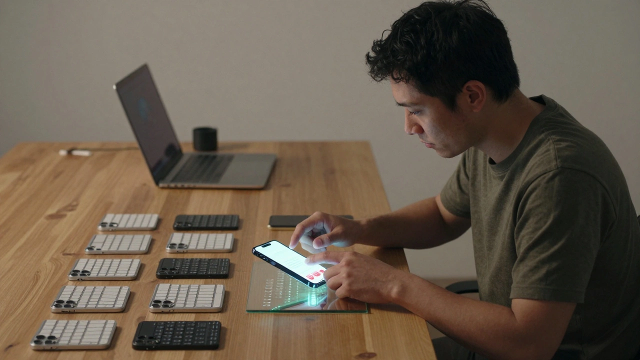
Finally, test with real humans. Not just colleagues. Watch someone use your product without helping them. Where do they hesitate? Where do they click the wrong thing? Those friction points reveal where your balance is off. Too much noise? Too much hiding? Adjust accordingly. Iterate. Simplicity is hard work. It takes longer to remove elements than to add them. But the payoff is loyalty. People trust tools that feel predictable and calm.
| Feature | Apple Approach | Common Competitor Approach |
|---|---|---|
| Interface Density | Low. High whitespace. Few visible controls. | High. Many buttons and menus visible at once. |
| Customization | Limited. Curated options to prevent confusion. | Extensive. User configures everything. |
| Hardware Integration | Tight. Chip, OS, and hardware designed together. | Modular. Uses third-party components. |
| Learning Curve | Shallow initially, steep for advanced tasks. | Steeper initially due to complexity, flexible later. |
| Updates | Unified rollout. All supported devices get same UI. | Fragmented. Depends on carrier and manufacturer. |
Frequently Asked Questions
Why does Apple remove features instead of adding them?
Apple removes features to maintain simplicity and reduce cognitive load. Each added feature increases complexity for all users, even if only 5% use it. By removing rarely used or redundant features, they keep the interface clean for the majority. This aligns with their belief that less is more when it comes to daily usability.
Is Apple's design philosophy subjective?
While taste is subjective, Apple's approach is backed by usability research. Studies show that excessive choices lead to decision fatigue. By limiting options, Apple speeds up task completion times for common actions. However, power users may find this restrictive. The philosophy prioritizes the median user's experience over niche preferences.
How does visual restraint impact battery life?
Indirectly, yes. Simpler interfaces often require less rendering power. Fewer animations and simpler layouts can reduce GPU usage. Additionally, Apple optimizes animations to run efficiently on their hardware. While not a direct battery-saving feature, efficient software design contributes to overall energy efficiency, allowing for longer battery life on smaller batteries.
Can small businesses copy Apple's design style?
Yes, but carefully. Copying the look is easy; copying the discipline is hard. Small teams must resist the urge to add every requested feature. Focus on core tasks. Invest in clean typography and consistent spacing. Avoid decorative elements that don't serve a function. Remember, Apple has resources to refine every pixel. Smaller teams should prioritize consistency over novelty.
Does Apple's minimalism hurt productivity?
For beginners, no. For experts, sometimes. Tasks requiring frequent switching between complex windows (like video editing) can feel slower on macOS compared to highly customizable Linux environments. However, Apple compensates with shortcuts and gestures. Once learned, these methods are faster than clicking through menus. The initial learning curve pays off in speed for regular users.