
Most people think Apple's success comes from a few genius designers in a room dreaming up the next "big thing." In reality, that intuition is backed by a rigorous, almost obsessive approach to measurement. They don't just hope a product feels premium; they quantify that feeling. When you notice how an iPhone holds its value years after launch or how the Apple Watch feels intuitive from the second you strap it on, you're seeing the result of design metrics is a framework of quantitative and qualitative measurements used to evaluate product quality, user adoption, and overall customer satisfaction in action.
Apple avoids the trap of relying on a single "magic number." Instead, they balance hard data-like repair rates and retention percentages-with deep human evaluation. This ensures that a feature isn't just "used" (which could be a vanity metric) but is actually providing value to the person holding the device.
The Hard Numbers: Loyalty and Retention
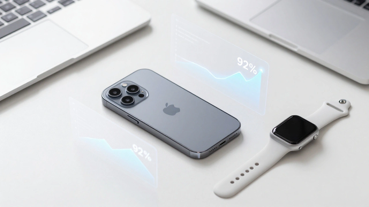
For Apple, the ultimate proof of design quality isn't a survey; it's whether a customer buys another Apple product. This is why Customer Retention is one of their most critical KPIs. When iPhone retention rates hover around 92%, it tells the design team that the ecosystem-from the hardware feel to the software flow-is working. If people are staying, the design is solving their problems.
They also track the Net Promoter Score (NPS), which is essentially a measure of how likely a user is to recommend their products to others. With an estimated NPS of 61 in 2025, Apple sits in a league of its own. But they don't stop at the general score. They look at the nuances. For instance, data shows that iPhone loyalty in the US hits 92% when users stay with the same carrier, but drops to 79% when they switch. This tells Apple that the "experience" isn't just their device, but how their device interacts with the external service provider.
| Metric | Estimated Value | What it Indicates |
|---|---|---|
| iPhone Retention Rate | ~92% | Extreme product-market fit and ecosystem lock-in. |
| Net Promoter Score (NPS) | 61 | High brand advocacy and overall user happiness. |
| Mac User Satisfaction | 90%+ | High reliability and performance in the professional segment. |
| General Customer Satisfaction | 81% | Comparative lead over other smartphone manufacturers. |
Quality Through the Lens of Reliability
Apple views reliability as a design feature. You can have the most beautiful interface in the world, but if the screen flickers or the battery dies in four hours, the design has failed. To measure this, they focus on service rates. In Apple's world, the strongest indicator of quality is how *infrequently* a product needs to be repaired.
By tracking out-of-warranty repair rates, Apple can see if a specific material or component is failing across the user base. Between 2015 and 2022, these rates declined measurably. This isn't just about saving money on warranties; it's about perceived quality. This reliability is exactly why iPhones retain about 40% more value on the secondary market than their competitors. The market "trusts" the build quality because the data supports it.

Human Evaluation vs. Technical Benchmarks
One area where Apple differs from many tech giants is their distrust of isolated quantitative metrics. You'll often see companies brag about a model having a "higher benchmark score" in a lab. Apple treats those as secondary. Instead, they lean heavily into human evaluation.
This is particularly evident in Apple Intelligence. When fine-tuning their foundation models for text writing or task prioritization, Apple doesn't just look at perplexity or loss curves. They measure success based on real-world interaction patterns. If a user refines a piece of text three times, the model failed, regardless of what the technical benchmark says. They prioritize the "aha moment"-the point where the user realizes the tool actually understands their intent.
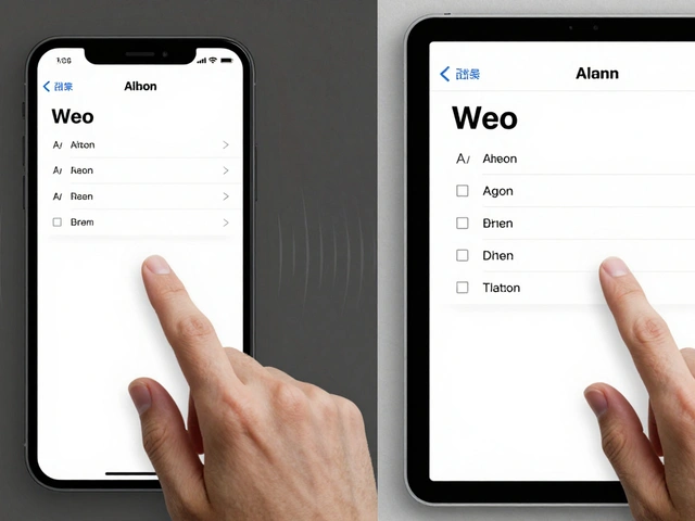
Measuring Design System Adoption
Internally, Apple manages massive design systems to keep the look and feel consistent across iOS, macOS, and watchOS. But how do they know if their internal design systems are actually helping? They avoid "vanity metrics." Simply counting how many times a component is used in a file is useless-that just means the designer was told to use it.
Instead, they look at deeper signals:
- Detached Instances: When a designer "detaches" a component from the main library to change it manually, it's a red flag. It means the system is too rigid and doesn't meet the actual need.
- Time-to-First Key Action: How quickly can a user reach the core value of a feature? If this time increases after a design system update, the update failed.
- Component Adoption Rate: Tracking the creation of new, non-standard components. A spike here suggests the current library is missing something critical.
They treat adoption as a lagging indicator. By the time you see high adoption, the design is already in the wild. To be proactive, they focus on quality metrics at the component level, such as accessibility scores and performance tracking, ensuring that a component is "worth" adopting before it's even pushed to the team.
The Role of Qualitative Sentiment
Quantitative data tells you *what* is happening, but qualitative data tells you *why*. Apple integrates CSAT (Customer Satisfaction Score) and Transactional Management Scores (TMS) into their support ecosystem. The Genius Bar isn't just a repair center; it's a massive qualitative data collection point.
When a user walks into a store, the interaction is a goldmine of sentiment. Apple tracks how the support experience influences overall loyalty. Interestingly, they've found that high-quality support can cushion the blow of a disappointing product launch. If the user feels "cared for" by the brand, their loyalty remains intact even if the new iPhone is only a marginal upgrade.
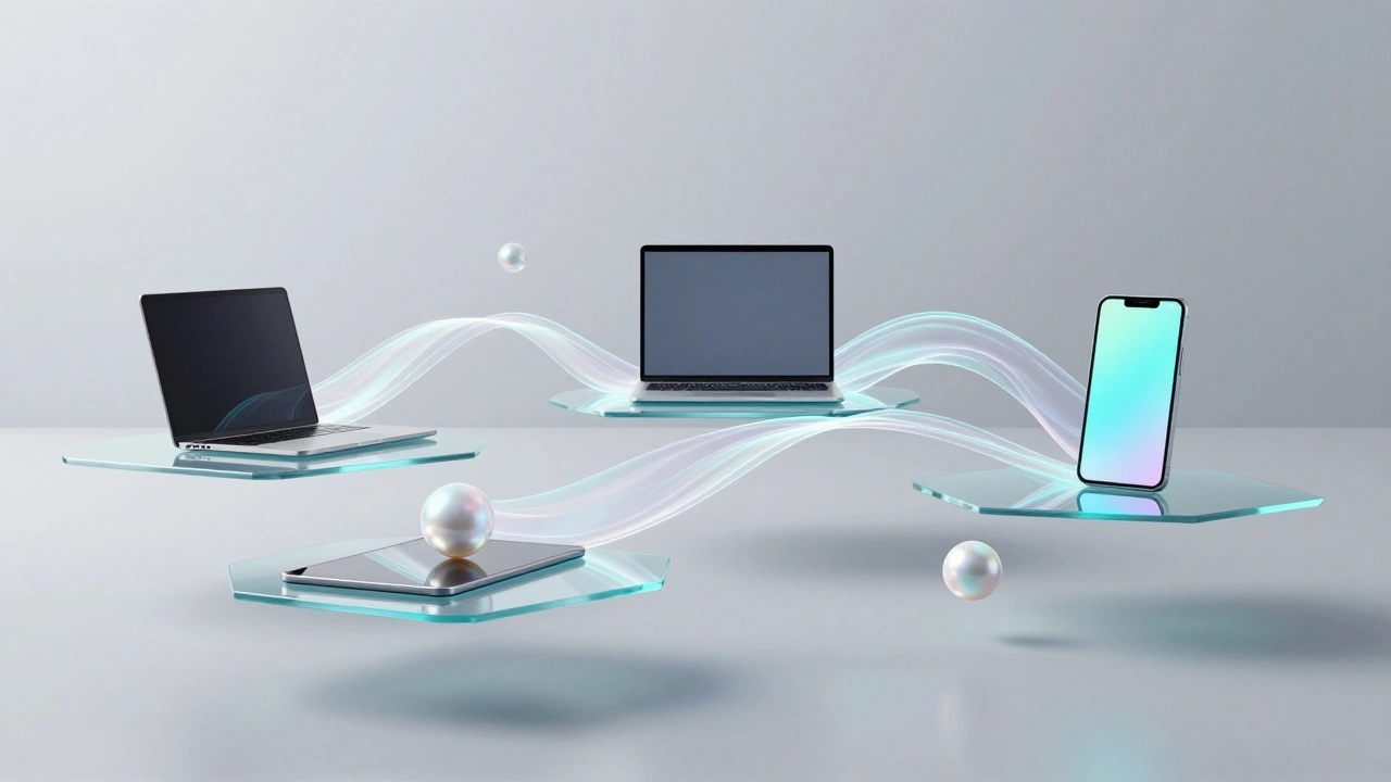
Connecting the Dots: The Ecosystem Effect
The final piece of the puzzle is the integration metric. Apple doesn't just measure the iPhone or the Mac in isolation; they measure the "seams" between them. Features like iCloud synchronization and Continuity are tracked based on how they reduce friction.
The goal here is "experience joy." When a user copies text on their iPhone and pastes it on their Mac, and the process is invisible and instant, that's a design win. Apple measures the success of these features by looking at the adoption of multi-device ownership. The more devices a person owns, the higher the switching cost becomes, not because of a contract, but because the design of the ecosystem is too convenient to leave.
What is a vanity metric in design?
A vanity metric is a data point that looks impressive on paper but doesn't actually correlate to business success or user value. For example, having 10,000 people download a feature is a vanity metric if only 100 of them actually use it to solve a problem. Apple avoids this by focusing on retention and "time-to-value" rather than just raw adoption numbers.
How does Apple use NPS differently than other companies?
While many companies use NPS as a marketing tool, Apple uses it to identify friction points in the customer journey. They correlate NPS with specific touchpoints-like the purchase process or a Genius Bar visit-to see exactly where the user experience is dipping or peaking.
Why is the repair rate considered a design metric?
Design isn't just about how things look; it's about how they function over time. High repair rates indicate a failure in industrial design or material selection. By reducing the frequency of repairs, Apple proves that the physical design is durable and reliable, which directly impacts long-term customer satisfaction.
How does human evaluation improve AI models?
Technical benchmarks can be "gamed" by models that learn to pass tests without actually being useful. Human evaluation involves real people grading the output based on helpfulness and naturalness. For Apple Intelligence, this ensures the AI feels like a tool that fits into a human's workflow rather than a chatbot that just produces grammatically correct text.
What are "detached instances" in a design system?
In tools like Figma, a detached instance is when a designer breaks the link between a component and its master library to make custom changes. If designers are constantly detaching components, it's a signal to the design system team that the existing components are too restrictive or don't cover the necessary use cases.
Categories
Popular Articles