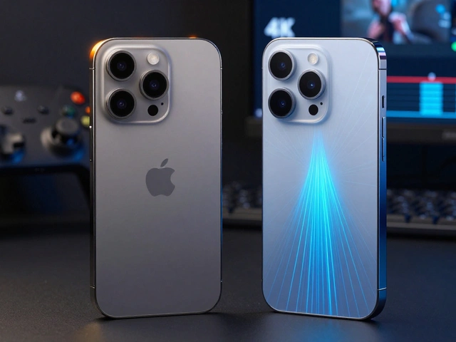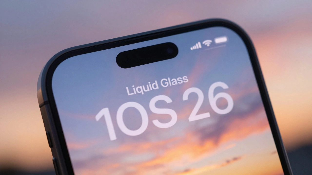

When Apple unveiled Liquid Glass in June 2025, it wasn’t just a new look-it was a full rewrite of how digital interfaces should feel. For the first time, the same design language stretched across iPhone, iPad, Mac, Apple Watch, and Apple TV. It wasn’t flat. It wasn’t glossy. It was translucent, alive, and constantly shifting. But here’s the problem: you can’t read it.
Look at your iPhone’s tab bar. The active tab used to stand out-solid, clear, unmistakable. Now? It blends. It fades. Sometimes, it disappears entirely. That’s not a bug. It’s the point. Liquid Glass is built to dissolve boundaries. It lets your wallpaper, your photo, your video background bleed through. It’s meant to feel like the interface is floating, not sitting on top. But when text sits on top of that, things break.
How Liquid Glass Works (And Why It Breaks Text)
Liquid Glass isn’t just a filter. It’s a physics engine. Every translucent surface reacts to light, motion, and background content in real time. It calculates specular highlights-those tiny flashes of shine-as you swipe. It adjusts opacity based on whether you’re in a bright room or a dark one. It even changes color slightly depending on what’s behind it. That’s impressive tech. But typography doesn’t care about tech. It cares about contrast.
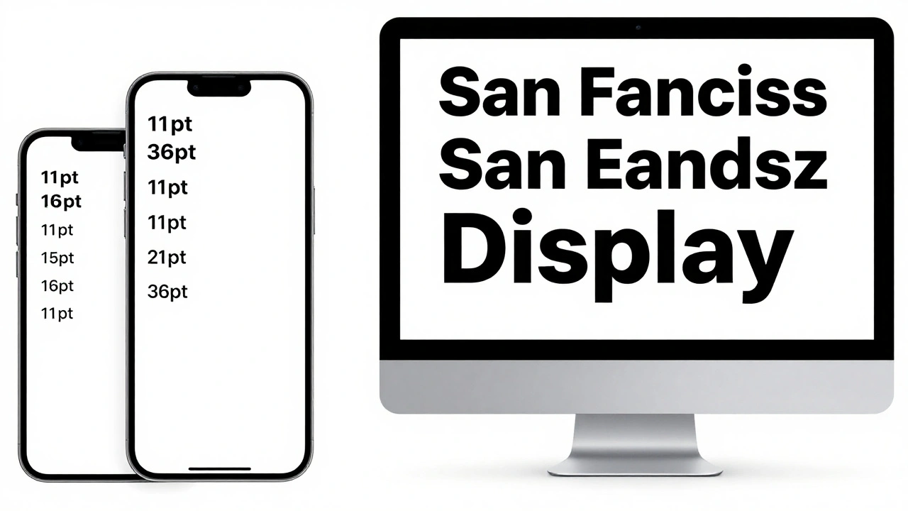
WCAG 2.1 says normal text needs at least a 4.5:1 contrast ratio against its background. That’s not a suggestion. It’s a baseline for accessibility. For people with low vision, color blindness, or just tired eyes, that gap makes the difference between reading and squinting. Apple’s own San Francisco font, designed to scale dynamically across devices, now fights against a background that’s never the same twice. A white label on a blurred photo of a sunset? Might be 2.1:1. On a dark forest? Maybe 5.8:1. You never know. And that’s the problem.
The Real Culprits: Blur, Opacity, and Adaptive Color
There are three things killing text in Liquid Glass: blur, low opacity, and adaptive color.
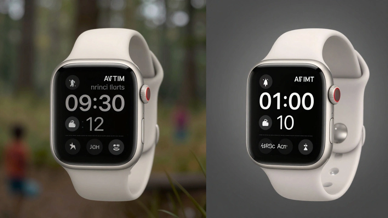
- Blur scatters light. It softens edges. It turns sharp letters into smudges. On a 6.1-inch screen, that’s annoying. On a 2.0-inch Apple Watch, it’s unreadable.
- Low opacity makes text feel like it’s underwater. The background isn’t hidden-it’s whispered. And whispers are hard to hear.
- Adaptive color is the sneakiest. The system looks at your wallpaper and says, "I’ll make this button a little darker," or "Let’s lighten this text." But it doesn’t check if that still works with the font weight. It doesn’t measure contrast. It just guesses.
Designers call this "a readability minefield." One user might see perfect text. The next, after changing their wallpaper, sees ghost letters. No one expects that. No one should have to.
What Apple Did Wrong (And What They’re Fixing)
Apple didn’t ignore accessibility. They assumed it would solve itself. They thought: "If the interface feels alive, users will forgive a little blur." But people don’t forgive blurry text. They stop using it.
Early versions of iOS 26 had tab bars so transparent, the active item looked like a shadow. Menu buttons vanished against bright backgrounds. Headings in Settings became unreadable on photos. The backlash was swift. Designers, developers, and accessibility advocates didn’t just complain-they showed proof. The Nielsen Norman Group called it "invisible UI." Typographers said it "broke their heart."
Apple listened. Sort of.
According to internal documentation, Apple has been "dialing back glassiness, then bumping it up again." They’re not sure what the right balance is. That’s not confidence. That’s indecision. But they’re trying. New builds show slightly higher opacity on text containers. Some backgrounds now have subtle solid underlays. Font weights are being nudged from Regular to Medium for smaller text. Letter spacing is being increased. These aren’t flashy changes. But they’re the right ones.
Solutions That Actually Work
You don’t need to scrap Liquid Glass. You just need to protect the text.
Here’s what works:
- Add a subtle gradient behind text-not a solid block, but a soft fade from 10% to 20% opacity. It lifts the text without killing the glass effect.
- Use text shadows that match the background’s tone. A light gray shadow on a bright background? It creates depth. A dark shadow on a dark background? It keeps the text from vanishing.
- Boost font weight for small text. Regular is dead. Use Medium for body text. Bold for headings. No exceptions.
- Lock opacity on critical elements. Tab bars, navigation buttons, alerts-these shouldn’t adapt. They need to be readable 100% of the time.
- Test with real backgrounds-not just white or black. Test on photos, gradients, moving videos. If text disappears when the background changes, it’s broken.
These aren’t hacks. They’re refinements. They keep Liquid Glass’s soul-its fluidity, its depth-but give text its spine.
Why This Matters Beyond Apple
Apple doesn’t just set trends. It defines them. When Liquid Glass launched, Android designers started experimenting with similar effects. Google’s Material 3 Expressive went bold and playful. Apple went translucent and delicate. One is loud. The other is quiet. But both are now facing the same question: Can beauty and clarity coexist?
The answer isn’t yes or no. It’s "it depends." Liquid Glass works beautifully in Vision Pro, where UI needs to feel like part of the real world. But on a phone? On a watch? On a tablet? Text needs to be a beacon-not a ghost.
Designers are starting to realize that material effects shouldn’t override function. A shiny interface doesn’t make a better app. A readable interface does.
The Future of Typography in Translucent UIs
Apple will keep tweaking. They always do. But the lesson here isn’t about Apple. It’s about design itself.
Translucency isn’t evil. Blur isn’t evil. But when you let them control your text, you’re letting aesthetics decide usability. And that’s a dangerous trade.
The next generation of design won’t be about how shiny it looks. It’ll be about how clearly it works. Liquid Glass taught us that. Even if Apple didn’t mean to.
Why does text disappear in Liquid Glass interfaces?
Text disappears because Liquid Glass uses dynamic transparency, blur, and adaptive color. The background changes based on wallpaper or lighting, and the text’s contrast ratio drops below the 4.5:1 minimum required for accessibility. This makes text blend into busy or bright backgrounds, especially on smaller screens like Apple Watch.
Is Liquid Glass bad for accessibility?
Yes, in its initial form. By design, Liquid Glass reduces opacity and adds blur to create a "lively" look, but this directly violates WCAG 2.1 contrast standards. Users with low vision, color blindness, or in bright environments struggle to read text. Apple has since started adding subtle underlays and increasing font weights to improve this.
Can I fix Liquid Glass text readability on my iPhone?
You can’t change system-wide settings, but you can help by choosing simpler wallpapers-solid colors or low-contrast images. Avoid busy photos behind app icons or tab bars. Apple’s future updates will likely include system-level fixes, like increased text opacity and consistent background tones for navigation elements.
Why did Apple use Liquid Glass across all devices?
Apple wanted a unified design language that felt cohesive from iPhone to Mac. Liquid Glass was inspired by visionOS, where UI elements need to blend into real-world AR environments. But applying the same translucent rules to flat screens ignored key differences in screen size, viewing distance, and lighting conditions-leading to readability issues.
How does Liquid Glass compare to Android’s Material Design?
Android’s Material 3 Expressive uses bold colors, strong shadows, and solid surfaces to ensure text stays readable. Apple’s Liquid Glass prioritizes subtlety-translucency, light reflections, and ambient blending. Android leans into clarity. Apple leans into atmosphere. One is easier to read. The other is harder to ignore.