Tag: iOS 26 UI
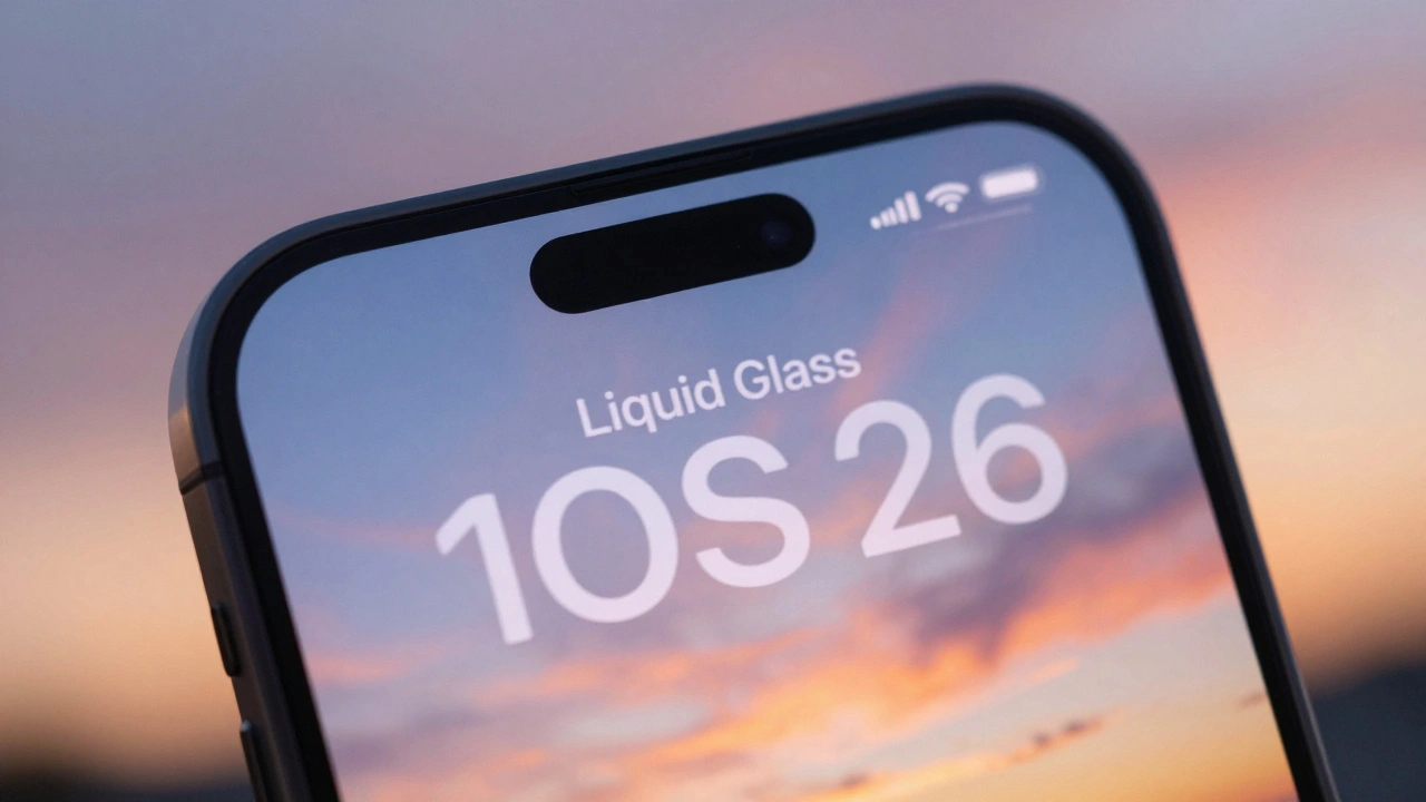
Typography and Liquid Glass: Contrast and Blur Considerations for Text in iOS 26

26/12
0
Apple's Liquid Glass design in iOS 26 creates stunning visuals but undermines text readability. Learn why contrast and blur break accessibility-and how to fix it.
Categories
Popular Articles