
Static icons are boring. We’ve all seen them, clicked past them, and ignored them. But when an icon draws itself onto the screen or pulses with activity to match your app’s state, it feels alive. That is exactly what Apple changed with the release of SF Symbols 7, which introduced a new way to handle motion directly within the system’s vector library. You no longer need heavy third-party libraries or complex Lottie files to make your interface feel polished. The platform handles the rendering, meaning your animations stay crisp, accessible, and performant right out of the box.
If you are building for iOS 18 or newer macOS versions, understanding these new tools isn't just about making things look cool. It is about using the native language of the operating system. When you use system-provided animations, your app feels like it belongs there. This guide breaks down how to use the two biggest innovations from this update: the organic stroke-based Draw effect and the data-driven Variable Rendering modes.
The Shift to Declarative Symbol Animation
Before we get into the code, let's look at why this matters. In earlier versions of SwiftUI, animating an icon usually meant swapping images or applying generic view modifiers like `scaleEffect` or `opacity`. Those work, but they treat the icon as a black box-a flat image that moves around.
With the evolution of SF Symbols, particularly since the introduction of variable templates in version 3, Apple has been preparing the ground for smarter animation. Now, in version 7, the symbols themselves contain metadata about their structure. They know where their strokes start and end. They know which layers belong together. This allows SwiftUI to apply specific animations to parts of an icon without you having to manually break the graphic apart.
This approach keeps your code clean. Instead of managing complex animation timelines, you attach a modifier to your Image view and tell the system *how* you want it to behave. The system does the rest.
Understanding the Draw Effect
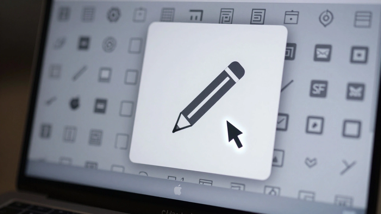
The headline feature of SF Symbols 7 is the Draw capability. Think of this as a "handwritten" style animation. Instead of an icon simply fading in, it traces its own outline, appearing as if someone is sketching it on the screen in real-time.
This works because designers (and Apple) have added special annotations called draw attachments to the symbol paths. These attachments define the direction and flow of the stroke. When you trigger the effect, the renderer follows these paths sequentially.
| Option | Behavior | Best Use Case |
|---|---|---|
.drawOn |
Animates the symbol drawing itself from start to finish. | Onboarding screens, highlighting new features, or playful UI elements. |
.drawOff |
Erases the symbol by retracing the strokes in reverse. | Clearing states, undo actions, or cleaning up the interface. |
| Motion Groups | Controls whether the whole symbol draws at once or layer by layer. | Complex icons with multiple distinct parts (like a battery and lightning bolt). |
To implement this, you use the .symbolEffect() modifier. Here is how simple it looks in practice:
Image(systemName: "pencil")
    .symbolEffect(.drawOn)
    .onTapGesture {
        // Trigger logic here
    }
The magic happens in the configuration. By default, the system might draw the entire symbol at once. However, if the symbol has defined motion groups, you can configure the effect to animate each group individually. This creates a staggered, more dynamic reveal. For example, a symbol representing a document with a checkmark could draw the paper first, then the checkmark, guiding the user’s eye through the information hierarchy.
One practical tip: Don't overuse this. A handwritten draw effect is engaging for a moment, but if every icon in your navigation bar sketches itself every time you tap, it becomes distracting. Reserve .drawOn for moments that deserve attention-like completing a task or introducing a key concept.
Variable Rendering: Data-Driven Icons
While Draw is about artistic flair, Variable Rendering is about utility. This feature turns static icons into dynamic indicators. You bind a numeric value (usually between 0.0 and 1.0) to the symbol, and the icon changes based on that number.
There are two distinct modes for this, and you must choose one at runtime. You cannot mix them on the same symbol instance.
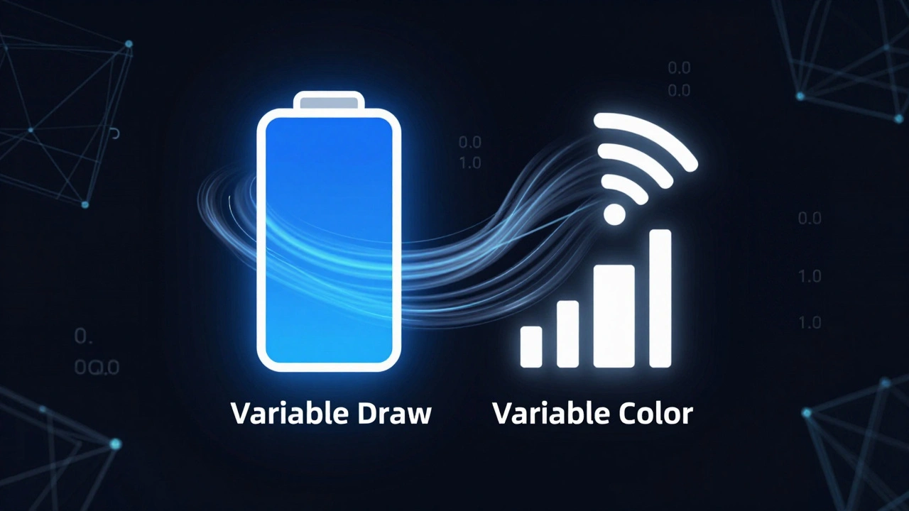
Mode 1: Variable Draw (Progress)
In Variable Draw mode, the geometry of the symbol changes. As your value increases, more of the symbol’s path is revealed. This is perfect for progress bars, loading states, or gauges.
Imagine a battery icon. At 0.0, it is empty. At 0.5, half the internal shape is drawn. At 1.0, it is full. The transition is smooth and continuous because the system interpolates the stroke length based on the underlying vector data.
To set this up, you pass a binding to the variableValue parameter of the Image initializer and specify the mode:
Image(systemName: "battery.100", variableValue: chargingPercentage)
    .symbolVariableMode(.draw)
Here, chargingPercentage is a Double property in your ViewModel. As that number updates, the icon fills up automatically. No custom shapes needed.
Mode 2: Variable Color (Opacity Steps)
In Variable Color mode, the geometry stays the same, but the opacity of different layers changes. Each layer in the symbol has a threshold. When your value crosses that threshold, the layer snaps to fully visible or fully hidden.
This creates a stepped effect. It is ideal for signal strength bars, volume levels, or discrete milestones. Unlike the smooth fill of Variable Draw, this feels digital and precise.
You activate it similarly:
Image(systemName: "wifi", variableValue: signalStrength)
    .symbolVariableMode(.color)
If your signal strength goes from 0.2 to 0.4, the first bar lights up. Jump to 0.6, and the second bar joins in. It gives immediate visual feedback without the ambiguity of partial fills.
Combining Effects with Content Transitions
Animations don't exist in a vacuum. Often, you need to swap one icon for another-for example, switching from a "bell" to a "bell.slash" when notifications are toggled off. A simple crossfade works, but it lacks polish.
SwiftUI offers .contentTransition(.symbolEffect(.replace)). This tells the system to analyze both icons and find the most logical morphing path between them. If the icons share similar structures, the system will slide, fade, or rotate the common elements while transitioning the unique ones. It looks seamless because the system understands the semantic relationship between the symbols.
You can pair this with hierarchical rendering. Adding .symbolRenderingMode(.hierarchical) ensures that foreground and background elements of the icon maintain their relative opacity and color depth during the transition, preserving the intended design hierarchy.
Designing for Animation in the SF Symbols App
If you are creating custom symbols rather than using Apple’s built-in library, you need to prepare them correctly. The SF Symbols app on macOS is not just a browser; it is a design tool.
To support Variable Rendering, you must use the variable template workflow. This involves providing drawings for three specific weights at the Small scale: Ultralight, Regular, and Black. The system uses these anchors to interpolate the intermediate steps. If you skip this, your custom symbol won't respond to variable values.
For Draw effects, you need to add draw attachments. In the SF Symbols app, you can select layers and define their stroke order and direction. You can also group layers into motion groups. If you want the handle of a pencil to draw before the lead, you put them in separate groups and order them accordingly. Without these annotations, the system treats your custom icon as a static blob, ignoring any animation modifiers you apply in code.

Performance and Best Practices
Because these animations are rendered by the system compositor, they are generally very efficient. They run on the GPU and do not block the main thread. However, complexity adds up.
Avoid chaining too many complex symbol effects in a single list view. If you have a table with fifty rows, and every row has a pulsing, drawing, variable-color icon, you will see frame drops. Stick to simpler effects like .pulse or .bounce for list items, and reserve the heavy hitters like .drawOn for focused views or headers.
Also, consider accessibility. Motion can be disorienting for some users. Always respect the reduceMotion setting. SwiftUI’s symbol effects automatically adapt to this preference, replacing complex transitions with simple fades or static states. You don’t need to write extra code for this; the system handles it, but you should test your app with Reduce Motion enabled to ensure the core functionality remains clear.
Summary of Key Techniques
- Use Draw for engagement: Apply
.drawOnto make icons appear organically. Great for onboarding or emphasizing a single action. - Use Variable Draw for progress: Bind a 0.0-1.0 value to show continuous growth, like a loading bar or battery charge.
- Use Variable Color for steps: Use this for discrete states like Wi-Fi bars or volume levels where step-wise visibility makes sense.
- Leverage content transitions: Use
.symbolEffect(.replace)for smooth swaps between related icons. - Annotate custom symbols: Ensure your custom assets in the SF Symbols app have proper draw attachments and variable templates to unlock these features.
Can I use both Variable Draw and Variable Color on the same symbol?
No, you cannot. At runtime, you must choose one mode via the .symbolVariableMode modifier. The symbol’s metadata supports both, but the rendering engine only processes one type of variable interpretation at a time. Choose Draw for continuous geometric changes and Color for discrete opacity steps.
Do I need iOS 18 to use SF Symbols 7 features?
Yes. The Draw effect and the enhanced variable rendering capabilities were introduced with SF Symbols 7, which requires iOS 18, iPadOS 18, macOS Sequoia, or later. Older versions of the OS will ignore these modifiers or fall back to static rendering.
How do I make a custom symbol support the Draw effect?
You must edit the symbol in the SF Symbols app on macOS. Add draw attachments to define the stroke path and direction. You can also organize layers into motion groups to control the sequence of the animation. Without these annotations, the system treats the symbol as a static shape.
What is the difference between symbol effects and standard SwiftUI animations?
Standard SwiftUI animations (like .animation) affect view properties such as position, size, or opacity. Symbol effects are specific to SF Symbols and manipulate the internal vector structure of the icon, such as drawing strokes or changing layer opacity based on thresholds. They are more granular and context-aware.
Are symbol animations accessible for users who prefer reduced motion?
Yes. SwiftUI automatically respects the user’s Reduce Motion setting. Complex animations like Draw or wiggle will be replaced with simpler fades or static displays. You do not need to implement this logic manually; the framework handles it to ensure a comfortable experience for all users.