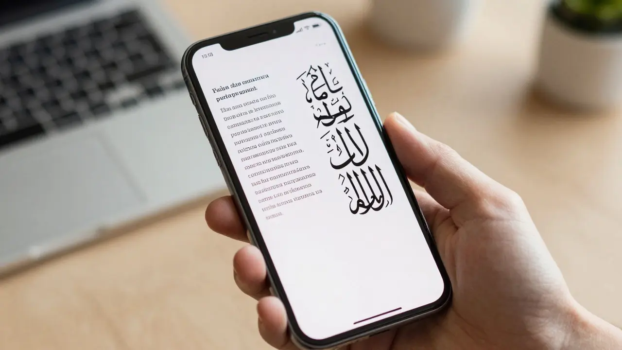

Imagine designing a marketing campaign for a global audience. You pick a sleek sans-serif font that looks perfect in English. But when you switch to Arabic or Hebrew, the text mirrors itself, breaks apart, or loses its soul. This is where international typography becomes critical. On Apple platforms, handling scripts, diacritics, and right-to-left (RTL) layouts isn't just a technical checkbox; it’s the difference between a professional product and one that feels broken to half your users.
Apple has long been a leader in typographic fidelity, but mastering it requires understanding how the system handles complex text rendering. Whether you’re building an iOS app, a macOS interface, or a website viewed on Safari, the underlying mechanisms remain consistent. Let’s break down how to get this right without guessing.
The Foundation: Unicode and System Fonts
Before touching any design tool, you need to understand what your canvas is made of. At the core of all Apple text rendering is Unicode, which is a universal character encoding standard that assigns unique numbers to characters across all writing systems. Without Unicode, combining a French accent with a German umlaut would be a nightmare of code page conversions. With it, every letter, symbol, and script has a stable identity.
Apple’s default typefaces are designed to handle this breadth. The system font stack includes:
- SF Pro: The primary interface font for iOS and macOS, optimized for clarity at small sizes and supporting extensive language coverage.
- New York: A serif option introduced in iOS 10, offering a more traditional feel while maintaining full international support.
- Avenir Next: A geometric sans-serif often used for display text, known for its clean lines and broad glyph set.
These aren’t just pretty faces. They include OpenType features that allow for proper ligatures, alternates, and contextual forms. For example, if you use SF Pro, you can enable specific stylistic sets to adjust how certain letters look in different contexts, ensuring consistency across languages.
Taming Diacritics: Accents, Marks, and Combining Characters
Diacritics are the little marks above, below, or through letters-like the acute accent in café or the tilde in señor. In many languages, these aren’t optional decorations; they change meaning entirely. Confusing brun (brown) with bûn (good) in Swedish could ruin a user’s trust in your app.
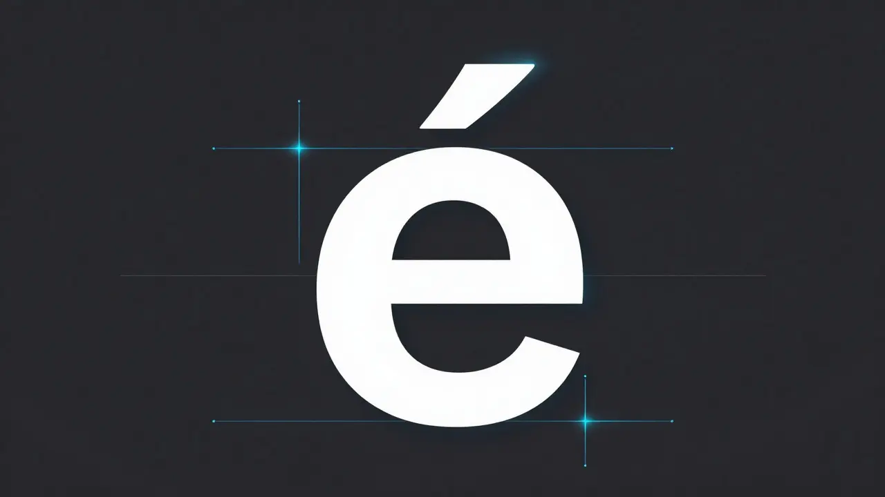
On Apple devices, diacritics are handled via combining characters in Unicode. This means the base letter and the mark are separate data points that the renderer combines visually. The challenge? Positioning. If the mark sits too high, it collides with the line above. Too low, and it clashes with the descender below.
Here’s how to ensure they render correctly:
- Check Vertical Metrics: Ensure your font has adequate ascent and descent values. Apple’s system fonts are tuned for this, but custom web fonts might not be. Use tools like FontForge or Glyphs to inspect vertical metrics if you’re using third-party typefaces.
- Test with Extreme Cases: Don’t just test “é.” Test “ẅ” (w with diaeresis and acute), “ǝ” (schwa), and “ɨ” (I with hook). These stress-test the positioning algorithms.
- Use CSS `line-height` Wisely: In web contexts, a `line-height` of 1.5 or higher gives diacritics room to breathe. Tighter values can clip marks, especially in dense paragraphs.
A common pitfall is assuming that because a font *supports* a character, it will *render* it well. Support means the glyph exists. Rendering well means it looks balanced and readable. Always preview in context, not just in isolation.
Right-to-Left (RTL) Layouts: More Than Just Mirroring
When dealing with Arabic, Hebrew, Persian, or Urdu, the text flows from right to left. Many designers make the mistake of simply mirroring their LTR (left-to-right) layout. It looks fine in a static mockup, but it breaks in interactive environments.
RTL isn’t just about flipping text direction. It affects:
- Alignment: Body text should align to the right margin, not the left.
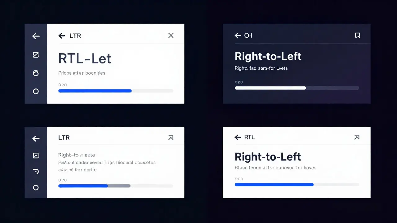
- Icons and Arrows: Forward/backward icons must flip. A “next” arrow pointing right in LTR should point left in RTL.
- Spacing: Paragraph indentation and list markers shift to the right side.
- Logical Properties: In CSS, use logical properties like `margin-inline-start` instead of `margin-left`. This lets the browser automatically adjust spacing based on text direction.
Apple’s Human Interface Guidelines (HIG) provide clear rules for RTL. For instance, navigation bars keep the back button on the leading edge (right in RTL), while action buttons stay on the trailing edge (left in RTL). Getting this wrong confuses users who rely on muscle memory.
In native iOS development, UIKit and SwiftUI handle much of this automatically. When you set a view’s alignment to `.leading`, it respects the current layout direction. But in web development, you need to be more deliberate. Use the `` attribute to signal direction to the browser, then leverage CSS logical properties to avoid hard-coded left/right values.
Mixed Directionality: Handling Bidi Text
Real-world content rarely sticks to one direction. You’ll encounter English terms inside Arabic sentences, or mathematical expressions embedded in Hebrew text. This is called bidirectional (bidi) text, and it’s governed by the Unicode Bidirectional Algorithm (UBA).
The UBA determines the visual order of characters based on their inherent directionality and embedding levels. For example, in an RTL paragraph, an English word appears in LTR order, but its position within the sentence follows RTL flow. Numbers are always treated as weakly directional, so “2024” stays “2024” even in RTL text.
Common issues with bidi text include:
- Isolated Punctuation: Commas or periods may appear on the wrong side of a word if not properly isolated.
- Embedded Quotes: Opening and closing quotes must flip in RTL contexts. Using straight quotes (“ ”) instead of curly ones (“ ”) avoids this problem, though curly quotes are preferred for aesthetic reasons.
- Mathematical Expressions: Formulas like “E = mc²” should remain LTR even in RTL text. Wrap them in `` to force correct rendering.
To test bidi text, create sample strings with mixed languages and symbols. For example: “The value of π is 3.14 in الرياضيات.” Notice how “π” and “3.14” stay LTR, while the surrounding Arabic flows RTL. If the math flips, you’ve got a bidi issue.
Practical Workflow: From Design to Deployment
Knowing the theory is one thing; applying it in your workflow is another. Here’s a practical approach to ensure international typography works seamlessly on Apple platforms.
1. Start with Locale-Aware Mockups
In Figma or Sketch, create artboards for each target locale. Don’t just translate the text; adjust the layout. For RTL locales, mirror the entire composition. Check that icons, badges, and buttons align logically. Use plugins like “i18n” to auto-translate placeholder text into multiple languages for quick visual checks.
2. Validate Font Coverage
If you’re using custom fonts, verify they cover all necessary scripts. Tools like Font Squirrel’s Generator or Google Fonts’ API can show you which glyphs are included. For Apple-specific apps, stick to system fonts unless you have a strong brand reason to deviate. System fonts guarantee optimal performance and accessibility.
3. Test on Real Devices
Simulators are great, but real devices reveal subtle rendering differences. Test on both iPhone and iPad, as screen size affects line length and readability. For macOS, check how text scales with Dynamic Type. Users with larger text settings need extra space for diacritics and line breaks.
4. Automate QA Checks
Integrate automated tests into your CI/CD pipeline. Libraries like `intl-text` or `bidi-js` can validate string directionality in JavaScript. For native apps, use XCTest to assert that UI elements respect layout direction. Catching RTL bugs early saves hours of manual testing later.
Comparison: System Fonts vs. Custom Fonts for International Support
| Feature | Apple System Fonts (SF Pro, New York) | Custom Web/Native Fonts |
|---|---|---|
| Script Coverage | Extensive (Latin, Greek, Cyrillic, CJK, Arabic, Hebrew, etc.) | Variable; depends on foundry and licensing |
| Diacritic Positioning | Optimized for OS-level rendering | Requires manual tuning; risk of clipping |
| RTL Support | Built-in via HIG compliance | Must be manually configured in layout |
| Performance | Highly optimized; no network requests | Potential load time impact; caching required |
| Brand Consistency | Generic; matches OS aesthetic | Unique; reinforces brand identity |
| Accessibility | Full Dynamic Type support | May lack variable weight/size adjustments |
System fonts win on reliability and performance. Custom fonts win on brand differentiation. The best approach? Use system fonts for body text and UI elements, and reserve custom fonts for headings or display text where brand voice matters most. This hybrid strategy balances consistency with personality.
Common Pitfalls and How to Avoid Them
Even experienced developers stumble over international typography. Here are the most frequent mistakes and how to sidestep them.
- Hard-Coding Left/Right Values: In CSS, avoid `text-align: left` for RTL-friendly designs. Use `text-align: start` instead. Similarly, replace `padding-left` with `padding-inline-start`.
- Ignoring Character Width Variations: CJK characters are typically square and wider than Latin letters. Adjust your grid and line lengths accordingly. A 60-character line in English might only fit 30 CJK characters.
- Forgetting Keyboard Input: On iOS, the keyboard switches layout based on the active input source. Ensure your text fields accept multi-line input for scripts that require it, like Arabic, which benefits from taller line heights.
- Overlooking Accessibility: Screen readers like VoiceOver must pronounce diacritics correctly. Test with VoiceOver enabled to ensure your text is read naturally, not as a string of codes.
Frequently Asked Questions
What is the best font for international support on Apple devices?
SF Pro is the best choice for international support on Apple devices. It covers over 100 languages, including Latin, Greek, Cyrillic, CJK, Arabic, and Hebrew. Its vertical metrics are optimized for diacritics, and it integrates seamlessly with Dynamic Type for accessibility.
How do I handle RTL layouts in CSS for Apple Safari?
Use the `dir="rtl"` attribute on the HTML element and leverage CSS logical properties like `margin-inline-start` and `text-align: start`. Avoid hard-coded left/right values. Safari fully supports these properties, ensuring automatic layout mirroring for RTL languages.
Why do my diacritics get clipped in some fonts?
Clipping occurs when a font’s ascent/descent metrics are too tight for the diacritic marks. Increase your `line-height` to 1.5 or higher, or choose a font with generous vertical metrics. System fonts like SF Pro are pre-tuned to prevent this, but custom fonts may require manual adjustment.
Do I need to flip icons for RTL interfaces?
Yes, directional icons like arrows, chevrons, and progress indicators must flip in RTL contexts. Non-directional icons like home or search remain unchanged. Use CSS transforms (`transform: scaleX(-1)`) or asset variants to ensure visual consistency.
How does Unicode Bidirectional Algorithm (UBA) affect my text?
UBA determines the visual order of mixed-direction text. It ensures that English words within Arabic sentences remain LTR, while the overall flow stays RTL. Misconfigured UBA can cause punctuation or numbers to appear out of place. Always test with real-world mixed-language strings to catch issues early.
Can I use custom fonts for Arabic or Hebrew text?
Yes, but ensure the font includes proper shaping rules (OpenType features like `init`, `medi`, `fina`, `rlig`). Many free fonts lack these, causing disconnected letters. Stick to well-established typefaces like Noto Naskh Arabic or Heebo for reliable rendering. Test extensively on device to confirm connection quality.
What is the role of Dynamic Type in international typography?
Dynamic Type allows users to adjust text size independently of other UI elements. For international typography, it’s crucial because larger text increases the risk of diacritic clipping and line wrapping issues. Design with scalable layouts that accommodate increased line heights and spacing, ensuring readability at all sizes.