Wolf and Hare

Tag: legibility

iPad Typography Choices: SF Pro Display and Text Pairings for Legibility

iPad Typography Choices: SF Pro Display and Text Pairings for Legibility
  • Elias Voss
  • Elias Voss

24/01
0

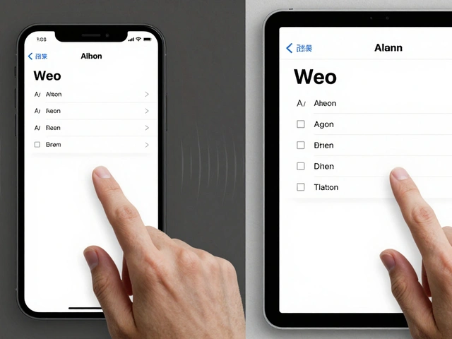
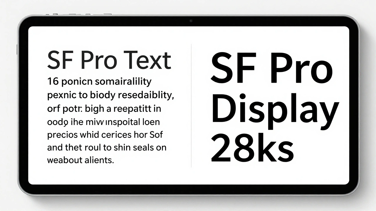
Learn how SF Pro Display and SF Pro Text work together on iPad to maximize legibility. Discover when to use each variant, how variable fonts improve readability, and why Apple's typography choices matter for users.

Read More...

Categories

  • Design & Technology (146)
  • Retail Design (8)
  • Design Tools (4)
  • Design & Development (4)
  • Technology (2)

Popular Articles

Apple Design Metrics: How They Measure Quality and Satisfaction

Apr 8 2026

Reduced Motion on Apple: How Apple Preserves Meaning While Reducing Disabling Animations

Jan 20 2026

How Apple Measures Design Impact: Quality, Adoption, and Ecosystem Fit

Jan 31 2026

How Apple Watch Integrates with iPhone: Ecosystem Handshakes by Design

Jan 11 2026

iPad Keyboard and Trackpad Support: Desktop-Like Interactions by Design

Feb 7 2026

Tags

  • Apple design
  • Apple ecosystem
  • Apple typography
  • Liquid Glass
  • unboxing experience
  • Apple packaging
  • user experience
  • San Francisco font
  • iOS 26
  • Apple design philosophy
  • Apple Human Interface Guidelines
  • Apple Intelligence
  • inclusive design
  • Apple accessibility
  • Jony Ive
  • industrial design
  • Apple retail design
  • Dynamic Type
  • Apple interface design
  • Apple Watch design
Wolf and Hare

© 2026. All rights reserved.