Tag: Apple Watch typography
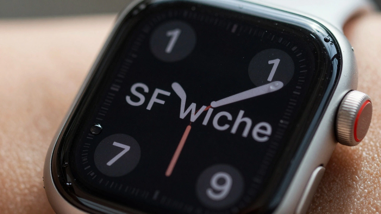
Why Apple Watch Uses SF Compact: The Typography Behind Small-Scale Legibility

23/12
0
SF Compact is Apple's custom font designed to make text readable on the tiny screen of the Apple Watch. Learn how its unique spacing, stroke weight, and width variations solve legibility challenges in wearable design.