
Imagine tapping a button on your iPhone that does nothing. No feedback, no sound, no visual change. For millions of users with low vision or motor impairments, this isn't a hypothetical bug; it's daily reality. If you are building for the Apple ecosystem, assuming your app is "accessible" because it looks good on a standard display is a risky bet. You need specific tools to verify how VoiceOver reads your interface, how color contrast holds up in bright sunlight, and whether animations trigger motion sickness. This guide breaks down the essential workflow for testing these three critical areas directly within Xcode and on physical devices. We will move beyond generic advice to show you exactly which simulators to toggle, what metrics to check, and how to catch errors before they reach the App Store.
Mastering VoiceOver Simulation in Xcode
VoiceOver is the built-in screen reader for iOS and macOS that converts text and visual elements into speech. It is the primary way blind and low-vision users interact with your app. However, testing it requires more than just turning it on. You need to understand the hierarchy of your user interface (UI) as the system perceives it, not how you designed it. Start by launching your app in the Xcode Simulator. Navigate to the top menu bar, select Device, then Sensor, and finally VoiceOver. When activated, you will hear a distinct chime. Now, use the keyboard shortcuts or swipe gestures to navigate. Do not rely on the mouse cursor. The order in which elements are read out is determined by the accessibility tree, which often differs from the visual layout. Common pitfalls include:- Dynamic Type Issues: If your labels do not resize when the font size increases, text may overlap or get cut off. Test at the largest supported text sizes.
- Missing Labels: Image-only buttons without an
accessibilityLabelproperty will be announced as "Button" with no context. Always provide explicit labels for icons. - Focus Order: Ensure the logical reading order matches the visual flow. A navigation bar should typically come before the main content area.
Contrast Checks: Beyond the 4.5:1 Rule
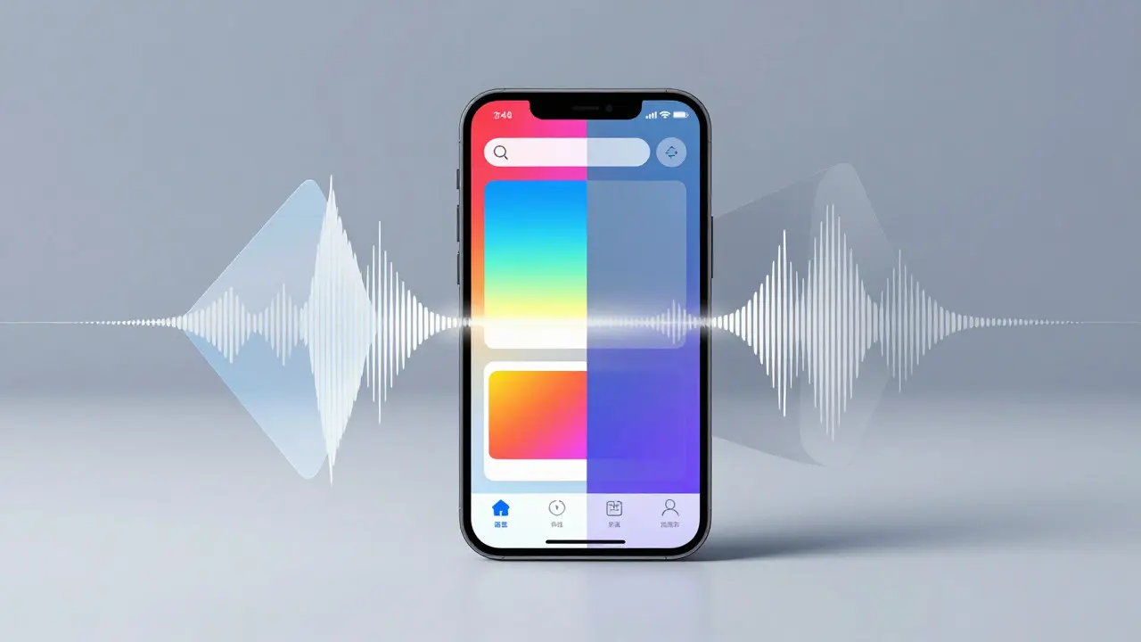
Color contrast determines readability. The Web Content Accessibility Guidelines (WCAG) recommend a minimum contrast ratio of 4.5:1 for normal text and 3:1 for large text. But in mobile apps, environmental factors complicate this. A user might be outside in direct sunlight or inside a dimly lit room. To test this effectively, use the Accessibility Inspector again. Select any text element, and the inspector will calculate the contrast ratio between the text color and its background. It flags failures instantly. However, manual testing is also crucial. Place your device in different lighting conditions:- Bright Sunlight: Check if light gray text on a white background disappears. If so, darken the text or add a subtle shadow.
- Dark Mode: Many developers forget that Dark Mode inverts colors. A high-contrast pair in Light Mode might fail in Dark Mode. Toggle your simulator to Dark Mode and re-run the contrast checks.
- Color Blindness Simulations: In the Accessibility Inspector, enable Protanopia (red-green), Deuteranopia (green-red), and Tritanopia (blue-yellow) filters. Verify that color is never the sole indicator of status. Pair color changes with icons or text labels.
| Element Type | Minimum Ratio | Example Scenario |
|---|---|---|
| Normal Body Text | 4.5:1 | Paragraphs in articles or settings menus |
| Large Text (18pt+) | 3:1 | Headings or prominent call-to-action buttons |
| UI Components | 3:1 | Input fields, sliders, and icons against background |
| Decorative Elements | N/A | Background patterns or non-essential graphics |
Motion Checks: Respecting Reduce Motion
Animations make apps feel alive, but excessive motion can cause dizziness or nausea for users with vestibular disorders. iOS provides a system-wide setting called Reduce Motion. Your app must respect this preference. If a user has enabled Reduce Motion, complex parallax effects, bouncing transitions, and spinning loaders should be replaced with simple fades or cross-fades. Testing this involves two steps. First, go to Settings > Accessibility > Motion on your physical device or simulator and toggle on Reduce Motion. Then, observe your app's behavior. Does the transition still bounce? Does the carousel still auto-scroll rapidly? In Xcode, you can force this state during development by adding the following key-value pair to your Info.plist file:UIRequiresFullScreen = NO (Note: This is a workaround for older versions; modern Xcode allows toggling via the Environment Overrides section).
More importantly, audit your animation code. Look for custom CABasicAnimation or UIView.animate blocks that do not check the UIAccessibility.isReduceMotionEnabled property. If true, swap the animation curve for a linear fade. This small code change significantly improves comfort for a vulnerable user group.
Physical Device Testing vs. Simulator
While the Xcode Simulator handles most logic and rendering tests, it lacks physical interaction nuances. For final validation, always test on a real iPhone or iPad.- Haptic Feedback: Some accessibility features rely on haptics. Ensure your device is not in Silent mode if you expect tactile cues.
- Screen Zoom: Double-tap with three fingers to zoom. Check if interactive elements remain tappable when magnified.
- AssistiveTouch: Enable AssistiveTouch to simulate one-handed operation. Can you reach all controls? Are touch targets at least 44x44 points?
Building a Repeatable Audit Checklist
Don't rely on memory. Create a standardized checklist for every release candidate. This ensures consistency across team members and prevents regression bugs.- Launch VoiceOver: Navigate through every screen. Listen for missing labels, incorrect order, and redundant announcements.
- Check Dynamic Type: Set text size to the maximum. Verify no clipping or overlap occurs.
- Verify Contrast: Use Accessibility Inspector on key screens in both Light and Dark modes.
- Test Color Blindness: Apply Protanopia filter. Ensure status indicators are not color-dependent.
- Enable Reduce Motion: Confirm animations simplify to fades. No spinning wheels or rapid scrolling.
- Zoom Test: Magnify the screen. Ensure hit targets remain accessible.
Can I test VoiceOver on a real iPhone without enabling it permanently?
Yes. Go to Settings > Accessibility > VoiceOver and toggle it on. To turn it off quickly, triple-click the Home button (or Side button on Face ID models). This shortcut works regardless of other settings, making it easy to switch back and forth during testing sessions.
What is the difference between Accessibility Inspector and Xcode's Accessibility Auditor?
The Accessibility Inspector is a standalone app that connects to your running app on a simulator or device. It allows real-time inspection of the accessibility tree and attribute editing. The Accessibility Auditor is a static analysis tool integrated into Xcode's build phase that scans your source code for common issues like missing labels or hard-coded fonts. Use both: the Auditor for code-level fixes and the Inspector for runtime verification.
Does Dark Mode automatically fix contrast issues?
No. Dark Mode changes the background to black or dark gray, but if your text color is also dark, the contrast ratio will drop significantly. You must define separate color assets for Light and Dark modes to ensure adequate contrast in both environments. Never assume default system colors will suffice for custom UI elements.
How do I handle custom drawn graphics for accessibility?
If you draw custom shapes using Core Graphics or SwiftUI Canvas, the system cannot automatically derive meaning from them. You must manually set the accessibilityLabel and accessibilityValue properties on the view containing the drawing. For example, a custom progress ring should announce its percentage value, not just say "Ring."
Is there a penalty for failing accessibility audits in the App Store Review?
Not directly. The App Store Review team focuses on functionality and guidelines compliance. However, severe accessibility failures (like unreadable text or unresponsive buttons) can lead to rejection under the "Functionality" guideline. More importantly, poor accessibility leads to lower ratings and higher uninstall rates, which indirectly hurts your store ranking and revenue.