
You probably know the clean, minimalist look of modern Apple products. But did you know that aesthetic didn’t start with Jony Ive? It started in the early 1980s with a radical shift called the Snow White design language. This wasn’t just about making computers look pretty. It was a strategic move to make high-tech feel friendly, approachable, and trustworthy.
Before Snow White, computers were beige boxes. They looked like laboratory equipment-cold, intimidating, and strictly for experts. Steve Jobs wanted to change that. He hired Hartmut Esslinger, a German industrial designer, and his firm frog design. Together, they created a visual identity that would define Apple for over a decade. Here is how they did it, and why it still matters.
The Problem With Beige Boxes
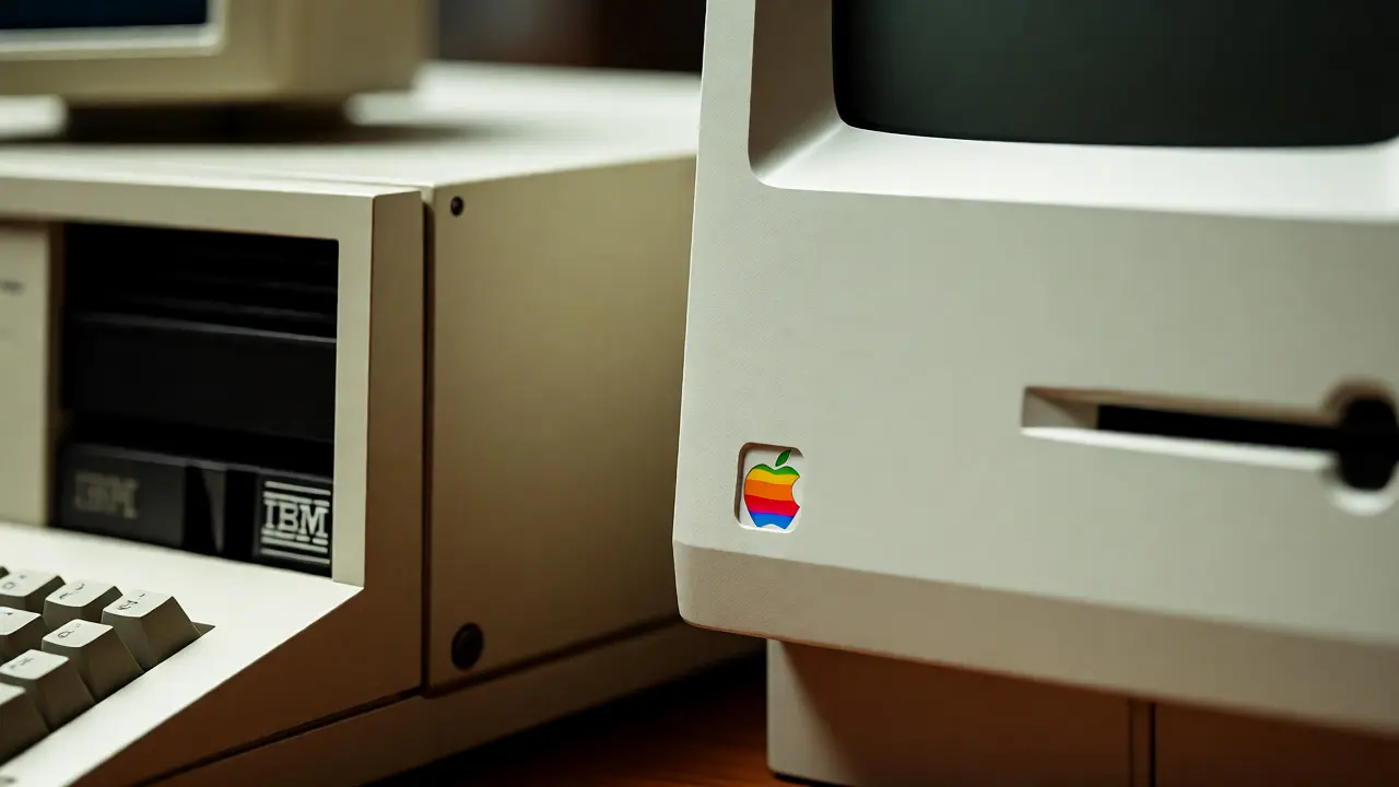
In the late 1970s, if you bought a computer, it likely came in one color: beige. IBM dominated this market with their IBM PC, which looked like a filing cabinet. The design philosophy was purely functional. Form followed function, but function was boring.
Apple faced a problem. Their Apple II was successful, but its design was dated. It had vents on the sides, sharp corners, and a plastic casing that felt cheap. When the Apple III launched in 1980, it failed partly because it looked messy and overheated. Jobs realized that technology needed a new face. It needed to be human.
He met Esslinger at a conference. Esslinger proposed a unified design system. Not just for one product, but for every device Apple made. This was revolutionary. Most companies designed each product in isolation. Apple wanted consistency. They wanted you to recognize an Apple product from across the room, even if you couldn’t see the logo.
Defining the Snow White Principles
The name "Snow White" came from a joke. Jobs joked that the design was so pure, it could only be associated with a fairy tale character. But the principles behind it were serious engineering constraints.
The core rules were simple but strict:
- Color: Use off-white (specifically Pantone 425C) instead of bright white or beige. This reduced glare and hid fingerprints.
- Corners: All edges must have a 2mm radius. No sharp corners. This made devices feel softer and safer to touch.
- Vents: Vents should be hidden or integrated into the design, not slapped on as afterthoughts.
- Proportions: Use specific ratios for width, height, and depth to create visual harmony.
- Labeling: Text and labels must use a consistent font and placement.
These weren’t arbitrary choices. The 2mm corner rule, for example, was chosen because it matched the thickness of standard credit cards. It made the device feel familiar in your hand. The off-white color was tested under office lighting to ensure it didn’t yellow over time like cheaper plastics.
| Feature | Traditional (IBM/Competitors) | Snow White (Apple) |
|---|---|---|
| Primary Color | Beige or Grey | Off-White (Pantone 425C) |
| Corner Radius | Sharp (0mm) | Rounded (2mm) |
| Ventilation | Visible Grilles | Hidden or Integrated Slots |
| Material Feel | Hard Plastic | Soft-Touch Texture |
| Design Goal | Function Only | Emotional Connection |
The First Test: The Macintosh
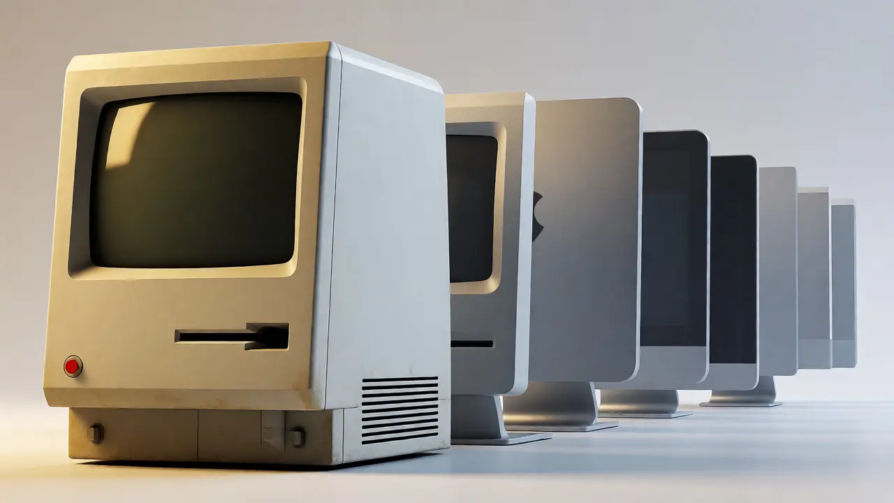
The first major test of Snow White was the original Macintosh 128K, released in 1984. Designed by Jerry Manock and Terry Oyama, with input from Esslinger, the Macintosh broke every rule of computer design at the time.
It had no visible screws. The front panel was smooth. The floppy drive slot was flush with the case. The screen bezel was thick but rounded, framing the display like a picture frame. It looked less like a machine and more like an appliance. People loved it. Sales soared, not just because of the graphical user interface, but because it didn’t scare people away.
However, the Macintosh also revealed flaws in the early implementation. Because engineers prioritized internal components over external form, some parts didn’t align perfectly. The power switch was awkwardly placed. These issues taught Apple that design must lead engineering, not follow it.
Refinement: The Apple IIc
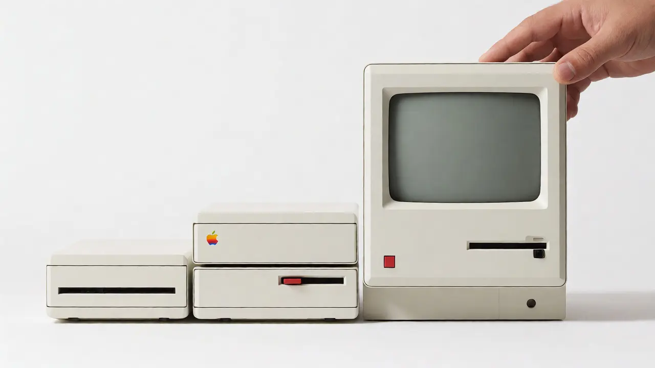
If the Macintosh was the debut, the Apple IIc (1984) was the perfection of Snow White. Esslinger’s team redesigned the classic Apple II architecture into a compact, portable unit. The result was stunning.
The IIc featured a uniform off-white casing with precise 2mm radii on every edge. The ports were recessed into a dark grey strip, creating a visual hierarchy. The keyboard was low-profile and chiclet-style, long before it became trendy. It won the IDSA Gold Award, the highest honor in industrial design.
This success proved that Snow White worked across different product categories. It wasn’t just for desktops. It could work for portables, peripherals, and even printers. The design language gave Apple a cohesive family look. If you owned a Macintosh, a LaserWriter printer, and a IIc, they all looked like siblings.
Challenges and Limitations
No design system is perfect. By the late 1980s, Snow White began to show its age. The rigid rules made it hard to innovate quickly. As technology changed, internal components grew larger. Engineers struggled to fit new processors and memory chips into the fixed dimensions dictated by Snow White.
Also, the off-white plastic tended to yellow over time due to UV exposure and bromine flame retardants used in ABS plastic. After five years, many "white" Apples turned cream or brown. This hurt the brand’s promise of cleanliness and modernity.
Moreover, the design felt increasingly dated compared to the sleeker, darker aesthetics emerging from competitors like Sony and later, NeXT. The playful, friendly vibe of Snow White clashed with the professional, serious image Apple wanted to project in the enterprise market.
The Transition to Platinum and Beyond
In 1990, Apple introduced the Macintosh Quadra series. This marked the beginning of the end for Snow White. The new design language, often called "Platinum," kept the rounded corners but shifted the color to a cooler grey-white. It also allowed for more modular designs and easier access to internals.
By 1993, with the release of the PowerBook 500 series, Apple moved further away from Snow White. The PowerBook introduced the trackball in the palm rest, a ergonomic innovation that required breaking traditional layout rules. The casing became thinner, sharper, and more metallic.
Esslinger left Apple in 1990. His departure signaled the end of an era. Apple spent the mid-90s struggling with design identity, producing beige boxes again (the "beige box" phase). It wasn’t until Steve Jobs returned in 1997 and brought in Jony Ive that Apple found a new design language: translucent colors, then aluminum unibodies.
Why Snow White Still Matters
You might ask, why care about a design language from 40 years ago? Because Snow White established the idea that design is a competitive advantage. Before Apple, tech companies competed on specs: clock speed, RAM, storage. Apple competed on experience.
Snow White taught us three key lessons that apply today:
- Consistency builds trust. When all products share a visual DNA, users feel confident buying new ones.
- Human-centric design sells. Making technology look friendly lowers the barrier to entry for non-experts.
- Design must evolve. A static design language becomes a constraint. You must update it as technology and culture change.
Look at any modern gadget. The rounded corners, the matte finishes, the hidden ports-all trace back to the principles laid out in 1984. Snow White wasn’t just a style. It was a mindset. It said that technology should serve humans, not the other way around.
Frequently Asked Questions
What exactly was the Snow White design language?
The Snow White design language was a set of industrial design guidelines created by Hartmut Esslinger and frog design for Apple in the early 1980s. It emphasized off-white colors, 2mm rounded corners, hidden ventilation, and proportional harmony to create a friendly, consistent aesthetic across all Apple products.
Who invented the Snow White design language?
German industrial designer Hartmut Esslinger and his firm frog design developed the Snow White language. They collaborated closely with Apple CEO Steve Jobs and internal designers like Jerry Manock to implement these standards starting with the Macintosh and Apple IIc in 1984.
Why did Apple stop using the Snow White design?
Apple phased out Snow White in the early 1990s because the rigid rules hindered hardware innovation. Additionally, the off-white plastic yellowed over time, and the aesthetic began to look dated compared to newer trends. The company transitioned to the "Platinum" design language around 1990.
Which Apple products used the Snow White design?
Key products included the original Macintosh 128K, the Apple IIc, the Macintosh Plus, the Macintosh SE, the Macintosh Classic, and various peripherals like the ImageWriter printers and Apple monitors produced between 1984 and roughly 1990.
Did Snow White influence other tech companies?
Yes, significantly. Many competitors adopted similar rounded, light-colored casings in the late 1980s and early 1990s. However, few achieved the same level of consistency and brand recognition. Snow White set the benchmark for consumer electronics design.