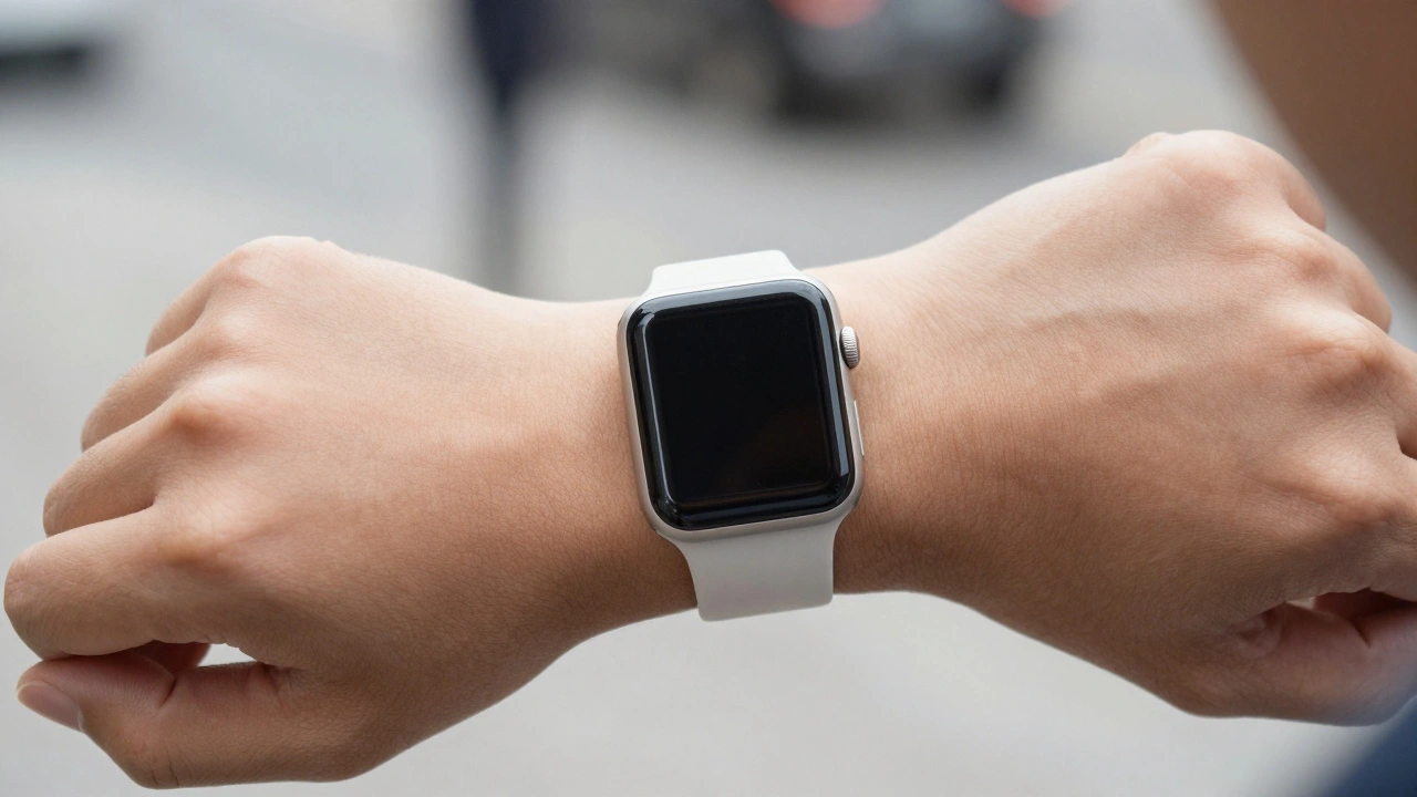

The Apple Watch didn’t just change how we track steps or get notifications-it changed what a smartwatch should look like. When it launched in 2015, nearly every other smartwatch on the market had a round face. The Moto 360, the LG G Watch, even early prototypes from Samsung-all went for the classic circular shape. But Apple did something unexpected. They went with a tall rectangle. Not a perfect square. Not a circle. A rectangle. And that decision wasn’t just about style. It was about function. It was about reading. It was about making every pixel count.
Why Circles Waste Screen Space
Think about what you actually look at on your wrist. Text messages. Weather updates. Calendar events. Heart rate graphs. Sleep scores. These aren’t circular. They’re blocks. Lines. Grids. Rectangles. But a round screen? It forces all of that into a circle. And that leaves big gaps.
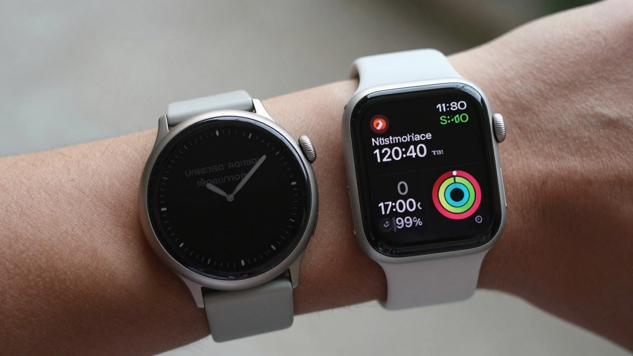
Imagine trying to fit a rectangular photo into a circular frame. You either crop it, stretch it, or leave empty space around it. That’s exactly what happens on round smartwatches. A 44mm Galaxy Watch 5 might have the same diagonal size as a 44mm Apple Watch, but its circular display only uses about 60% of the available screen area. The rest? Blank. Useless. You can’t put a full calendar event on it without cutting off the beginning or end. You can’t show a full text message without making users swipe endlessly just to read one line.
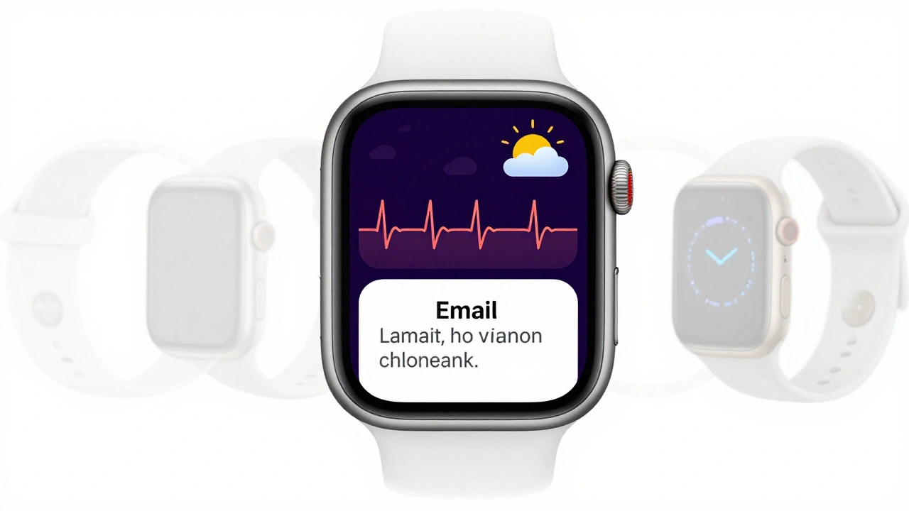
Compare that to the Apple Watch. A message shows up fully. The time is centered. The weather icon and temperature sit neatly in the top-right corner. Your activity rings fill the bottom. All of it fits. No trimming. No scrolling just to see what’s missing. That’s because the rectangular display matches how we naturally consume information-left to right, top to bottom. Circles don’t. They fight it.
The Math Behind the Shape
This isn’t just opinion. It’s math.
If you took two watches with the same diagonal measurement-say, 44mm-and made one circular and one rectangular, the difference in usable screen area is staggering. The circular version would have roughly 1,190 square millimeters of display. The rectangular one? Just 741 square millimeters. At first glance, that sounds worse. But here’s the twist: the circular screen wastes nearly half of that space. The rectangular one uses almost every single pixel.
That’s not a bug. It’s a feature. Apple didn’t shrink the screen. They optimized it. Every millimeter of the rectangular display is meant to hold content. You don’t need to zoom in or pan sideways to read a text. The entire message fits. The battery lasts longer because the screen doesn’t need to light up unused areas. The chip doesn’t need to push pixels into empty corners. It’s efficient.
And then there’s the hardware. The chips, the sensors, the battery-all of them are square-shaped. Making a round display would’ve meant adding extra layers, padding, and space just to fit the circle around the square components. That adds cost. Adds thickness. Adds weight. Apple didn’t want a sleeker-looking watch. They wanted a better-performing one.
What You Can Actually See
Try this: look at your watch right now. If it’s round, and you get a notification with a long message, how many times do you swipe? How often do you miss the last word? Now imagine that same message on an Apple Watch. It shows up fully. No truncation. No "eep session" instead of "sleep session" like on some round smartwatches. That’s not a glitch. That’s design.
Apple’s rectangular screen doesn’t just show more-it shows it better. Album art? Full. Movie thumbnails? Clear. Text-heavy notifications? Readable. Even the watch faces that mimic traditional analog dials-like Kaleidoscope or Utility-use the rectangular space smartly. The hands move within the center, but the corners still hold battery level, date, or weather. You get the classic look without losing the smart features.
Round watches force you to choose: either lose the digital features to keep the classic look, or sacrifice the classic look to get the digital features. Apple’s design lets you have both.
Why People Still Prefer Round
Let’s be honest: round watches look nicer. On your wrist. In photos. In ads. They feel more like jewelry. More like something your grandfather wore. That’s why Samsung, Fossil, and others still make them. And it’s why some Apple Watch users still wish for a round option.
But aesthetics don’t solve usability problems. You can’t read a 10-line email on a round screen without scrolling five times. You can’t glance at your calendar and instantly see what’s next. You can’t check your sleep score without tapping through three screens. That’s not convenience. That’s friction.
Apple’s choice wasn’t about ignoring tradition. It was about rejecting the idea that a smartwatch should just look like a watch. It should act like a computer-on your wrist. And computers? They’re rectangular. So are your photos, your emails, your maps, your timers. Why should your watch be any different?
The Bigger Picture
Here’s the truth: 90% of what people do on a smartwatch doesn’t need a rectangle. Checking the time. Counting steps. Seeing heart rate. But the other 10%? That’s everything that makes a smartwatch worth having. Reading long messages. Reading full calendar invites. Seeing full workout stats. Managing smart home controls. Watching short videos. All of those need space. And space means a rectangular shape.
Apple didn’t choose rectangular because they hate tradition. They chose it because they hate wasted effort. They hate when you have to tap three times just to read a message. They hate when half your screen is empty. They hate when the device fights the way you naturally interact with information.
That’s why, six years later, every major competitor has followed suit. Samsung’s Galaxy Watch now comes in a square-ish shape. Google’s Pixel Watch? Rectangle. Even Fitbit’s latest models are moving away from circles. The market didn’t change because of fashion. It changed because the math didn’t lie.
It’s Not About Shape. It’s About Substance.
There’s no perfect watch shape. But there is a perfect shape for the job. And the job of a smartwatch isn’t to look like a wristwatch. It’s to deliver information-fast, clearly, without friction.
Apple’s rectangular display isn’t a compromise. It’s the answer. It’s the only shape that lets you see everything you need, all at once, without having to hunt for it. It’s why you can glance at your watch and instantly know your next meeting, your heart rate, your battery level, and your daily progress-all without lifting your wrist.
Round watches might feel more familiar. But rectangular watches? They work better.
Why doesn’t Apple offer a round Apple Watch?
Apple doesn’t offer a round Apple Watch because the rectangular design delivers more usable screen space, better readability for text and data, and more efficient hardware integration. Round screens waste up to 40% of the display area, making it harder to show full messages, calendar events, or app content without forcing users to scroll or tap repeatedly. Apple prioritized functionality over tradition, and the rectangular shape supports all of their core features-like activity rings, notifications, and third-party apps-without compromise.
Do round smartwatches have worse battery life?
Yes, generally. Round smartwatches require more power to light up unused screen areas around the circular display. Because the screen’s content is rectangular (messages, maps, graphs), the display must illuminate pixels outside the circular boundary just to create the illusion of a full circle. This increases energy use. Apple’s rectangular screen uses nearly every pixel for actual content, reducing unnecessary power draw and improving battery efficiency.
Can I use a round watch face on an Apple Watch?
Yes. Apple includes multiple round-style watch faces like Kaleidoscope, Utility, and Motion. These use the rectangular hardware to simulate traditional analog watch aesthetics-ticking hands, circular dials, and Roman numerals-while still allowing widgets to appear in the corners for battery, weather, and calendar data. The shape of the face is software, not hardware. The screen remains rectangular to maximize content display.
Is the Apple Watch screen really a square?
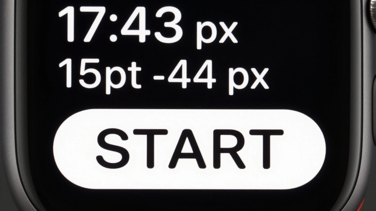
No. The Apple Watch screen is a tall rectangle-not a perfect square. This aspect ratio (about 1.5:1) allows space for widgets in the top and bottom corners while keeping the time centered. It’s designed to match how people naturally read: top to bottom, with information flowing vertically. A perfect square would leave less room for scrolling content like messages or workout summaries.
Why do other brands still make round smartwatches?
Other brands make round smartwatches because they target users who prioritize aesthetics over functionality. Round shapes feel more like traditional watches, which appeals to fashion-conscious buyers or those who don’t heavily use apps or notifications. But these devices often sacrifice readability, screen efficiency, and app compatibility. As users demand more from smartwatches, even these brands are shifting toward rectangular designs.