Wolf and Hare

Tag: watch readability

Square vs. Round Watch Displays: Why Apple Chose Rectangular for Better Readability
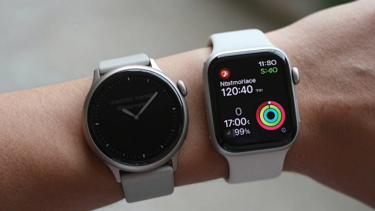
Square vs. Round Watch Displays: Why Apple Chose Rectangular for Better Readability
  • Elias Voss
  • Elias Voss

8/01
0

Apple chose a rectangular watch face not for style, but because it shows more information clearly, uses screen space efficiently, and works better with real-world data like messages, calendars, and health stats. Round watches waste pixels and force scrolling. The math doesn’t lie.
Read More...

Categories

  • Design & Technology (184)
  • Retail Design (8)
  • Design Tools (6)
  • Design & Development (6)
  • Technology (3)

Popular Articles

Density Decisions: How Apple Adapts Typography from iPhone to iPad to Mac

Feb 3 2026

Molly Anderson’s Appointment: Apple’s Next Chapter in Industrial Design

May 1 2026

How Dieter Rams and Braun Shaped Apple's Minimalist Design Language

Jan 27 2026

Simplicity as ROI at Apple: How Clear UX Lowers Support Costs

Jan 30 2026

iPad Home Screen Design: Mastering Widget Density and Information Hierarchy

May 22 2026

Tags

  • Liquid Glass
  • Apple design
  • Apple typography
  • Apple ecosystem
  • inclusive design
  • Apple Human Interface Guidelines
  • Apple Intelligence
  • user experience
  • Apple design philosophy
  • unboxing experience
  • Apple packaging
  • iOS 26
  • San Francisco font
  • Apple accessibility
  • Apple industrial design
  • Jony Ive
  • industrial design
  • Apple retail design
  • Dynamic Type
  • Apple interface design
Wolf and Hare

© 2026. All rights reserved.