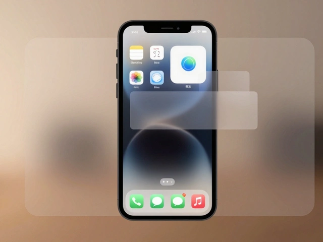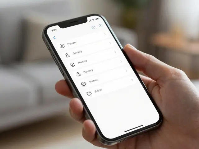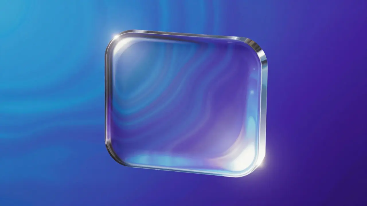

Imagine tapping a button that feels less like pressing a flat pixel grid and more like pushing into a pane of wet, polished crystal. That is the core promise of Liquid Glass is a visual design language that simulates the optical properties of thick, refractive glass to create immersive digital interfaces. Unlike standard flat design or basic transparency, this approach relies on physics-based rendering to make icons appear suspended in a viscous, light-bending medium. It transforms static UI elements into objects with perceived weight and volume, changing how users interact with their screens by adding a tactile layer to purely digital experiences.
Why Liquid Glass Changes How We See Interfaces
Traditional Glassmorphism is a design trend characterized by frosted glass effects, background blur, and subtle borders. While popular, it often lacks true physical accuracy. Liquid Glass goes further by incorporating refraction, dispersion, and specular highlights that react to environmental light sources. This shift matters because human brains are hardwired to interpret shadows and reflections as indicators of depth. When an icon bends the background image behind it, our visual cortex immediately calculates its distance from the surface. This creates a subconscious sense of hierarchy without needing explicit labels or drop shadows.
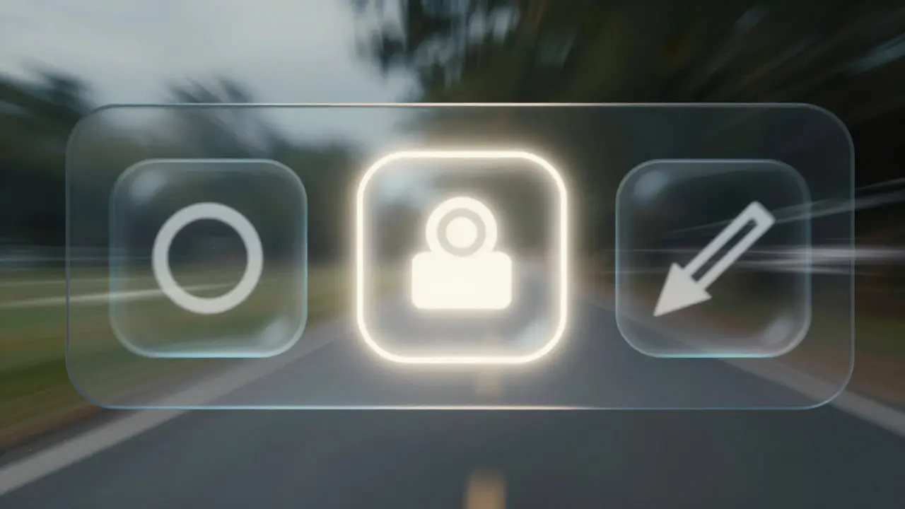
The psychological impact is significant. Users report feeling more engaged when interfaces feel "alive" rather than static. By using dynamic lighting, designers can guide attention not just through color contrast, but through luminance peaks. A bright, sharp highlight on the edge of a liquid glass icon draws the eye faster than a bold font size ever could. This makes the style particularly effective for navigation bars, media controls, and primary call-to-action buttons where immediate recognition is critical.
Anatomy of Depth: Refraction and Blur
Depth in liquid glass iconography comes from two main mechanisms: refraction and background blur. Refraction occurs when light passes through a medium with a different density, bending the light rays. In digital design, we simulate this by distorting the pixels behind the icon. The key attribute here is the refractive index. Higher values create more dramatic warping. For a realistic liquid effect, you typically want a refractive index between 1.33 (water) and 1.52 (standard crown glass). Going higher than 1.6 starts to look like diamond, which can feel too flashy for everyday UI elements.
Background blur acts as the second pillar of depth. Without blur, the refraction looks like a simple distortion filter. With blur, the edges of the icon soften, creating a sense of thickness. The blur radius should be tied to the icon's size. A small 24px icon needs a subtle 2-4px blur, while a large 120px card might require 10-15px. If the blur is too strong, the icon loses definition; if it is too weak, the glass appears paper-thin. Balancing these two attributes ensures the object feels solid yet transparent.
| Attribute | Standard Glassmorphism | Liquid Glass |
|---|---|---|
| Light Interaction | Static opacity | Dynamic refraction and dispersion |
| Edge Definition | Crisp border | Softened, blurred edge with caustics |
| Background Distortion | None or minimal | High-frequency wave distortion |
| Perceived Weight | Light, floating | Dense, heavy, viscous |
| Best Use Case | Subtle overlays, modals | Primary navigation, hero elements |
Mastering Reflections and Specular Highlights
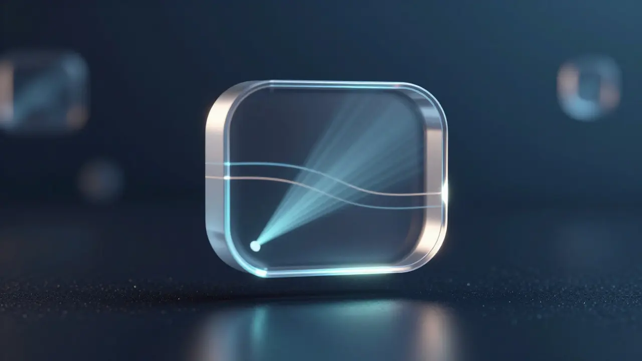
Reflections give liquid glass its signature shine. However, not all reflections are created equal. You need to distinguish between diffuse reflection (soft glow) and specular reflection (sharp, mirror-like spots). In liquid glass, specular highlights are the stars of the show. They represent the direct bounce of a light source off the curved surface of the icon. To make them look real, they must follow the curvature of the object. A flat, circular white dot looks fake. A stretched, elliptical highlight that follows the top-left curve of the icon looks authentic.
Positioning is everything. Most digital interfaces assume a single, dominant light source coming from the top-left. This convention exists because most people read left-to-right and top-to-bottom, so our eyes naturally scan from that corner. Place your primary specular highlight near the top-left edge of the icon. Add a secondary, much dimmer highlight on the bottom-right to suggest ambient light bouncing back up. This dual-light setup creates a spherical illusion even on flat rectangular shapes. Avoid placing highlights in the center; that area should remain clear to show the underlying content or iconography clearly.
Dynamic Highlights and Motion Design
Static images only tell half the story. True liquid glass shines when it moves. Dynamic highlights respond to user interaction, such as hover states, scroll position, or device tilt. When a user hovers over a liquid glass button, the highlight should subtly shift or intensify, mimicking the way light catches a physical object as you move it. This micro-interaction provides immediate feedback, confirming that the element is interactive.
Scroll parallax is another powerful tool. As the page scrolls, the background image moves at a different speed than the foreground icon. Because the icon refracts the background, the internal distortion shifts accordingly. This creates a mesmerizing effect where the icon seems to contain a moving world within it. Keep the motion smooth and linear. Jerky animations break the illusion of physical mass. Use easing curves that mimic inertia-slow start, fast middle, slow stop-to maintain the feeling of weight.
Practical Implementation Tips for Designers
Creating these effects doesn't require complex 3D modeling software anymore. Modern vector tools and CSS frameworks have caught up. Here is how to execute this effectively in your workflow:
- Layer Order Matters: Always place the refraction layer below the icon symbol but above the background. The blur layer sits on top of the refraction to soften the edges.
- Color Tinting: Pure white glass is invisible against white backgrounds. Add a slight tint (blue, gray, or purple) to the glass body to ensure visibility. The tint should be under 10% opacity to maintain transparency.
- Caustics Effect: Add a thin, bright line along the inner edge where the light focuses. This "caustic" ring is what separates cheap blur from high-end liquid glass. It should be 1-2 pixels wide and slightly brighter than the main highlight.
- Contrast Check: Ensure the icon symbol inside the glass has enough contrast against the distorted background. If the background is busy, add a subtle darkening layer behind the icon symbol to improve legibility.
Performance is a common concern. Heavy blur filters can lag on older devices. Optimize by limiting the blur radius and using GPU-accelerated properties in CSS (like `backdrop-filter`). Test on mid-range hardware to ensure the effect remains smooth at 60fps. If performance drops, reduce the complexity of the refraction pattern or switch to a pre-rendered static version for low-power modes.
Common Pitfalls to Avoid
Even experienced designers stumble with liquid glass. The most frequent mistake is over-saturation. If every element on the screen has a strong glass effect, the interface becomes noisy. Use liquid glass sparingly for primary actions and keep secondary elements flat or minimally translucent. Another error is ignoring the background. Liquid glass is context-dependent. An icon that looks stunning over a dark gradient may disappear over a bright photo. Always test your designs across multiple background types: solid colors, gradients, and photographic textures.
Finally, don't forget accessibility. High-contrast highlights can cause visual fatigue for some users. Provide a toggle in your settings that reduces the intensity of the dynamic lights or switches to a matte finish. This shows respect for user preference while maintaining the aesthetic integrity of the design system.
What is the difference between liquid glass and standard glassmorphism?
Standard glassmorphism uses simple blur and opacity to simulate frosted glass. Liquid glass adds physical accuracy through refraction (bending background pixels), dispersion (color splitting), and dynamic specular highlights that react to light sources, creating a sense of volume and weight.
How do I create a realistic refraction effect in CSS?
Pure CSS refraction is difficult. Most designers use SVG filters with `feDisplacementMap` combined with `backdrop-filter: blur()`. Alternatively, WebGL libraries like Three.js allow for real-time shader-based refraction for high-fidelity results.
Does liquid glass hurt mobile battery life?
Yes, potentially. Real-time blur and displacement maps require GPU processing. On modern smartphones, the impact is minimal for a few elements. However, applying heavy effects to full-screen backgrounds can increase battery drain by 5-10%. Optimize by limiting the affected area and reducing blur radius on lower-end devices.
Where should I place the main highlight on a liquid glass icon?
Place the primary specular highlight on the top-left edge of the icon, following the curve of the shape. This aligns with the conventional top-left light source assumption in UI design, ensuring consistent lighting across the interface.
Can liquid glass work on dark mode interfaces?
Yes, but adjustments are needed. In dark mode, increase the opacity of the glass tint slightly to prevent it from disappearing into the black background. Enhance the brightness of the specular highlights to make them pop against the darker surroundings.
Categories
Popular Articles