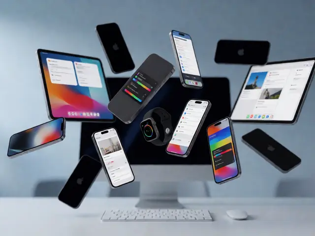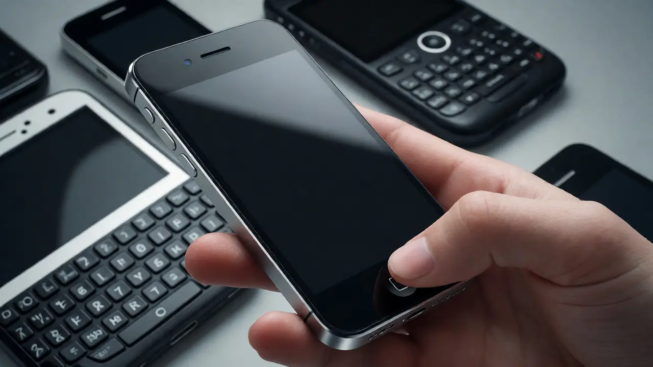

Imagine holding a slab of glass and aluminum that had no physical buttons except one. No stylus. No QWERTY keypad sliding out from the bottom. Just a black rectangle waiting for your finger. In 2007, this wasn't just a gadget launch; it was a declaration of war against the status quo of mobile phones. The Original iPhone didn't just improve what came before-it deleted it. By removing the physical constraints of hardware keyboards and resistive touchscreens, Apple forced users to learn a new language of gestures. If you've ever pinched to zoom or swiped to unlock, you're speaking that language every day.
The Problem with Physical Keyboards
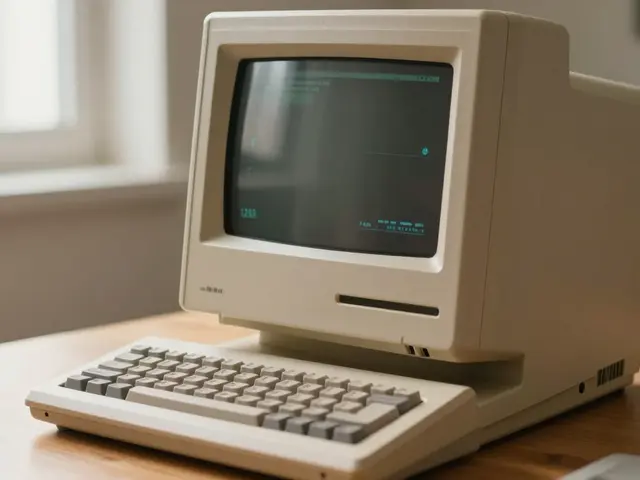
Before the iPhone, smartphones were dominated by devices like the BlackBerry Bold and the Nokia E-series. These phones relied on physical QWERTY keyboards. Why? Because typing on small screens was terrible. Resistive touchscreens required pressure, often needing a stylus or a fingernail. They felt sluggish and imprecise. Developers built apps around these limitations. You couldn't have a full-screen map because the keyboard took up half the space. You couldn't have a large photo gallery because the keys blocked the view.
Apple's team realized something counterintuitive: the best interface is the one that disappears when you don't need it. A physical keyboard is always there, taking up real estate even when you're just browsing the web or watching a video. An on-screen keyboard is dynamic. It appears only when you tap a text field and vanishes when you're done. This simple shift freed up nearly 50% of the screen area for content. Suddenly, maps became immersive, photos became vibrant, and emails became readable without squinting at tiny fonts.
Multitouch: Teaching Glass to Listen
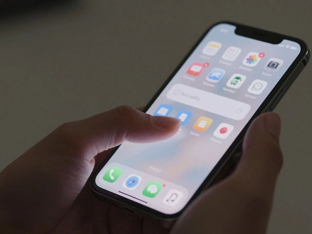
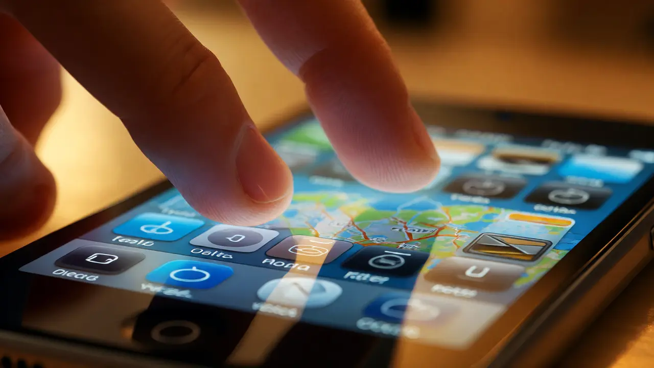
The magic trick behind the original iPhone was its multitouch technology. Unlike the single-point touchscreens found in ATMs or older PDAs, which could only track one finger at a time, the iPhone's capacitive screen could detect multiple contact points simultaneously. This wasn't just about having more fingers on the glass; it was about context. Two fingers moving apart meant "zoom in." Two fingers rotating meant "rotate image." One finger dragging meant "scroll."
This required a complete rethink of user interface design. There were no tooltips. No help manuals. The interface had to be intuitive enough that a five-year-old could figure out how to swipe through album covers. Apple leveraged physics simulations-momentum scrolling made lists feel like they had weight and inertia. When you flicked a list, it kept moving after you lifted your finger, slowing down gradually. This subtle detail made the digital world feel tangible and responsive.
| Feature | Traditional Smartphone (e.g., BlackBerry) | Original iPhone |
|---|---|---|
| Input Device | Physical Keys / Stylus | Finger (Capacitive Touch) |
| Screen Real Estate | Fixed by Hardware | Dynamic (Context-Aware) |
| Gestures | Limited (Click/Tap) | Rich (Pinch, Swipe, Rotate) |
| Learning Curve | High (Memorize Shortcuts) | Low (Intuitive Physics) |
Designing the Invisible Interface
With no physical buttons to anchor the user, the software had to provide all the feedback. The iOS operating system introduced visual cues that mimicked real-world objects. Buttons looked raised until you pressed them. Folders looked like manila envelopes. This skeuomorphic design helped bridge the gap between the physical and digital worlds during the transition period.
The home screen itself was a radical departure. Instead of a hierarchical menu system buried under layers of submenus, everything was accessible in two taps. Apps were icons on a grid. You could rearrange them by long-pressing and shaking the device-a playful, almost chaotic interaction that gave users control over their environment. This simplicity reduced cognitive load. You didn't need to remember where "Settings" was nested; it was right there, next to Mail and Safari.
The Impact on App Development
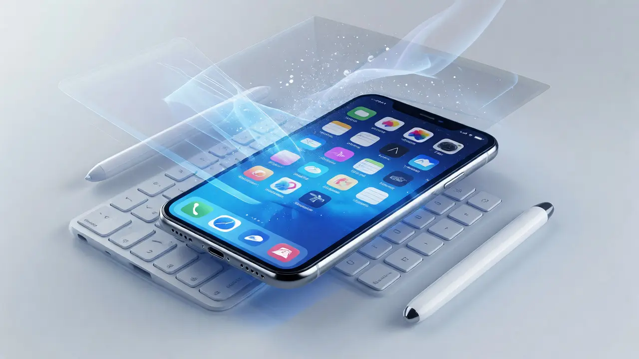
For developers, the shift to multitouch was both a nightmare and an opportunity. Early iPhone apps had to abandon standard desktop patterns. Menus couldn't be drop-downs; they had to be slides or fades. Text fields needed larger hit targets because fingers are clumsy compared to mouse cursors. Apple established strict Human Interface Guidelines that prioritized thumb-friendly zones. Critical actions had to be within reach of the thumb when holding the phone with one hand.
This constraint drove innovation. Developers created new types of interactions. Photo editing apps allowed users to crop images by dragging corners. Music players let you skip tracks with a swipe. The keyboard itself became a playground for experimentation. Predictive text algorithms improved rapidly because the system learned from user corrections. Autocorrect, once a joke, became a reliable assistant, reducing typing errors significantly despite the lack of tactile feedback.
Why It Still Matters Today
Fifteen years later, we take these features for granted. But look at any modern smartphone, tablet, or even car dashboard. The DNA of the original iPhone is everywhere. Android adopted multitouch shortly after. Windows Phone tried to reinvent it with live tiles but failed to match the fluidity of iOS animations. Even smart TVs now use remote controls that mimic touch gestures.
The core lesson from 2007 remains relevant: technology should adapt to human behavior, not the other way around. We didn't learn to type faster on glass; the glass adapted to our fingers. We didn't memorize complex command codes; the interface revealed itself through exploration. This philosophy of "invisible design" continues to drive tech today, from voice assistants to augmented reality interfaces. The goal hasn't changed-to make the tool disappear so the task can shine.
Did the original iPhone have a copy-paste function?
No, the original iPhone running iOS 1 did not support copy and paste. Users had to manually retype text if they wanted to move information between apps. Apple added this feature in iOS 3.0 in 2009, responding to significant user demand.
Why did Apple choose a capacitive touchscreen over resistive?
Capacitive screens respond to the electrical charge in your finger, allowing for multi-touch gestures and greater clarity. Resistive screens require pressure and typically only register one point of contact, making them less suitable for the gesture-based interface Apple envisioned.
How did the on-screen keyboard affect battery life?
The on-screen keyboard itself consumed minimal power compared to backlit physical keys. However, the constant refresh rate of the LCD screen and the processing power required for smooth multitouch animations were significant battery drains. Apple optimized these processes heavily to maintain acceptable usage times.
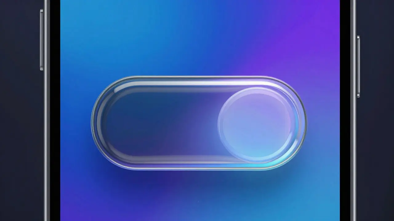
What was the 'Slide to Unlock' gesture?
It was a deliberate friction point designed to prevent accidental dialing in pockets. Users had to drag a slider across the screen to activate the device. It served as a psychological ritual, signaling the start of interaction and ensuring the phone was intentionally being used.
Did other companies immediately adopt multitouch?
Not immediately. Many competitors mocked the lack of a physical keyboard initially. However, by 2010, major manufacturers like Samsung and HTC began releasing Android devices with similar capacitive multitouch interfaces, acknowledging the market shift.