Wolf and Hare

Tag: Figma variables

SF Pro Text vs. Display: Typography Scales for Apple Component Libraries
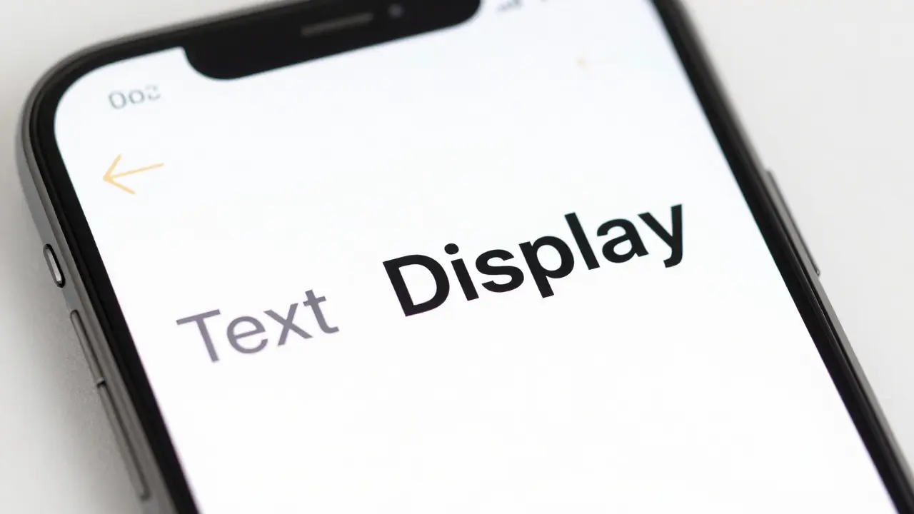
SF Pro Text vs. Display: Typography Scales for Apple Component Libraries
  • Elias Voss
  • Elias Voss

23/08
0

Learn how to correctly implement SF Pro Text and Display variants in your component libraries. Understand the 20pt optical size threshold and how to set up design tokens for consistent typography across Apple platforms.
Read More...

Categories

  • Design & Technology (264)
  • Retail Design (15)
  • Design Tools (10)
  • Technology (7)
  • Design & Development (6)

Popular Articles

Building Design Systems for Apple Products: Tokens, Components, and Governance

Jan 22 2026

Macintosh 1984: The All-in-One Design That Changed Computing

Aug 17 2026

How Apple Orchestrates Design, Engineering, and Manufacturing to Build Iconic Products

Jan 19 2026

How to Use Apple’s Product Bezels and Color Guides for Accurate UI Mockups

May 25 2026

Contextual Menus and Peek: How Apple Unified Touch Interactions Across iOS and iPadOS

Feb 22 2026

Tags

  • Apple design
  • Apple ecosystem
  • industrial design
  • user experience
  • Apple typography
  • Apple Intelligence
  • Liquid Glass
  • inclusive design
  • Apple design philosophy
  • Apple Human Interface Guidelines
  • Apple packaging
  • Jony Ive
  • iOS design
  • unboxing experience
  • iOS 26
  • Apple accessibility
  • sustainable packaging
  • SF Pro
  • UI design
  • San Francisco font
Wolf and Hare

© 2026. All rights reserved.