Wolf and Hare

Tag: leading in iOS

Typography Hierarchy in Apple Apps: Sizes, Leading, and Contrast Strategies
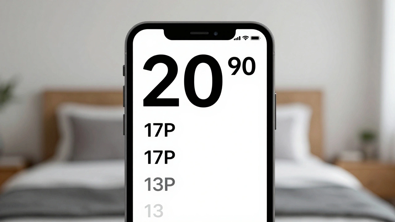
Typography Hierarchy in Apple Apps: Sizes, Leading, and Contrast Strategies
  • Elias Voss
  • Elias Voss

20/01
0

Apple's typography hierarchy uses San Francisco font, Dynamic Type, and precise sizing to guide users through apps. Learn how size, leading, weight, and contrast work together to create clear, accessible interfaces.

Read More...

Categories

  • Design & Technology (312)
  • Retail Design (18)
  • Design Tools (14)
  • Technology (8)
  • Design & Development (8)

Popular Articles

Typography in watchOS: How Compact Scales and Tap-Target Alignment Shape Usability

Dec 20 2025

MacBook Air’s Thinness Goal: Designing for Ultra-Portable Productivity

Jan 14 2026

How Apple's Focus on Essentials Guides Product Scope and Feature Prioritization

Mar 26 2026

Apple Ecosystem Notifications: How to Get Coherent Alerts Across Devices

Sep 24 2026

System Services by Design: How Apple Integrates Location, Photos, and Health

Sep 8 2026

Tags

  • Apple design
  • user experience
  • industrial design
  • Apple ecosystem
  • inclusive design
  • Apple typography
  • Apple Intelligence
  • Liquid Glass
  • Apple design philosophy
  • Apple Human Interface Guidelines
  • Jony Ive
  • Apple packaging
  • iOS design
  • unboxing experience
  • Apple accessibility
  • Apple design history
  • VoiceOver
  • San Francisco font
  • iOS 26
  • Apple industrial design
Wolf and Hare

© 2026. All rights reserved.