Wolf and Hare

Tag: watchOS typography

Typography in watchOS: How Compact Scales and Tap-Target Alignment Shape Usability

Typography in watchOS: How Compact Scales and Tap-Target Alignment Shape Usability
  • Elias Voss
  • Elias Voss

20/12
0

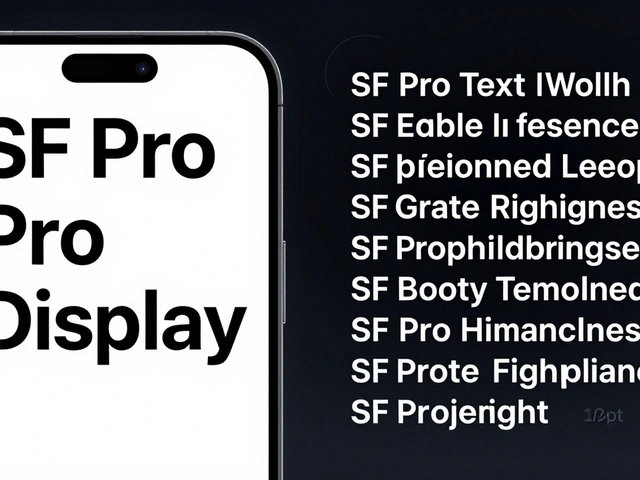
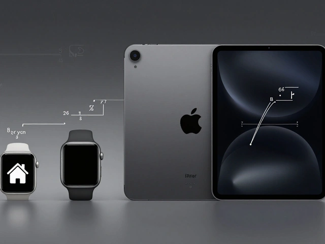
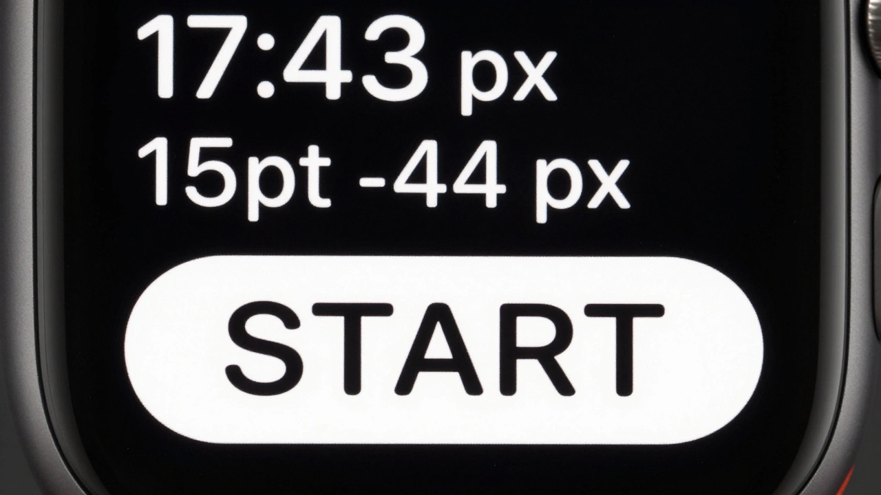
Typography on the Apple Watch isn't about aesthetics-it's about survival. Learn how SF Compact, precise tracking, and 44-pixel tap targets create interfaces that users actually read and use.

Read More...

Categories

  • Design & Technology (184)
  • Retail Design (8)
  • Design Tools (6)
  • Design & Development (6)
  • Technology (3)

Popular Articles

Density Decisions: How Apple Adapts Typography from iPhone to iPad to Mac

Feb 3 2026

Haptic Alternatives on Apple: Non-Visual Feedback That Communicates

Feb 4 2026

Thermal Design in MacBook: How Apple Achieves Quiet Performance Without Sacrificing Thin Form

Jan 19 2026

Design-Driven Engineering at Apple: How Function and Form Evolve Together

Jan 13 2026

How Apple’s Design Process Eliminates Features to Improve User Outcomes

May 17 2026

Tags

  • Liquid Glass
  • Apple design
  • Apple typography
  • Apple ecosystem
  • inclusive design
  • Apple Human Interface Guidelines
  • Apple Intelligence
  • user experience
  • Apple design philosophy
  • unboxing experience
  • Apple packaging
  • iOS 26
  • San Francisco font
  • Apple accessibility
  • Apple industrial design
  • Jony Ive
  • industrial design
  • Apple retail design
  • Dynamic Type
  • Apple interface design
Wolf and Hare

© 2026. All rights reserved.