
When you’re trying to read a text message, check your calendar, or tap a button on your phone, but the screen feels blurry or washed out, it’s not just an inconvenience-it’s a barrier. For millions of people with low vision, everyday interactions with Apple devices can be overwhelming without the right settings. Apple doesn’t treat accessibility as an afterthought. Instead, they’ve built a system-wide approach to high contrast and focus indicators that actually works across every device you own. This isn’t about making things look different. It’s about making them usable.
High Contrast Isn’t Just About Colors
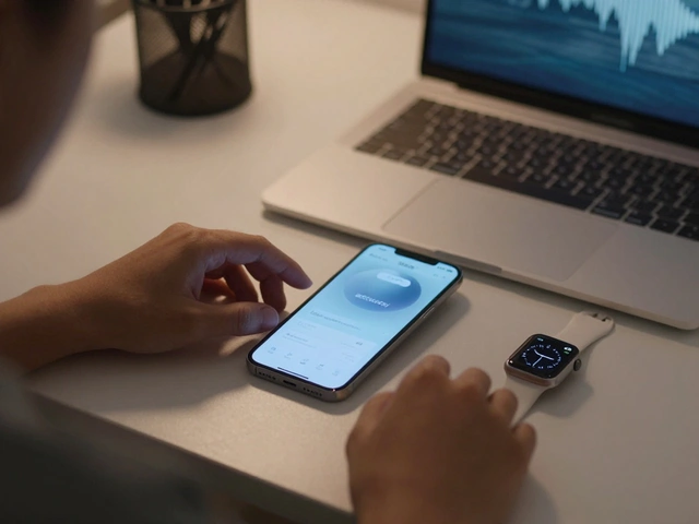
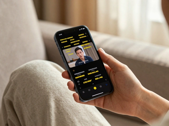
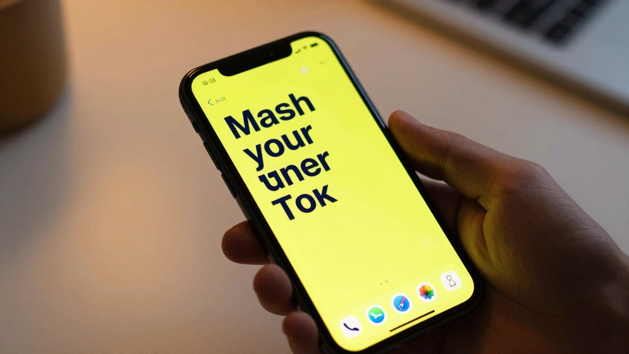
High contrast on Apple devices isn’t one setting. It’s a collection of tools that work together. The most obvious one is Invert Colors. Flip the screen: white text on black background instead of black on white. For many people with low vision, this reduces glare and makes text pop. But it’s not for everyone. Some users prefer Grayscale, which removes color entirely. Why? Because distinguishing between reds, greens, or blues can be hard when vision is blurry. Grayscale turns everything into shades of gray, making shapes and edges clearer. Then there’s the Accessibility Reader, introduced in 2025. This isn’t just a zoom tool. It lets you change font type, size, spacing, text color, and background color-all in one place. You can set it to a deep navy text on bright yellow, or white on charcoal. It works everywhere: Messages, Safari, Mail, even third-party apps. You don’t need to adjust each app individually. Apple made it system-wide so your preferences follow you from iPhone to Mac to Vision Pro.Focus Indicators: Seeing What You’re Tapping
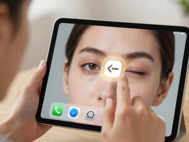
Ever tried clicking a button but weren’t sure if it was the right one? For people with low vision, this uncertainty is constant. That’s where focus indicators come in. On iPhone and iPad, when you navigate with a pointer or keyboard, a subtle highlight moves with your selection. But on Apple Vision Pro, it’s different. The focus highlight isn’t just a border-it’s a soft, glowing outline that follows your gaze. It’s designed to help you know exactly where your attention is in a 3D space. The Pointer Control settings let you adjust the size, color, and trail of the pointer. You can make it thicker, change it to bright red, or even add a trailing glow so you can track its movement. This matters because when everything on screen is magnified or inverted, small visual cues disappear. Focus indicators replace those cues.Zoom: Magnification That Goes Beyond the Screen
Apple’s Zoom feature isn’t just a magnifier. It’s a full-screen magnification tool that works across all apps. On iPhone, you can triple-click the side button to turn it on and off instantly. But on Vision Pro, it does something remarkable: it magnifies your real-world view. Point your head at a street sign, a menu in a restaurant, or a label on a medicine bottle-and Zoom enlarges it in real time. The device’s outward-facing cameras capture what you’re looking at, and the display renders it larger, clearer, and with adjustable contrast. This isn’t just useful for reading. It helps people identify faces, recognize objects, or navigate unfamiliar spaces. And it’s not limited to Vision Pro. On Mac, you can use Zoom to magnify the entire desktop, with smooth panning as you move your cursor. On Apple Watch, it even works for reading small text on apps like Weather or Stocks.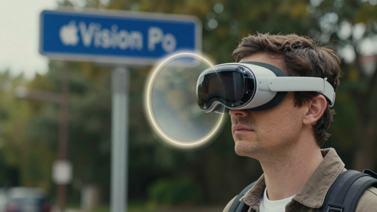
The Magnifier App: A Dedicated Tool for Real-World Clarity
In 2025, Apple brought the Magnifier app to Mac. It was already on iPhone and iPad, but now it’s available on desktop too. The Magnifier uses your Mac’s camera to act like a digital magnifying glass. You can adjust brightness, contrast, and color filters. Freeze the image. Add a crosshair to pinpoint exact spots. Use it to read a printed receipt, check the expiration date on a pill bottle, or examine a photo. Unlike Zoom, which enlarges the whole screen, Magnifier isolates a small area. It’s designed for precision tasks. And because it syncs with your iCloud account, your preferred settings transfer to your iPhone or iPad automatically.Control Center: Quick Access to What Matters
You shouldn’t have to dig through menus every time you need to adjust contrast or turn on Zoom. Apple’s Control Center lets you customize which accessibility tools appear at the tap of a finger. Go to Settings > Control Center > Customize Controls, and add Invert Colors, Grayscale, Zoom, or Accessibility Reader as quick toggles. Some users set up a triple-click shortcut-pressing the side button three times-to toggle between their most-used settings. You could make it switch from Grayscale to High Contrast to Zoom in one motion. It’s about reducing friction. Every extra tap is a barrier.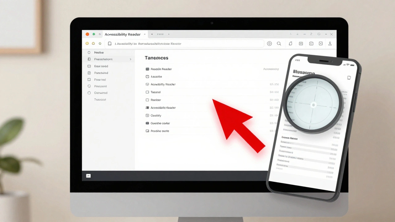
Accessibility Nutrition Labels: Know What You’re Downloading
Not all apps support high contrast or focus indicators. Some use custom buttons that don’t respond to system-wide settings. That’s why Apple introduced Accessibility Nutrition Labels in 2025. Before you download an app, you can see exactly which accessibility features it supports: Does it work with VoiceOver? Does it respect system contrast settings? Does it have focus indicators? This transparency changes how people choose apps. Instead of guessing, users can filter for apps that meet their needs. A banking app that doesn’t support high contrast? Skip it. A note-taking app with full focus indicator support? Download it. This turns accessibility from a feature into a selection criterion.It’s Not Just About Tools-It’s About Consistency
What makes Apple’s approach powerful isn’t the number of features. It’s that they work together. If you set your contrast settings on your iPhone, they sync to your iPad and Mac. Your Zoom preferences follow you to Vision Pro. Your Magnifier settings are the same across devices. This consistency matters because low vision users don’t switch between devices-they live across them. Apple doesn’t leave it up to developers to reinvent the wheel. Instead, they build the foundation. If an app uses standard UIKit or AppKit components, it automatically inherits system contrast, focus, and text settings. That means even small apps from indie developers can be accessible without extra work.What’s Missing? The Human Layer
Even the best tools can’t replace personal guidance. Apple’s features are powerful, but they’re not intuitive for everyone. Someone with age-related macular degeneration might need help choosing between Invert Colors and Grayscale. A person with cataracts might not realize Zoom can magnify their real-world view. That’s why Apple partners with organizations like Be My Eyes on Vision Pro, connecting users with sighted volunteers via live video. They’ve also started integrating Braille displays across devices and supporting brain-computer interfaces through Switch Control. These aren’t just tech upgrades-they’re bridges between tools and human need.Designing for low vision isn’t about making things bigger or brighter. It’s about giving people control. Control over contrast, control over focus, control over how they interact with the world. Apple’s system-wide, consistent, customizable approach doesn’t just help users-it empowers them. And that’s what accessibility should be.
How do I turn on High Contrast on my iPhone?
Go to Settings > Accessibility > Display & Text Size > Display Accommodations. Toggle on "Invert Colors" or "Grayscale." You can also enable these with a triple-click of the side button if you set it up in Accessibility Shortcut.
Does Zoom work on Apple Vision Pro for real-world objects?
Yes. Vision Pro’s Zoom feature uses its outward-facing cameras to magnify your real-world view. Point at text, signs, or objects, and they appear larger on your display. You can adjust magnification level and contrast directly in the Accessibility settings.
Can I use Focus Indicators with a keyboard on Mac?
Yes. On Mac, when you enable Keyboard Navigation in Accessibility settings, focus indicators appear as a glowing outline around buttons, links, and fields. You can change the color and thickness of this outline in the same menu.
Why doesn’t my third-party app respect my contrast settings?
Some apps use custom UI elements that don’t connect to system accessibility settings. Check the app’s Accessibility Nutrition Label before downloading. If it doesn’t list "High Contrast Support," the developer likely hasn’t implemented it. Contact the developer or look for alternatives that do.
Do I need to set up these features on each Apple device separately?
No. If you’re signed in with the same Apple ID, your Accessibility settings sync across iPhone, iPad, Mac, and Vision Pro. Your preferred contrast, text size, and Zoom settings transfer automatically.