Wolf and Hare

Tag: low vision accessibility

Designing for Low Vision on Apple: High Contrast and Focus Indicators

Designing for Low Vision on Apple: High Contrast and Focus Indicators
  • Elias Voss
  • Elias Voss

15/03
0

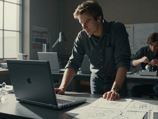
Apple’s high contrast and focus indicator tools help people with low vision navigate their devices with clarity and control. From Invert Colors to Vision Pro’s real-world zoom, these features work seamlessly across all Apple products.

Read More...

Categories

  • Design & Technology (265)
  • Retail Design (15)
  • Design Tools (10)
  • Technology (7)
  • Design & Development (6)

Popular Articles

Reducing Cognitive Load: How Apple Designs for Simpler Decisions

Jan 13 2026

iPad Color Management: Wide Gamut & True Tone for Designers

Aug 17 2026

Apple Watch Accessibility Guide: VoiceOver, Taptic Time, and High-Contrast Settings

May 24 2026

Designing Navigation Hierarchy with Liquid Glass: Context Without Confusion

Aug 17 2026

Captions and Transcripts in Apple Media: Equal Access by Design

Dec 28 2025

Tags

  • Apple design
  • Apple ecosystem
  • industrial design
  • user experience
  • Apple typography
  • Apple Intelligence
  • Liquid Glass
  • inclusive design
  • Apple design philosophy
  • Apple Human Interface Guidelines
  • Apple packaging
  • Jony Ive
  • iOS design
  • unboxing experience
  • iOS 26
  • Apple accessibility
  • sustainable packaging
  • SF Pro
  • UI design
  • San Francisco font
Wolf and Hare

© 2026. All rights reserved.