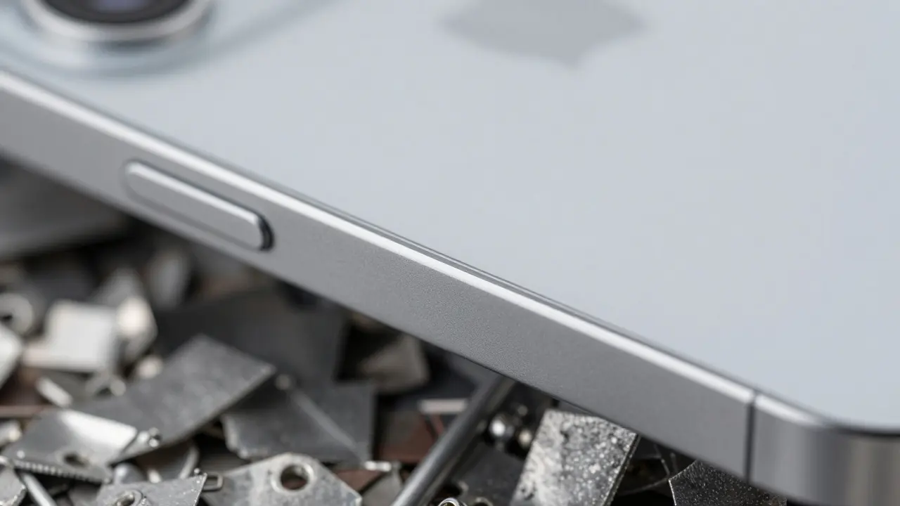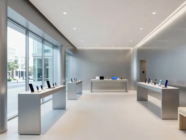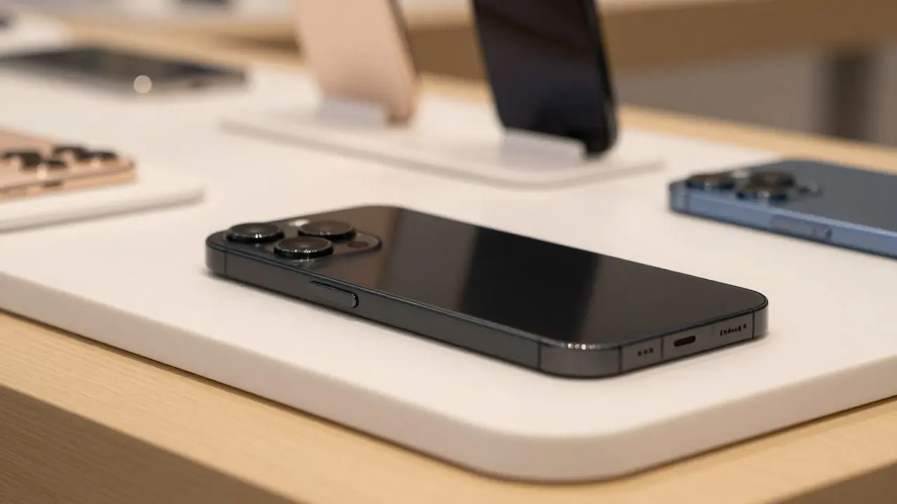

Walk into an Apple Store and look at the lineup of iPhones or MacBooks. You don't just see colors; you see names like "Midnight," "Starlight," "Space Gray," and "Deep Blue." These aren't random labels. They are carefully crafted palette narratives that turn a simple hardware choice into an emotional experience. For designers and marketers, understanding how Apple approaches this is less about aesthetics and more about psychology. It’s about using language to sell a feeling before the customer even touches the device.
The Psychology Behind Material Finish Names
Color naming is a subset of sensory marketing. When Apple names a finish "Starlight" instead of "Light Gold," they are shifting the consumer's mental framework from a commodity (metal) to an experience (the night sky). This technique relies on the association between visual stimuli and memory. A matte black phone isn't just black; it's "Space Black," which evokes mystery, depth, and sophistication. The name does half the work of the product itself.
This approach works because humans process stories faster than data. If you tell someone a laptop is "Silver," they think of a standard office tool. If you call it "Silver with a brushed aluminum texture," you start describing the tactile experience. But if you call it "Galactic Silver," you’ve created a mini-story. The material finish becomes a character in that story. This is why Apple rarely uses generic color codes like "Pantone 432C" in their marketing. They use words that trigger imagination.
Consistency Across Product Lines
One of the most impressive aspects of Apple’s strategy is consistency. The same color name often appears across different product categories, creating a unified ecosystem feel. For example, the "Graphite" or "Space Gray" found on a MacBook Pro is conceptually linked to the "Graphite" iPad. This creates a sense of harmony for users who own multiple devices. It tells them, "These products belong together."
However, this consistency requires rigorous internal standards. Apple’s industrial design team must ensure that the actual pigment and finish match the narrative promise. If a product is named "Ocean Blue," the blue needs to have a certain depth and saturation that feels "oceanic." If the finish looks too bright or too pastel, the narrative breaks. This alignment between name, visual, and tactile reality is what builds trust in the brand.

Crafting Your Own Palette Narratives
You don’t need to be Apple to use this technique. Whether you’re designing a website, a packaging line, or a new product interface, you can apply similar principles. The key is to move away from descriptive labeling and toward evocative labeling. Here is how you can start:
- Identify the Core Emotion: What feeling should the user have when they interact with this color? Is it calm? Energy? Luxury? Trust?
- Find the Metaphor: Look for natural or cultural metaphors that align with that emotion. For calm, think of water, fog, or stone. For energy, think of fire, sunrise, or citrus.
- Test the Tactile Connection: Does the name fit the texture? A glossy finish might suit "Glossy Coral," while a matte finish might suit "Dusty Rose." The name should hint at the physical property.
- Avoid Clichés: While "Midnight" is powerful, it’s also common. Try to find fresh angles. Instead of "Blue," maybe "Glacier" or "Abyss."
For instance, if you are launching a sustainable product line, avoid names that sound industrial. Use names that evoke nature but with a modern twist. "Moss Green" is better than "Green," but "Fern Shadow" adds a layer of specificity and imagery. This helps your audience visualize the product in their lives, not just as an object in a catalog.
The Role of Lighting and Display
Color perception is heavily influenced by lighting conditions. Apple knows this well. Their stores are designed with specific lighting temperatures to make the "Starlight" finish glow softly rather than look yellowish. In digital design, this translates to ensuring your UI colors look consistent across different screens and ambient light levels.
When creating a palette narrative, consider where your audience will see the color. Will it be under harsh office fluorescent lights? Or in a dimly lit living room? A color named "Sunset Orange" might look vibrant in direct sunlight but muddy in shadow. The narrative needs to account for these variations. Sometimes, this means choosing a name that is broad enough to cover slight shifts in appearance, like "Warm Sand" instead of "Beige."
Common Pitfalls in Color Storytelling
Even big brands get this wrong. The most common mistake is over-complicating the name. If a customer has to ask, "Wait, what color is 'Nebula' again?", you’ve lost them. Good color names are intuitive yet intriguing. They should spark curiosity without causing confusion.
Another pitfall is ignoring cultural context. A color that feels "luxurious" in one culture might feel "funereal" in another. Apple mitigates this by keeping their core palettes relatively neutral and global, saving the more specific narrative twists for regional marketing campaigns. For global brands, it’s safer to stick to universal metaphors like sky, earth, and ocean, which carry positive connotations across most major markets.
Implementing Narrative Palettes in Digital Design
In web and app design, color naming affects developer handoff and accessibility. If you name a button color "Primary Action," developers know its function. But if you name it "Vibrant Teal," they understand its aesthetic role. Best practice is to use both. Use semantic names for code variables (e.g., `btn-primary`) and narrative names for design systems documentation (e.g., "Vibrant Teal - High Energy CTA").
This dual approach ensures that the technical team understands the hierarchy, while the marketing team understands the story. It bridges the gap between engineering precision and creative expression. By doing this, you create a shared language that speeds up development and keeps the brand voice consistent across all touchpoints.
Why does Apple use poetic names for colors instead of standard color codes?
Apple uses poetic names to shift the consumer focus from technical specifications to emotional experience. Names like 'Midnight' or 'Starlight' create associations with luxury, mystery, or elegance, making the product feel more personal and aspirational than a simple 'Black' or 'Gold' would.
How can small businesses apply Apple's color naming strategy?
Small businesses can start by identifying the core emotion of their brand and finding a metaphor that matches it. For example, a coffee shop might name its logo color 'Morning Mist' instead of 'Light Gray.' Consistency across all materials and digital assets is key to making the narrative stick.
Does color naming affect sales conversion rates?
Yes, indirectly. Strong color narratives increase perceived value and reduce decision fatigue. When customers feel a connection to a color name, they are more likely to choose that variant over a generic alternative, leading to higher engagement and potentially higher average order values.
What are some examples of bad color naming?
Bad color naming occurs when the name is confusing, culturally insensitive, or inconsistent with the visual appearance. For example, calling a bright orange 'Autumn Leaf' might be misleading if the shade is too neon. The name should always support, not contradict, the visual reality.
How do I test if my color narrative works?
Show the color and name to a small group of target users without explaining the meaning. Ask them what they feel when they see it. If their feedback aligns with your intended emotion, the narrative is working. If they are confused or indifferent, you may need to refine the name or the color itself.