Tag: Apple typography - Page 2
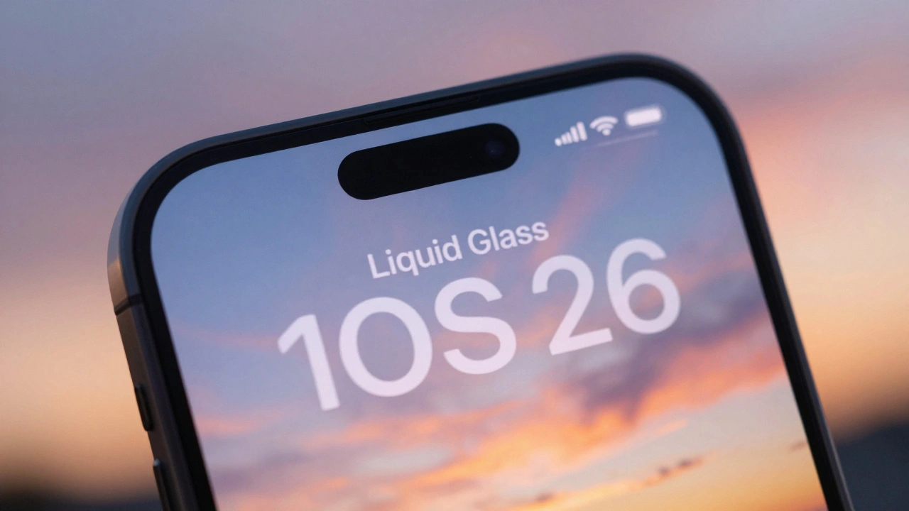
Typography and Liquid Glass: Contrast and Blur Considerations for Text in iOS 26

26/12
0
Apple's Liquid Glass design in iOS 26 creates stunning visuals but undermines text readability. Learn why contrast and blur break accessibility-and how to fix it.
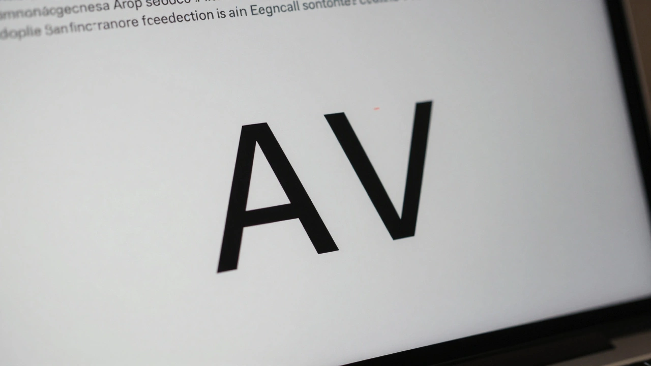
Micro-Typography on Apple: Kerning, Tracking, and Optical Alignment Explained
25/12
0
Apple's micro-typography-kerning, tracking, and optical alignment-creates the seamless text experience on iOS and macOS. Learn how these systems work together to make text look natural, readable, and polished across all device sizes.