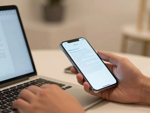

Ever stared at a beautifully designed app interface only to feel a subtle visual dissonance? It’s rarely the colors or the icons. Usually, it’s the text. On Apple platforms, where Apple Typography is a set of guidelines and system fonts designed to ensure consistency and readability across iOS and macOS, the devil is in the details. Specifically, in how your text aligns with the underlying structure of the screen.
We often talk about aesthetics, but we forget that reading is a physical act. Your eyes move in patterns. If those patterns clash with the rigid geometry of a smartphone or desktop window, cognitive load spikes. The reader gets tired. They stop engaging. This is where typographic rhythm comes in. It’s not just about making things look neat; it’s about creating a predictable, comfortable flow for the human eye.
Why Baseline Grids Matter More Than You Think
A baseline grid is an invisible horizontal ruler that dictates where every line of text sits. In print, this has been standard practice for centuries. In digital interfaces, especially on high-resolution Retina displays, it’s equally critical. Without a consistent baseline, multi-column layouts or mixed font sizes create a jagged, chaotic edge that distracts from the content.
On iOS and macOS, you don’t have to build this from scratch. The operating systems provide built-in support. However, understanding the mechanics helps you debug when things look "off." The core concept is simple: every character sits on a specific line, called the baseline. When you stack lines of text, these baselines should align perfectly with a global grid unit. If one paragraph uses a 16px font and another uses 14px, their baselines might not land on the same grid line unless you adjust the line height carefully.
This alignment creates what designers call "visual harmony." It signals to the brain that the interface is stable and organized. For developers using SwiftUI or AppKit, this means paying attention to the `lineSpacing` and `minimumScaleFactor` properties. For pure designers, it means ensuring that your mockups respect a consistent vertical unit, often derived from the primary body text size.
The Sweet Spot: Calculating Optimal Line Lengths
If the baseline grid controls the vertical rhythm, line length controls the horizontal experience. How many characters fit between the left and right margins? This number matters more than most people realize. Too short, and your eyes constantly jump back to the start of the next line (called "bouncing"). Too long, and your eyes lose their place, struggling to find the beginning of the next line.
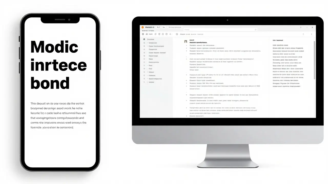
The industry standard, rooted in centuries of typesetting tradition, suggests a line length of 45 to 75 characters. This includes spaces and punctuation. On a modern iPhone with a width of roughly 390 logical points, achieving this range requires careful margin management. If your body text is 17pt (the default iOS body size), you’ll likely need generous side margins to keep the line length under control.
On macOS, the situation is different. Desktop screens are wider. A full-width text column can easily exceed 100 characters, which is exhausting to read. Here, you must actively constrain the text container. Use a max-width property in your CSS-like logic or frame constraints in Swift. Aim for that 65-75 character sweet spot. It feels spacious yet focused. It respects the reader’s attention span without forcing them to scroll horizontally or squint.

Platform-Specific Nuances: iOS vs. macOS
While the principles are universal, the execution differs significantly between the two major Apple platforms. Ignoring these differences leads to interfaces that feel clunky or inconsistent.
| Attribute | iOS (iPhone/iPad) | macOS |
|---|---|---|
| Default Body Size | 17pt | 13pt |
| Typical Line Height | ~22-24pt (1.3-1.4x) | ~18-20pt (1.4-1.5x) |
| Max Recommended Chars/Line | 45-60 (due to narrow screens) | 65-75 (constrained columns) |
| Grid Unit Basis | Dynamic Type scale | Fixed point sizes |
Notice the difference in default sizes. iOS prioritizes touch targets and readability at arm's length, hence the larger 17pt base. macOS assumes closer viewing distance and higher precision, allowing for smaller 13pt text. This impacts your grid. If you use a 4pt grid unit on iOS, your line heights must be multiples of 4 (e.g., 20pt, 24pt). On macOS, a 3pt or 4pt grid works well, but the absolute values are smaller.
Also consider Dynamic Type. iOS allows users to change text size globally. If your layout relies on fixed pixel heights for text containers, it will break when a user increases their accessibility settings. Instead, let the text dictate the height, and ensure your baseline grid scales accordingly. This flexibility is a hallmark of good iOS Human Interface Guidelines compliance.
Practical Steps for Implementing Rhythm
How do you actually apply this in your workflow? You don’t need complex math software. You need discipline and a few simple tools.
- Choose Your Base Unit: Start with your body text size. If it’s 17pt, decide if your grid unit is 4pt or 5pt. 4pt is common because it divides evenly into 16, 20, 24, etc.
- Set Line Heights as Multiples: Ensure your line height is a multiple of your grid unit. If your grid is 4pt, use 20pt or 24pt line heights. Avoid 22pt if it breaks the grid alignment for adjacent elements.
- Constrain Horizontal Width: In Figma or Sketch, draw a guide box around your text. Count the characters. If it’s over 75, widen the margins. If it’s under 45, narrow them.
- Test with Mixed Content: Add headers, captions, and buttons. Do they align with the text baselines? If a button sits above a paragraph, does its bottom edge align with the text baseline or the grid line? Consistency here is key.
- Validate on Device: Mockups lie. Real devices have bezels, safe areas, and varying resolutions. Test your layout on a physical iPhone and Mac. Does the rhythm hold up?
A pro tip: Use a plugin or feature in your design tool that overlays a baseline grid. Most professional design software now supports this. Toggle it on while designing. If your text doesn’t snap to the grid, fix it before exporting. It saves hours of debugging later.
Common Pitfalls and How to Avoid Them
Even experienced designers make mistakes here. The most common error is ignoring the interaction between font metrics and grid units. Not all fonts have the same ascender and descender heights. A serif font like New York (Apple’s system serif) has different vertical proportions than San Francisco (the system sans-serif). If you switch fonts without adjusting the line height, your baseline alignment will drift.
Another trap is over-constraining. Sometimes, perfect grid alignment forces awkward spacing between sections. Don’t sacrifice usability for purity. If a gap looks too large, consider adjusting the section padding rather than distorting the text line height. The goal is rhythm, not rigidity.
Finally, neglecting the mobile context. On small screens, line length is naturally constrained. But if you add excessive padding, you might end up with lines that are too short, causing excessive bouncing. Balance is everything. Test your smallest screen size first. If it works there, it will almost certainly work on larger screens with adjusted margins.
Frequently Asked Questions
What is the ideal line height for body text on iOS?
For the default 17pt body text on iOS, a line height of 22pt to 24pt is generally recommended. This provides a ratio of approximately 1.3 to 1.4, which balances readability with space efficiency. Always ensure this value aligns with your chosen baseline grid unit.
How do I handle Dynamic Type without breaking my baseline grid?
Use relative units instead of fixed pixels for your grid calculations where possible. In code, leverage system-provided metrics that scale with Dynamic Type. In design, test your layout at the largest accessible text size. If the grid breaks, increase your grid unit or allow for flexible spacing between components rather than forcing fixed heights.
Is a 4pt grid better than an 8pt grid for Apple interfaces?
A 4pt grid offers more granularity and is often preferred for detailed typographic alignment. An 8pt grid is coarser and easier to manage but may result in less precise baseline alignment for smaller text sizes. Many teams use a hybrid approach: 4pt for fine-tuning text and 8pt for larger structural blocks.
Why does my text look misaligned even though the line heights are correct?
This is usually due to font metric variations. Different fonts have different internal leading (space above and below the glyphs). Check if you are mixing fonts with significantly different x-heights or ascenders. Adjust the line height slightly for each font family to ensure visual baseline alignment, even if the mathematical values differ.
Should I use the same line length rules for headings and body text?
No. Headings are typically shorter and can benefit from tighter line lengths (30-40 characters) to create emphasis and hierarchy. Body text requires longer lines (45-75 characters) for sustained readability. Applying body text rules to headings often makes them look weak and unbalanced.



Categories
Popular Articles