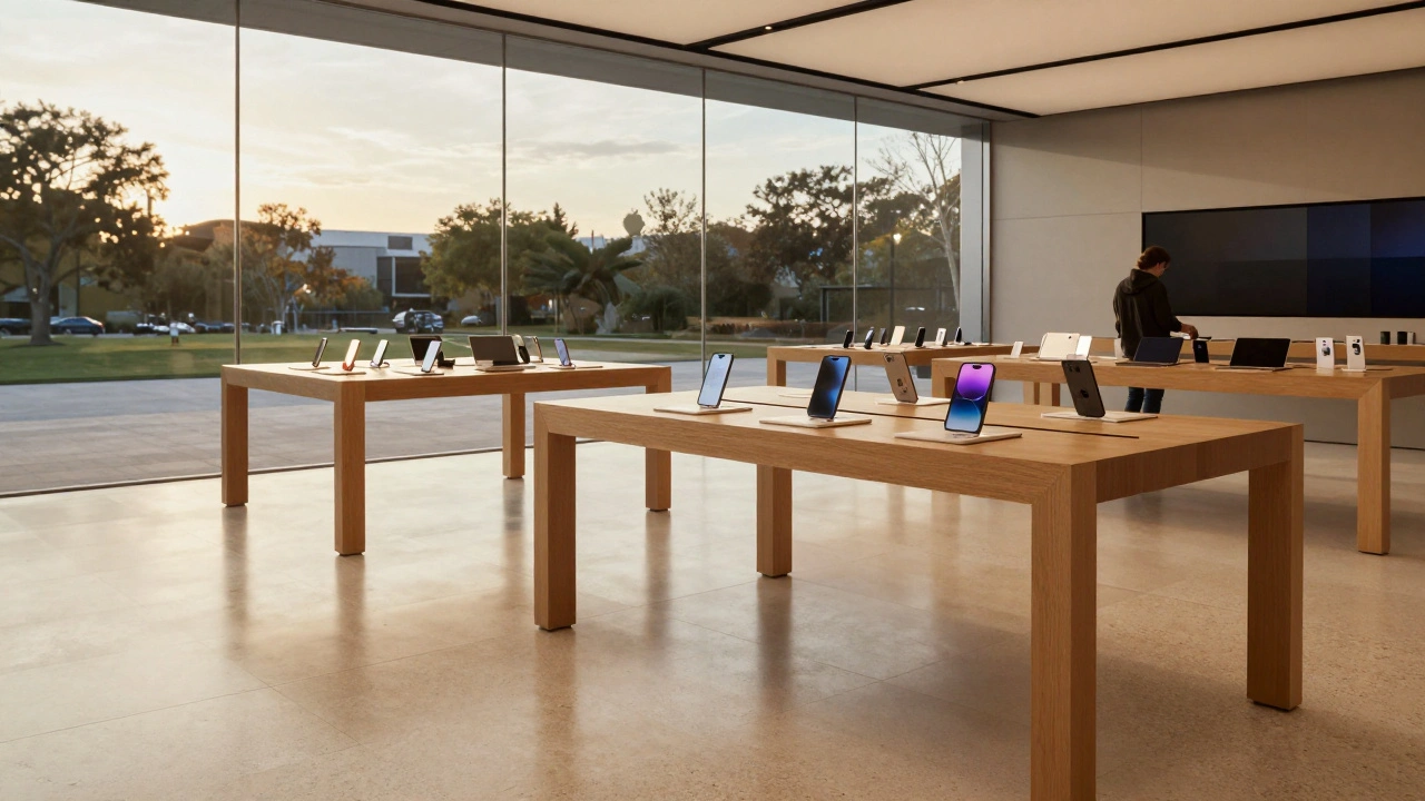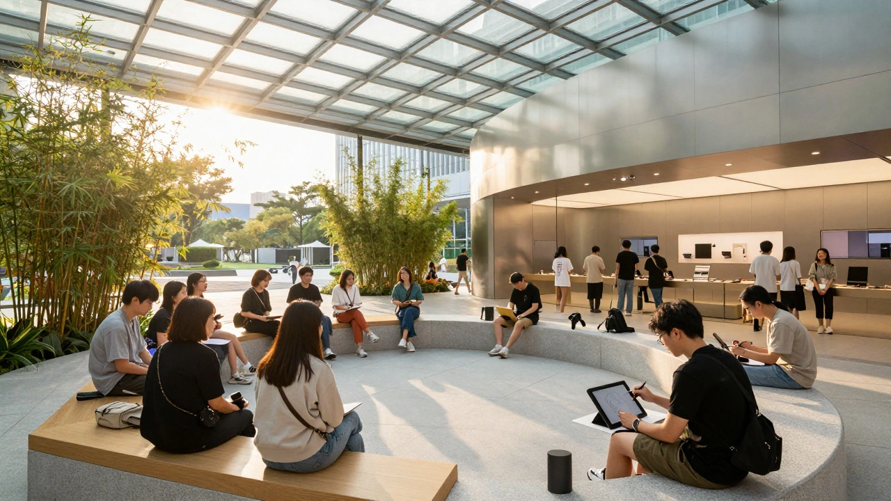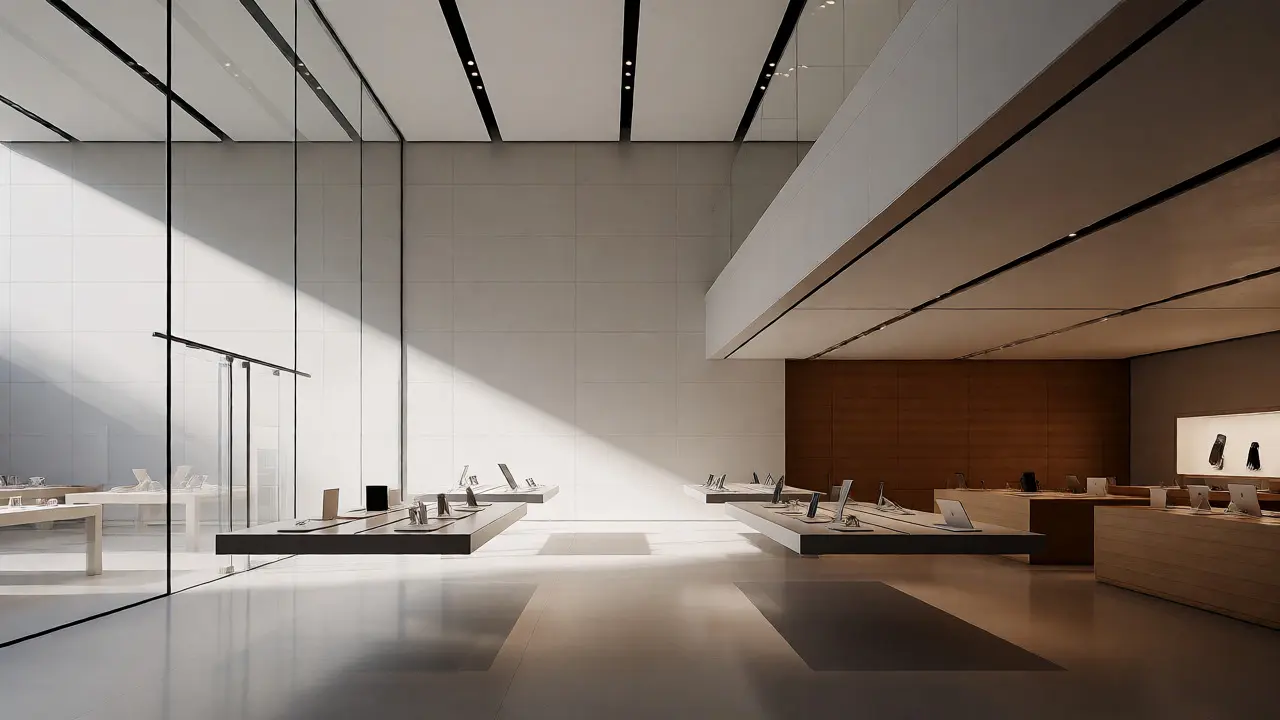

You walk into an Apple Store. The air feels different. It’s not just the temperature control or the scent of new electronics; it’s the silence that isn’t really silent. It’s a visual quietness. There are no screaming red sale tags, no cluttered end-caps, and no chaotic posters taped to glass. Instead, you see massive walls of wood, floating tables, and screens that seem to breathe. This is the result of decades of obsessive refinement in Apple retail graphics, where typography, imagery, and motion work together to turn a store into a product itself.
Most retailers treat their physical space as a warehouse for goods. Apple treats its space as a stage. If you’re a designer, a brand strategist, or just someone who wonders why those stores feel so expensive yet inviting, you need to look under the hood. We aren’t talking about logo placement here. We’re talking about how a specific font size on a wall can change your perception of price, or how a three-second video loop can make a phone feel like magic.
The Typography of Trust: Why San Francisco Rules the Walls
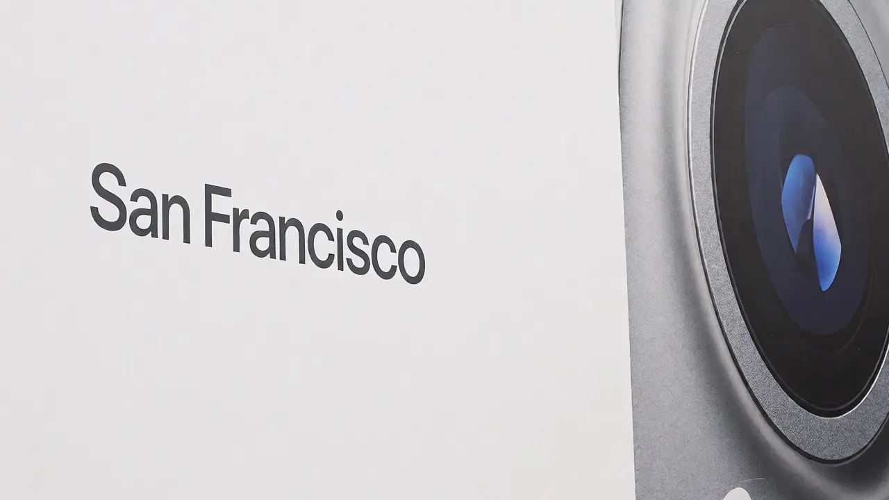
Open any Apple brochure from the early 2000s and you’ll see Helvetica Neue everywhere. Clean, yes. But by 2014, Apple realized Helvetica was too generic for their evolving hardware. They needed something that could handle tiny text on a watch face and massive headlines on a storefront window without losing character. Enter San Francisco, a custom typeface designed specifically for readability across all Apple devices and environments.
In physical retail, typography does more than convey information; it sets the cognitive load. When you read a product spec sheet on a wall in an Apple Store, you aren’t squinting. The kerning (spacing between letters) is optimized for distance viewing. The weight is consistent. This reduces friction. If you have to work hard to read a label, you subconsciously associate that effort with the product’s complexity or quality.
- Hierarchy: Headlines use bold weights to grab attention from 20 feet away. Body text uses regular weights for close-up reading at the table level.
- Consistency: The same font family appears on the iPhone screen, the website, and the printed card next to the display unit. This creates a seamless omnichannel experience.
- Negative Space: Text never crowds the edges. Ample white space around words signals luxury and confidence. Cheap brands fill every inch of space; confident brands let their words breathe.
Notice how they rarely use all-caps for body copy. All-caps slows down reading speed because we recognize word shapes, not individual letters. By using sentence case, Apple ensures you scan information quickly, keeping you moving through the store rather than stopping to decode a message.
Imagery That Doesn’t Compete With Reality
Walk past a Best Buy or a Walmart, and you’ll see images that shout. Bright colors, action shots, models smiling unnaturally at cameras. Apple’s approach to retail imagery is radically different. Their photography focuses on texture, light, and context. They don’t show you a person running with an iPhone; they show the iPhone itself, often isolated against a neutral background or placed in a minimalist lifestyle setting.
This strategy works because the product is the hero. In a digital world saturated with stock photos, authenticity stands out. Apple’s in-store displays often feature high-resolution macro shots of device materials-the grain of aluminum, the depth of glass. These images invite touch. You want to reach out and verify what your eyes are seeing.
| Feature | Traditional Retailer | Apple Retail |
|---|---|---|
| Color Palette | High saturation, multiple brand colors | Neutral tones (white, grey, wood) with product color accents |
| Image Focus | Lifestyle scenarios, emotional appeals | Product detail, material texture, minimal context |
| Lighting | Uniform fluorescent overhead lighting | Directional spotlights highlighting specific zones |
| Information Density | High (price tags, features, reviews) | Low (minimal specs, QR codes for details) |
Another key element is the lack of human faces in most promotional imagery. Humans are distracting. Our brains are wired to look at other people’s faces. By removing faces, Apple forces your eye to rest on the object. You stop looking at the model wearing the Watch and start looking at the Watch itself.
Motion Graphics: The Invisible Salesperson
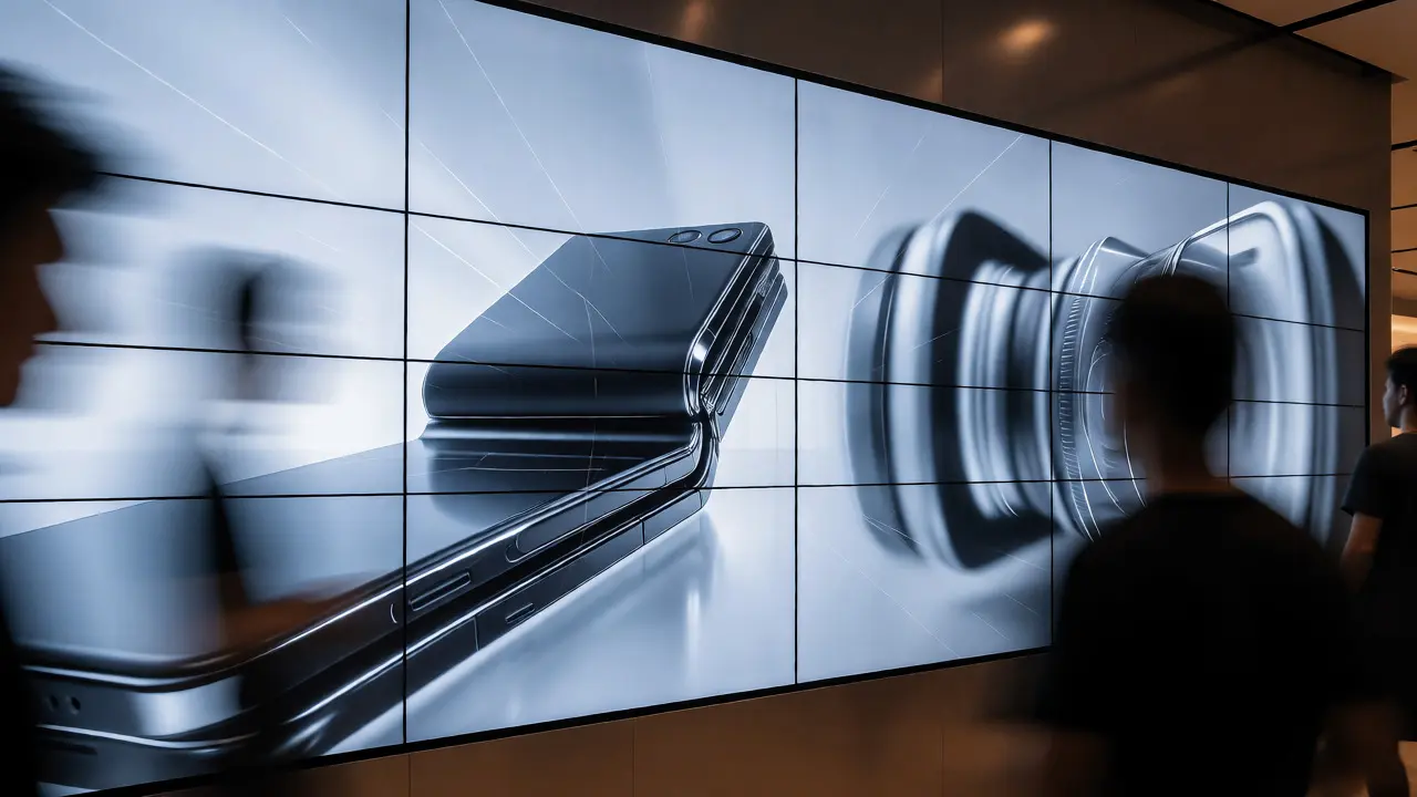
If typography is the voice and imagery is the face, then motion is the personality. Apple Stores are filled with large-format LED screens and smaller iPad-based displays on each table. These aren’t just looping videos; they are carefully choreographed animations known as splash screens.
These animations serve a critical function: demonstration without interruption. A static image of a folding phone doesn’t explain how it folds. A video does. But if the video has sound, it contributes to noise pollution. Apple’s motion graphics are almost always silent. They rely on smooth transitions, parallax effects, and subtle movements to guide your eye.
Consider the "Pro" series launches. The screens might show a camera lens zooming in, followed by a photo appearing. This mimics the user experience. It’s not telling you "This has a great camera." It’s showing you the capability. This is called "show, don't tell," taken to its logical extreme in physical space.
- Pacing: Animations move slowly enough to be understood but fast enough to keep interest. Typically, a loop lasts 15-30 seconds.
- Sync: On multi-screen walls, animations are synchronized. If one screen shows a swipe left, the adjacent screen continues the gesture. This creates a cohesive environment rather than disjointed billboards.
- Interactivity: Some displays react to proximity sensors. As you approach, the animation might shift from a wide shot to a close-up, creating a sense of personal engagement.
Spatial Branding: How Materials Talk
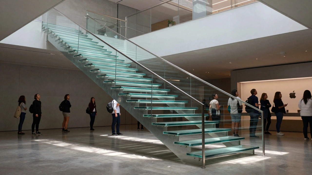
You can’t separate graphics from the physical substrate. In traditional retail, graphics are applied to surfaces-vinyl on glass, paper on cardboard. In Apple Stores, the architecture *is* the graphic. The use of Corian countertops, oak wood fixtures, and glass staircases provides a canvas that enhances the digital content displayed on them.
The color temperature of the lighting interacts with the printed materials. Apple uses warm-toned LEDs to complement the natural wood tones, creating a cozy, library-like atmosphere despite the high-tech products. Contrast this with the cool, blue-white lighting of many tech competitors, which feels clinical and sterile.
Signage is also integrated. Directional signs aren’t hanging from the ceiling on wires. They are etched into glass or embedded in stone. This permanence suggests stability and trustworthiness. When a brand invests in heavy, permanent materials for its wayfinding, it signals that it intends to stay. It’s a subtle psychological cue that reduces purchase anxiety.
The Role of Data in Visual Merchandising
How does Apple know which graphics work? They don’t guess. They track everything. Using computer vision and Wi-Fi tracking, Apple analyzes foot traffic patterns. Where do people stop? Which displays draw the longest dwell times?
This data informs future design iterations. If customers consistently bypass a certain display zone, Apple might change the lighting angle, swap the product placement, or update the motion graphic loop. It’s a feedback loop between physical space and digital analytics.
For designers, this highlights a crucial lesson: your physical graphics are not static art pieces. They are dynamic interfaces. They should be tested, measured, and refined based on real-world behavior. A beautiful poster that no one looks at is a failed design, regardless of its aesthetic merit.
Implementing Apple-Level Graphics in Your Space
You don’t need a billion-dollar budget to apply these principles. Start small. Audit your current signage. Is the font legible from five feet away? Are there too many competing messages? Can you remove half the text and still convey the core value?
Focus on consistency. Choose one primary font family and stick to it. Use a limited color palette. Ensure your images reflect the reality of your product, not an idealized fantasy. And consider adding motion-even a simple GIF on a tablet screen can increase engagement significantly compared to a static printout.
Remember, the goal isn’t to copy Apple exactly. It’s to understand the underlying philosophy: respect the customer’s attention span. Every pixel, every word, and every movement in your physical space should earn its place. If it doesn’t help the customer decide, buy, or enjoy, cut it.
Why does Apple use so much white space in its retail graphics?
White space reduces cognitive load. It allows the eye to rest and directs focus to the product. In a cluttered retail environment, negative space signals premium quality and confidence, implying the brand doesn’t need to shout to be heard.
What font does Apple use in its stores?
Apple primarily uses its proprietary typeface, San Francisco. Before 2014, they used Helvetica Neue. San Francisco was designed for optimal readability on both small screens and large physical signage, featuring variable widths and optical sizes.
Do Apple Store displays include audio?
Generally, no. Most in-store video loops and motion graphics are silent. This prevents noise pollution and allows customers to engage with the visuals without auditory distraction. Audio is typically reserved for specific demo areas or Genius Bar interactions.
How does lighting affect Apple's retail graphics?
Apple uses directional, warm-toned LED lighting to highlight products and create contrast. This lighting enhances the visibility of graphics and textures, making materials like aluminum and glass appear more vibrant and tactile compared to uniform fluorescent lighting.
Can I use Apple's design principles for a small business?
Absolutely. Key principles include using a single clean font, minimizing text, focusing on high-quality product imagery, and ensuring ample negative space. You don’t need custom fonts or expensive materials; clarity and consistency are free.