Category: Design & Technology - Page 9
MacBook Camera and Mic Privacy: Indicator Cues and Hardware Integration
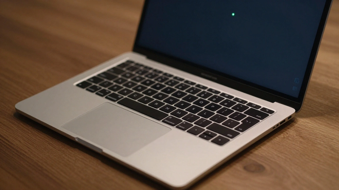

MacBook camera and mic privacy indicators show when apps access your hardware. Learn how the green and orange dots work, how to manage permissions, and why Apple built this into the chip level for real privacy.
How Apple Watch Integrates with iPhone: Ecosystem Handshakes by Design
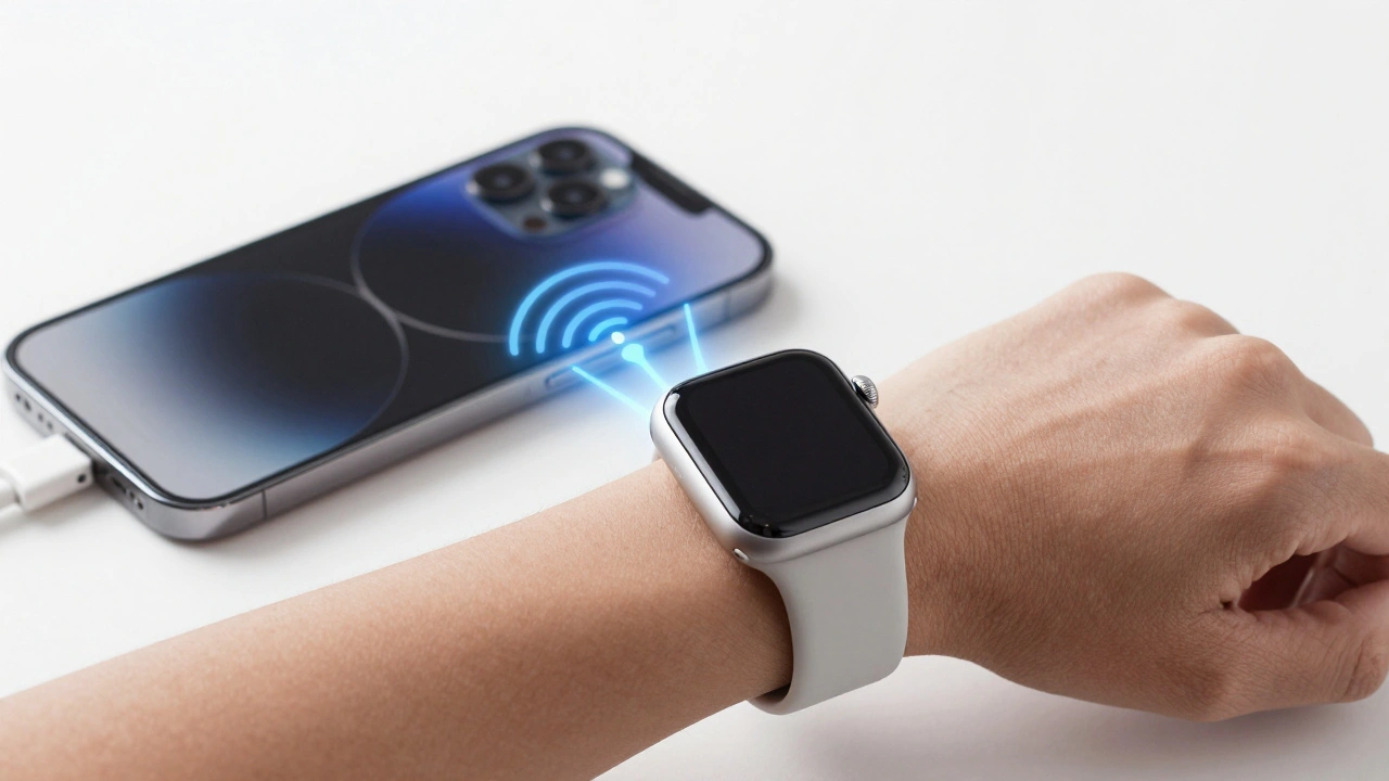
The Apple Watch and iPhone are designed to work together, not separately. From notifications to health tracking, their seamless integration creates a smarter, faster experience that neither device could deliver alone.
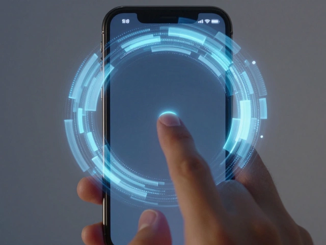
Liquid Glass on iPhone: How Translucent Controls Keep Focus on Content
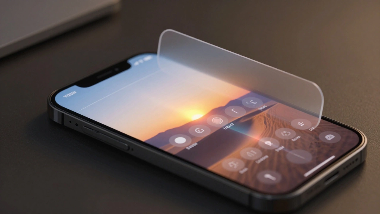
Liquid Glass on iPhone is Apple's new interface design that uses dynamic translucency to keep content front and center while making controls feel alive. It responds to light, motion, and touch-making every interaction smoother and more intuitive.
Prototype to Perfection: How Apple Masters Packaging Design Through Iteration
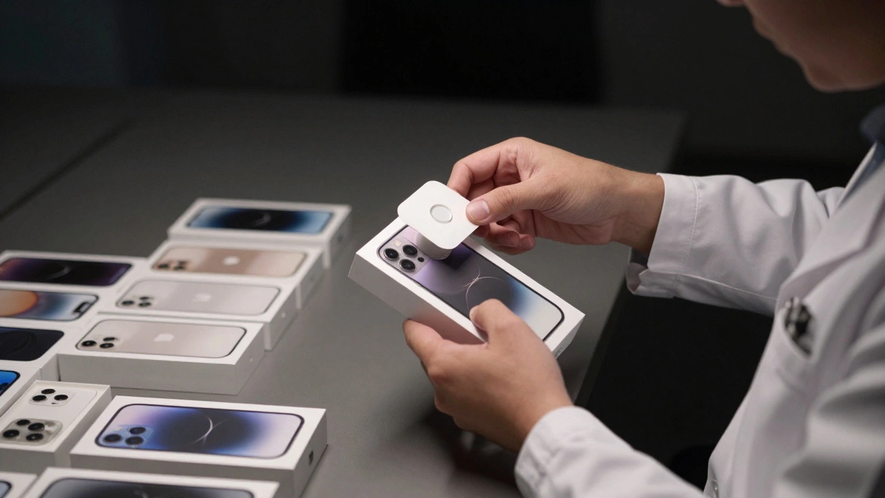
Apple doesn't just design products-they design the moment you first open them. Discover how thousands of hours of prototype testing turn a simple box into a premium experience that shapes brand perception before you even touch the device.
Sustainable Design Strategy: How Apple Lowers Carbon Without Cutting Quality
Apple cuts carbon emissions by 60% since 2015 without sacrificing product quality. Learn how recycled materials, clean energy, and durable design make sustainability work - without compromise.
Water Resistance by Design: Interface Cues for Swim and Rain Scenarios
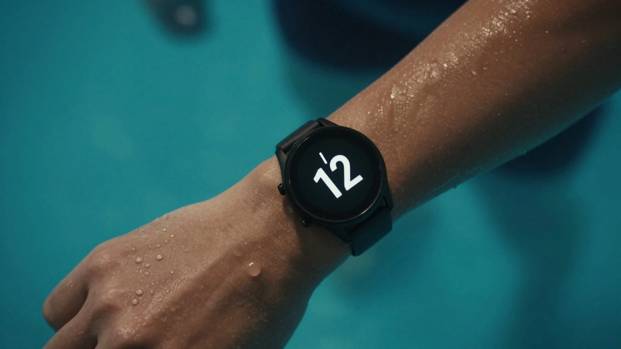
Water-resistant watches aren't just built to survive water - they need interfaces that work in it. Learn how swim and rain scenarios demand tactile buttons, visual cues, and smart modes that actually help users, not hinder them.
Adaptive Tab Bars in iOS 26: How Shrinking and Expanding with Liquid Glass Motion Changes Navigation
iOS 26's adaptive tab bar shrinks and expands with Liquid Glass motion, but this flashy design sacrifices predictability. Users and developers are struggling with disappearing controls, confusing search tabs, and broken navigation habits.
Square vs. Round Watch Displays: Why Apple Chose Rectangular for Better Readability
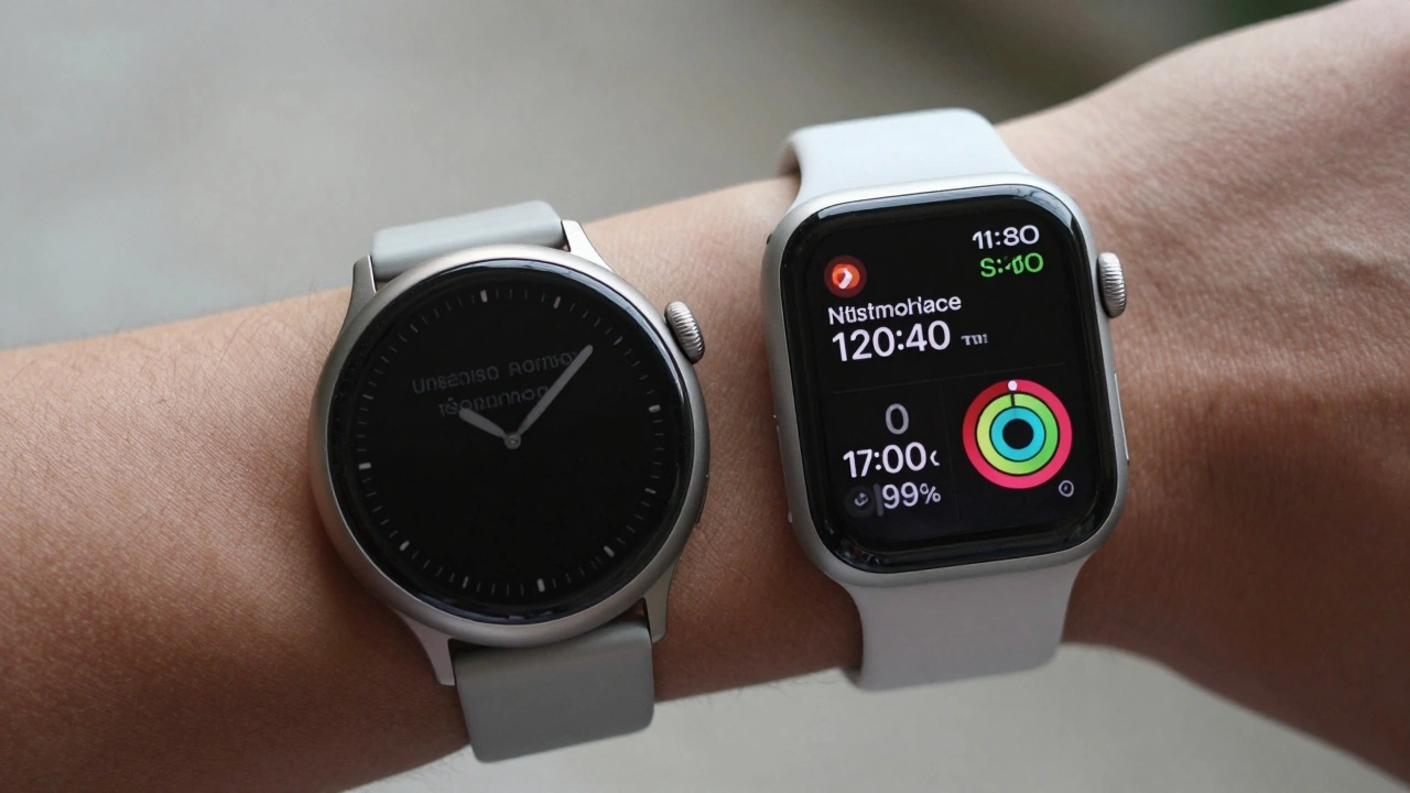
Apple chose a rectangular watch face not for style, but because it shows more information clearly, uses screen space efficiently, and works better with real-world data like messages, calendars, and health stats. Round watches waste pixels and force scrolling. The math doesn’t lie.
Switching Costs in Apple’s Ecosystem: How Design Choices Lock You In
Apple doesn't just sell devices - it sells a locked-in experience. From iCloud to custom chips, every design choice makes leaving harder than staying. Here's how Apple turns convenience into loyalty.
Icon Composer for Apple Platforms: Build Multi-Layer Icons with Dynamic Lighting in Xcode 26
Icon Composer in Xcode 26 lets you build dynamic, multi-layered app icons with Liquid Glass effects for all Apple platforms. No more manual exports-just one file that adapts to light, dark, and mono modes automatically.
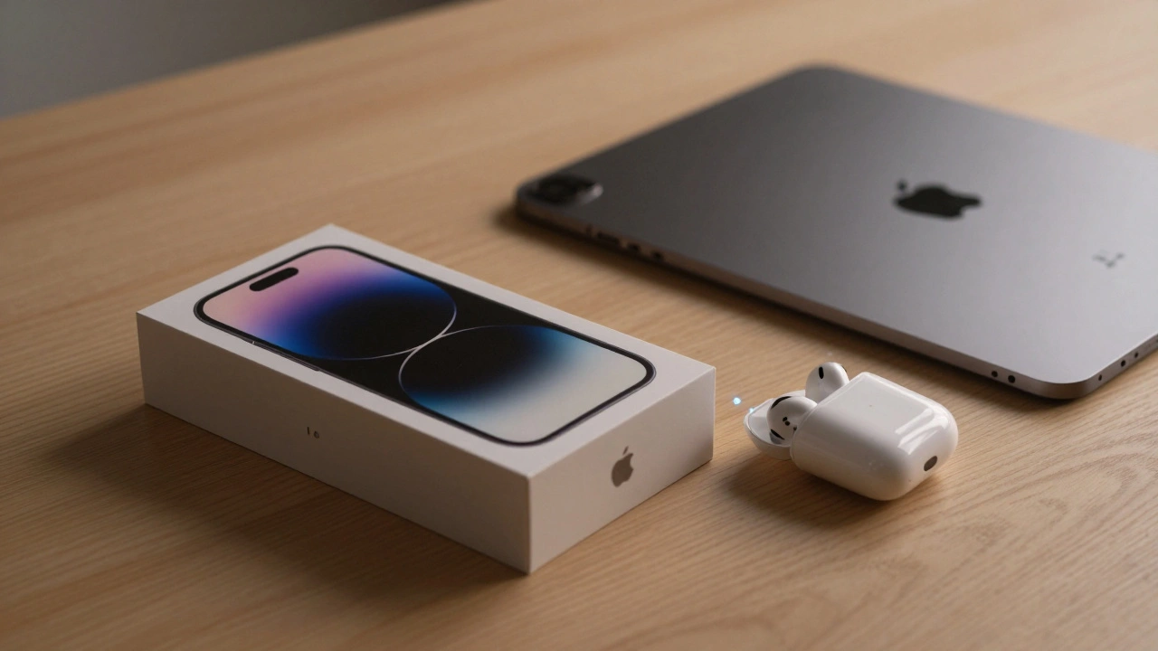
Friction and Drag in Apple Packaging: How Lids Create Ritual and Delight
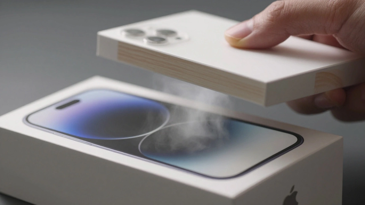
Apple’s packaging isn’t about protection-it’s about creating a ritual. Through engineered friction, sound, and texture, the unboxing experience turns a simple act into a memorable moment that builds brand loyalty and emotional connection.
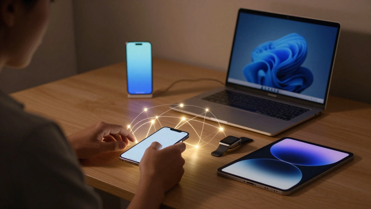
Ecosystem Onboarding: How Apple Makes Device Pairing Feel Like Magic
Apple's ecosystem onboarding turns device setup into a seamless, intuitive experience that feels like magic. From automatic pairing to service integration, learn how Apple makes connecting devices effortless - and why it works so well.
Categories
Popular Articles