Category: Design & Technology - Page 6
How Apple Uses Motion and Depth to Show Interface Hierarchy

Apple uses motion and depth-not color or size-to silently guide users through interfaces. By blending subtle shadows, fluid transitions, and translucent layers, Apple makes hierarchy feel intuitive, not forced. This approach reduces clutter and keeps focus on content.
Strategic CMF Choices: Materials That Signal Performance and Sustainability at Apple
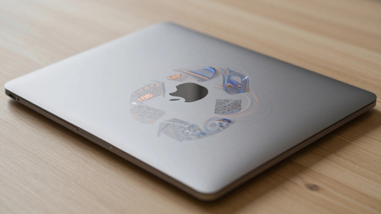
Apple’s CMF strategy redefines premium design by using 100% recycled aluminum, cobalt, copper, and rare earth elements without sacrificing performance. From the MacBook Air M3 to the Restore Fund, materials now tell a story of sustainability and innovation.
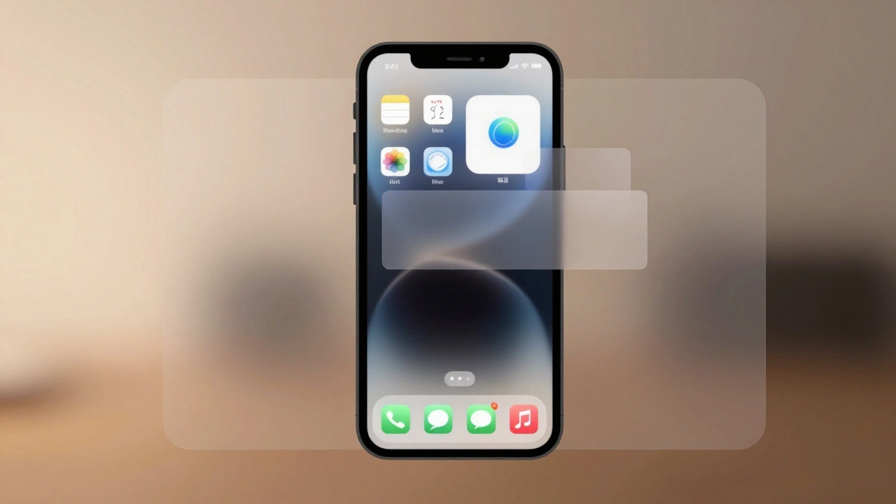
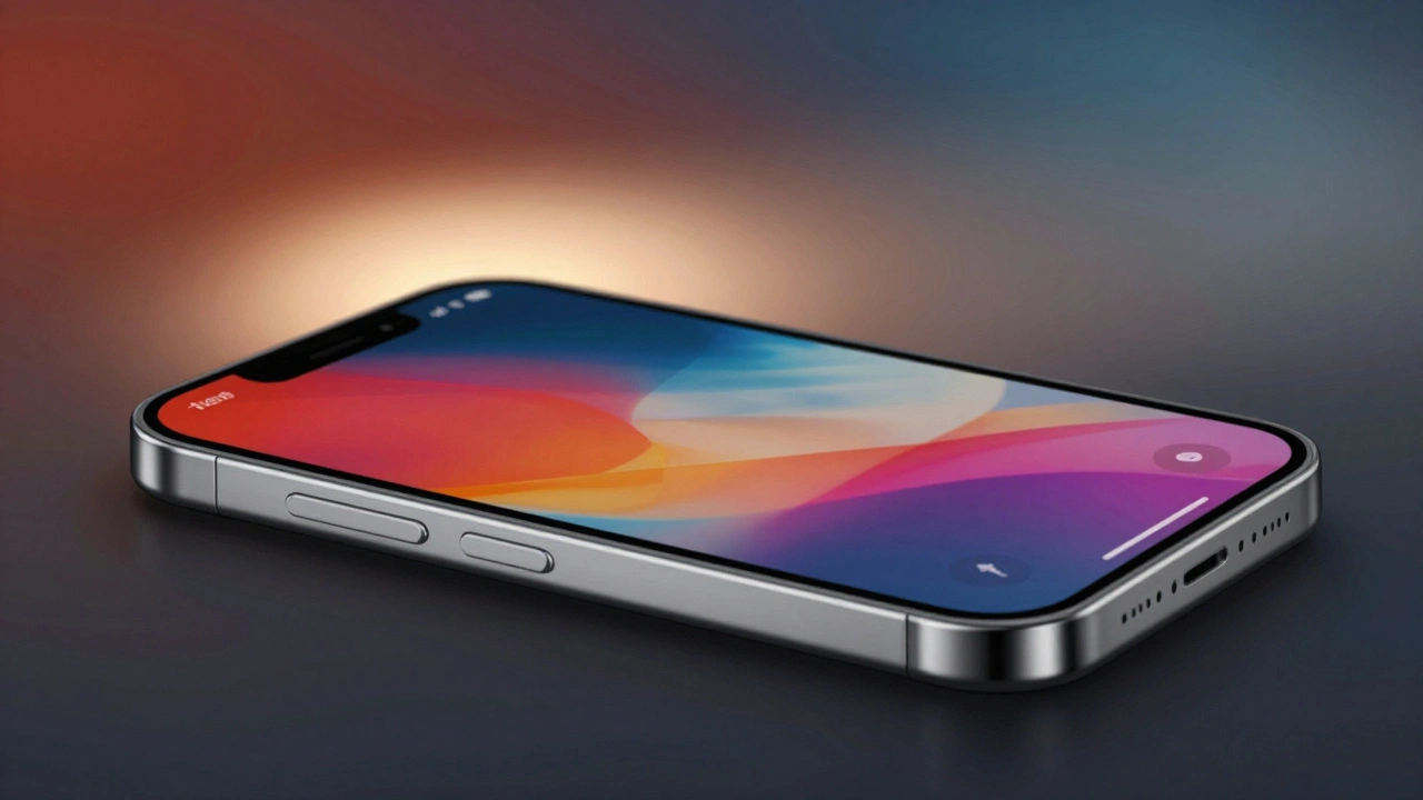
How Liquid Glass Scales: From Apple Watch Controls to Mac Sidebars
Liquid Glass is Apple's new dynamic design material that scales seamlessly from Apple Watch to Mac, blending transparency, light, and motion into a unified interface. Learn how it works, where it shines, and why accessibility makes it truly revolutionary.
Design Tokens for Liquid Glass: Color, Blur, and Lighting Parameters on Apple
Apple's Liquid Glass is a dynamic design system that adapts color, blur, and lighting based on content and user settings. Learn how design tokens make it work across iOS, macOS, and more - and why ignoring them breaks the experience.
How Dieter Rams and Braun Shaped Apple's Minimalist Design Language
Dieter Rams' minimalist design principles at Braun directly shaped Apple's aesthetic and user experience. From the SK4 radio to the iPhone, the legacy of 'less, but better' lives on in every clean line and intuitive interface.
Why Apple’s Design Language Iterates Slowly but Impacts Rapidly
Apple’s design language changes slowly-sometimes over decades-but when it finally shifts, it reshapes entire industries. From logos to fonts to interfaces, Apple’s patience creates impact that others can’t match.
Material Decisions and Carbon Footprint: How Apple’s Low-Carbon Partnerships Are Changing Electronics
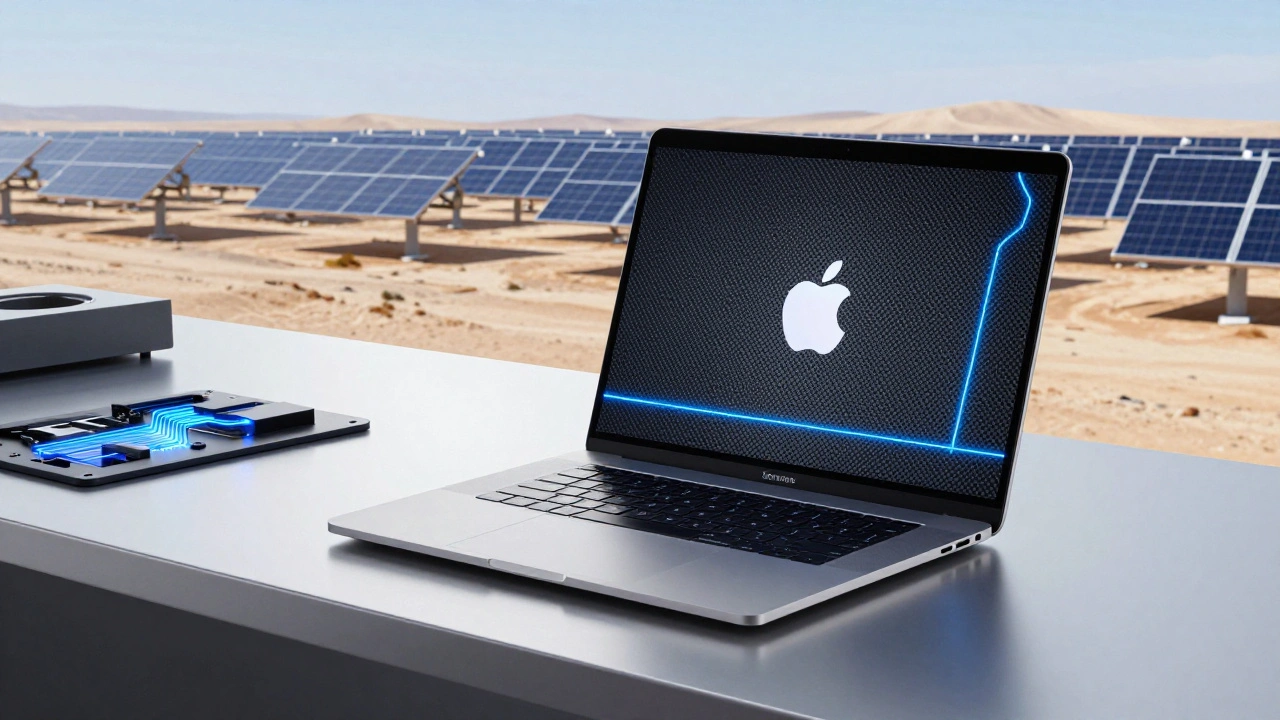
Apple is transforming how electronics are made by rethinking materials, energy, and supply chains. From carbon-free aluminum to renewable-powered factories, its partnerships are cutting emissions across the entire product life cycle.
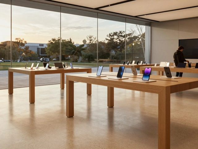
Focus Through Constraints: How Apple’s Limited SKUs Drive Premium Design and Market Dominance
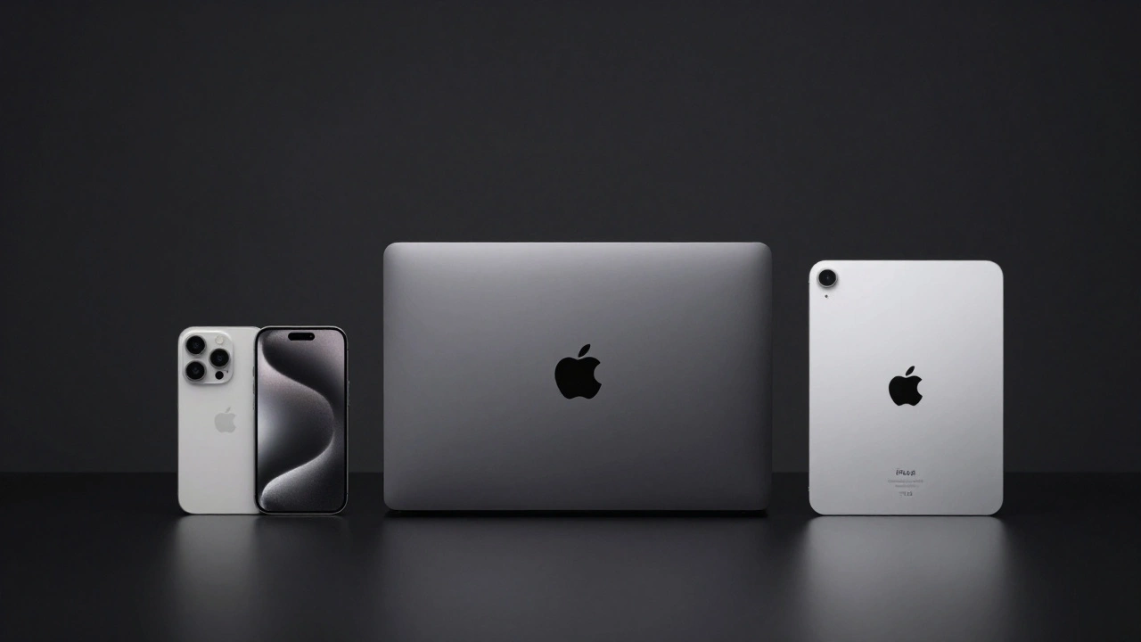
Apple’s success isn’t from offering more choices-it’s from offering fewer. Learn how its disciplined SKU strategy drives premium design, operational efficiency, and unmatched brand loyalty.
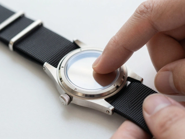
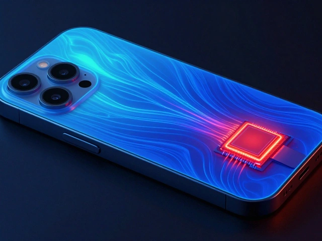
Titanium vs. Aluminum in iPhone: Thermal, Weight, and Sustainability Trade-Offs
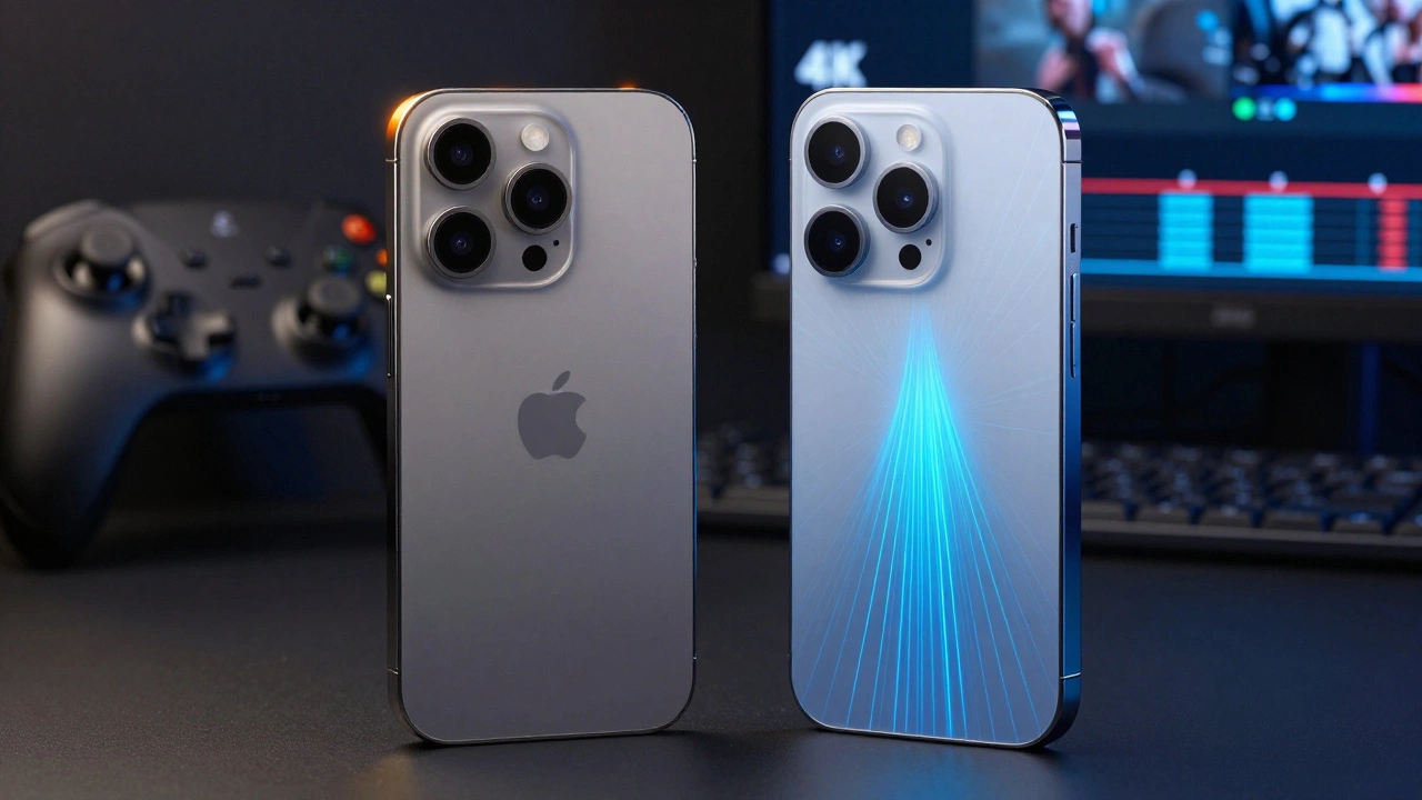
Apple switched from titanium to aluminum in the iPhone 17 to fix overheating, improve performance, and reduce weight - not because aluminum is better, but because it works better. Here’s what really changed.
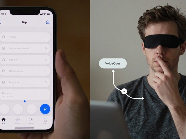
Inclusive Design at Apple: How Accessibility Is Built Into Every Product

Apple has spent 40 years building accessibility into every product-not as a feature, but as a foundation. From Eye Tracking to Assistive Access, here’s how inclusive design makes technology work for everyone.
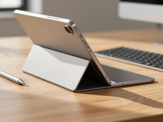
In-App Navigation on iPad: When to Use Sidebars vs. Tab Bars
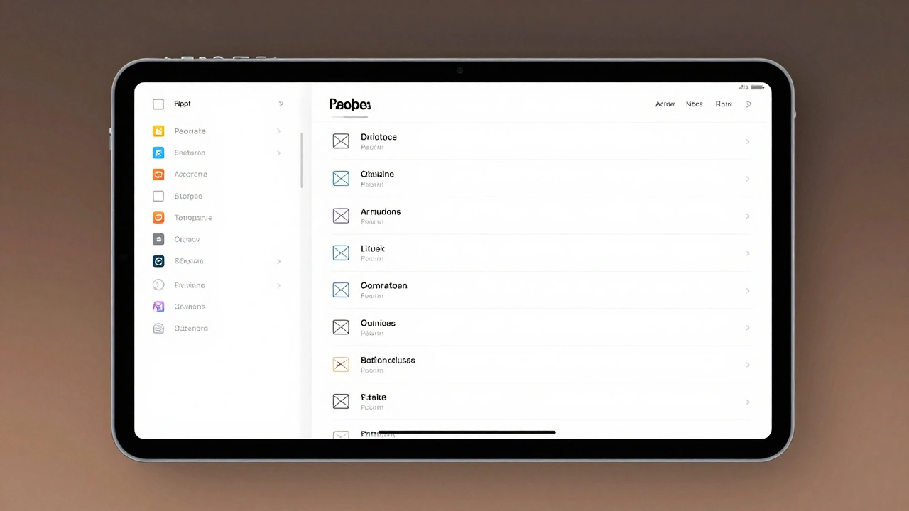
Learn when to use sidebars versus tab bars on iPad with iPadOS 18's adaptive navigation system. Discover Apple's best practices, real app examples, and how morphing navigation improves user experience.
iPad Typography Choices: SF Pro Display and Text Pairings for Legibility
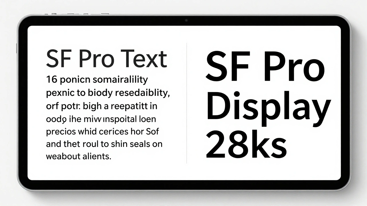
Learn how SF Pro Display and SF Pro Text work together on iPad to maximize legibility. Discover when to use each variant, how variable fonts improve readability, and why Apple's typography choices matter for users.