Category: Design & Technology - Page 4
How Apple Builds Confidence Through Interface Clarity: Micro-Interactions That Reduce Cognitive Load

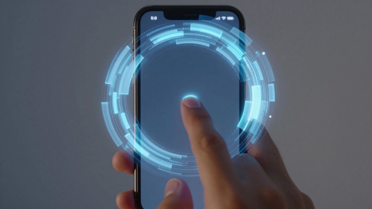
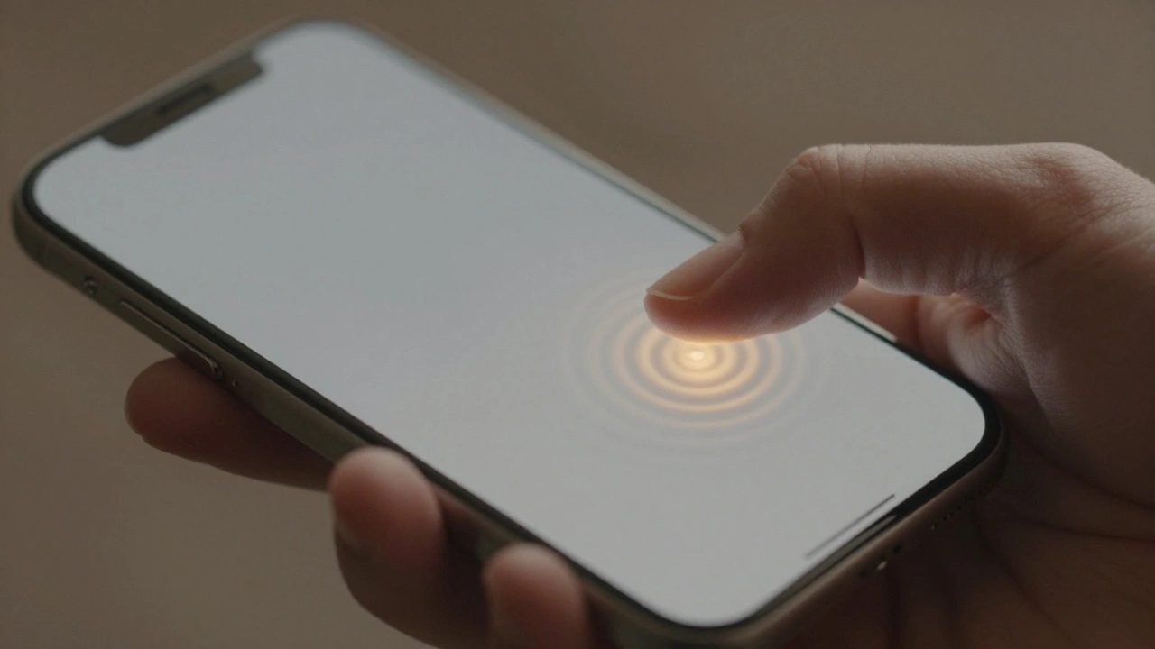
Apple builds user confidence not through flashy features, but through tiny, thoughtful interface details. These micro-interactions reduce mental strain, create trust, and make every tap feel intentional and reliable.
Pro-Level Workflows on MacBook: How Interface and Thermal Design Work Together
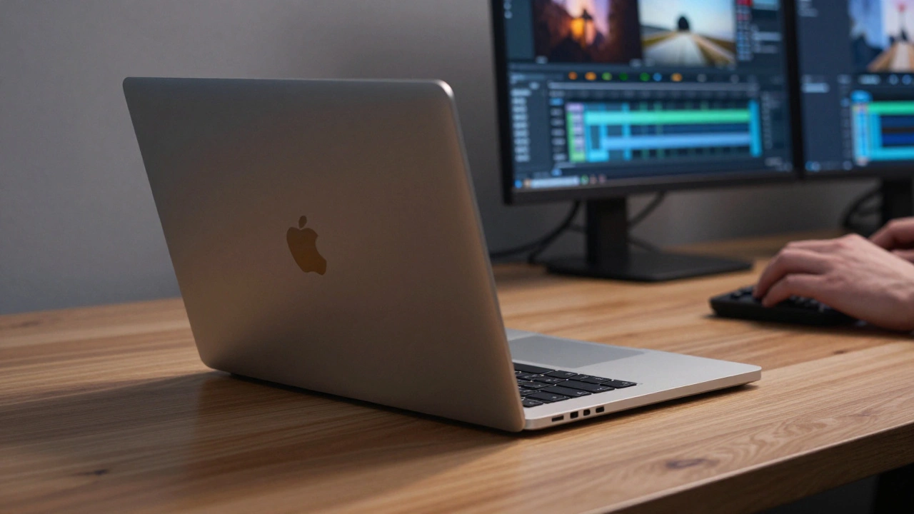
MacBook performance isn't just about the chip-it's about how heat moves through the device. Learn how interface design and thermal systems work together to make or break professional workflows.
Third-Party Ecosystem Fit: Making Apple Apps Feel Native with HIG
Third-party apps on Apple devices must align with Human Interface Guidelines to feel native, intuitive, and trustworthy. Learn why HIG isn’t about copying Apple-but about respecting user expectations across iOS, iPadOS, and macOS.
How iPhone Camera Image Pipeline Integration Creates a Seamless UX
iPhone's camera doesn't just capture images-it anticipates them. Through Zero Shutter Lag, deferred processing, and custom silicon, Apple has turned the image pipeline into a seamless, invisible experience that makes photography feel instantaneous.
iPad Pro as a Production Tool: Interface Patterns for Professional Apps
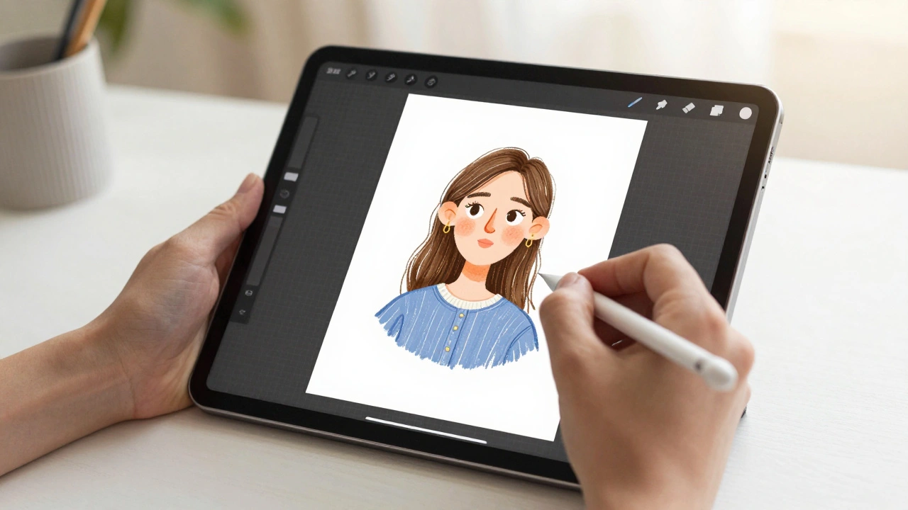
The iPad Pro is now a legitimate production tool for designers using apps like Procreate, Figma, and Affinity Designer. Learn the interface patterns that make professional workflows possible - and where the platform still falls short.
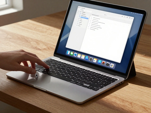
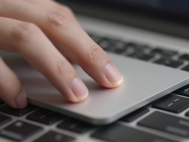
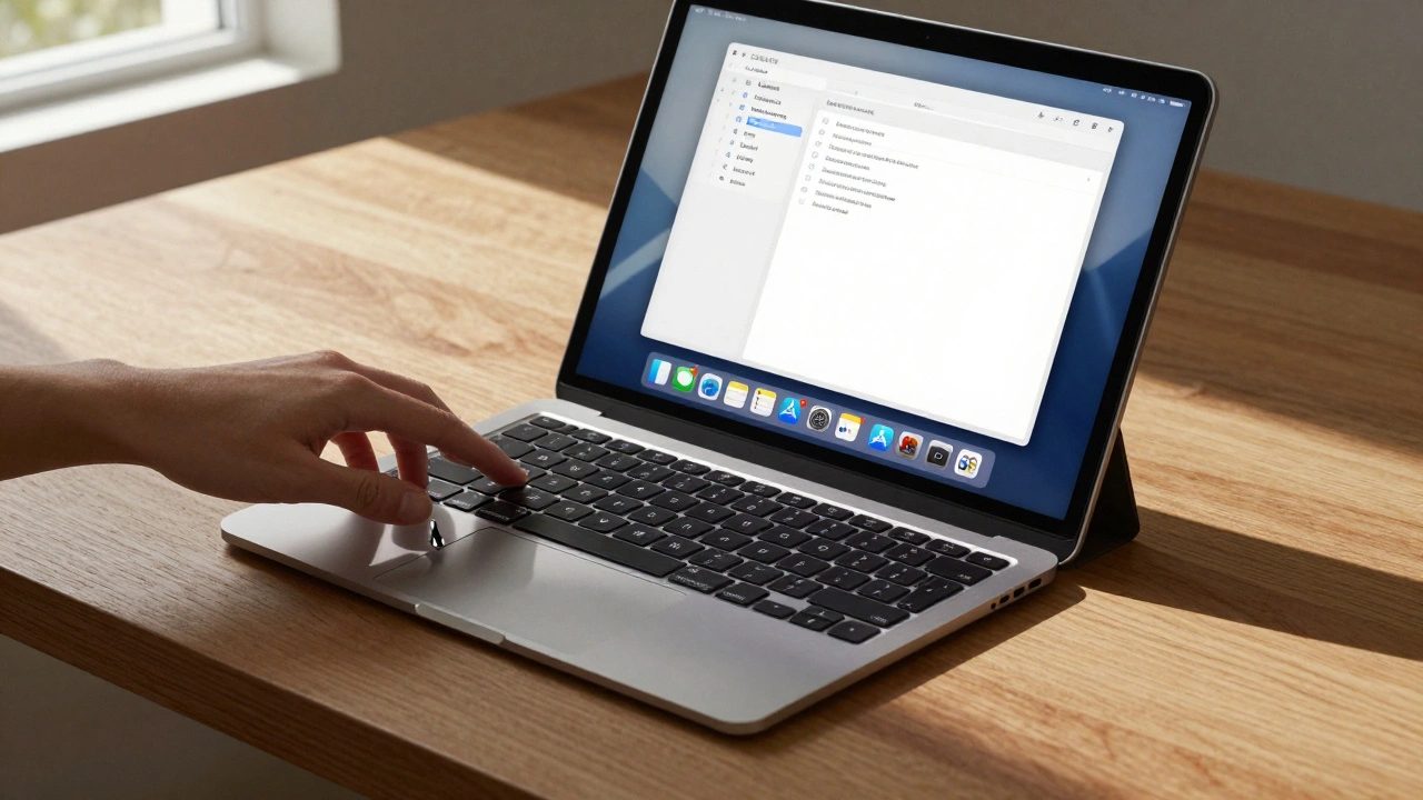
macOS Interaction Patterns: Precision Controls for Trackpad and Keyboard
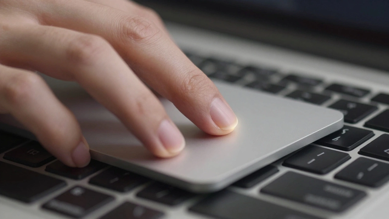
Learn how macOS trackpad and keyboard interactions work together to boost precision and productivity. Master gestures, modifiers, and settings most users never touch.
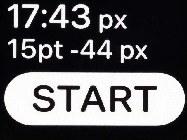
Strap Mechanisms by Design: Why Quick Release Is the New Standard in Watch Design
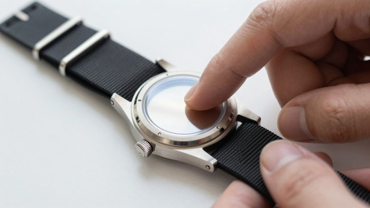
Quick-release watch straps eliminate tools, reduce wear, and make changing styles effortless. Learn how this smart design became the new standard - and why it matters for everyday wear.
iPad Keyboard and Trackpad Support: Desktop-Like Interactions by Design
iPad keyboard and trackpad support, powered by iPadOS 26, transforms the tablet into a desktop-like productivity tool. With precise typing, gesture controls, and seamless integration, Apple's Magic Keyboard makes the iPad a true laptop alternative.
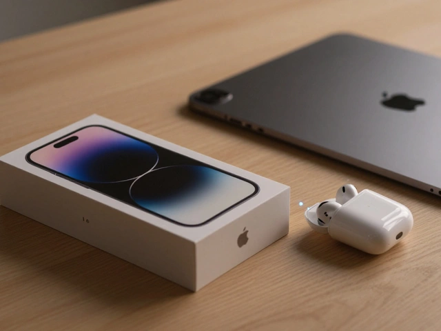
Sustainable Packaging at Apple: How Premium Design Meets Eco-Innovation
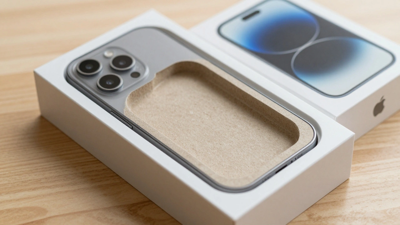
Apple replaced plastic packaging with 100% fiber-based materials without losing its premium feel. By 2026, over 98% of its packaging is recyclable, made from bamboo, bagasse, and FSC-certified paper-proving sustainability and luxury can go hand in hand.
Hartmut Esslinger and Frog: How Snow White Redefined Apple’s Design DNA
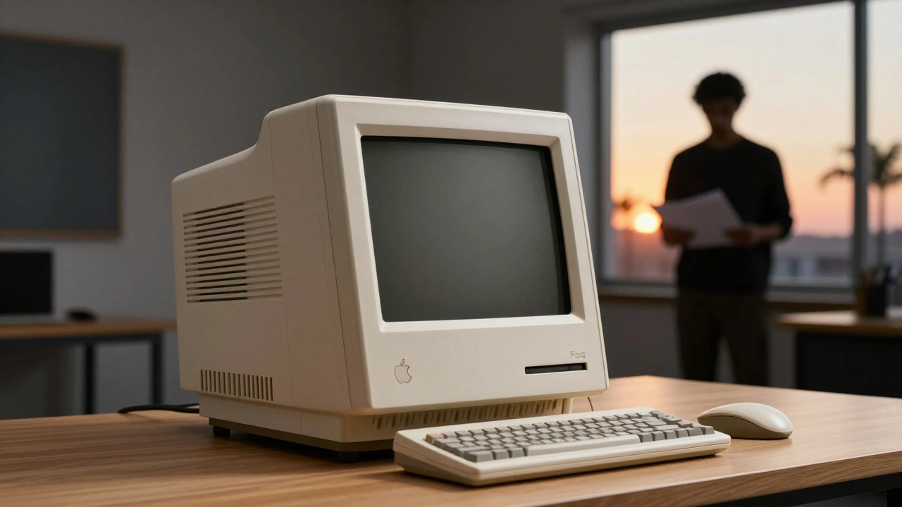
Hartmut Esslinger and frogdesign created the Snow White design language that turned Apple from a tech startup into a design icon. Its clean lines, white enclosures, and California branding reshaped how the world saw computers.
Reducing Plastic in Apple Packaging: Material Trade-Offs and Feel
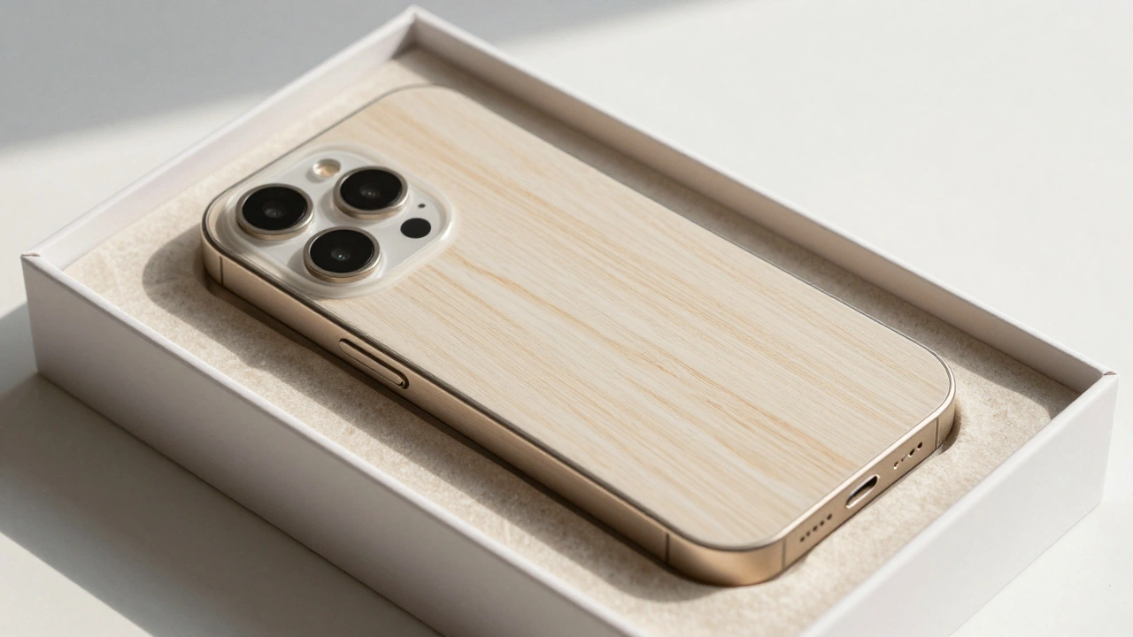
Apple eliminated plastic from nearly all its packaging by 2025, replacing it with fiber-based materials that match plastic's protection and feel. Learn how molded pulp, smarter design, and supply chain innovation made this possible-and why it's changing the industry.
Haptic Alternatives on Apple: Non-Visual Feedback That Communicates
Apple is replacing physical buttons with haptic feedback to create inclusive, non-visual interfaces that communicate through touch. This isn’t just about sleek design - it’s about making technology work for everyone, regardless of sight or ability.