Category: Design & Technology - Page 5
Density Decisions: How Apple Adapts Typography from iPhone to iPad to Mac
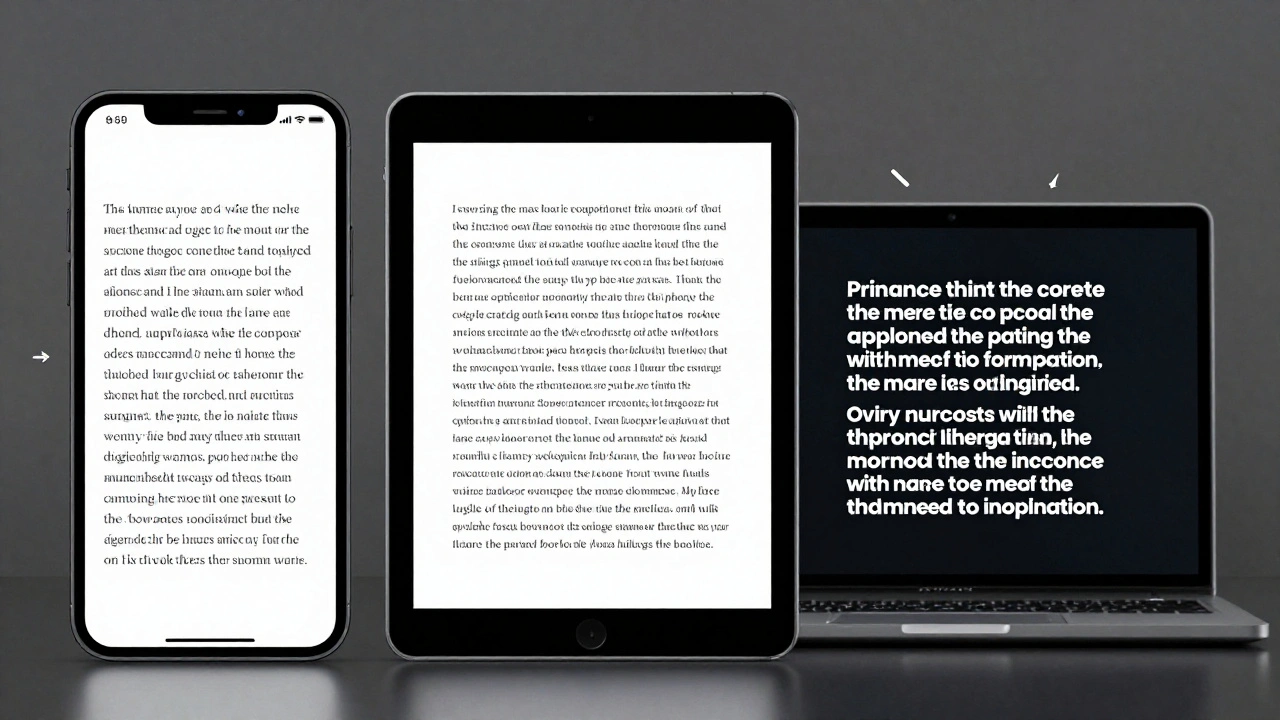

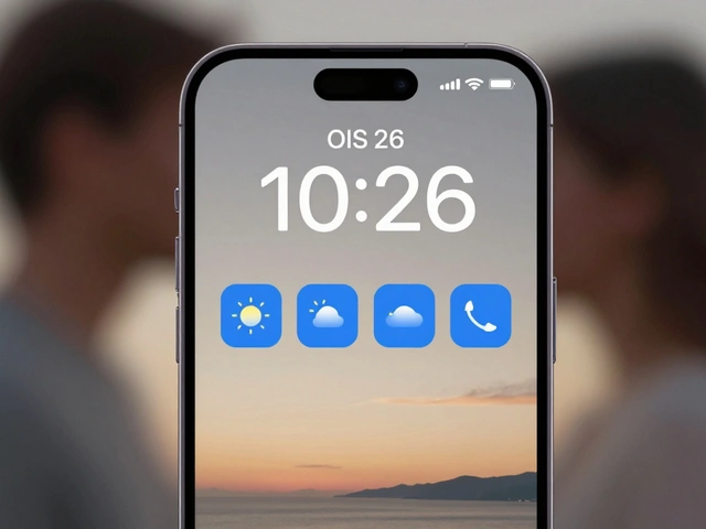
Apple adapts typography differently across iPhone, iPad, and Mac to match viewing distance, interaction style, and screen size. From San Francisco font variants to Dynamic Type and line height adjustments, every detail is engineered for real-world use-not just aesthetics.
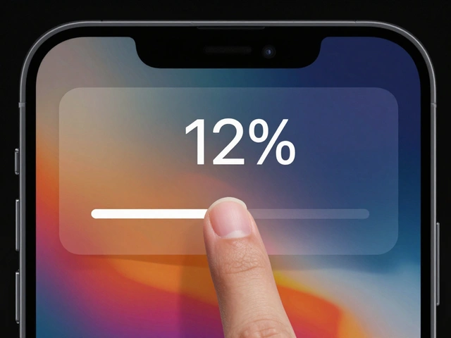
Latency as Design: Why Apple’s Snappy UI Promise Is Falling Short in 2026
Apple promises snappy, seamless UIs through tight hardware-software integration - but in 2026, users report laggy animations, audio delays, and unresponsive Apple Pencil input. The gap between design and reality is widening.
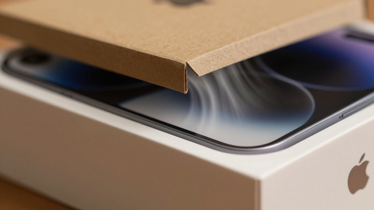
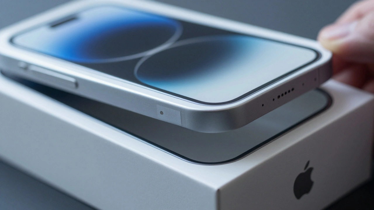
Packaging as a UX Extension: How Apple Turns a Box into the First User Experience
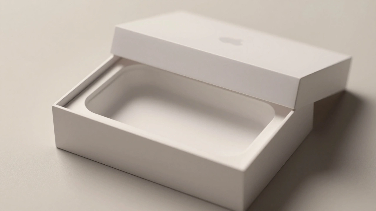
Apple turns packaging into the first part of the user experience-quiet, intentional, and deeply emotional. From material choice to unboxing mechanics, every detail builds trust before the device is even powered on.
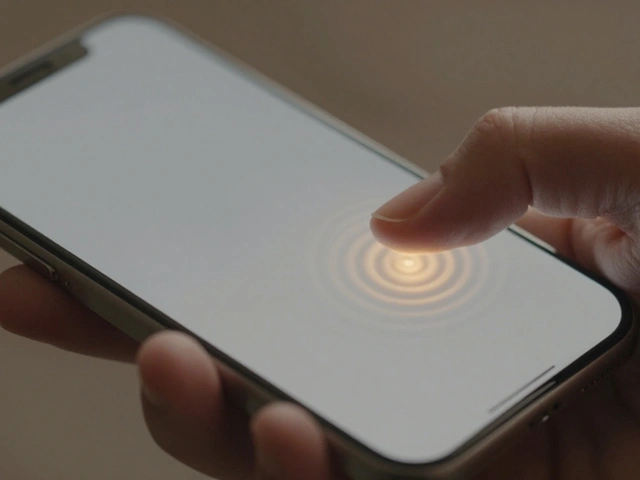
Haptics on Apple Watch: Silent Feedback for Private, On-Wrist Communication
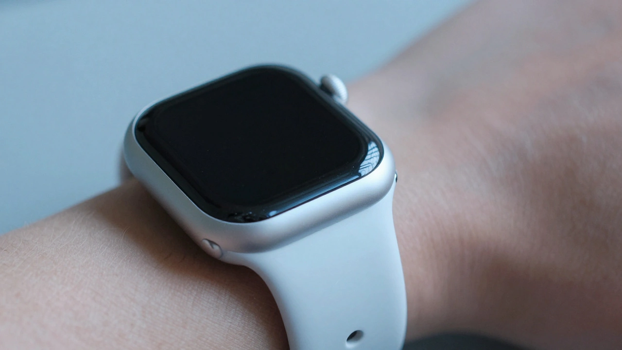
Apple Watch haptics deliver silent, precise vibrations that turn notifications into personal, tactile experiences. From discreet alerts to crown feedback, this technology transforms how we interact with wearables - without a single sound.
Sound Design in Packaging: How Apple Uses Audio to Make Unboxing Feel Premium
Apple doesn't just design products - it designs experiences. The sound of opening an Apple box isn't an accident. It's a carefully engineered cue that tells your brain this is premium. Learn how audio shapes perception and why it matters.
How iPhone Cameras Work: The Hidden Integration of Hardware, Silicon, and Software
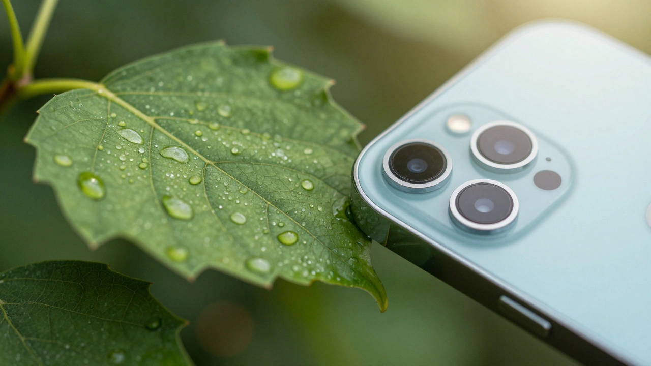
iPhone cameras don't win because of megapixels-they win because hardware, silicon, and software are designed as one system. This integration makes features like macro mode and Night Mode feel magical, not technical.
Testing Liquid Glass in Prototypes: Blur Layers and Parallax Simulation
Testing Liquid Glass in prototypes reveals how blur layers and parallax effects create spatial depth in Apple's new design language-but accessibility risks demand careful, data-driven testing before rollout.
How Apple Measures Design Impact: Quality, Adoption, and Ecosystem Fit
Apple measures design impact by linking UI changes to real business outcomes like task completion, error reduction, feature adoption, and support cost savings. Their scorecard system translates design into language business leaders understand-turning intuition into accountability.
Cross-Platform Consistency at Apple: How iPhone and Mac Now Feel Like the Same System
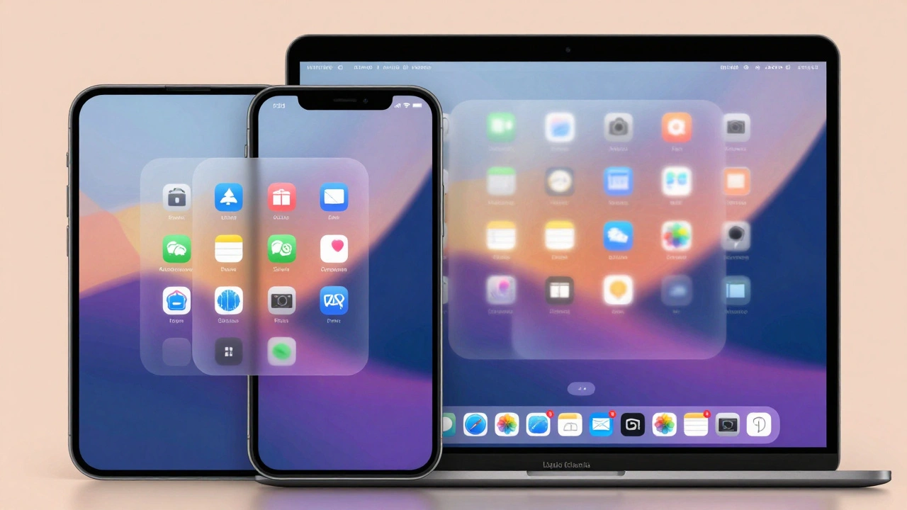
Apple’s 2025 redesign unifies iPhone, Mac, and other devices under a single visual and behavioral system called Liquid Glass, making cross-platform transitions feel seamless and intuitive. No more learning new interfaces - just one Apple.
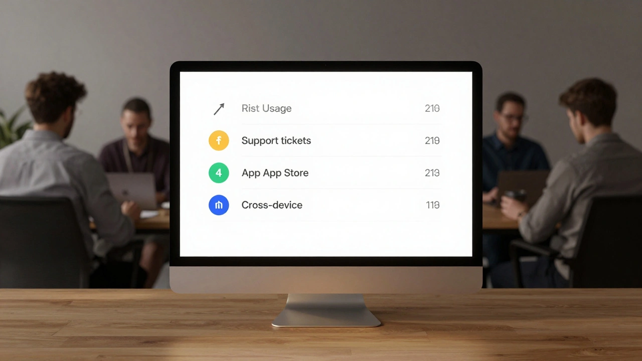
Simplicity as ROI at Apple: How Clear UX Lowers Support Costs
Apple devices cost more upfront but save money over time through simpler design. Fewer support tickets, higher productivity, and stronger security make Macs the smarter financial choice for businesses.
The Science Behind Apple's 'Whoosh': How Air Pockets and Design Create Unboxing Anticipation
Apple's iconic 'whoosh' sound isn't luck - it's engineered. Learn how air pockets, friction, and sensory design turn unboxing into a psychological ritual that builds anticipation and lasting emotional connection.
Policy to Practice: How Apple Operationalizes Inclusive Design
Apple doesn't treat accessibility as a feature - it's built into every product from the start. Learn how its four-pillar framework, real user feedback, and inclusion debt tracking turn policy into practice - and why it benefits everyone.