Author: Elias Voss - Page 9
Translucent Plastics at Apple: How Material Design Communicates Approachability and Playfulness

Apple’s translucent plastics and Liquid Glass aren’t just aesthetics-they’re emotional design tools that make technology feel approachable, playful, and alive. From the iMac to iOS 26, transparency has been a quiet revolution.
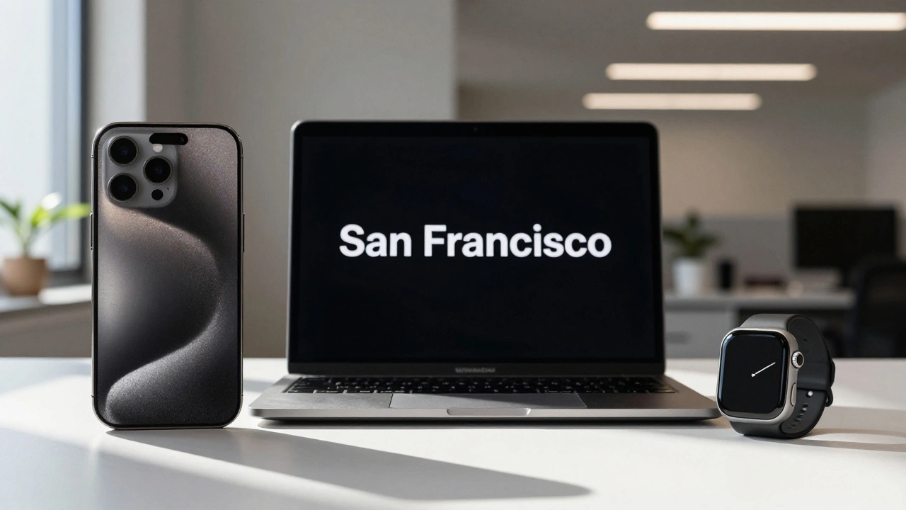
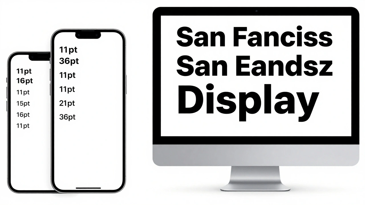
Headlines vs. Body Text on Apple: Why SF Pro Display and SF Pro Text Are Designed Differently
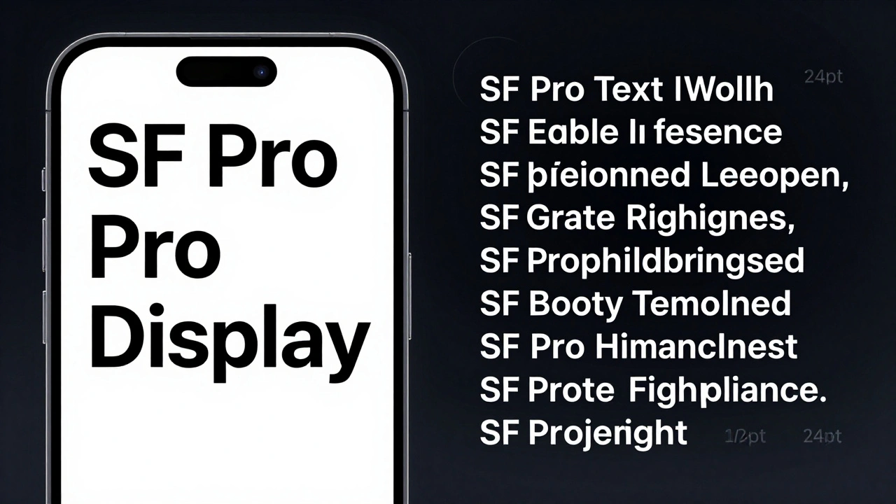
Apple uses two different versions of its San Francisco font-SF Pro Display for headlines and SF Pro Text for body copy. Each is optimized for its job: impact vs. readability. Here’s how and why.
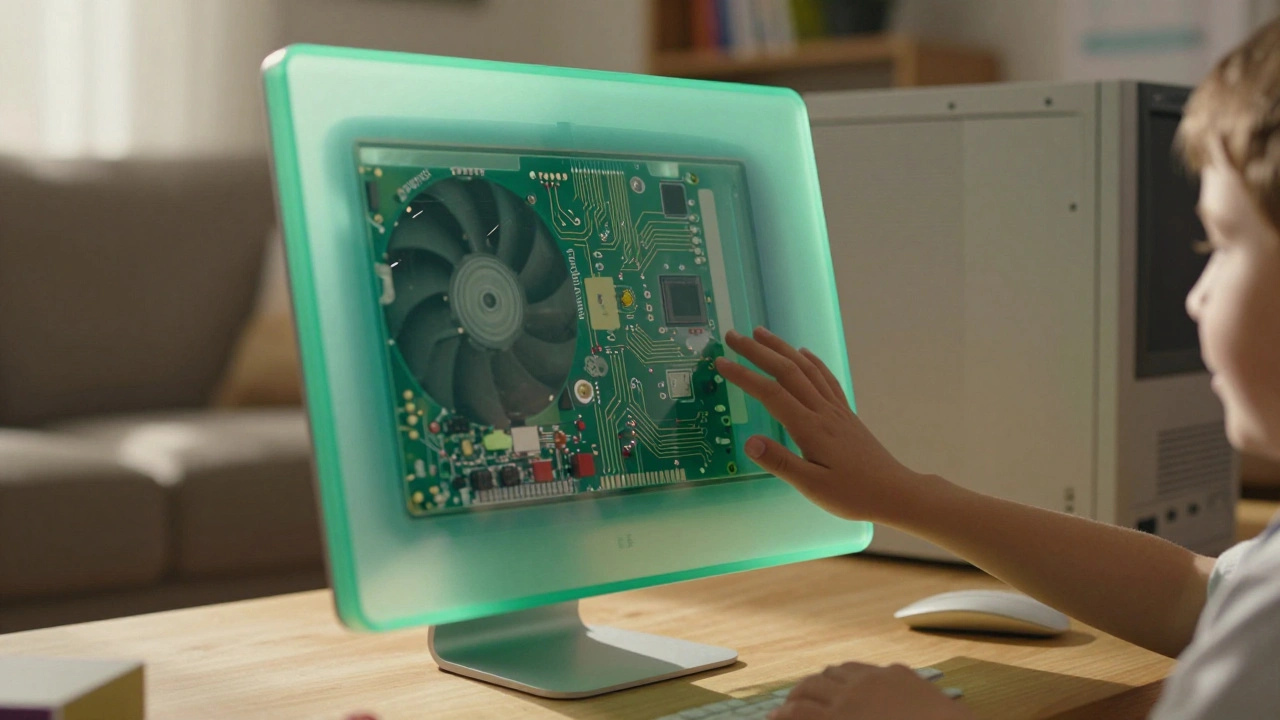
Liquid Glass vs. Skeuomorphism and Flat Design: Apple’s New Material Middle Ground
Apple's Liquid Glass is a new interface material that blends the best of skeuomorphism and flat design, using dynamic light and motion to create a more intuitive, responsive experience across all devices.
Typography Testing on Apple Devices: Contrast, Crispness, and Rendering
Learn how Apple's San Francisco font system ensures crisp, readable text across all devices. Discover essential testing methods for contrast, rendering, and accessibility on iOS, iPadOS, and macOS.
MacBook Air’s Thinness Goal: Designing for Ultra-Portable Productivity

The MacBook Air’s thinness isn’t just about looks-it’s engineered for real-world productivity. With a fanless design, recycled materials, and silent performance, it’s built for people who carry their work everywhere.
From 2015 Launch to Today: How Apple Watch Design Evolved with Users
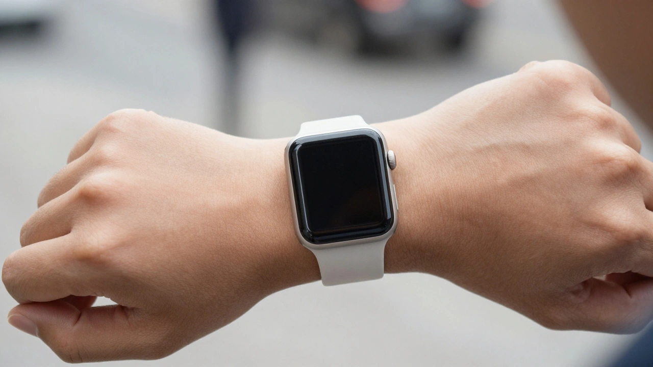
From its 2015 launch to today, the Apple Watch evolved not by chasing trends, but by listening to users. Every design change-larger screens, always-on displays, double-tap gestures-was driven by real needs. This is how a smartwatch became essential.
Designing Accessible Typography on Apple: Legible at a Glance and Up Close
Learn how Apple ensures text is legible at any size or viewing distance. From San Francisco font rules to Dynamic Type and contrast requirements, this guide covers the essential principles of accessible typography on iOS, macOS, and watchOS.
Reducing Cognitive Load: How Apple Designs for Simpler Decisions
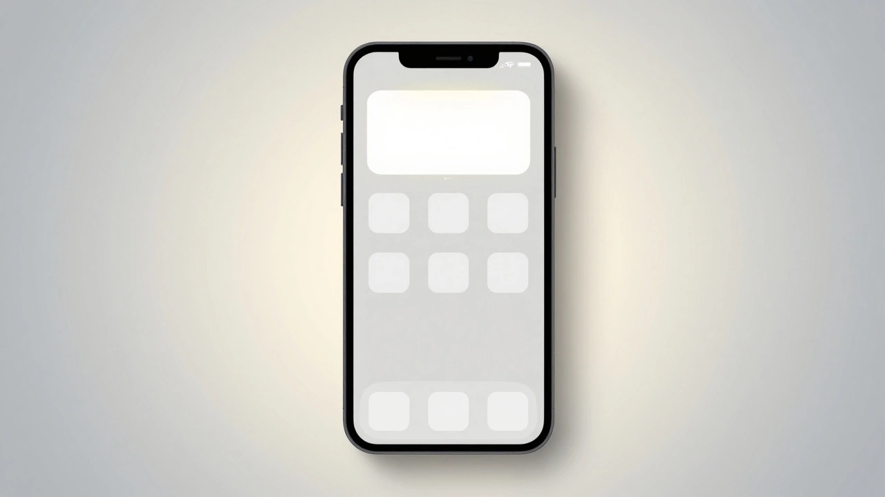
Apple reduces cognitive load by removing choices, using smart defaults, and designing for effortless interaction. Their approach isn't about minimalism - it's about making decisions disappear.
Design-Driven Engineering at Apple: How Function and Form Evolve Together
Apple's design-driven engineering merges function and form from day one, creating products that feel intuitive, not just smart. This is how they build devices that redefine expectations.
Apple Watch Design: How Style and Utility Work Together
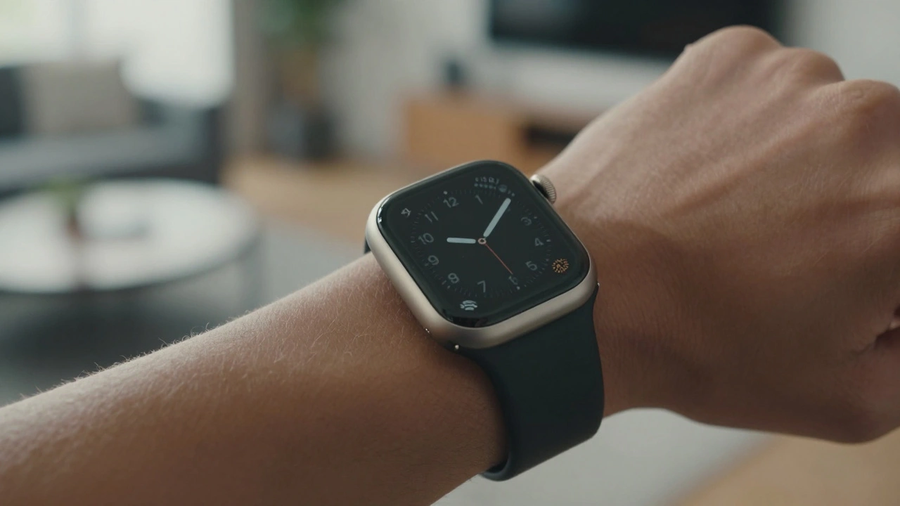
Apple Watch design balances personal style through customizable bands and sleek form with wearable utility via always-on screens, gesture controls, and rugged variants like the Ultra. It's not about flashy tech-it's about seamless integration into daily life.
MacBook Camera and Mic Privacy: Indicator Cues and Hardware Integration
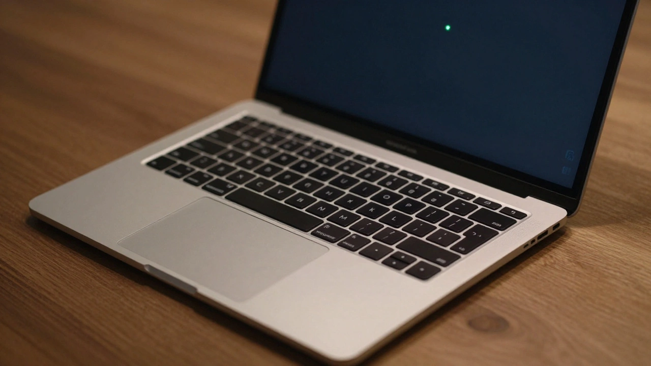
MacBook camera and mic privacy indicators show when apps access your hardware. Learn how the green and orange dots work, how to manage permissions, and why Apple built this into the chip level for real privacy.
How Apple Watch Integrates with iPhone: Ecosystem Handshakes by Design
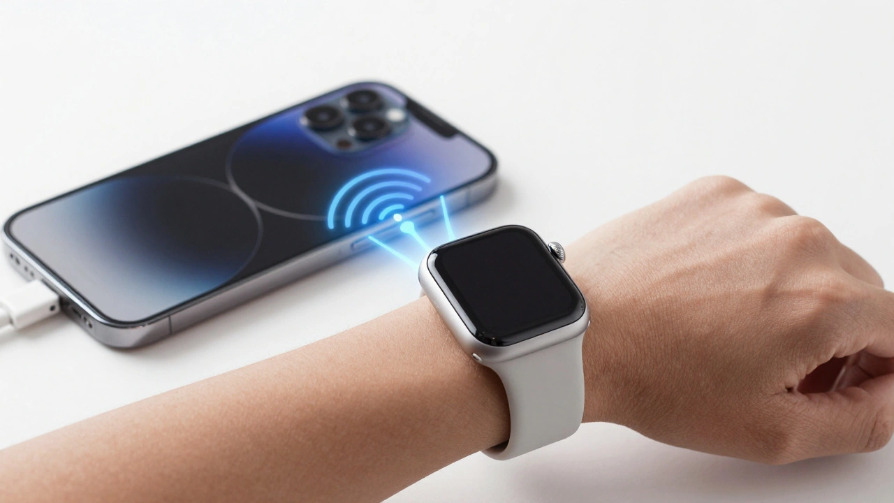
The Apple Watch and iPhone are designed to work together, not separately. From notifications to health tracking, their seamless integration creates a smarter, faster experience that neither device could deliver alone.