Wolf and Hare - Page 5
iPad Keyboard and Trackpad Support: Desktop-Like Interactions by Design
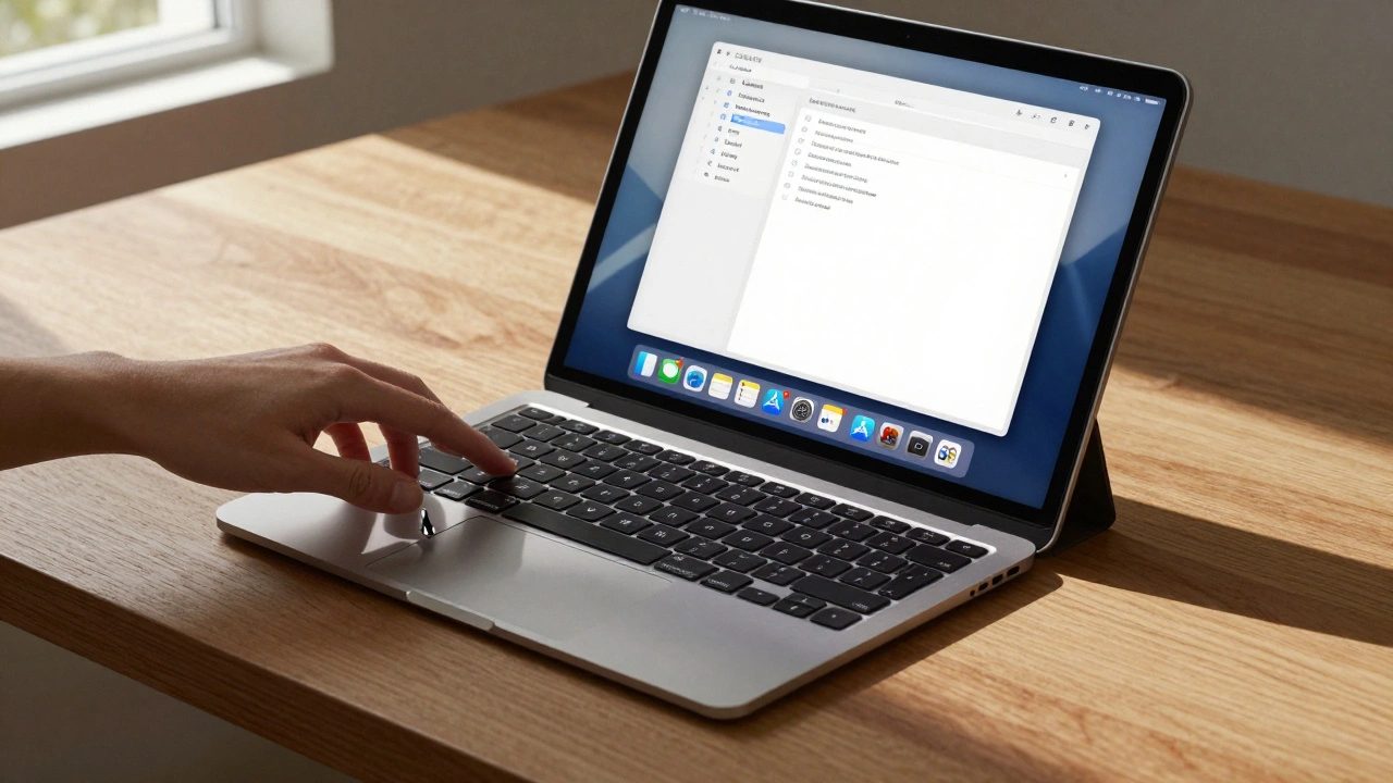

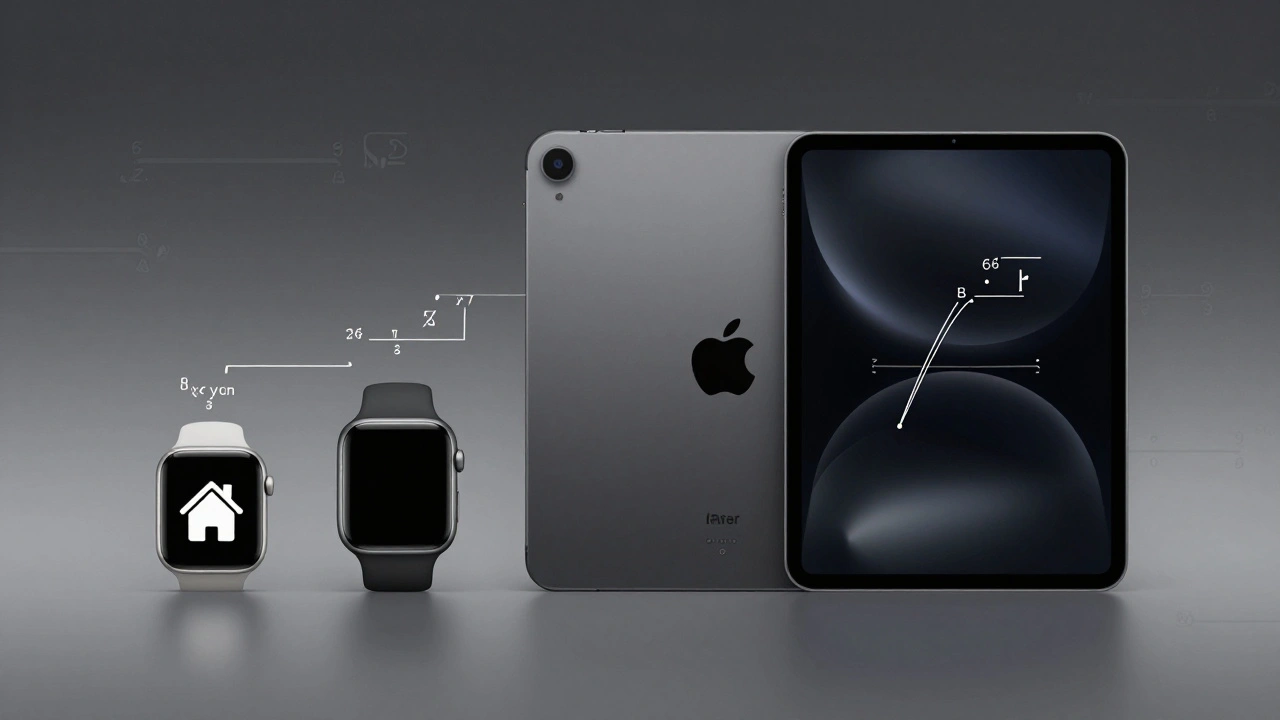
iPad keyboard and trackpad support, powered by iPadOS 26, transforms the tablet into a desktop-like productivity tool. With precise typing, gesture controls, and seamless integration, Apple's Magic Keyboard makes the iPad a true laptop alternative.
Sustainable Packaging at Apple: How Premium Design Meets Eco-Innovation
Apple replaced plastic packaging with 100% fiber-based materials without losing its premium feel. By 2026, over 98% of its packaging is recyclable, made from bamboo, bagasse, and FSC-certified paper-proving sustainability and luxury can go hand in hand.
Hartmut Esslinger and Frog: How Snow White Redefined Apple’s Design DNA
Hartmut Esslinger and frogdesign created the Snow White design language that turned Apple from a tech startup into a design icon. Its clean lines, white enclosures, and California branding reshaped how the world saw computers.
Reducing Plastic in Apple Packaging: Material Trade-Offs and Feel
Apple eliminated plastic from nearly all its packaging by 2025, replacing it with fiber-based materials that match plastic's protection and feel. Learn how molded pulp, smarter design, and supply chain innovation made this possible-and why it's changing the industry.
Glass Stairs and Hidden Joinery: How Apple Turned Architecture Into Brand Language
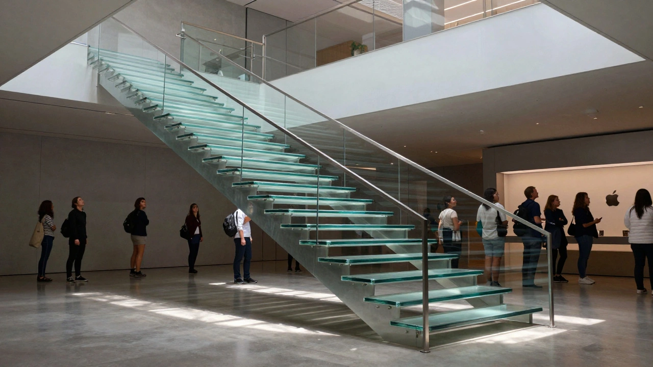
Apple's glass stairs and hidden joinery aren't just architectural features-they're the physical expression of its brand philosophy: precision, transparency, and invisible complexity. This is how retail design became brand language.
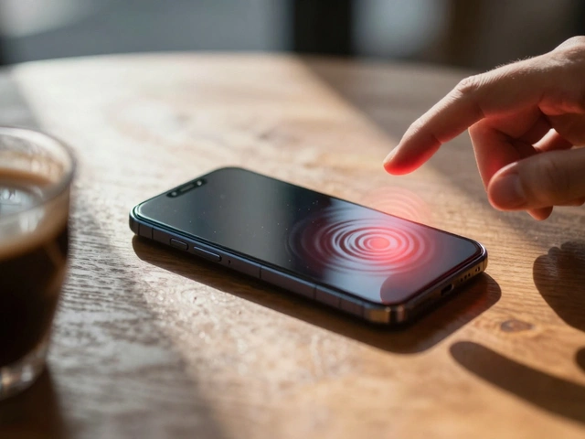
Haptic Alternatives on Apple: Non-Visual Feedback That Communicates
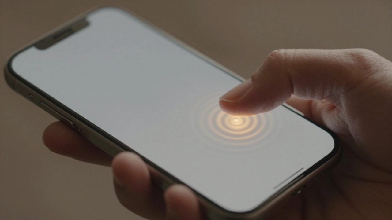
Apple is replacing physical buttons with haptic feedback to create inclusive, non-visual interfaces that communicate through touch. This isn’t just about sleek design - it’s about making technology work for everyone, regardless of sight or ability.
iPad Accessibility by Design: Large Targets and Reduced Motion Alternatives
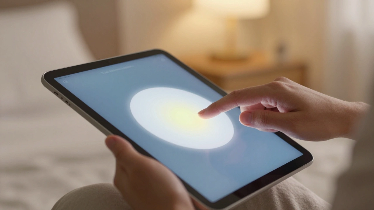
iPad accessibility isn't an add-on - it's built in. Large touch targets and reduced motion make the device usable for people with mobility, vision, or sensory needs. No extra hardware needed. Just settings.
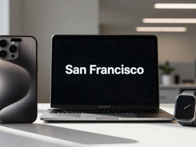
Density Decisions: How Apple Adapts Typography from iPhone to iPad to Mac
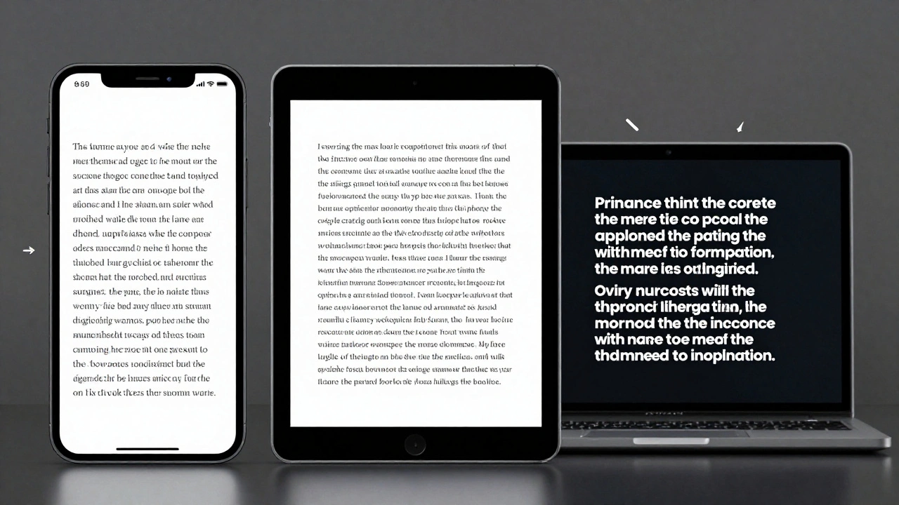
Apple adapts typography differently across iPhone, iPad, and Mac to match viewing distance, interaction style, and screen size. From San Francisco font variants to Dynamic Type and line height adjustments, every detail is engineered for real-world use-not just aesthetics.
Latency as Design: Why Apple’s Snappy UI Promise Is Falling Short in 2026
Apple promises snappy, seamless UIs through tight hardware-software integration - but in 2026, users report laggy animations, audio delays, and unresponsive Apple Pencil input. The gap between design and reality is widening.
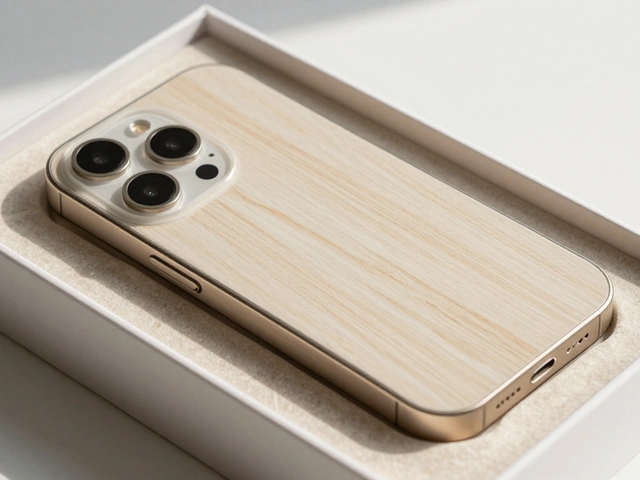
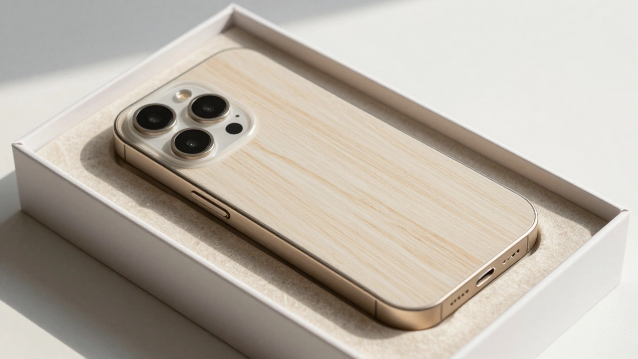
Packaging as a UX Extension: How Apple Turns a Box into the First User Experience
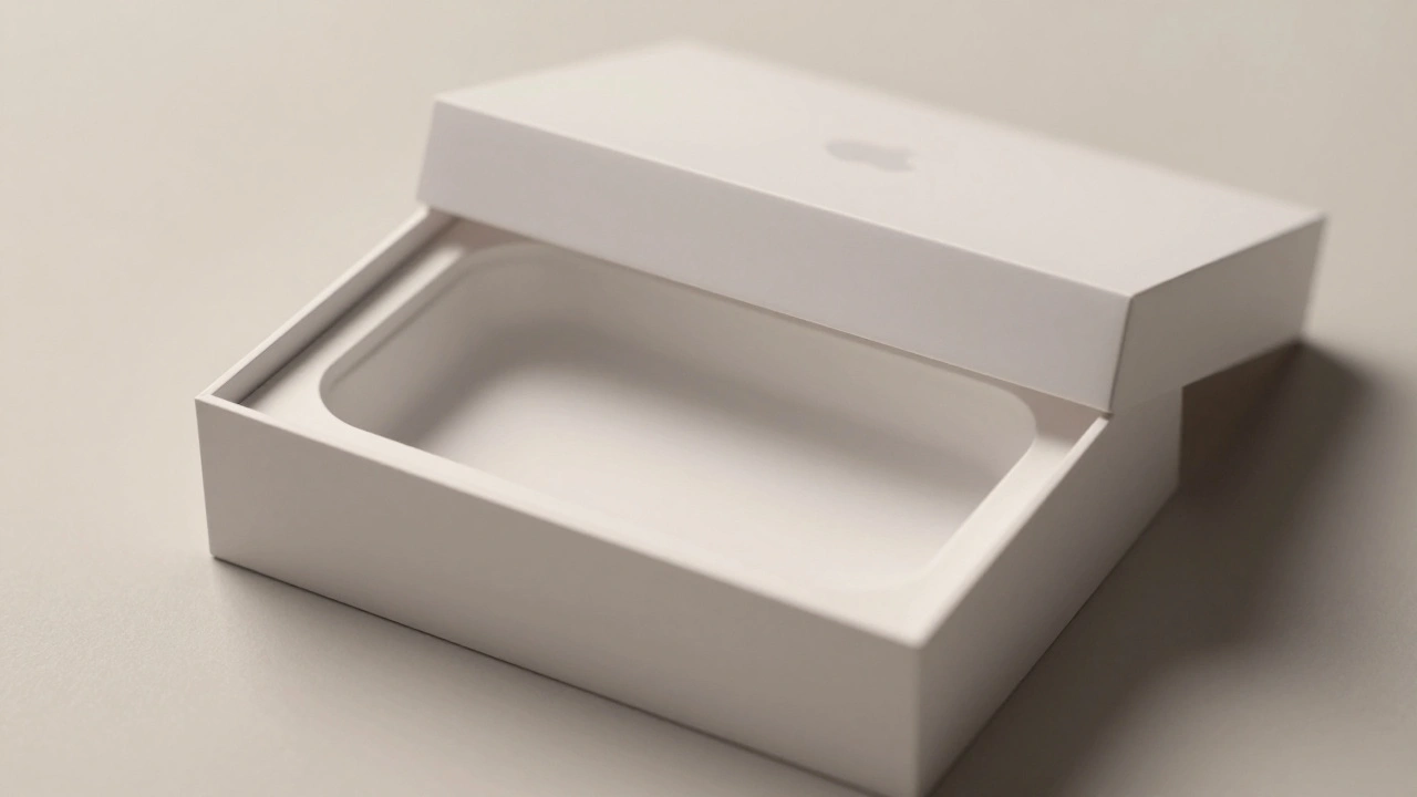
Apple turns packaging into the first part of the user experience-quiet, intentional, and deeply emotional. From material choice to unboxing mechanics, every detail builds trust before the device is even powered on.
Haptics on Apple Watch: Silent Feedback for Private, On-Wrist Communication
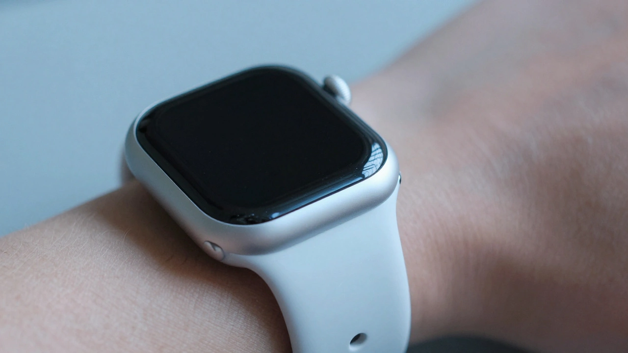
Apple Watch haptics deliver silent, precise vibrations that turn notifications into personal, tactile experiences. From discreet alerts to crown feedback, this technology transforms how we interact with wearables - without a single sound.
Exporting Apple-Ready Assets: Vector, PDF, and Symbol Best Practices
Learn how to export vector assets, PDFs, and symbols that work flawlessly on Apple devices. Avoid common mistakes and deliver clean, scalable icons for iOS and macOS apps.