Wolf and Hare - Page 8
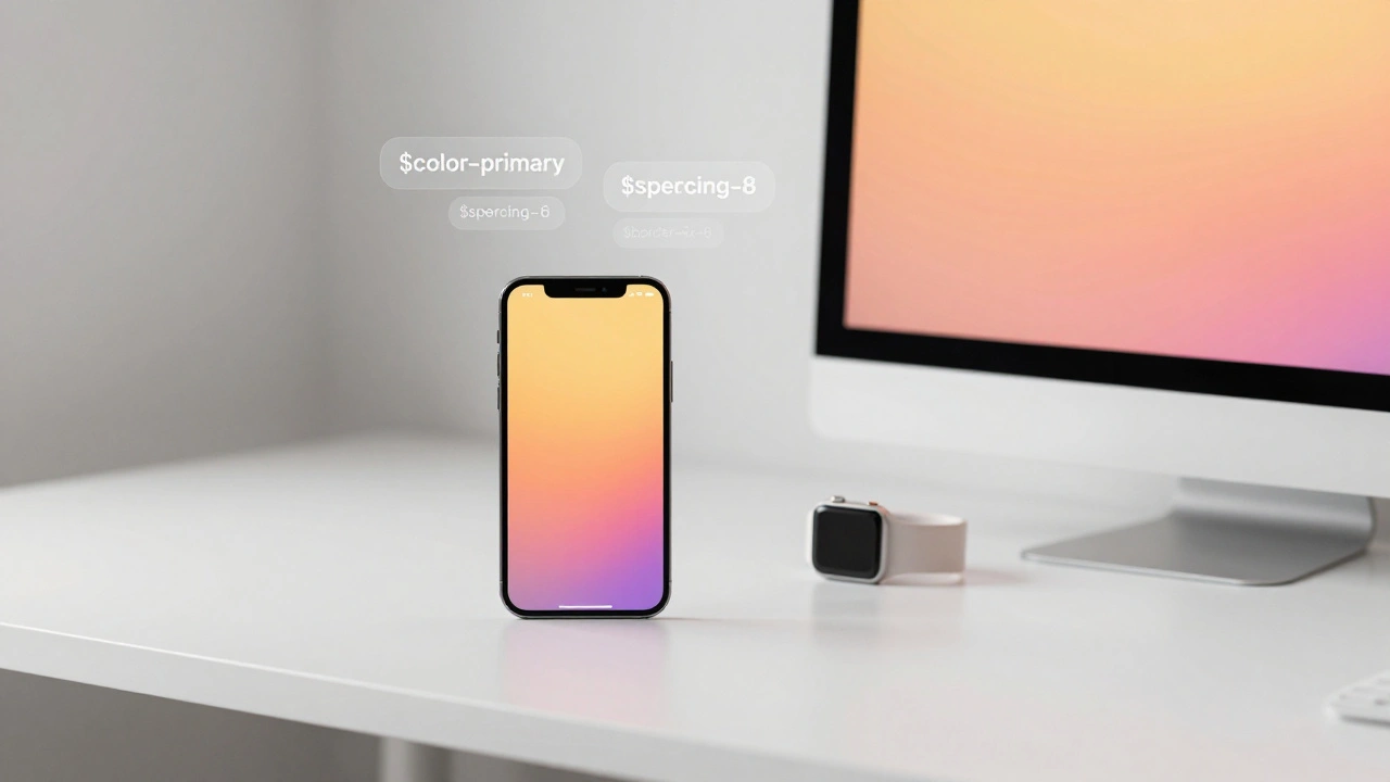
Building Design Systems for Apple Products: Tokens, Components, and Governance
Apple's design consistency across devices comes from a hidden system of tokens, components, and strict governance. Learn how design tokens power their UI, why semantic naming matters, and how to build your own scalable system.
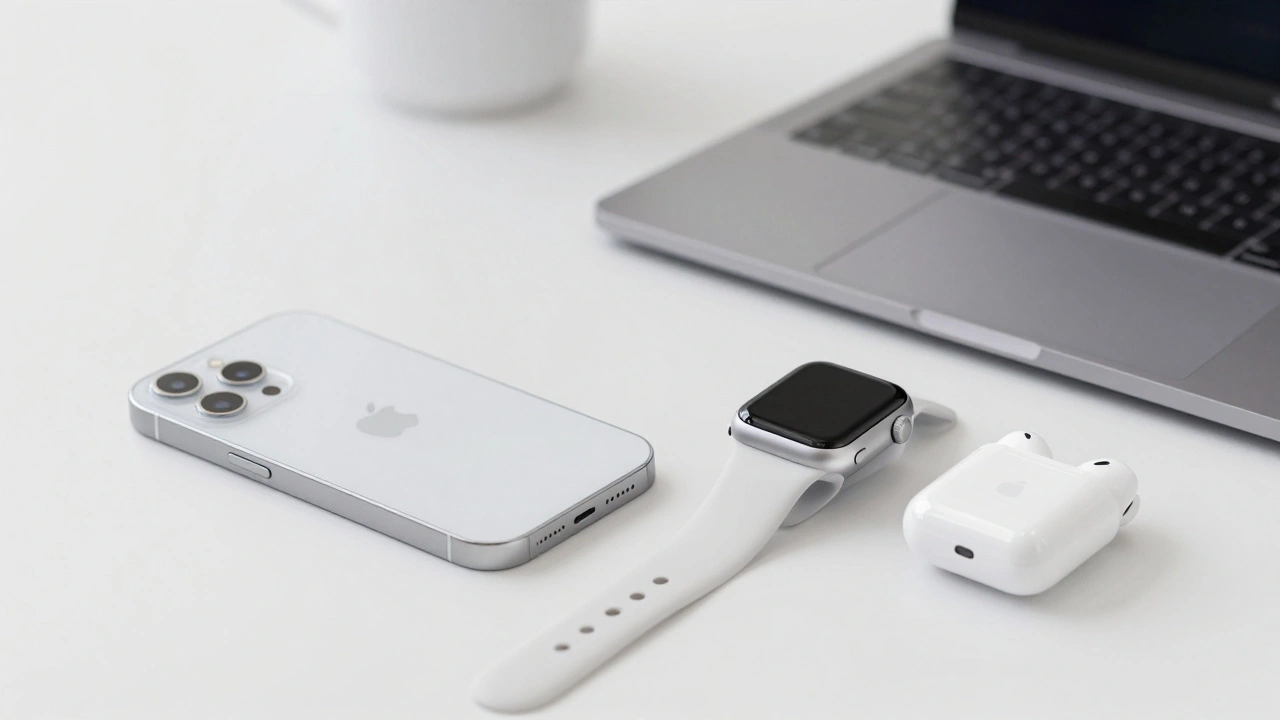
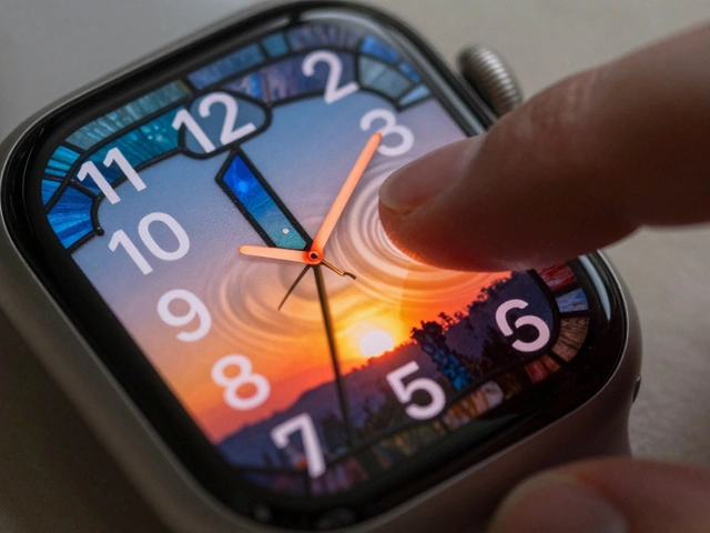
Ecosystem Branding: How Apple Uses Visual Signals to Connect Its Products
Apple connects its products through invisible visual signals-logo, color, typography, and Liquid Glass UI-that create a seamless, consistent experience across devices. This ecosystem branding builds loyalty by making every interaction feel familiar and unified.
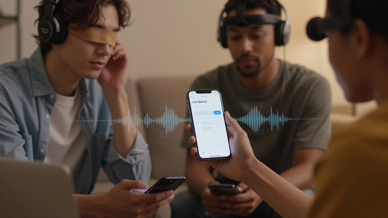
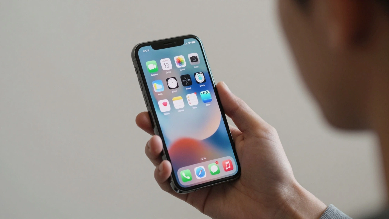
How iPhone Accessibility Features Shape Core Interaction Patterns
iPhone accessibility features like VoiceOver, AssistiveTouch, and Switch Control aren't just for users with disabilities - they redefine how everyone interacts with touchscreens. These tools shape core iOS patterns that benefit all users.
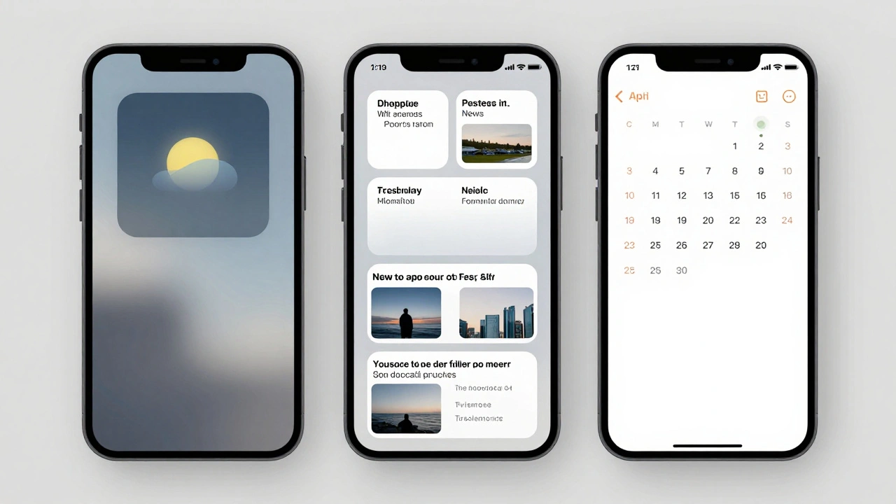
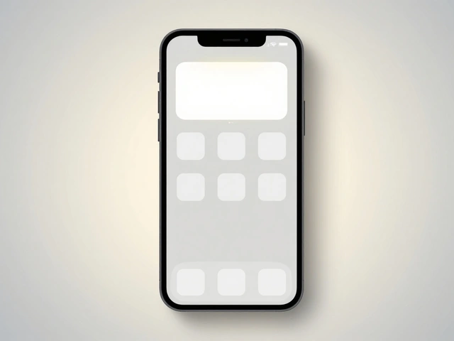
Designing Widgets for Apple Platforms: At-a-Glance Value and System Harmony
Apple widgets deliver essential information at a glance while blending seamlessly into the system. Learn how at-a-glance design and system harmony shape modern iOS, iPadOS, and macOS interfaces-with practical rules for developers and users.
Reduced Motion on Apple: How Apple Preserves Meaning While Reducing Disabling Animations
Apple's Reduced Motion setting helps users with motion sensitivity by simplifying animations across devices. It preserves useful transitions while removing distracting or harmful motion, making tech more usable for everyone.
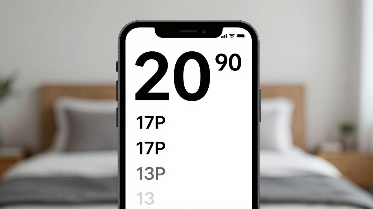
Typography Hierarchy in Apple Apps: Sizes, Leading, and Contrast Strategies
Apple's typography hierarchy uses San Francisco font, Dynamic Type, and precise sizing to guide users through apps. Learn how size, leading, weight, and contrast work together to create clear, accessible interfaces.
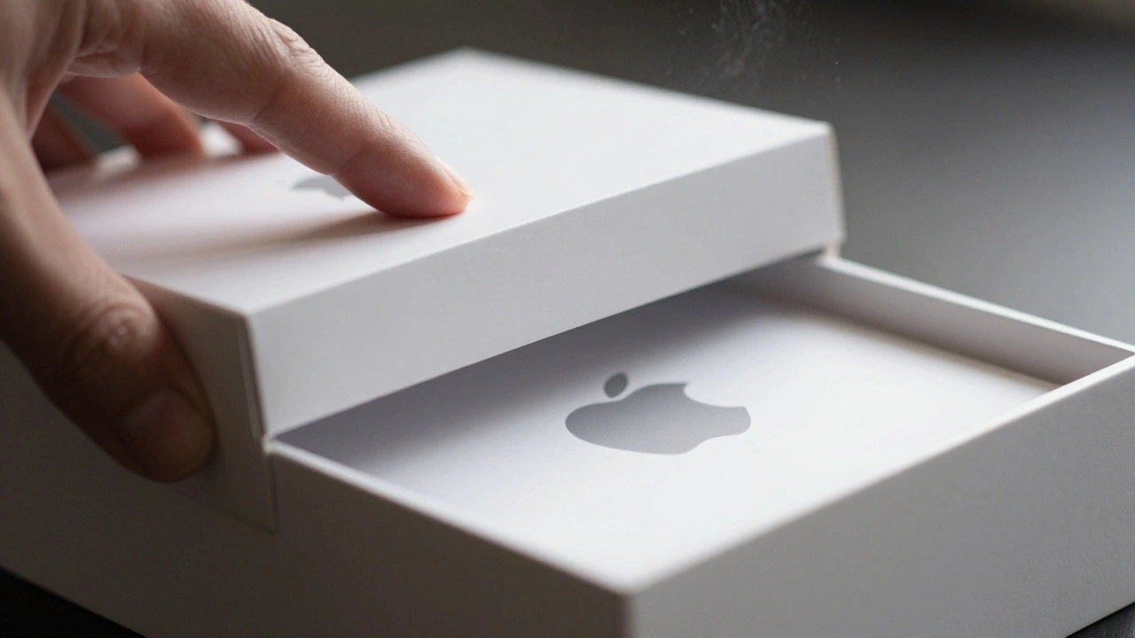
Packaging as Retention: How Apple’s Unboxing Experience Keeps Customers Coming Back
Apple’s packaging isn’t just a box-it’s a carefully crafted experience that turns unboxing into a memorable ritual. With 87% of users keeping their boxes, it’s clear this design strategy drives lasting loyalty and emotional connection.
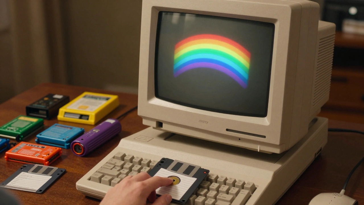
Design Milestones at Apple: A Timeline from 1977 to the Modern Ecosystem
From the rainbow Apple II logo to the seamless iPhone ecosystem, Apple’s design evolution redefined technology. This timeline traces how simplicity, integration, and bold choices turned Apple into a design powerhouse.
AssistiveTouch and Switch Control: Alternative Interaction Modes on Apple Devices
AssistiveTouch and Switch Control on Apple devices offer flexible, customizable ways to interact without relying on traditional touch or button presses. These tools empower users with motor limitations to navigate iPhones and iPads independently.
How Apple Orchestrates Design, Engineering, and Manufacturing to Build Iconic Products
Apple’s product success comes from a unique system where designers, engineers, and manufacturers work in tight, disciplined cycles - prioritizing perfection over speed. This is how they build icons.
Thermal Design in MacBook: How Apple Achieves Quiet Performance Without Sacrificing Thin Form
Apple's MacBook thermal design balances silent operation, thin form, and powerful performance. Learn how fanless Air models and dual-fan Pro systems manage heat without compromise.
State Restoration on Apple: Seamless Continuity Across Sessions and Devices
Apple's State Restoration features like Handoff, Universal Clipboard, and iPhone Mirroring let you pick up where you left off across devices-no manual transfers needed. It’s not syncing files. It’s syncing your workflow.
