Tag: San Francisco font
Density Decisions: How Apple Adapts Typography from iPhone to iPad to Mac
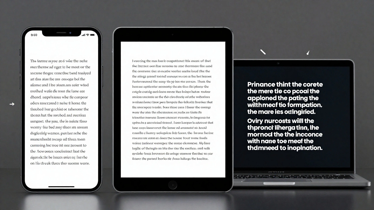

Apple adapts typography differently across iPhone, iPad, and Mac to match viewing distance, interaction style, and screen size. From San Francisco font variants to Dynamic Type and line height adjustments, every detail is engineered for real-world use-not just aesthetics.
Typography Hierarchy in Apple Apps: Sizes, Leading, and Contrast Strategies
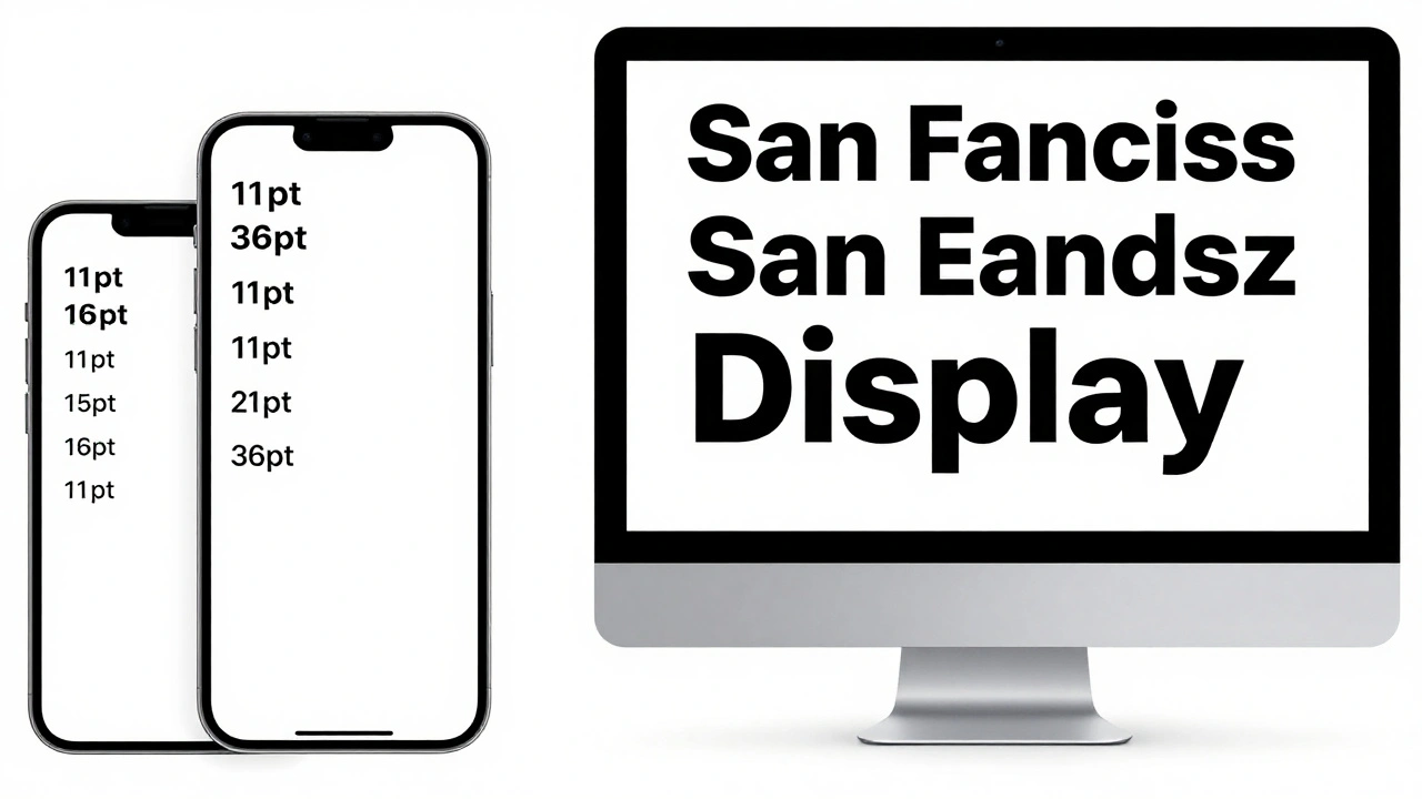
Apple's typography hierarchy uses San Francisco font, Dynamic Type, and precise sizing to guide users through apps. Learn how size, leading, weight, and contrast work together to create clear, accessible interfaces.
Typography Testing on Apple Devices: Contrast, Crispness, and Rendering
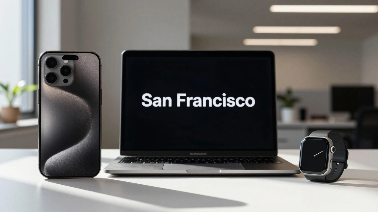
Learn how Apple's San Francisco font system ensures crisp, readable text across all devices. Discover essential testing methods for contrast, rendering, and accessibility on iOS, iPadOS, and macOS.
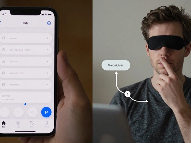
Designing Accessible Typography on Apple: Legible at a Glance and Up Close
Learn how Apple ensures text is legible at any size or viewing distance. From San Francisco font rules to Dynamic Type and contrast requirements, this guide covers the essential principles of accessible typography on iOS, macOS, and watchOS.
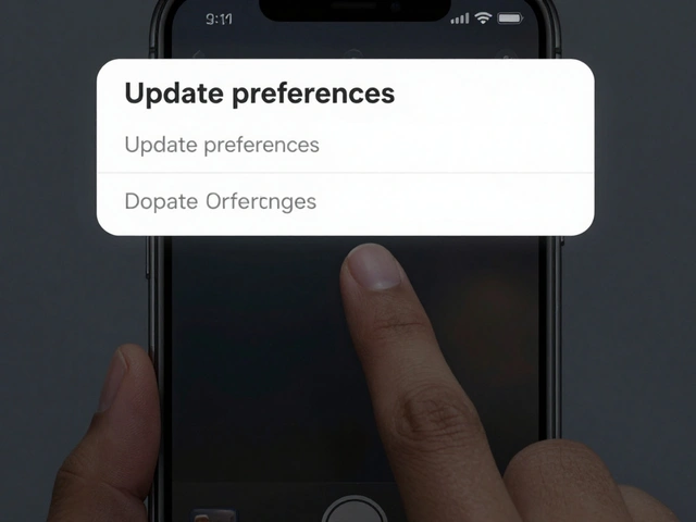
Micro-Typography on Apple: Kerning, Tracking, and Optical Alignment Explained
Apple's micro-typography-kerning, tracking, and optical alignment-creates the seamless text experience on iOS and macOS. Learn how these systems work together to make text look natural, readable, and polished across all device sizes.
Why Apple Watch Uses SF Compact: The Typography Behind Small-Scale Legibility
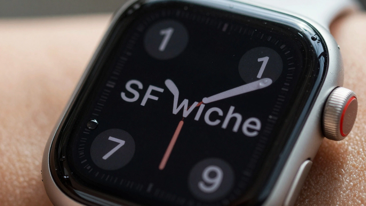
SF Compact is Apple's custom font designed to make text readable on the tiny screen of the Apple Watch. Learn how its unique spacing, stroke weight, and width variations solve legibility challenges in wearable design.
Categories
Popular Articles