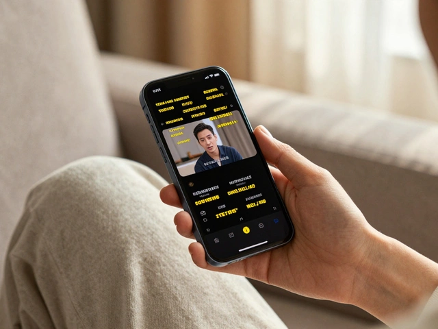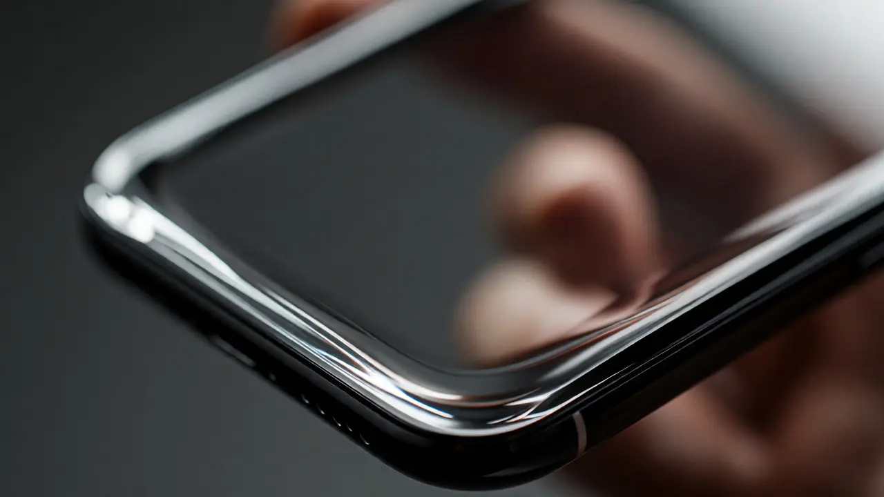

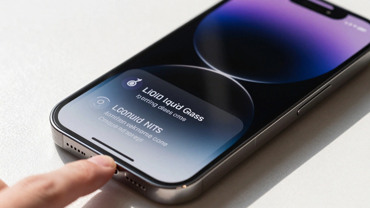
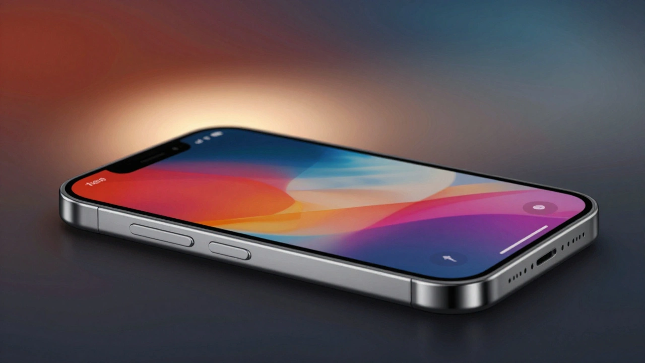
You’ve probably noticed that your phone’s screen isn’t actually a rectangle anymore. It’s got rounded corners, curved edges, and sometimes even cutouts for cameras. Yet, the apps you use often still look like they’re sitting on a flat, square canvas. This disconnect between the physical shape of your device and the digital interface running on it has been a headache for designers for years. Enter Liquid Glass, a design concept that doesn’t just ignore these hardware quirks but embraces them to create a seamless visual experience.
The core problem is simple: hardware manufacturers want sleek, ergonomic devices with soft curves. Software developers, however, have traditionally built interfaces based on rigid grids and sharp angles. When you put a sharp-cornered app on a curved screen, you get awkward gaps or clipped content. Liquid Glass solves this by treating the user interface as if it were made of a viscous, transparent material that flows over the hardware’s contours. It’s not just a aesthetic tweak; it’s a fundamental shift in how we think about the boundary between the physical device and the digital layer.
Why the Gap Between Hardware and Software Exists
To understand why this matters, you have to look at where we came from. For decades, screens were flat rectangles. Design systems like Material Design or early iOS guidelines assumed a fixed rectangular viewport. You designed for pixels, not for physical curvature. But as phones became more like slabs of glass and less like boxes, the hardware evolved faster than the software standards.
This created what I call the "corner anxiety." Developers had to write complex code to detect where the screen was curved and then manually adjust padding and margins. If they got it wrong, buttons looked off-center, or text ran into the bezel. Users felt it too, even if they couldn’t articulate why an app felt "janky" or unnatural. The interface didn’t feel like it belonged to the device; it felt pasted on top of it.
What Is Liquid Glass Exactly?
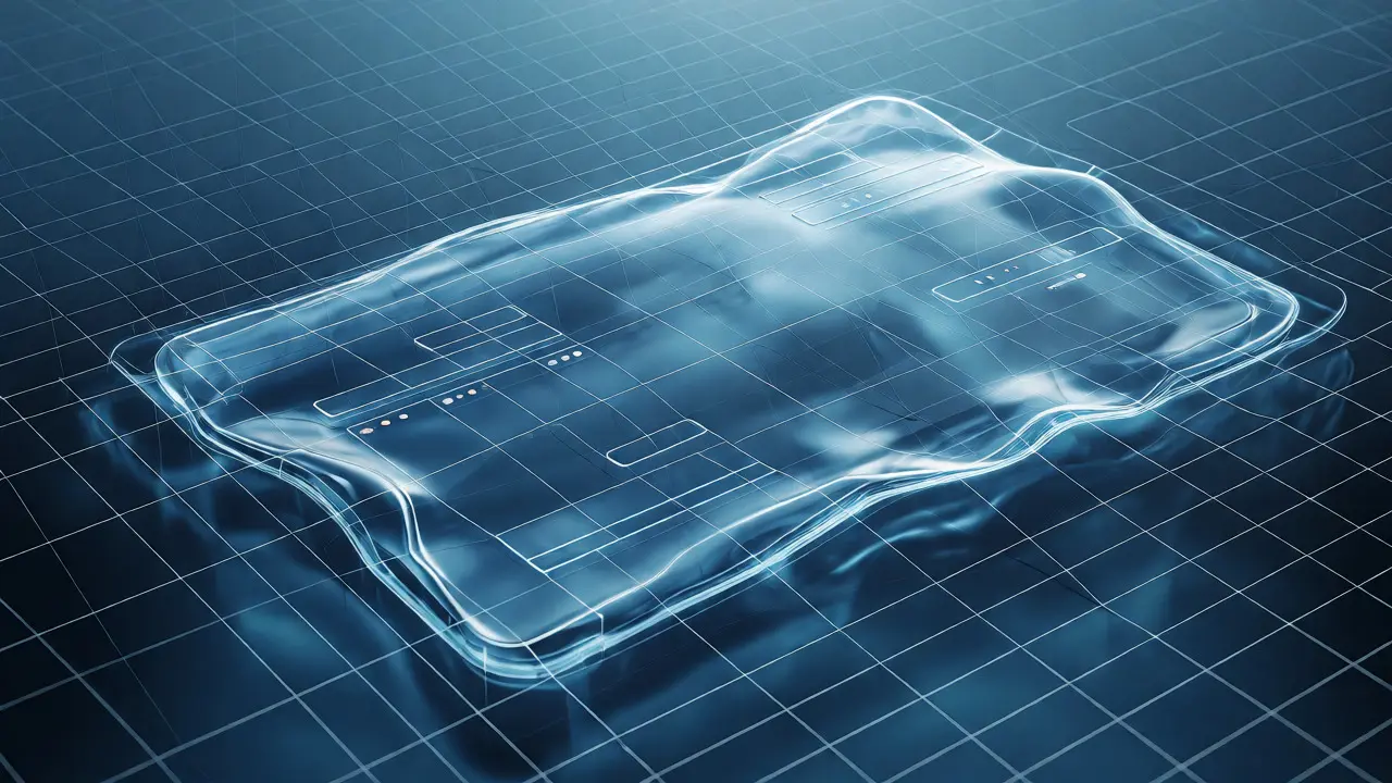
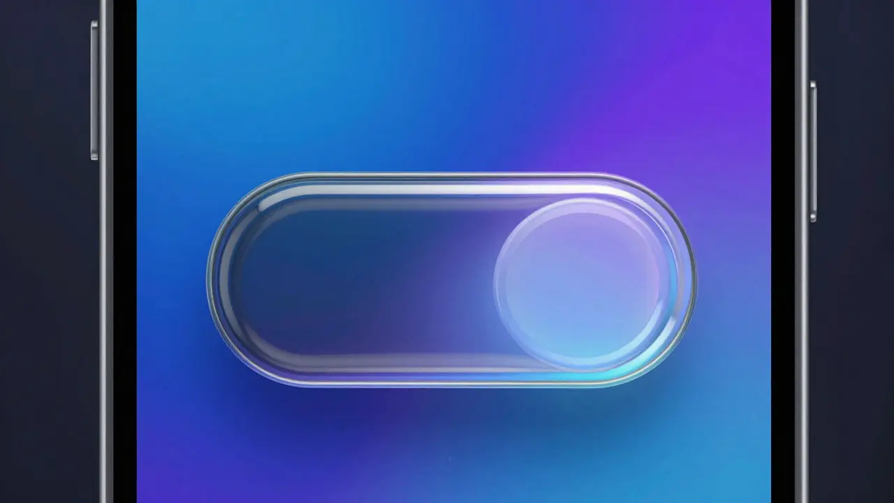
Liquid Glass is a design philosophy and technical framework that uses dynamic rendering to adapt software elements to the physical geometry of the display. Think of it like water filling a container. If the container (your phone) has rounded edges, the water (the UI) naturally conforms to those edges without leaving empty spaces or overflowing awkwardly.
In practice, this means using advanced masking techniques and real-time layout calculations. Instead of hard-coding a button to be 10 pixels from the left edge, the system calculates the exact distance from the visible curve of the screen. The result is an interface that feels organic. Elements don’t just sit near the corner; they hug it. This approach relies heavily on modern GPU capabilities, which can now handle these complex shape calculations without draining your battery.
The Technical Mechanics Behind the Magic
So, how does the code actually make this happen? It’s not magic; it’s math and graphics processing. At its heart, Liquid Glass relies on three main components:
- Dynamic Viewport Masking: The operating system provides a map of the "safe area"-the part of the screen that is fully visible and touchable. This map changes based on the device model.
- Adaptive Layout Engines: Frameworks like SwiftUI or Jetpack Compose allow developers to define layouts that respond to these masks automatically. You don’t draw a box; you define a relationship between elements.
- Visual Continuity Layers: Backgrounds and shadows are rendered with gradients that fade out precisely at the hardware curve, creating an illusion of depth and transparency.
For example, when you scroll a list on a modern iPhone, the background doesn’t abruptly stop at the bottom corner. It fades smoothly, following the curve. This is achieved by applying a shader effect that adjusts opacity based on the pixel’s distance from the screen’s edge. It sounds complex, but for the developer, it’s often just a single line of code thanks to updated SDKs.
Benefits for Users and Developers
You might ask, "Is this worth the effort?" Absolutely. For users, the benefit is cognitive ease. When the interface matches the hardware, your brain processes the visual information faster. There’s no mental friction trying to reconcile a square button with a round corner. Everything feels cohesive, premium, and intentional.
For developers, Liquid Glass reduces maintenance headaches. Instead of writing specific hacks for every new phone release, you rely on the system’s adaptive tools. If Apple or Samsung releases a device with a different curve radius, your app adapts automatically. This future-proofs your design significantly. Plus, it encourages a more consistent design language across platforms, making cross-platform development smoother.
| Feature | Traditional Fixed Layout | Liquid Glass Adaptive Layout |
|---|---|---|
| Corners Handling | Manual padding adjustments per device | Automatic conformance to hardware mask |
| Visual Consistency | Potential clipping or large gaps | Seamless flow with screen edges |
| Development Effort | High (requires constant updates) | Low (system handles adaptation) |
| User Perception | Can feel disjointed | Feels native and integrated |
| Performance Impact | Negligible | Minimal (GPU-accelerated) |
Implementing Liquid Glass Principles Today
If you’re a designer or developer, you don’t need to wait for the next OS update to start using these ideas. Here’s how you can bring Liquid Glass principles into your current projects:
- Audit Your Safe Areas: Check how your app currently handles screen edges. Are you using hardcoded margins? Switch to dynamic insets provided by your framework.
- Embrace Transparency: Use semi-transparent backgrounds that allow the wallpaper or underlying layers to show through, especially near the edges. This enhances the "glass" effect.
- Test on Multiple Devices: Don’t just test on one emulator. Try your UI on devices with different corner radii and notch styles. See where things break.
- Use Soft Shadows: Hard drop shadows look fake on curved surfaces. Use diffuse, multi-layered shadows that mimic light passing through glass.
Remember, the goal isn’t to hide the hardware but to celebrate it. When your UI respects the physical constraints of the device, it builds trust. Users subconsciously perceive this attention to detail as quality.
The Future of Interface Geometry
We are moving toward foldables, rollable displays, and eventually, maybe even flexible screens. In a world where the hardware shape itself can change dynamically, static software corners become obsolete. Liquid Glass is essentially the bridge to that future. It teaches us that interfaces shouldn’t be rigid boxes but fluid responses to their environment.
As hardware continues to push boundaries-think under-display cameras and thinner bezels-the role of software will be to smooth out the transition. We won’t see "screens" anymore; we’ll see continuous surfaces. And the only way to make that work visually is to treat our digital content like liquid glass: adaptable, transparent, and perfectly shaped to fit the vessel holding it.
Does Liquid Glass require special hardware?
No, it primarily requires modern software frameworks that support dynamic layout adjustments. However, the visual effect is most pronounced on devices with curved edges or non-rectangular displays, such as modern smartphones and tablets.
Is Liquid Glass compatible with Android and iOS?
Yes, the concept applies to both platforms. iOS uses safe area insets extensively, while Android’s WindowInsets API allows similar adaptive behaviors. Many cross-platform frameworks like Flutter and React Native also support these features.
Will Liquid Glass affect my app's performance?
The impact is minimal on modern devices because the calculations are handled by the GPU. Older devices might struggle slightly with complex masking effects, but standard adaptive layouts rarely cause noticeable lag.
How do I test Liquid Glass designs?
Use device simulators that offer various screen shapes and aspect ratios. Additionally, testing on physical devices with different corner radii (like comparing an older iPhone to a newer Pro model) gives the best insight into how your UI adapts.
Can I apply Liquid Glass to desktop applications?
While less common due to typically rectangular monitors, it is applicable to window borders and floating panels. Modern OSes like macOS and Windows 11 already incorporate some rounded corner aesthetics, making the principle relevant for consistency.
Categories
Popular Articles