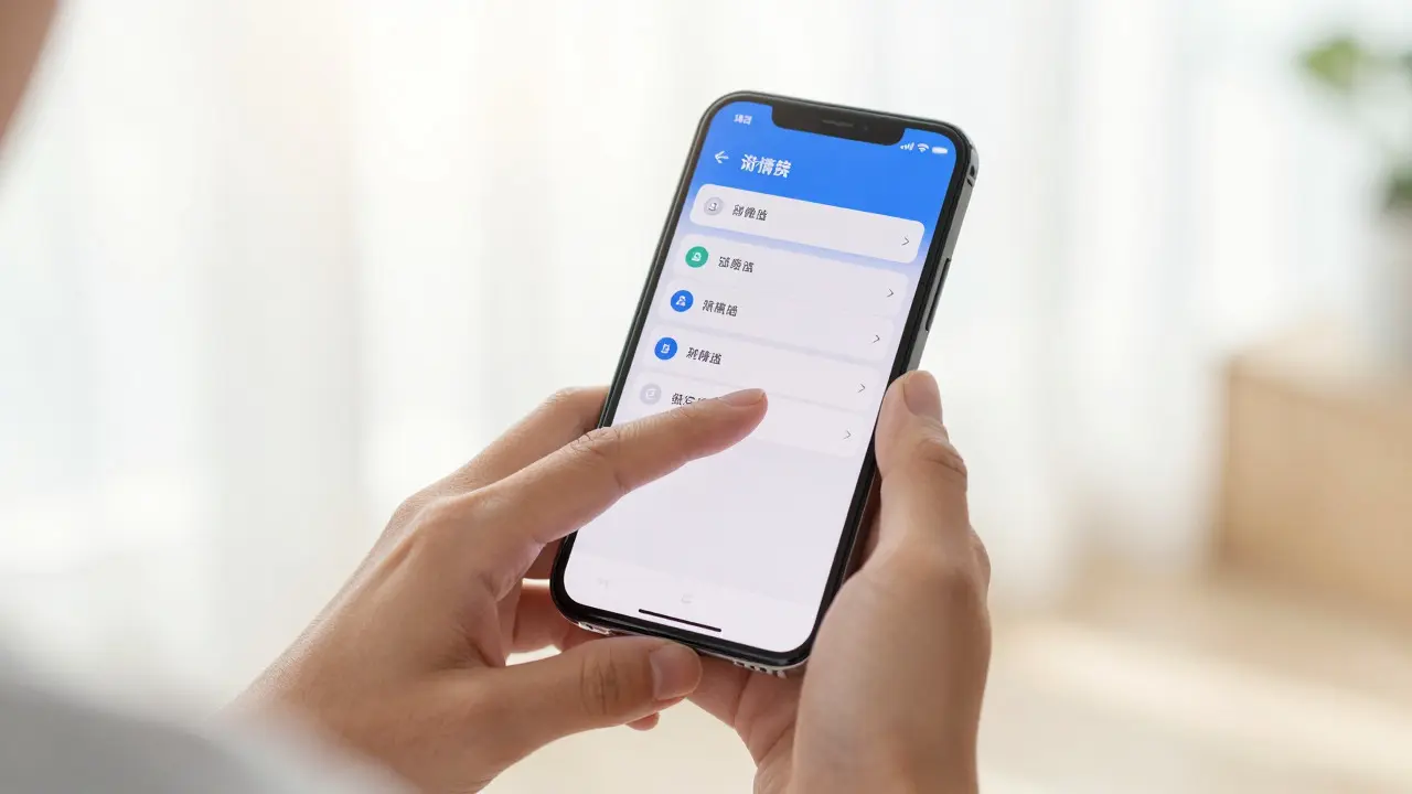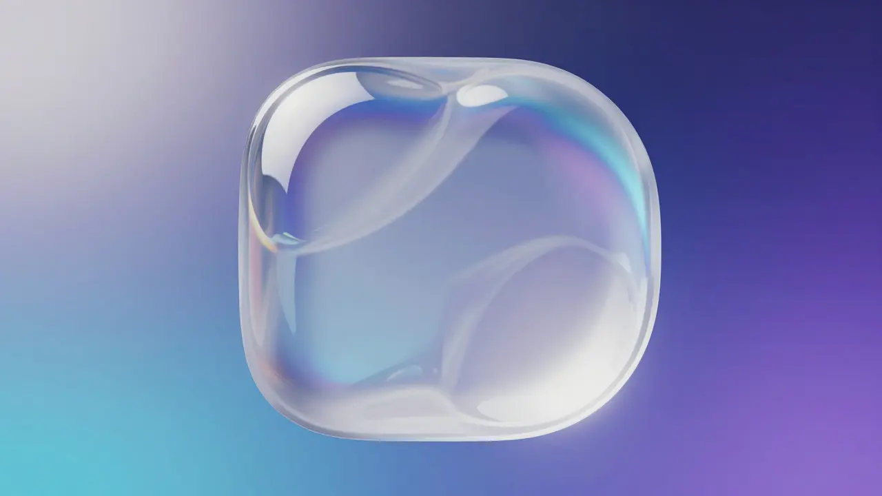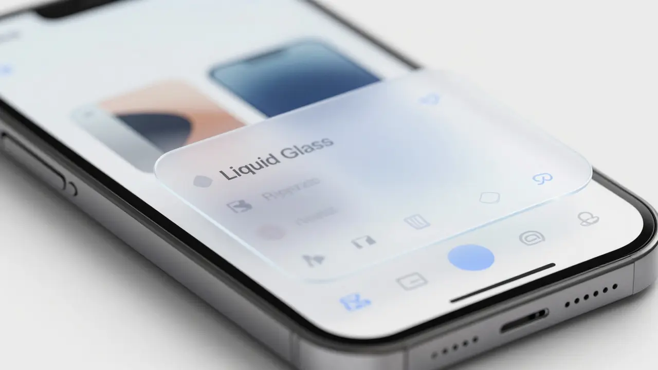

Ever clicked a button and wondered where you were in the app? Or tapped a menu item only to feel lost in a sea of flat icons? That’s exactly the problem Liquid Glass is solving. It’s not just a shiny new aesthetic trend; it’s a functional approach to navigation hierarchy that uses transparency, blur, and depth cues to keep users oriented without cluttering the screen. In 2026, as interfaces become more complex and multi-layered, Liquid Glass offers a way to show context-where you are, what’s behind you, and what’s next-without overwhelming the user.
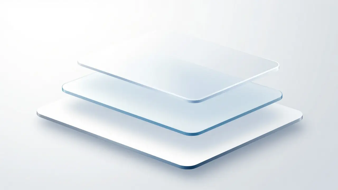
The core idea is simple: use visual layers to communicate structure. Instead of hiding menus or burying options in drawers, Liquid Glass lets background content bleed through slightly blurred panels. This creates a natural sense of place. You can see the page you came from while interacting with a new layer. It’s like looking through frosted glass at your desk-you know what’s underneath, but it doesn’t distract you from the task at hand.
Why Flat Design Hit Its Limits
For years, flat design reigned supreme. Clean lines, solid colors, minimal shadows. It worked well for simple apps but struggled when complexity crept in. When you have multiple levels of navigation, modals, sidebars, and overlays, flat design often fails to distinguish between them. Users start clicking blindly because there are no visual cues indicating depth or hierarchy.
Liquid Glass brings back depth without returning to the heavy skeuomorphism of the early 2010s. It’s subtle. A 10% opacity change or a 4-pixel blur can make a massive difference in how users perceive spatial relationships. The key is restraint. If everything looks like glass, nothing stands out. The magic happens when you selectively apply these effects to interactive elements that need to stand above the content below.
Building the Hierarchy: Layers and Transparency
To implement Liquid Glass effectively, you need to think in terms of layers. Each layer represents a different level of interaction or information density. Here’s how to structure them:
- Base Layer (Content): Your main text, images, and primary data. No blur, full opacity. This is the foundation.
- Secondary Layer (Navigation/Menus): Slight blur (8-12px) and 90-95% opacity. These elements float above the content but remain connected to it.
- Tertiary Layer (Modals/Overlays): Higher blur (16-24px) and 85-90% opacity. These demand attention and clearly separate from the rest of the interface.
- Quaternary Layer (Tooltips/Notifications): Minimal blur, high contrast borders. Used sparingly for transient info.
The trick is consistency. If your navigation bar uses a 10px blur, don’t suddenly jump to 30px for a dropdown menu unless you’re signaling a major shift in context. Smooth transitions between states help users track their position. Think of it like zooming in on a map-the background stays visible but becomes less detailed as you focus on specific areas.
Practical Implementation Tips
You don’t need expensive plugins to achieve this look. Modern CSS makes it surprisingly accessible. The backdrop-filter property is your best friend here. It allows you to apply blur and saturation directly to the area behind an element. Combined with semi-transparent backgrounds, you get that signature Liquid Glass effect.
Here’s a quick example of how this works in code:
.glass-panel {
  background: rgba(255, 255, 255, 0.7);
  backdrop-filter: blur(10px);
  -webkit-backdrop-filter: blur(10px);
  border: 1px solid rgba(255, 255, 255, 0.3);
  border-radius: 12px;
}
Notice the border? It’s crucial. Without a subtle edge, the glass effect can disappear against light backgrounds. A thin, low-opacity border helps define the shape of the element, giving it physical presence. Also, pay attention to color contrast. Text on glass panels needs to be darker than usual if the background is light, or lighter if the background is dark. Aim for a contrast ratio of at least 4.5:1 to maintain accessibility standards.
Common Pitfalls to Avoid
Even with the right tools, it’s easy to overdo it. Here are the most common mistakes designers make when adopting Liquid Glass:
- Too Much Blur: If you can’t read the text behind the panel, you’ve gone too far. Keep blur values under 20px for most applications. High blur kills readability and increases cognitive load.
- Inconsistent Opacity: Mixing 50% and 90% opacity panels in the same view creates visual noise. Stick to a tight range (e.g., 85%-95%) for all interactive layers.
- Ignoring Performance: Backdrop filters can be GPU-intensive. On older devices, excessive blur can cause frame drops. Test on mid-range hardware to ensure smooth scrolling and interactions.
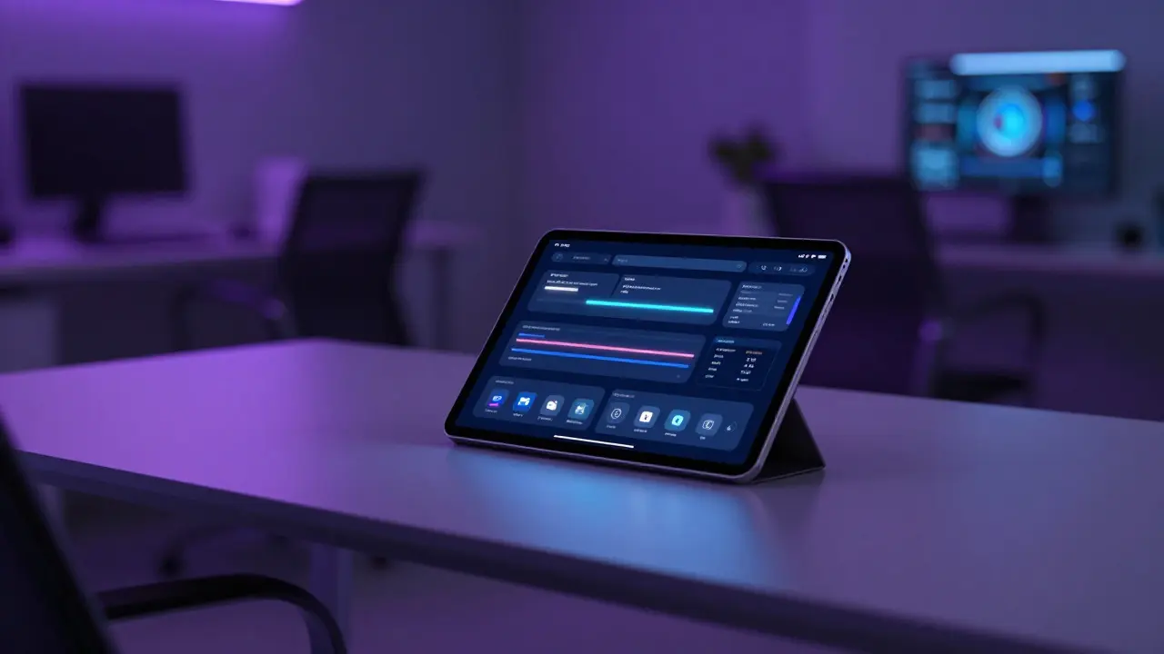
- Forgetting Dark Mode: Glass looks different in dark mode. White glass might look like fog, while black glass can disappear into the background. Adjust tint and border colors accordingly. Often, a slight blue or purple tint works better in dark themes than pure white or black.
Comparing Approaches: Liquid Glass vs. Traditional Shadows
Many designers still rely on drop shadows to indicate elevation. While shadows work, they lack the contextual connection that glass provides. Shadows suggest separation; glass suggests continuity. Let’s compare the two approaches side-by-side:
| Feature | Liquid Glass | Drop Shadows |
|---|---|---|
| Context Awareness | High - shows background content | Low - isolates element |
| Visual Weight | Light, airy | Can feel heavy or detached |
| Performance Cost | Moderate (GPU dependent) | Low (CPU efficient) |
| Dark Mode Adaptability | Requires careful tuning | Works out-of-the-box |
| User Orientation | Strong - maintains spatial memory | Weak - breaks spatial continuity |
If your app has deep navigation structures, like a file explorer or a multi-step checkout process, Liquid Glass usually wins. It keeps the user anchored to their starting point. For simpler, single-page layouts, drop shadows might be sufficient and more performant.
Accessibility Considerations
One concern with transparent designs is accessibility. Can users with low vision tell where the clickable areas are? The answer is yes, if you follow these rules:
- Use distinct hover and active states. Change opacity or add a glow effect when users interact with glass elements.
- Maintain high contrast for text. Don’t rely on the glass effect alone to separate foreground from background.
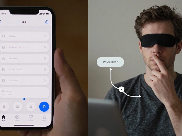
- Provide non-visual alternatives. Screen readers should still announce navigation changes clearly, regardless of the visual style.
- Test with real users. What looks clear to a designer might be confusing to someone with color blindness or low contrast sensitivity.
Accessibility isn’t just about compliance; it’s about ensuring everyone understands the hierarchy. If the glass effect hides important buttons, it’s failing its primary job: guiding the user.
Future Trends in Interface Depth
As we move further into 2026, expect to see Liquid Glass evolve. We’re already seeing experiments with dynamic blur based on scroll speed or device tilt. Imagine a navigation bar that blurs more as you scroll down, creating a parallax-like effect that reinforces depth. Or interfaces that adjust transparency based on ambient light, using the device’s sensors to optimize visibility.
Another trend is the integration of haptic feedback. When a glass panel “solidifies” upon selection, a subtle vibration can confirm the action. This multisensory approach strengthens the mental model of physical objects in digital spaces. It’s not just about looking good; it’s about feeling intuitive.
Ultimately, the goal of designing with Liquid Glass is to reduce friction. Every pixel should serve a purpose. If the transparency doesn’t help the user understand where they are or what to do next, remove it. Simplicity remains king, even when the surface looks like water.
What is Liquid Glass in UI design?
Liquid Glass is a design technique that uses semi-transparent layers with backdrop blur to create depth and hierarchy in user interfaces. It allows background content to show through interactive elements, providing context without clutter.
How does Liquid Glass improve navigation?
By maintaining visual continuity between layers, Liquid Glass helps users understand their current location within an app. Seeing the underlying content reduces disorientation during multi-step processes or complex menu structures.
Is Liquid Glass suitable for mobile devices?
Yes, but performance must be monitored. Modern smartphones handle backdrop filters well, but older models may experience lag. Optimize blur radius and test on mid-range devices to ensure smooth interactions.
What CSS properties are needed for Liquid Glass?
The primary property is backdrop-filter with a blur value. Combine this with a semi-transparent background color (using rgba) and a subtle border to define the element's edges. Vendor prefixes like -webkit-backdrop-filter may also be required for broader compatibility.
How do I ensure accessibility with transparent UIs?
Maintain a minimum contrast ratio of 4.5:1 for text on glass panels. Use distinct hover and focus states to highlight interactive areas. Test with screen readers and users with low vision to verify that the hierarchy is clear without relying solely on visual cues.