
You know that feeling when a new Apple OS drops and suddenly your app looks like it belongs in a museum? It’s not just about changing colors or swapping icons. The real shift happens in the system materials-the digital textures, blurs, and lighting effects that define the depth of an interface. If you’re still shipping flat designs while Apple is pushing translucent layers, you’re fighting against the current instead of riding it.
Adopting these materials early isn’t just about keeping up with trends; it’s about usability. Users expect interfaces to feel physical, even though they’re touching glass. When you ignore the new material standards, your app feels disconnected from the rest of their phone experience. Let’s break down how to actually implement these changes without breaking your build or confusing your users.
What Are System Materials?
Before we talk about adoption, let’s get clear on what we’re dealing with. In the context of Apple’s ecosystem, a system material is a predefined visual style that handles background blur, tinting, and vibrancy automatically. Think of it as a smart wrapper for your views.
Unlike a simple hex color code, a material reacts to its environment. If you place a button over a photo, the material adjusts its opacity and blur so the text remains readable. If you move that same button over a white settings menu, it shifts to ensure contrast. This dynamic behavior is powered by the operating system, not your custom CSS or Swift code.
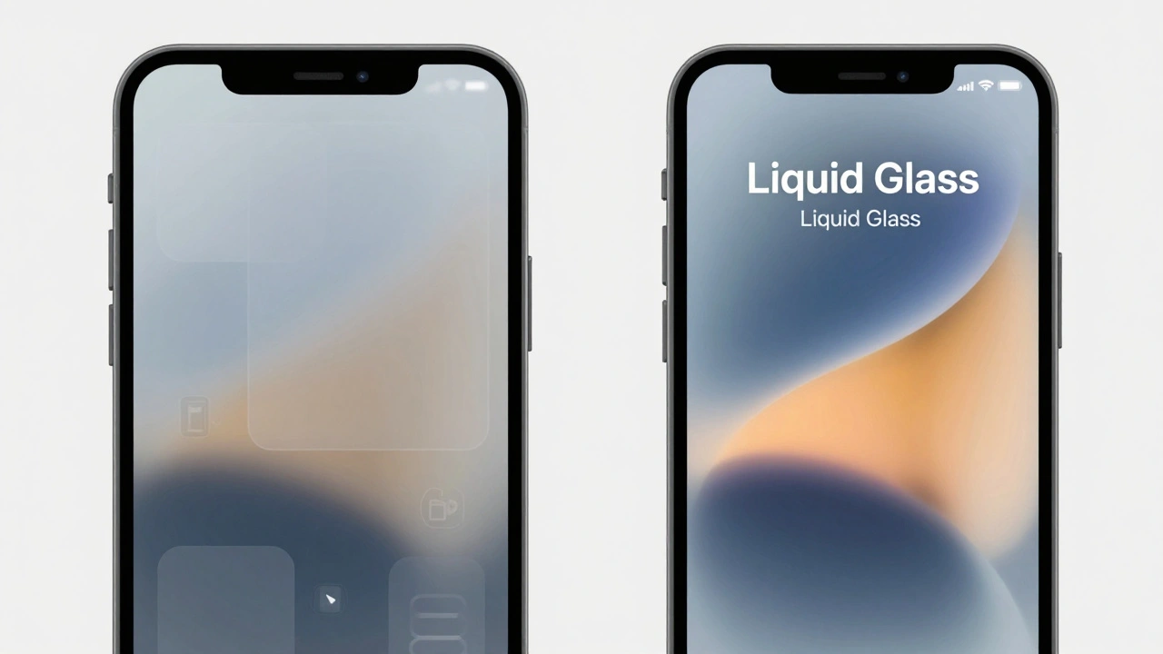
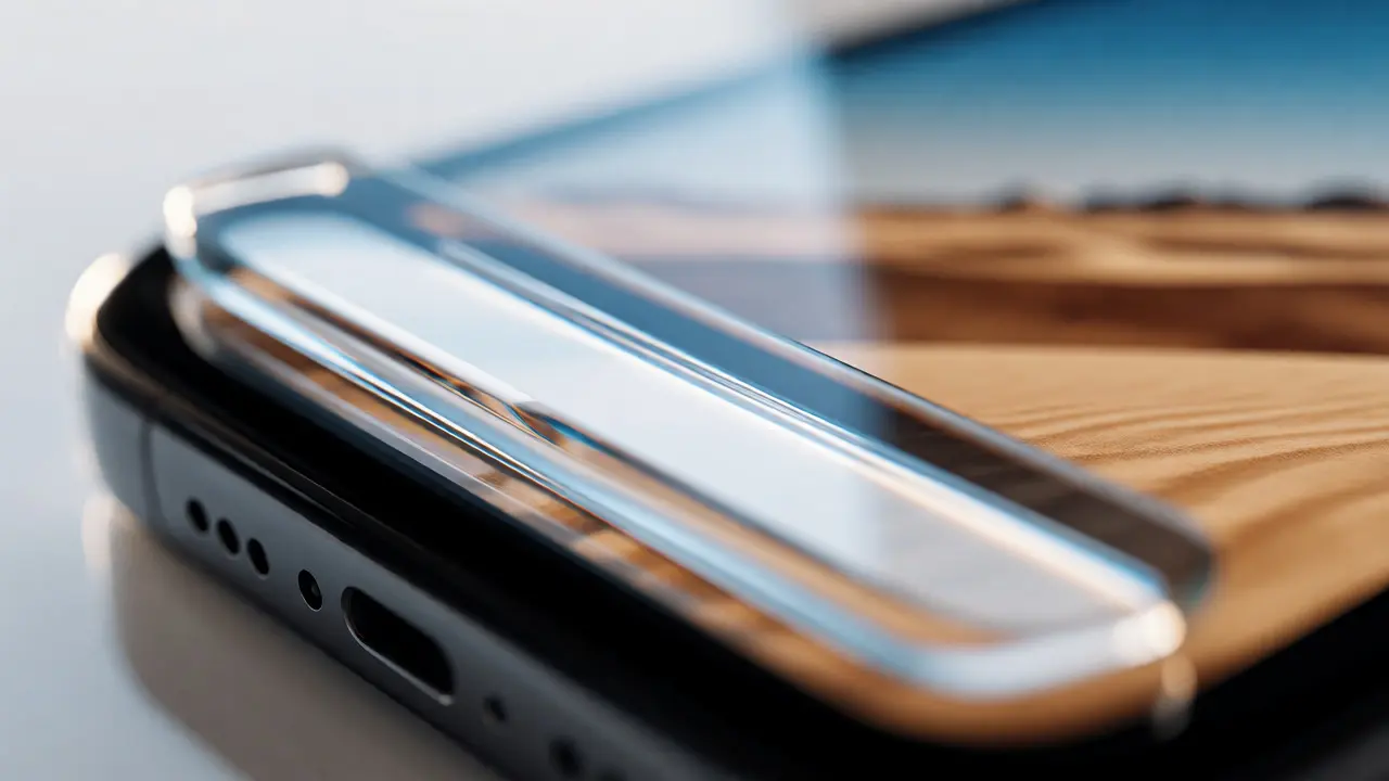
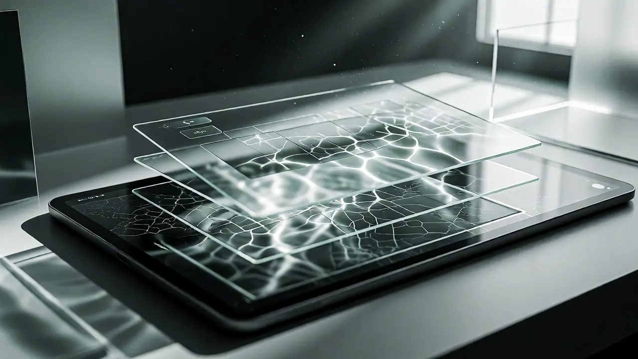
The most prominent example recently is Liquid Glass, introduced with iOS 26. It’s not just a frosted glass effect; it’s a refractive surface that bends light around elements, creating a sense of depth that static images can’t match. Understanding this distinction is key. You aren’t just adding transparency; you’re adding physics.
Why Early Adoption Matters
You might be thinking, "I’ll wait until the next major update." That’s a risky bet. Apple’s Human Interface Guidelines (HIG) are strict, and App Store review teams are increasingly flagging apps that look outdated or inconsistent with the current OS version. But beyond compliance, there’s the user perception angle.
When your app matches the system materials, it feels native. It disappears into the user’s workflow. When it doesn’t, it stands out as "third-party" in a negative way. Early adopters also benefit from better tooling support. Design tools like Figma and development frameworks like SwiftUI often release updated libraries within weeks of a new OS launch. Waiting means you’re working with legacy assets while competitors are leveraging new features.
Consider the performance aspect. Native materials are optimized at the GPU level. Trying to replicate a complex blur effect with third-party libraries or custom shaders often drains battery life and causes jank during scrolling. By adopting the system standard, you’re offloading heavy lifting to Apple’s hardware optimizations.
From Flat to Fluid: The Evolution
To understand where we’re going, look at where we’ve been. Apple’s design language has swung between two poles: skeuomorphism and minimalism.
| Era | Key Material | Visual Characteristic | User Expectation |
|---|---|---|---|
| iOS 1-6 | Skeuomorphic Textures | Realistic leather, paper, metal | Physical familiarity |
| iOS 7-14 | Flat Colors & Subtle Gradients | High contrast, solid fills | Clarity and speed |
| iOS 15-18 | Standard Blur Materials | Translucency, layered depth | Contextual awareness |
| iOS 26+ | Liquid Glass | Refraction, specular highlights | Immersive realism |
The shift from iOS 7’s flat design was controversial but necessary for scalability. Now, with Liquid Glass, we’re seeing a return to realism, but with a modern twist. It’s not about looking like a fake notebook; it’s about looking like a sophisticated piece of technology. The goal is harmony, not decoration.
Practical Steps for Implementation
So, how do you actually swap out old backgrounds for new system materials? Here is a straightforward workflow for designers and developers.
- Audit Your Existing Assets: Open your design file. Identify every instance where you used a semi-transparent black or white overlay. These are likely candidates for replacement. Look for hard-coded hex codes like #FFFFFF80. These need to go.
- Map to System Tokens: Instead of specific colors, use semantic tokens. In SwiftUI, this means using modifiers like `.background(.regularMaterial)` or `.background(.ultraThinMaterial)`. Don’t guess which one fits; test them against your content.
- Test Contrast Ratios: Translucent backgrounds change based on what’s behind them. A white text label might be readable on a dark photo but invisible on a bright sky. Use accessibility checkers that simulate different underlying content. Ensure your text maintains a 4.5:1 contrast ratio regardless of the background blur intensity.
- Update Figma Libraries: If you work in Figma, don’t manually draw blurs. Install community plugins or official Apple UI kits that sync with the latest OS updates. This ensures your mockups reflect the actual rendering engine, including noise and grain textures that screens display differently than monitors.
One common pitfall is overusing materials. If everything is blurred, nothing is. Use materials to create hierarchy. Primary actions should sit on solid or distinct surfaces, while secondary information can recede into translucent layers. This guides the eye naturally.
Tools That Help You Adapt Faster
You don’t have to do this blind. Several tools streamline the transition to new system materials.
Sketch and Figma have both rolled out advanced blur effects that mimic iOS rendering more accurately than before. However, the real game-changer is SwiftUI Preview. Developers can now see exactly how materials react to different content types in real-time within Xcode. No more guessing games.
For those managing large design systems, tools like Storybook (for web-based prototypes) or Zeplin help document these material specs for cross-functional teams. They allow you to annotate not just colors, but blur radii and opacity percentages, ensuring consistency across platforms.
If you’re dealing with legacy UIKit projects, consider bridging to SwiftUI components for specific views. You don’t need to rewrite the whole app. Start with navigation bars and modals-these are high-visibility areas where users notice material inconsistencies immediately.
Pitfalls to Avoid
Not every screen benefits from Liquid Glass. Complex data tables with dense text can become unreadable if the background moves too much behind them. In these cases, stick to solid backgrounds or very subtle tints. Reserve the heavy refraction effects for hero sections, media viewers, and navigation overlays.
Another trap is ignoring Dark Mode. Materials behave differently in light and dark appearances. A material that provides good contrast in Light Mode might fail in Dark Mode because the underlying luminance changes. Always test both variants. Apple’s automatic adjustments usually handle this well, but custom overrides can break the balance.
Finally, watch your animation curves. New materials often come with new motion guidelines. Elements shouldn’t just fade in; they should scale and blur together. If you animate position but forget to animate the blur radius, the transition will feel disjointed. Sync your timing functions with the system defaults.
Looking Ahead: What’s Next for Apple Design?
We’re moving toward interfaces that are less about static pixels and more about environmental response. Future releases may tie materials to device sensors, adjusting brightness and texture based on ambient light conditions detected by the camera. Imagine your app’s glass effect becoming clearer when you walk outside into sunlight.
Staying ahead means keeping an eye on beta releases and WWDC announcements. Join developer communities where engineers share early findings on performance impacts. The gap between a "good" app and a "great" app is often measured in these subtle details. By adopting system materials early, you’re not just updating your visuals; you’re signaling to users that your product is alive, responsive, and cared for.
Can I use system materials on older iOS versions?
Yes, but with limitations. Most system materials have fallbacks. For example, if you request a 'Liquid Glass' effect on an iPhone running iOS 15, the system will typically render a standard blur material instead. This ensures compatibility, though you lose the specific refractive qualities of the newer OS. Always test on the minimum supported version to ensure readability hasn't degraded.
Do system materials impact battery life?
They do, but minimally if used correctly. Because these effects are hardware-accelerated by the GPU, they are far more efficient than custom software-rendered blurs. However, stacking multiple layers of heavy blur (like a blurred modal over a blurred tab bar over a blurred map) can increase GPU load. Keep layer complexity reasonable to maintain optimal battery performance.
How do I ensure my text is accessible over translucent backgrounds?
Use the system's built-in vibrancy styles. In SwiftUI, applying `.foregroundStyle(.primary)` or `.secondary` allows the text to automatically adjust its opacity and blend mode to remain legible against varying backgrounds. Additionally, avoid placing small, thin fonts directly over highly textured or high-contrast images without a supporting material layer.
Is it worth updating my entire app to new materials at once?
Usually, no. A phased approach is safer. Start with global elements like navigation bars, tab bars, and modals. These are consistent across the app and provide immediate visual cohesion. Then, tackle individual screens based on usage metrics. High-traffic screens deserve attention first. This reduces risk and allows you to gather user feedback incrementally.
What is the difference between 'Material' and 'Blur'?
A blur is just a Gaussian blur effect applied to the background. A Material includes the blur, but also adds a tint (color), a saturation adjustment, and sometimes a noise texture. This combination creates the illusion of physical depth and separation between layers. Using only blur often results in a muddy appearance, whereas materials maintain clarity and structure.