Tag: Apple interface design
Motion and Depth in Apple Interfaces: How Spatial Design Communicates State Without Noise

Apple uses motion and depth-not alerts or sounds-to communicate state in its interfaces. This quiet, spatial design reduces cognitive load, enhances focus, and feels intuitive by working with how human vision naturally perceives space and movement.
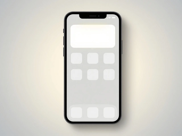
How Apple Builds Confidence Through Interface Clarity: Micro-Interactions That Reduce Cognitive Load
Apple builds user confidence not through flashy features, but through tiny, thoughtful interface details. These micro-interactions reduce mental strain, create trust, and make every tap feel intentional and reliable.
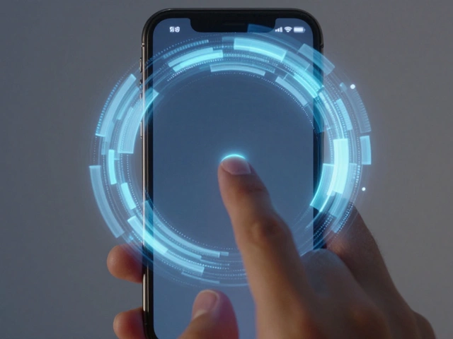
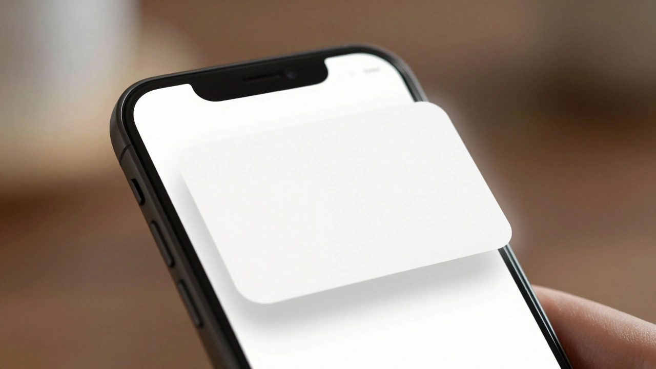
How Apple Uses Motion and Depth to Show Interface Hierarchy
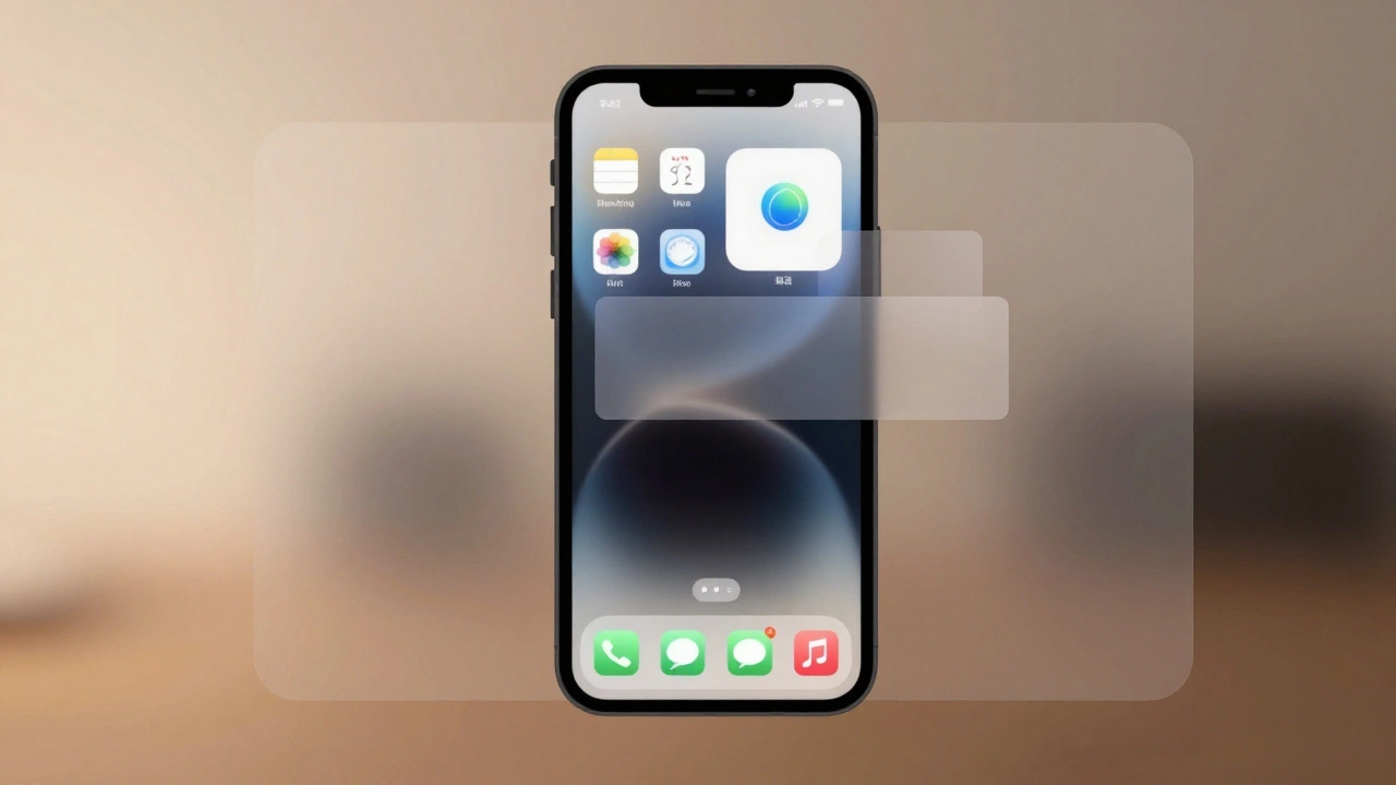
Apple uses motion and depth-not color or size-to silently guide users through interfaces. By blending subtle shadows, fluid transitions, and translucent layers, Apple makes hierarchy feel intuitive, not forced. This approach reduces clutter and keeps focus on content.
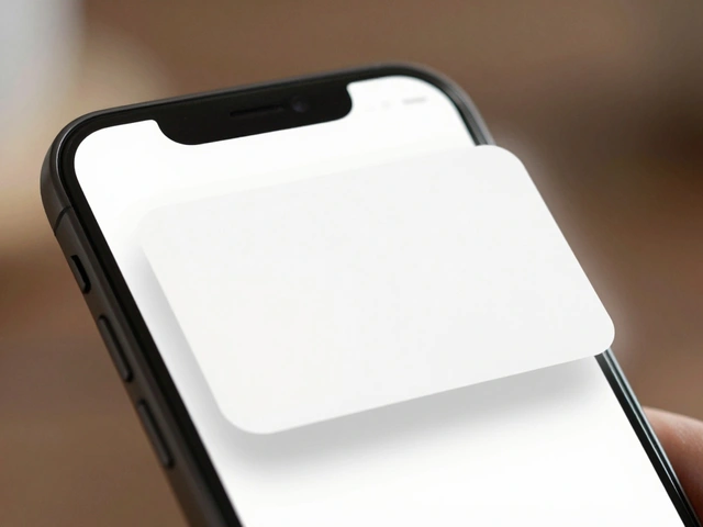
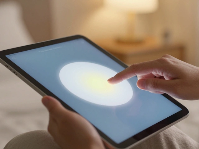
Liquid Glass on iPhone: How Translucent Controls Keep Focus on Content
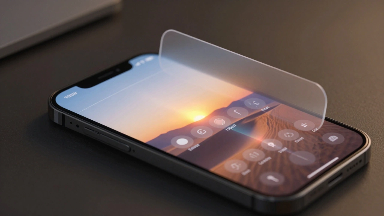
Liquid Glass on iPhone is Apple's new interface design that uses dynamic translucency to keep content front and center while making controls feel alive. It responds to light, motion, and touch-making every interaction smoother and more intuitive.
Categories
Popular Articles