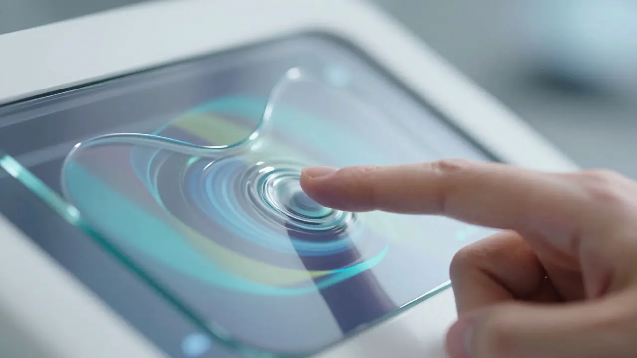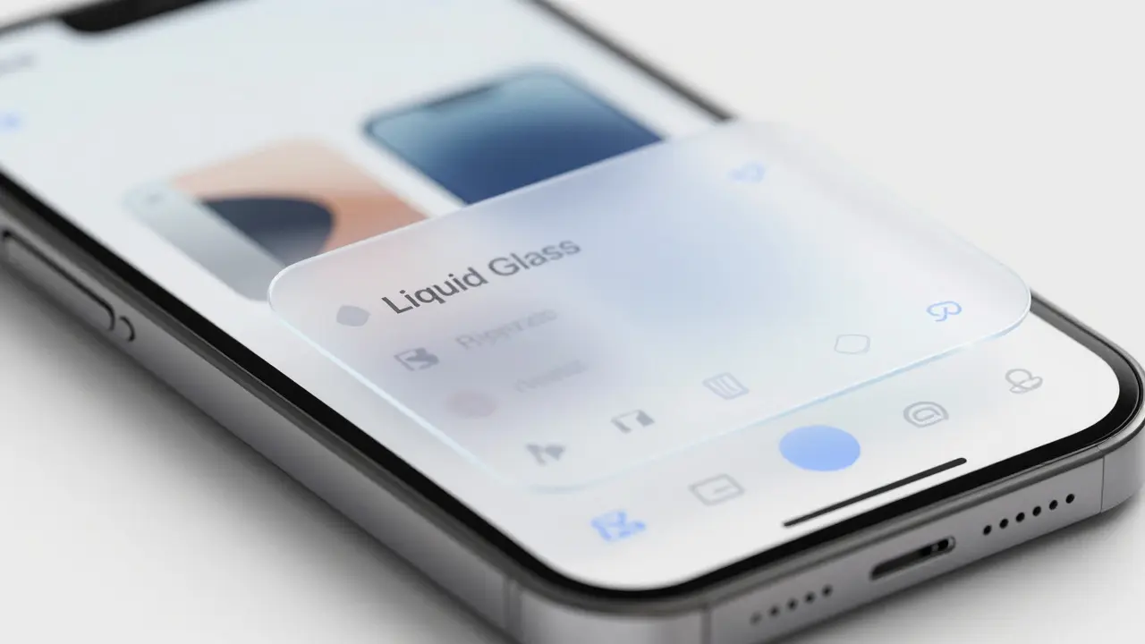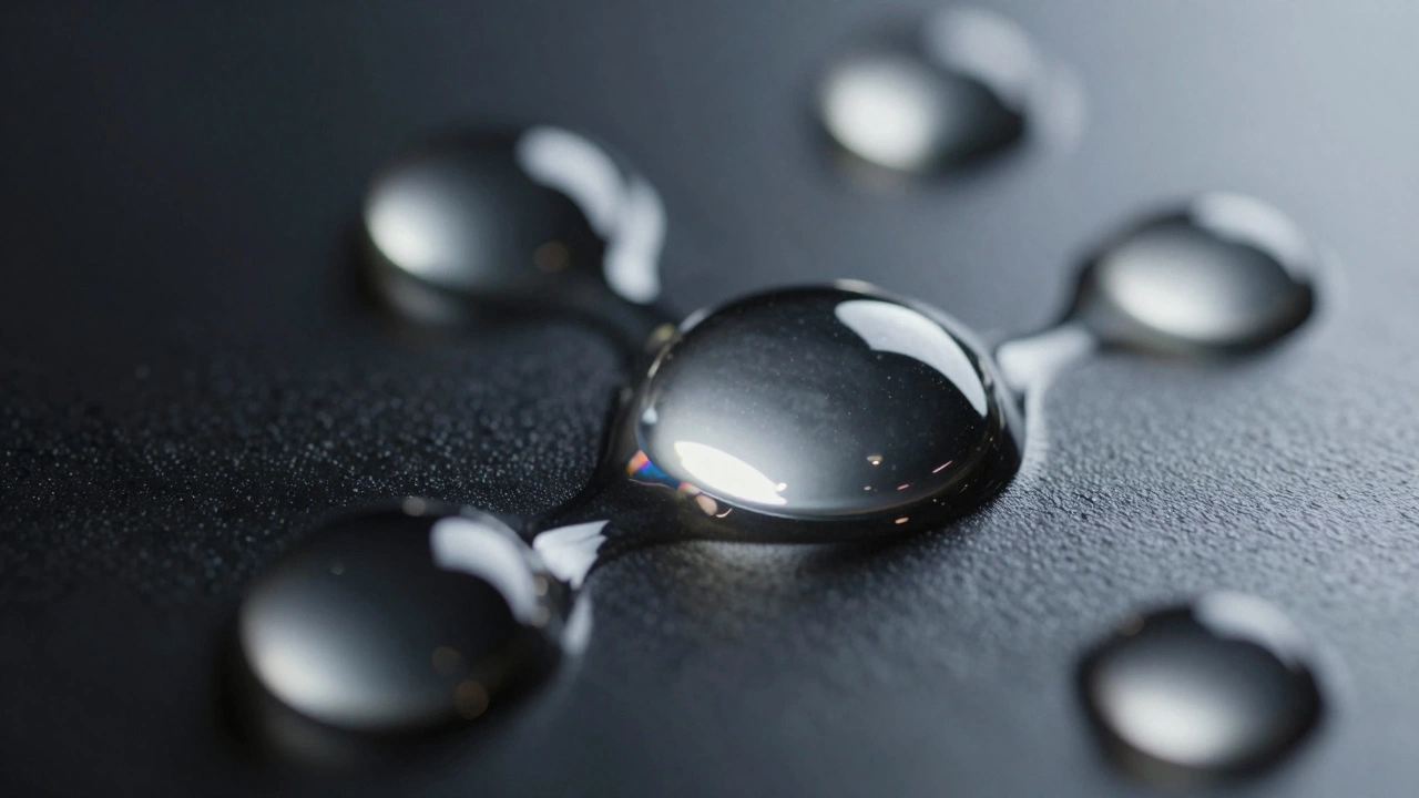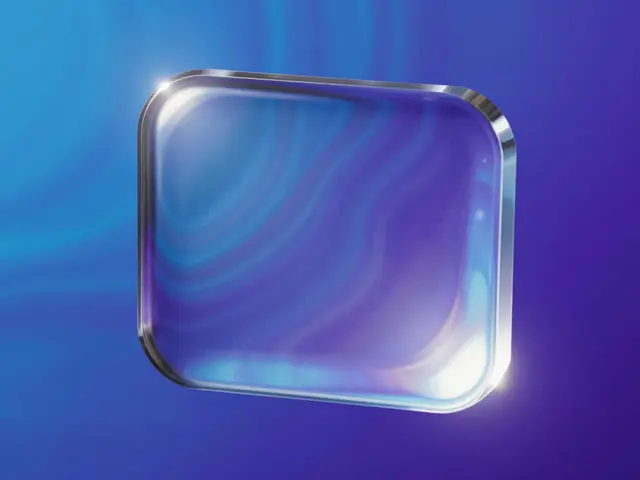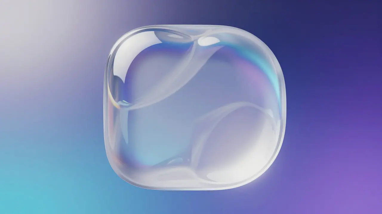

Imagine tapping a button that doesn’t just change color but ripples like water before settling into its new shape. That is the essence of Liquid Glass, a visual design aesthetic characterized by fluid, translucent, and refractive properties that mimic physical glass. In 2026, this isn't just a fancy filter; it is the standard language for premium user interfaces. When you combine liquid glass with micro-interactions, small, single-purpose animations that provide feedback on user actions, you create an interface that feels alive rather than static.
The core problem with most modern apps is that they feel flat. A toggle switch snaps from off to on instantly. It’s efficient, sure, but it lacks soul. By using subtle morphing techniques, you bridge the gap between the digital screen and the physical world. The goal is not to distract the user, but to confirm their action with a tactile sense of weight and flow. This article breaks down how to implement these effects without killing your frame rate or confusing your users.
Why Liquid Glass Works for State Changes
Traditional UI states are binary. You are either active or inactive. Visible or hidden. Liquid glass introduces a third dimension: transformation. Because glass is transparent and refracts light, any change in its underlying structure creates a visible distortion. This makes it perfect for showing progress, loading states, or selection changes.
Consider a navigation bar. In a standard flat design, selecting a tab might highlight it with a solid background. With liquid glass, the selected tab could appear as a raised pane of glass that subtly bends the content behind it. This visual cue tells the user two things at once: "You are here" and "This element has depth." It leverages our brain's innate understanding of physics. We know glass is heavy and smooth. When we see a UI element move with that specific inertia, we subconsciously trust it more.
This approach also solves the issue of visual clutter. Since liquid glass elements are semi-transparent, they don't block context. They overlay the interface without hiding it. This allows for complex state changes-like a card expanding to show details-without requiring the user to lose their place on the page. The background remains visible through the glass, maintaining spatial continuity.
Anatomy of a Liquid Glass Morph
To build these interactions, you need to understand the three key components of the effect: refraction, blur, and specular highlights. Each plays a distinct role in selling the illusion.
- Refraction: This is the bending of light. In code, this is often simulated using displacement maps or SVG filters. When the glass moves, the pixels behind it should shift slightly. If the movement is too fast, the distortion increases, mimicking the optical aberrations seen in real thick glass.
- Gaussian Blur: The background behind the glass must be blurred. The radius of this blur usually correlates with the thickness of the imaginary glass. Thicker glass equals higher blur. During a morph, you can animate the blur radius to simulate the glass getting thinner or thicker as it reshapes.
- Specular Highlights: These are the bright white reflections on the edges of the glass. They define the curvature. As the shape morphs, the highlights should slide across the surface. This is crucial because it provides directional lighting cues. Without moving highlights, the glass looks like a flat sticker, not a 3D object.
When combining these for a state change, such as a button turning from "Play" to "Pause," you aren't just swapping icons. You are animating the entire glass pane. The icon inside might stay sharp, but the container around it swells, the blur intensifies momentarily, and the highlights sweep across the top edge. This takes about 300 milliseconds to complete. Any longer, and it feels sluggish. Any shorter, and it feels jarring.
Implementing Smooth Morphing Techniques
How do you actually make the shape change smoothly? The answer lies in path interpolation. If you use CSS border-radius changes, you get a square-to-circle transition that looks mechanical. Instead, you want organic, blob-like transitions.
For web developers, this often involves using SVG paths with libraries that handle path morphing, or leveraging newer CSS features like d() property animation where supported. For mobile app developers, native frameworks like SwiftUI or Jetpack Compose now have built-in support for spring-based shape morphing. The key is to use easing curves that mimic fluid dynamics. A standard ease-in-out curve works, but a custom cubic-bezier with slight overshoot (where the shape stretches a bit past its final form before settling) adds significant realism.
Here is a practical rule of thumb: keep the morph duration between 250ms and 400ms. Use a stiffness value of 170 and damping of 26 if you are using spring physics. This combination creates a "wobbly" feel that resembles liquid viscosity. Avoid linear easing at all costs; it makes the glass look like it’s sliding on ice, which contradicts the heavy, viscous nature of the material.
Performance is the biggest enemy here. Real-time refraction is expensive. On low-end devices, trying to calculate live pixel displacement can drop your frame rate from 60fps to 30fps. To mitigate this, pre-render your displacement maps or use hardware-accelerated GPU filters. Never animate the blur radius on the main thread if you can avoid it. Offload these calculations to the compositor layer whenever possible.
Common Pitfalls in Fluid Design
It is easy to overdo it. The biggest mistake designers make is adding motion to every single state change. If every tiny hover effect triggers a full liquid ripple, the interface becomes exhausting to watch. Reserve the heavy morphing for primary actions: navigation, modal openings, and major toggles. For secondary actions, stick to simple opacity fades or scale transforms.
Another pitfall is ignoring accessibility. Users with vestibular disorders often suffer from motion sickness when exposed to excessive parallax or fluid movements. Always respect the prefers-reduced-motion media query. When this setting is active, replace the liquid morph with a simple cross-fade. The glass shape can still exist, but it shouldn’t wobble or ripple. This ensures inclusivity without sacrificing the aesthetic for those who can handle the motion.
Finally, watch out for contrast issues. Because liquid glass is translucent, text placed on top of it can become hard to read if the background behind the glass is too busy. You may need to add a subtle darkening layer or increase the saturation of the text color dynamically based on the background luminance. This is known as adaptive contrast, and it is essential for maintaining WCAG compliance while keeping the glassy look.
| Feature | Standard Flat UI | Liquid Glass UI |
|---|---|---|
| Visual Feedback | Color change or border highlight | Shape morph, blur shift, and light refraction |
| Perceived Weight | None (flat) | High (simulated mass and viscosity) |
| Context Retention | Low (solid backgrounds hide content) | High (transparency shows underlying layers) |
| Performance Cost | Very Low | Medium to High (requires GPU acceleration) |
| Best Use Case | Data-dense dashboards, utility tools | Consumer apps, media players, premium e-commerce |
Optimizing Performance for Fluid Effects
If you decide to go the liquid route, you need to monitor your performance budget. A good rule is that your animation should never consume more than 16.6ms per frame to maintain 60fps. If you are dropping below that, simplify the effect. Reduce the number of blur layers. Limit the complexity of the SVG displacement map. Sometimes, a simpler, faster animation feels better than a complex, stuttering one.
Test on actual devices, not just simulators. Simulators often fake GPU acceleration, making your animations look smoother than they will be on a mid-range Android phone from three years ago. Carry a few older devices in your pocket. If the liquid glass effect stutters on them, consider providing a "Lite" mode that swaps the complex refraction for a simple gradient shift. This ensures your design scales gracefully across the device spectrum.
Frequently Asked Questions
What is the best tool for creating liquid glass effects in web development?
For web, CSS backdrop-filter combined with SVG displacement maps is the most common approach. Libraries like GSAP can help orchestrate the timing of the morphs. For high-fidelity projects, WebGL shaders offer the most control but require significant expertise.
Does liquid glass work well for dark mode interfaces?
Yes, but you need to adjust the specular highlights. In dark mode, the glass should reflect less intense light. Increase the transparency of the glass itself so the dark background shows through more clearly, preventing the interface from looking washed out.
How long should a liquid morph animation last?
Aim for 300 milliseconds. This is short enough to feel instant but long enough to perceive the fluid movement. Anything under 200ms feels snappy but loses the liquid quality, while anything over 400ms feels slow and unresponsive.
Can I use liquid glass for data-heavy tables?
Generally, no. The transparency can make text alignment harder to read when rows overlap or scroll quickly. Use liquid glass for headers or action buttons within the table, but keep the data cells themselves solid and opaque for clarity.
Is liquid glass a passing trend or a permanent design pattern?
It is evolving into a permanent pattern. As screens get larger and higher resolution, the demand for depth and realism in UI grows. While the specific "glass