Category: Retail Design
Community at Apple Retail: How Apple Designs Stores as Public Hubs for Learning and Connection
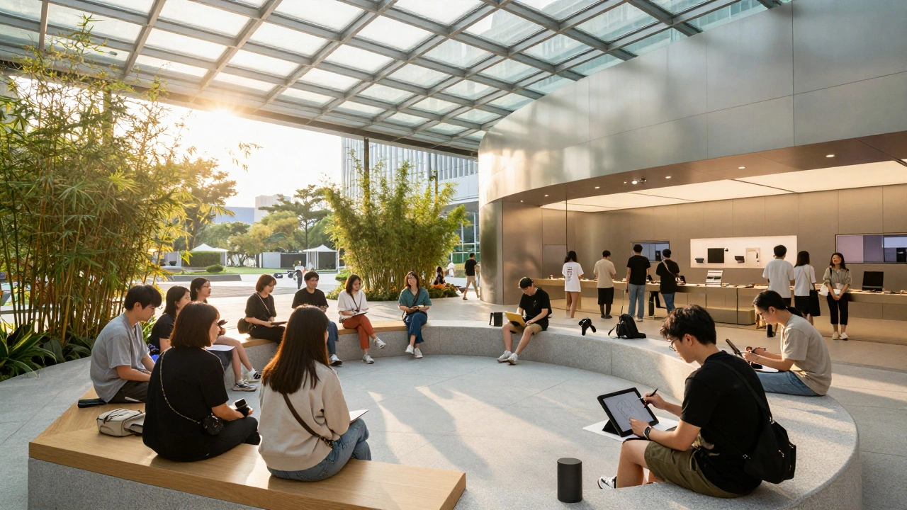

Apple stores are no longer just places to buy tech-they're community hubs designed for learning, connection, and creativity. From free coding workshops to open support zones, Apple's retail spaces are redefining what a store can be.
Learning Zones in Apple Stores: How Layouts Drive Hands-On Education
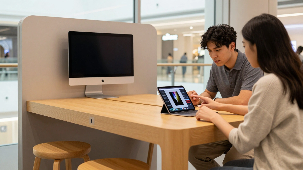
Apple's learning zones are designed to turn shoppers into users through hands-on, intimate sessions. From compact tables to immersive forums, each layout serves a purpose-and the trend is toward simplicity, not spectacle.
Designing the Apple Store Experience: Try, Learn, and Decide with Confidence
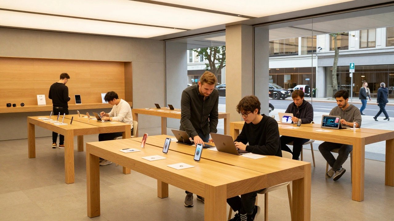
Apple Stores aren't just retail spaces-they're designed to help you explore, learn, and decide with confidence. No pressure. No sales pitches. Just hands-on experiences, expert guidance, and a community feel that turns customers into loyal users.
Cross-Channel Design: How Apple Aligns Its Website and Retail Stores
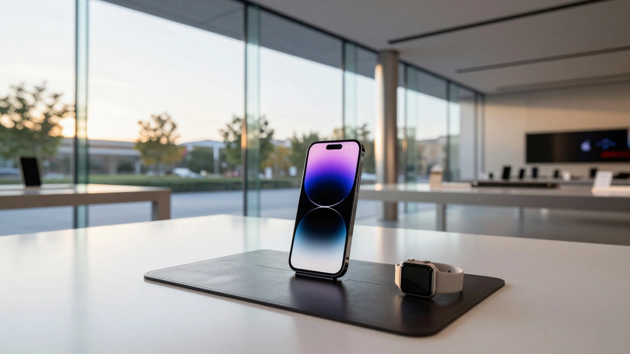
Apple aligns its website and retail stores through a unified design language that prioritizes calm, clear, and consistent experiences. From white space to hands-on product displays, every touchpoint reinforces the same message: simplicity builds trust.
Glass Stairs and Hidden Joinery: How Apple Turned Architecture Into Brand Language
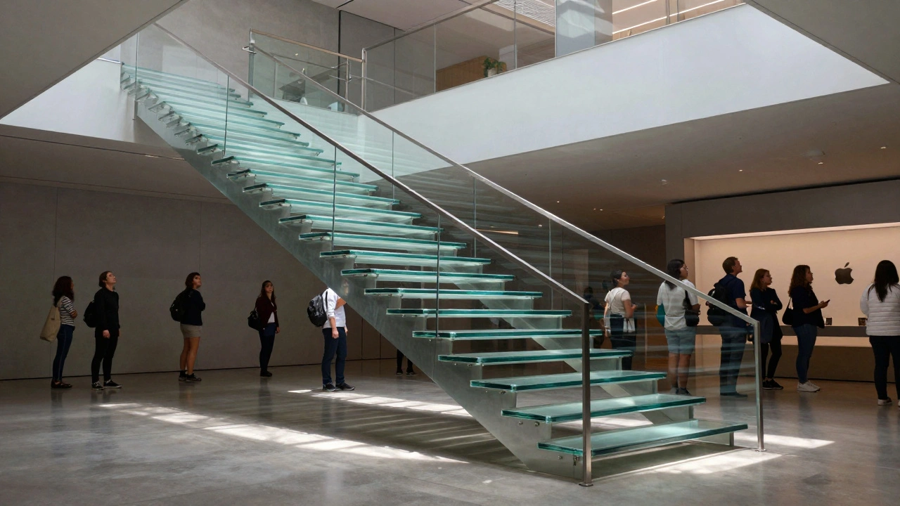
Apple's glass stairs and hidden joinery aren't just architectural features-they're the physical expression of its brand philosophy: precision, transparency, and invisible complexity. This is how retail design became brand language.
Minimalism in Apple Retail: How Wood, Stone, and Open Plans Define a Brand
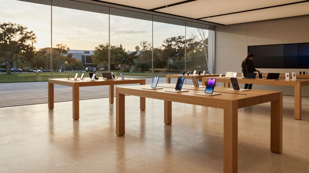
Apple's minimalist retail stores use wood, stone, and open layouts not just for style-but to communicate calm, trust, and human-centered design. This isn't decoration. It's brand strategy.
Iconic Apple Stores: Marina Bay, Regent Street, and Via del Corso Case Studies
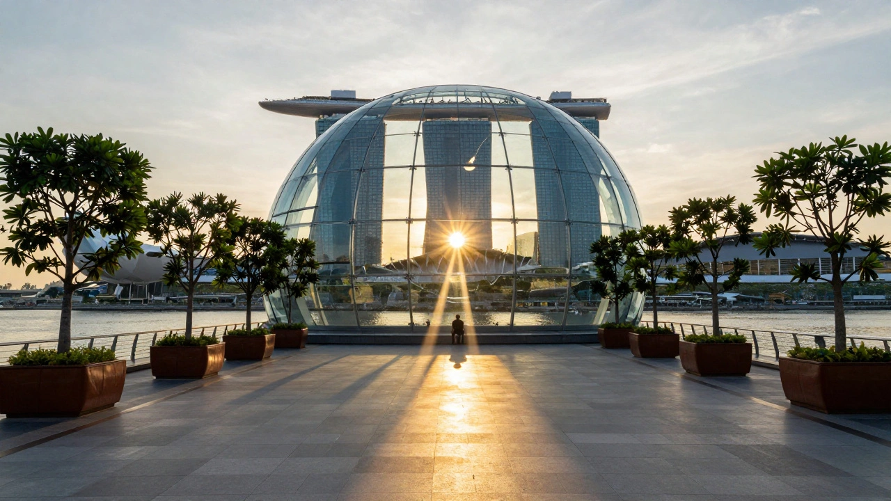
Three iconic Apple Stores-Marina Bay Sands, Regent Street, and Via del Corso-show how retail design blends architecture, culture, and technology. Each tells a different story about light, space, and place.