
Ever wonder why an old iMac from 1999 feels like a toy, while a modern MacBook feels like a piece of jewelry? It isn't just about the specs inside. It's about CMF is the design discipline focusing on Color, Materials, and Finish. This trio determines how a product looks, feels, and eventually ages in your hands. Apple didn't just accidentally stumble into a sleek look; they executed a calculated shift from playful, candy-colored plastics to a rigid, professional identity built on glass and metal.
The Era of "Lickable" Plastics
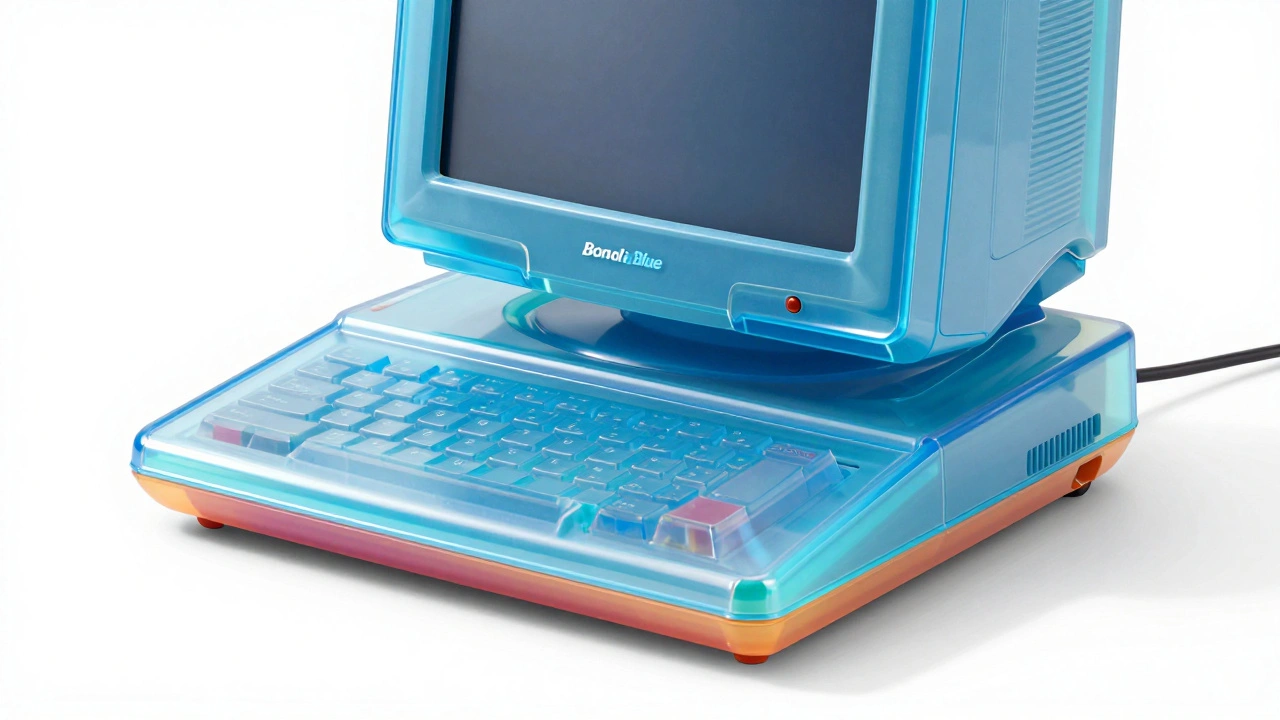
Back in the late 90s and early 2000s, Apple wanted to shake off its image as a boring beige-box computer company. They did this by leaning into translucency. The original Bondi blue iMac wasn't just a color choice; it was a statement. This era was defined by a pairing of vibrant hardware and a user interface known as "Aqua," which looked so glossy it was famously described as "lickable."
To get that specific look, Apple relied on SPI (Society of the Plastics Industry) is a set of industry standard finish codes that ensure consistent surface quality in plastic molding finish codes. Specifically, they used the SPI-A2 finish. To achieve this, manufacturers polished the molds with a 3000 Grit Diamond buff. The result was a high-gloss, candy-like shell that made technology feel approachable and fun, rather than intimidatingly corporate.
The Shift to Anodized Aluminum
The turning point for Apple's material identity arrived with the iPod mini. This was the first time the company moved away from plastics toward Anodized Aluminum is an electrolytic passivation process that increases the thickness of the natural oxide layer on the surface of aluminum parts . This wasn't just an aesthetic choice; it was a technical necessity. Raw aluminum alloys dull quickly as they oxidize. Anodizing creates a hard, protective layer that allows Apple to "dye" the metal into specific colors without the paint peeling off over time.
Apple's approach to color here was cyclical. They experimented with pastel tones, then shifted to deep jewel tones, and occasionally circled back to pastels. However, by 2016, the "crayon-inspired" palette largely disappeared. Apple realized that if they wanted to be seen as a luxury brand, they needed to stop playing with colors and start focusing on the purity of the material.
| Era | Primary Material | Finish Type | Brand Identity |
|---|---|---|---|
| Early 2000s | Polycarbonate Plastic | High-Gloss (SPI-A2) | Playful & Accessible |
| Mid 2000s-2010s | Anodized Aluminum | Matte / Bead-Blasted | Professional & Durable |
| Modern Era | Glass & Unibody Metal | Satin / Polished | Luxury & Minimalist |
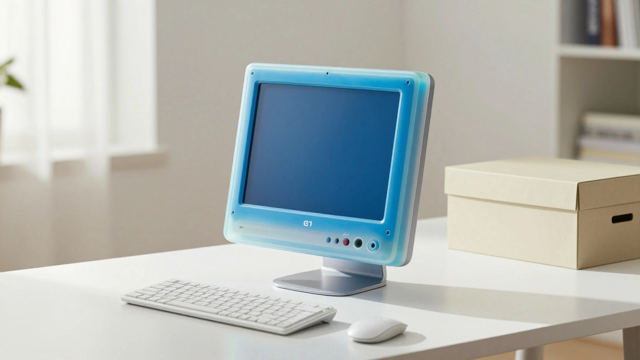
The Secret to the "Apple White"
While aluminum got the spotlight, Apple's use of white plastic is a masterclass in CMF precision. Achieving a bright, opaque white that doesn't look like a cheap household appliance is incredibly difficult. Apple targets a shade that resembles pure titanium dioxide.
In the world of manufacturing, there is a very thin line between a "premium white" and a "cheap white." If the color is off by a fraction, the product looks like a generic toy. By standardizing this specific white across their ecosystem, Apple created a visual bridge between different products, ensuring that an Apple mouse and an Apple keyboard looked like they belonged to the same family regardless of when they were made.
Engineering the Unibody Feel
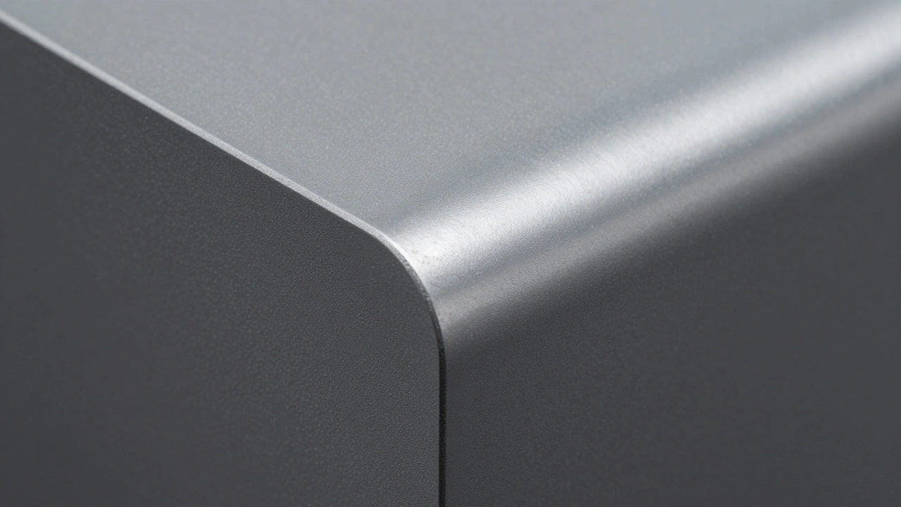
Most modern Apple products use a Unibody Construction is a manufacturing process where a product's chassis is milled from a single solid block of material . This eliminates the seams and screws found in traditional assembly, which reduces the number of parts and increases structural rigidity.
To get that signature matte feel, Apple doesn't just sand the metal. They use a process called glass bead blasting. They fire ultra-fine glass beads at high speed against the aluminum. This creates a microscopic texture that diffuses light and feels soft to the touch. The only major exception to this rule is the Mac Pro, which uses a high-gloss aluminum exterior to signal its status as a high-end professional powerhouse.
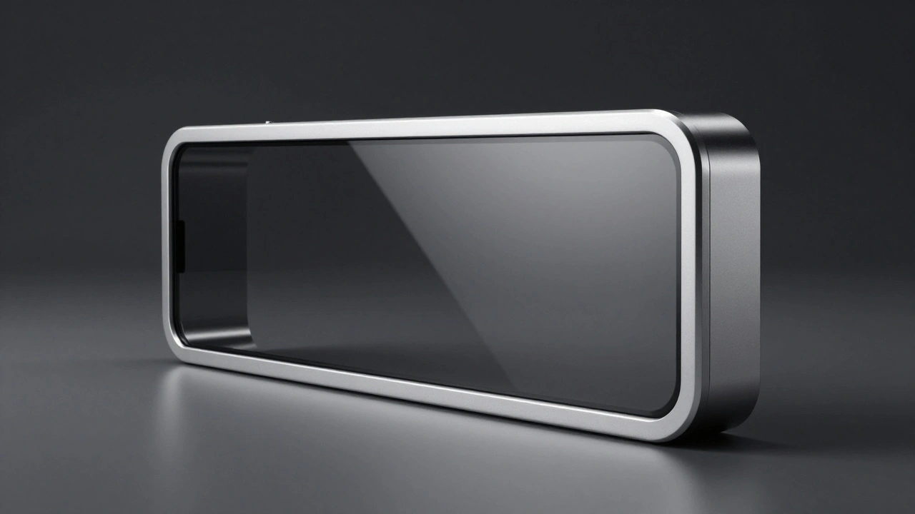
The Modern Pivot to Glass and Darker Tones
Lately, the strategy has shifted again. We've seen a massive move toward glass frames wrapped in metal. This creates a "sandwich" effect that feels denser and more expensive. Interestingly, as the hardware has become more focused on glass, the software has trended toward darker, more subdued UI designs.
This is a calculated move. Light-colored plastics are cheaper to color and handle heat better during manufacturing, but darker materials and glass hide fingerprints and dirt more effectively over time. By moving toward these "serious" materials, Apple has successfully transitioned from a company that makes cool gadgets to one that produces professional-grade luxury tools.
What exactly is CMF in product design?
CMF stands for Color, Materials, and Finish. It is a specialized branch of industrial design that focuses on the sensory experience of a product. Color deals with the visual hue (often using Pantone standards), Materials refers to the physical substance (like aluminum, glass, or plastic), and Finish is the surface treatment (like matte, glossy, or sandblasted) that affects how the product reflects light and feels to the touch.
Why does Apple use anodizing instead of painting aluminum?
Painting creates a layer on top of the metal that can chip or peel. Anodizing is an electrochemical process that actually transforms the surface of the aluminum into a durable oxide layer. The color is then integrated into this layer, making it far more resistant to wear and tear while preventing the metal from corroding or dulling.
What is the SPI-A2 finish mentioned in early Apple products?
SPI (Society of the Plastics Industry) provides standardized codes for mold finishes. An A2 finish is a high-gloss polish achieved by using a 3000 Grit Diamond buff on the injection mold. This is what gave the early iMacs and iBooks their glass-like, shiny plastic appearance.
Does the material choice affect the product's heat management?
Yes. For example, light-colored plastics generally perform better under high-heat manufacturing conditions. Aluminum, used in the unibody design, also acts as a giant heat sink, helping to dissipate heat from the internal components more efficiently than plastic ever could.
Why did Apple move away from the bright "crayon" colors?
The shift was part of a brand repositioning. While bright colors were great for attracting early adopters and making tech feel "friendly," the company wanted to move up-market into the professional and luxury segments. Neutral tones (Space Gray, Silver, Starlight) are perceived as more timeless and high-end.
Next Steps for Design Enthusiasts
If you're looking to apply these principles to your own projects, start by building a physical mood board. Don't just look at colors on a screen; find actual material samples. If you're working with plastic, look into SPI finish standards to communicate exactly what level of gloss you need to your manufacturer. If you're aiming for a premium feel, experiment with bead-blasting or anodizing to see how texture changes the perceived value of a part.
Categories
Popular Articles