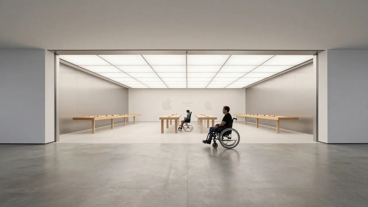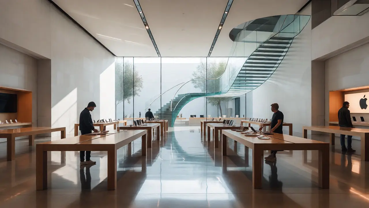

You walk into an Apple Store. You don't see a map on the wall. You don't see arrows painted on the floor. Yet, you instinctively know where to go for support, where the laptops are, and how to get out without bumping into anyone. That’s not luck. That’s Apple retail wayfinding-a system of subtle cues that directs human behavior through space without a single explicit instruction.
Most retail spaces rely on noise. Bright signs, loud announcements, and cluttered aisles scream for your attention. Apple does the opposite. It uses silence in its design to create clarity. The goal isn't just to sell products; it's to reduce cognitive load. When you aren't thinking about navigation, you're more likely to engage with the product. Let's break down exactly how this works, why it matters for modern retail, and what other businesses can steal from this playbook.
The Psychology Behind Invisible Navigation
Wayfinding is often mistaken for signage. It’s not. Signage tells you where you are. Wayfinding helps you understand where you want to go and how to get there. In a high-stakes environment like a flagship store, confusion kills sales. If a customer feels lost, their cortisol spikes. They stop exploring. They leave.
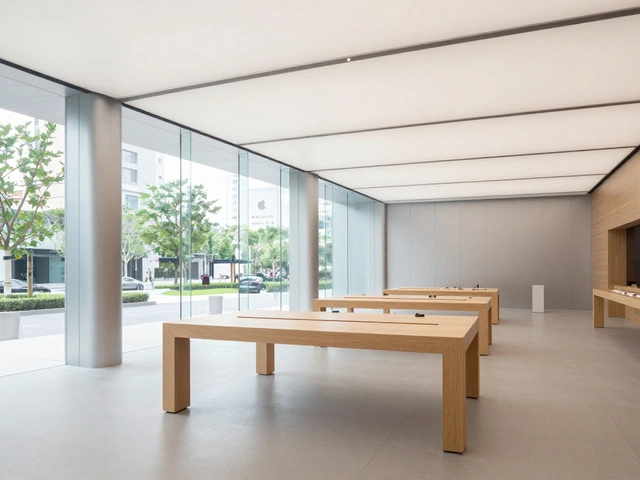
Environmental psychology suggests that humans navigate using landmarks, paths, and nodes. Apple leverages all three but hides them in plain sight. The giant glass staircases? Those aren't just aesthetic features. They are vertical landmarks. The long wooden tables? They act as linear paths that guide traffic flow. The Genius Bar at the back? It’s a destination node that pulls people through the entire store.
This approach reduces decision fatigue. In traditional stores, you have to read signs to find the checkout. At Apple, the checkout is usually integrated into the service area or placed near exits, signaled by the presence of staff rather than a "Cashier" sign. Your brain processes social cues faster than text. Seeing a person in a blue shirt waiting to help you is a stronger directional signal than a plastic arrow.
Materiality as a Directional Cue
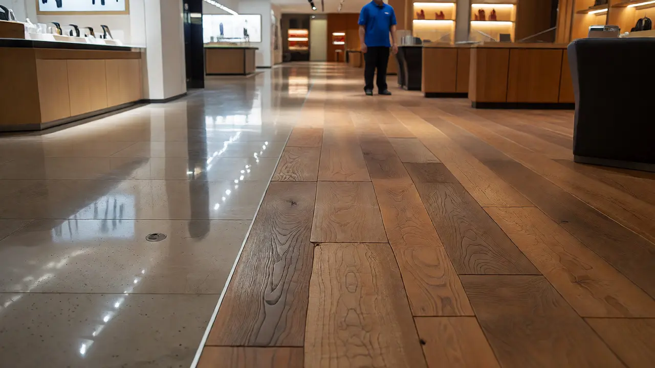
One of the most powerful tools in Apple’s arsenal is material consistency. The brand uses specific materials to define zones. Polished concrete or stone floors dominate the main exhibition areas. This hard surface reflects light and creates a sense of openness. But when you move toward the workshop areas or meeting rooms, the flooring might shift to wood or carpet. This change in texture under your feet signals a change in function before you even look up.
Lighting plays a similar role. The main showroom is bathed in cool, bright white light (around 4000K-5000K), which keeps energy levels high and highlights product details. Service areas often use warmer, softer lighting. This temperature shift subconsciously tells customers, "Slow down here. Talk here." It’s a non-verbal cue that manages pace.
| Element | Traditional Retail | Apple Retail Approach |
|---|---|---|
| Signage | Frequent, large, text-heavy | Minimalist, icon-based, sparse |
| Flooring | Uniform or patterned to hide dirt | Zoned by material to define function |
| Lighting | General ambient illumination | Task-focused with color temperature zoning |
| Furniture | Static displays, fixed shelves | Modular tables acting as path guides |
| Staff Role | Passive observers or cashiers | Active beacons for direction and assistance |
The Genius Bar as a Magnetic Node
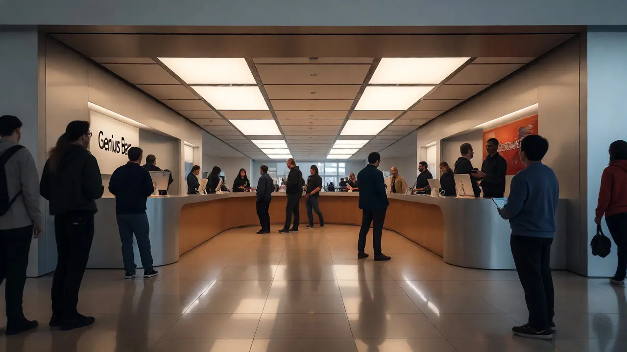
If you’ve ever walked into an Apple Store, you know the pull of the Genius Bar. It’s almost always located at the rear of the store. Why? Because it forces traffic to traverse the entire retail floor. This is a classic retail strategy known as the "decompression zone" followed by the "power aisle," but Apple executes it with surgical precision.
The bar itself is designed to be visible from the entrance. The curved counter invites interaction. Unlike a bank teller window, which creates a barrier, the Genius Bar lowers the physical divide between staff and customer. This accessibility encourages questions. Questions lead to conversations. Conversations lead to sales.
Moreover, the queue management at the Genius Bar is part of the wayfinding system. There are no velvet ropes. Instead, staff members hold iPads and greet you immediately. This removes the anxiety of waiting in line. You’re already being served before you reach the desk. The movement stops feeling like a wait and starts feeling like an appointment. This psychological shift is critical for maintaining a calm atmosphere in crowded spaces.
Open Layouts and Sightlines
Apple stores rarely have walls that block sightlines. Even multi-level stores use open atriums so you can see activity on different floors. This transparency builds trust. You can see if the store is busy or quiet. You can spot a colleague or friend easily. In a maze-like department store, finding someone takes minutes. In an Apple Store, it takes seconds.
The lack of partitions also aids security. Staff can monitor the entire floor from any vantage point. But beyond security, it supports exploration. When you can see a product across the room, you’re more likely to walk over to it. Visual access drives foot traffic. Cluttered layouts obscure products; clean lines reveal them.
Consider the placement of accessories. They are often placed near high-traffic paths or checkout points, but never blocking the main thoroughfare. Small items like cases and chargers are displayed on low-profile stands that don’t obstruct eye contact with larger devices. This hierarchy ensures that the hero products-the iPhones and MacBooks-remain the focal points.
Digital Integration in Physical Space
While the physical design is minimalist, digital integration is robust. Customers use their own devices to navigate inventory. If you want to check stock for a specific iPhone model, you don’t ask a clerk. You scan a QR code or use the app. This self-service option reduces congestion at service desks.
However, the digital layer doesn’t replace human guidance; it enhances it. When you order online for pickup, the notification tells you exactly where to go. Often, these orders are ready within minutes, allowing you to bypass the main shopping area entirely. This dual-path system accommodates both browsers and buyers, preventing bottlenecks.
Some newer locations even use augmented reality (AR) features in their apps to help users visualize products in their homes. While this happens outside the store, it prepares the customer for a more efficient in-store visit. They arrive knowing what they want, reducing time spent wandering and increasing satisfaction.
Lessons for Other Retailers
You don’t need a billion-dollar budget to apply these principles. Start by auditing your current space. Are your signs necessary, or are they compensating for poor layout? Can you remove a partition to improve sightlines? Could changing the floor material define a new zone?
- Simplify Signage: Use icons instead of words. A coffee cup icon is understood globally; "Coffee Here" requires reading.
- Use Light Zones: Brighten areas where you want action. Dimmer lights encourage lingering and conversation.
- Leverage Staff: Train employees to be mobile guides, not static fixtures. Position them at natural decision points.
- Create Landmarks: Identify one unique feature in your store-a sculpture, a mural, a distinct furniture piece-and use it as a reference point in directions.
The key takeaway is respect for the customer’s intelligence. Don’t shout at them. Guide them. When the environment feels intuitive, customers feel empowered. And empowered customers spend more time-and money-in your space.
Frequently Asked Questions
Why doesn't Apple use many signs in their stores?
Apple relies on environmental cues like lighting, flooring changes, and furniture arrangement to guide customers. This reduces visual clutter and cognitive load, making the shopping experience feel seamless and premium rather than chaotic.
How does the Genius Bar influence store traffic?
Located typically at the back of the store, the Genius Bar acts as a destination node. It draws customers through the entire retail floor, exposing them to various product displays and encouraging impulse purchases along the way.
What role does lighting play in Apple's wayfinding?
Lighting defines zones. Cool, bright light in showrooms energizes shoppers and highlights products, while warmer, softer light in service areas encourages relaxation and conversation, subtly guiding behavior without words.
Can small retailers apply these wayfinding principles?
Yes. By minimizing signage, using distinct landmarks, optimizing sightlines, and training staff to act as mobile guides, smaller stores can create intuitive navigation experiences that improve customer flow and satisfaction.
How do materials affect navigation in retail spaces?
Changes in flooring material (e.g., from stone to wood) or texture signal transitions between different functional areas, helping customers subconsciously recognize shifts from browsing zones to service or consultation areas.