Tag: SF Pro Display
iPad Typography Choices: SF Pro Display and Text Pairings for Legibility

24/01
0
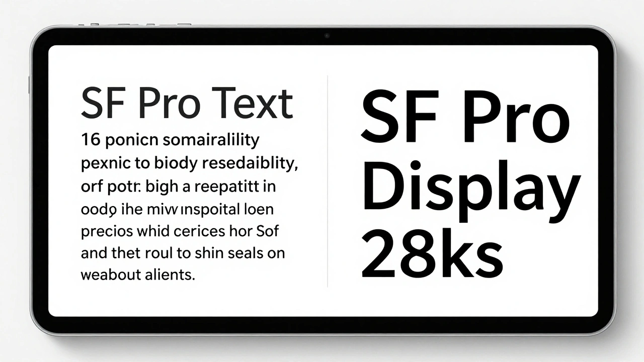
Learn how SF Pro Display and SF Pro Text work together on iPad to maximize legibility. Discover when to use each variant, how variable fonts improve readability, and why Apple's typography choices matter for users.
Headlines vs. Body Text on Apple: Why SF Pro Display and SF Pro Text Are Designed Differently
16/01
0
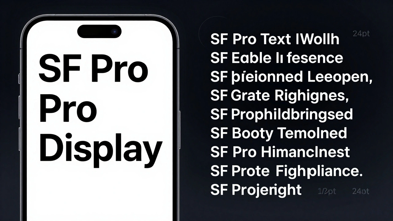
Apple uses two different versions of its San Francisco font-SF Pro Display for headlines and SF Pro Text for body copy. Each is optimized for its job: impact vs. readability. Here’s how and why.