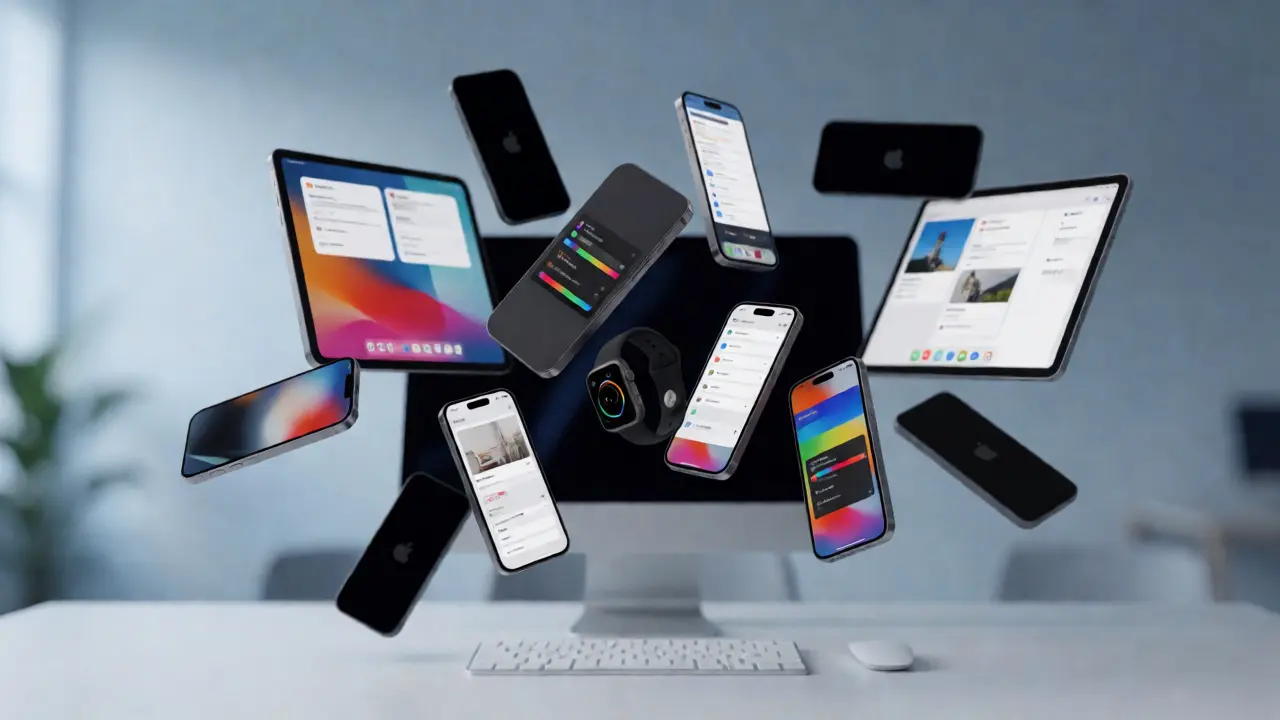

Shipping a new feature on the iPhone is hard enough. Shipping it simultaneously across the iPhone, iPad, Mac, and Apple Watch? That’s a logistical nightmare that kills more product launches than bad code ever does. You’ve got different screen sizes, input methods, processing power, and user expectations for each device. If you try to push everything everywhere at once, you end up with half-baked experiences on smaller screens and underutilized potential on larger ones.
The solution isn’t just better coding; it’s smarter roadmapping design. It’s about understanding that an idea doesn’t live in a vacuum-it lives in a specific context. A notification makes sense on a wrist. A complex data visualization belongs on a desktop. This article breaks down how to sequence your features so they land where they matter most, without burning out your engineering team or confusing your users.
The Myth of Simultaneous Release
Product managers often dream of the "Big Bang" launch. One day, Feature X appears on every Apple device. It sounds clean. It looks great in marketing slides. In reality, it’s a trap. Why? Because the definition of "done" varies wildly between platforms.
On macOS, "done" might mean supporting drag-and-drop, keyboard shortcuts, and multi-window management. On watchOS, "done" means the interface fits in a 40mm square and responds to a single tap. Trying to achieve both definitions simultaneously forces compromises. You either strip the Mac version down to mobile simplicity (annoying power users) or bloat the Watch app with unnecessary complexity (frustrating casual users).
Instead, treat each device as its own market segment within your ecosystem. Your roadmap should reflect a phased rollout based on capability and user intent, not just calendar dates.
Mapping User Intent by Device
To sequence correctly, you first need to understand what people actually do on each piece of hardware. Apple has spent decades refining these distinctions, and ignoring them is costly.
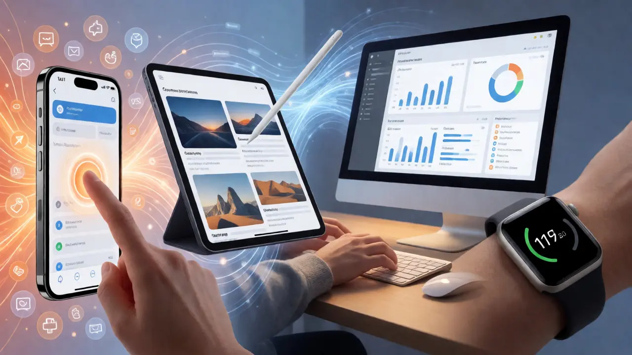
- iPhone is the primary communication and quick-action hub, characterized by touch-first interaction and high-frequency usage.
- iPad functions as a content consumption and light creation tool, bridging the gap between mobile portability and desktop productivity.
- Mac serves as the deep-work workstation, offering precision inputs like mouse and keyboard for complex tasks.
- Apple Watch acts as a glanceable companion for health metrics and immediate notifications, minimizing cognitive load.
When you map your features against these intents, the sequencing becomes obvious. A feature requiring text entry? Start on Mac or iPad. A feature requiring location awareness? iPhone is king. A feature needing constant background monitoring? The Watch takes the lead.
Technical Constraints Drive Roadmap Order
You can’t ignore the hardware. The Apple Silicon architecture unifies instruction sets across devices but leaves significant performance gaps between M-series chips and A-series chips. While this makes code sharing easier via Catalyst or SwiftUI, it doesn’t erase the physical limitations of battery life and thermal throttling.
Consider a video editing feature. On a MacBook Pro, you can render 4K footage in real-time. On an iPhone SE, that same task drains the battery in minutes and heats the device until it throttles. If you release the full-featured editor on all devices at once, iPhone users will blame your app for killing their battery. They won’t know it’s a hardware limitation; they’ll think your optimization is poor.
Here is a practical framework for assessing technical readiness:
| Feature Type | Best Starting Device | Secondary Rollout | Last to Implement |
|---|---|---|---|
| Heavy Data Processing | Mac | iPad Pro | iPhone / Watch |
| Quick Notifications | Watch | iPhone | Mac / iPad |
| Complex Forms/Input | Mac | iPad | iPhone |
| Media Consumption | iPhone | iPad | Mac / Watch |
Leveraging SwiftUI for Efficient Sequencing
If you’re starting from scratch or refactoring, SwiftUI is Apple’s declarative UI framework that allows developers to build interfaces for iOS, macOS, watchOS, and tvOS using a single codebase. It’s not magic-you still need platform-specific tweaks-but it drastically reduces the friction of moving features between devices.
With SwiftUI, you can write a view once and adapt it using environment variables. For example, you can check if the horizontal size class is compact (likely iPhone) or regular (likely iPad/Mac). This lets you conditionally hide complex controls on smaller screens while keeping the core logic intact. This approach supports a "progressive enhancement" model: ship the MVP on iPhone, then enable advanced layouts on iPad and Mac as the feature matures.
Don’t underestimate the value of App Intents, which standardize actions across Siri, Shortcuts, and widgets, allowing features to be accessible without opening the app. By implementing App Intents early in your roadmap, you ensure that even if the full UI isn’t ready on all devices, the functionality is available system-wide. This builds anticipation and utility before the polished visual experience arrives.
The Phased Rollout Strategy
So, how do you actually structure the timeline? Here is a proven three-phase approach used by successful teams in Portland and beyond.
- Phase 1: Core Utility on Primary Device. Identify the one device where the feature provides the highest immediate value. Usually, this is the iPhone for consumer apps or the Mac for professional tools. Polish this experience relentlessly. Gather feedback here. If it fails on the primary device, it won’t succeed elsewhere.
- Phase 2: Contextual Expansion. Move to the next logical device. If Phase 1 was iPhone, move to iPad for consumption or Mac for creation. Adapt the UI to fit the new form factor. Do not simply scale the iPhone layout. Use this phase to test cross-device continuity, such as Handoff or Universal Clipboard.
- Phase 3: Peripheral Integration. Finally, bring the feature to secondary devices like the Watch or Vision Pro. These integrations should be lightweight. The Watch shouldn’t replicate the Mac experience; it should act as a remote control or glanceable summary for the work done on the main devices.
This method prevents scope creep. Each phase has clear success metrics. Phase 1 measures engagement. Phase 2 measures retention across devices. Phase 3 measures ecosystem lock-in.
Pitfalls to Avoid in Cross-Device Design
Even with a solid plan, things go wrong. Here are the most common mistakes I see when reviewing roadmaps.
Ignoring Input Methods. Designers often forget that the Mac uses a cursor, the iPad uses a finger or Pencil, and the Watch uses a crown and digital touch. A button that works perfectly with a thumb on an iPhone might be too small for a precise click on a Mac trackpad. Always design for the dominant input method of the target device.
Assuming Screen Real Estate Equals Simplicity. Just because a Mac has a larger screen doesn’t mean you should cram more information onto it. Users on desktops expect density and efficiency, not clutter. Conversely, don’t strip the Mac version down to mobile simplicity just to save dev time. Power users pay for Macs because they want power.
Neglecting State Synchronization. If a user starts a task on their iPhone, they expect to finish it on their Mac. If your backend doesn’t sync state in near-real-time, the cross-device promise breaks. Invest in robust cloud sync infrastructure before rolling out features to multiple devices.
Measuring Success Across the Ecosystem
How do you know if your sequencing worked? Don’t just look at total downloads. Look at cross-device usage patterns. Are users who install the Watch app retaining the iPhone app longer? Do Mac users engage more deeply after trying the iPad version?
Use analytics to track "ecosystem depth." Define a metric that counts the number of distinct devices a user actively engages with per month. If this number grows after a new feature rollout, your sequencing is working. If it stays flat, you might be shipping features to devices where they don’t belong.
Remember, the goal isn’t to have your app on every device. The goal is to have your app solve problems effectively wherever those problems occur. Sometimes, that means deliberately leaving a feature off the Watch because it adds no value there. That restraint is a sign of mature design strategy.
Should I use Catalyst for my Mac app?
Catalyst is useful for bringing existing iPad apps to Mac quickly, but it often results in a subpar Mac experience. If your Mac audience expects native menu bars, window management, and keyboard shortcuts, consider building a native AppKit or SwiftUI Mac app instead. Use Catalyst only if speed-to-market outweighs the need for perfect native integration.
How do I handle different screen sizes in SwiftUI?
Use adaptive stacks (HStack/VStack switching) and dynamic type scaling. Leverage the `horizontalSizeClass` environment variable to detect whether you are on a compact (phone) or regular (tablet/desktop) width. This allows you to change layout structures dynamically without writing separate views for every device.
Is it worth developing for Apple Vision Pro early?
For most apps, no. Vision Pro is currently a niche developer-focused platform. Unless your app relies heavily on spatial computing or immersive media, wait until the user base grows. Focus on iPhone, iPad, and Mac first, ensuring your architecture is modular enough to support visionOS later.
What is the biggest mistake in cross-device roadmapping?
Trying to launch all features on all devices simultaneously. This leads to compromised quality on at least one platform. It is better to nail the experience on one device and expand gradually than to offer a mediocre experience everywhere at once.
How does iCloud sync impact feature sequencing?
iCloud sync is critical for cross-device continuity. If your feature involves data created on one device and consumed on another, you must implement reliable sync before launching on the second device. Without it, users perceive the app as broken or disconnected.