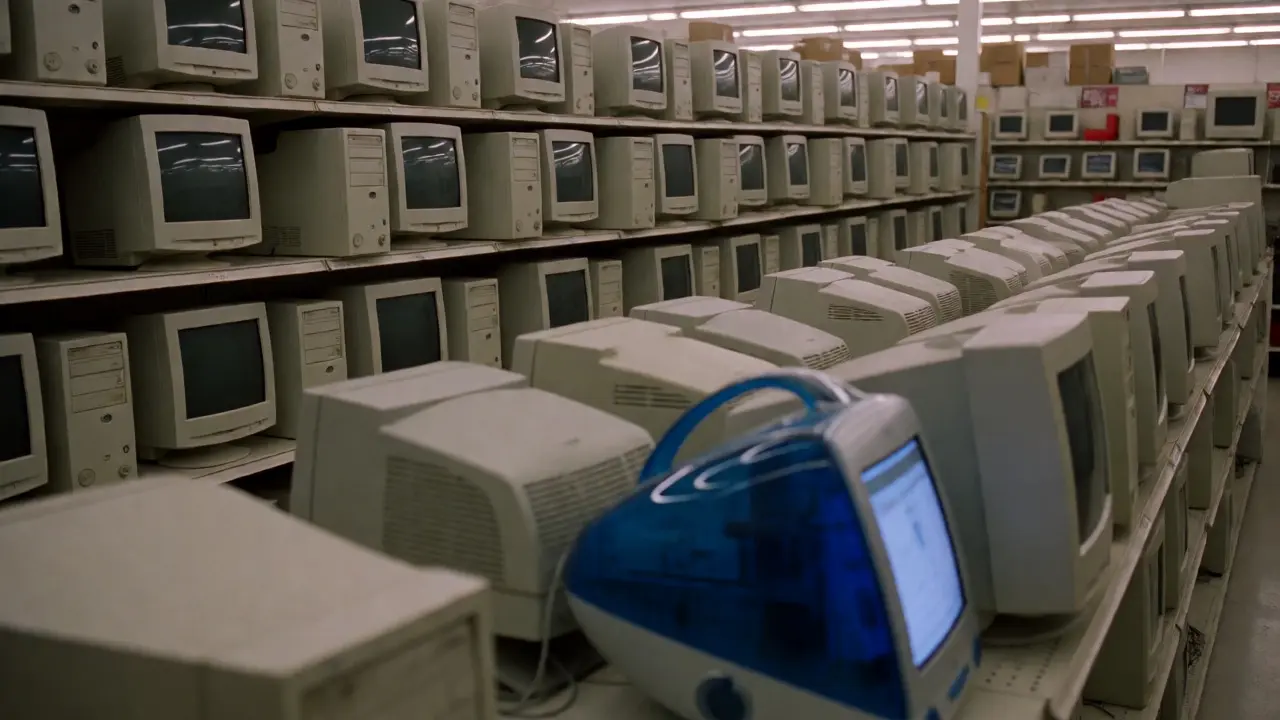

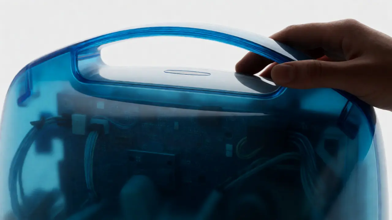
Imagine walking into a Best Buy in 1997. You’re looking for a computer. What do you see? Beige boxes. Lots of them. They smell like warm plastic and dust. The monitors are bulky CRTs that take up half your desk. The towers look like filing cabinets from an accounting firm. Nothing about them says "I want to touch this." Then, in May 1998, Steve Jobs walks onto a stage in Cupertino and pulls a cloth off something that looks like it fell out of a sci-fi movie. It’s translucent. It’s blue. It has a handle on top. It doesn’t just sit on the desk; it lives there.
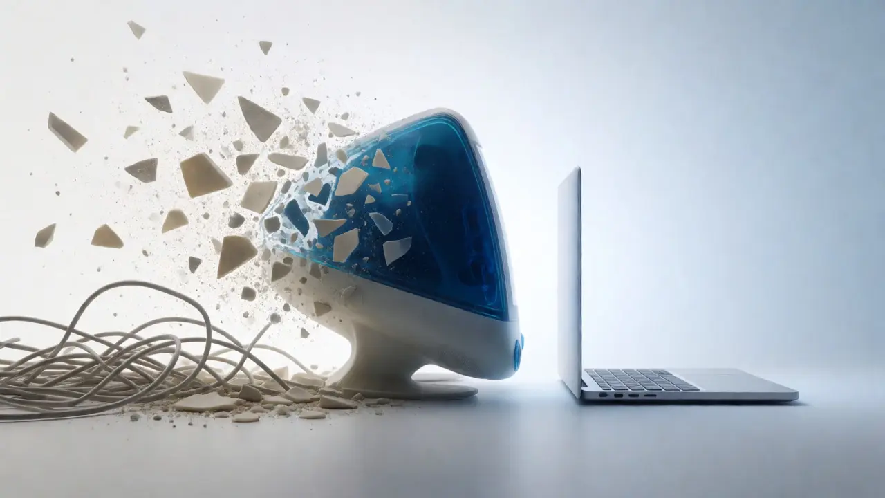
This wasn't just a new computer. It was a slap in the face to every assumption the industry had made for twenty years. Before the iMac G3, computers were appliances hidden under desks. After it, they became lifestyle objects you wanted to show off at parties. How did one machine change everything? Let’s break down the design decisions that turned a beige nightmare into a cultural icon.
The End of the Beige Box Era
For decades, computer manufacturers played it safe. Beige was the color of office equipment. It matched the walls, the carpets, and the boredom of corporate IT departments. If you bought a PC or a Macintosh in the mid-90s, you weren't buying style. You were buying utility. And frankly, the utility was often painful. Setting up a computer meant crawling behind a heavy tower, plugging in a PS/2 keyboard (which could only go in one way, but somehow never seemed to work), and dealing with a monitor that weighed more than the CPU itself.
Jony Ive, then a relatively unknown designer at Apple, saw this differently. He didn't want to make a better box. He wanted to erase the concept of the box entirely. The team stripped away the internal hard drive bays, the expansion slots, and the floppy drive options to create a single, unified unit. This wasn't just aesthetic minimalism; it was functional reduction. By removing the clutter, they forced users to focus on the screen and the interaction, not the machinery.
The result was the Bondi Blue casing. It wasn't just colored plastic; it was translucent polycarbonate. You could see inside the machine. This was a radical move. Usually, manufacturers hid their components because they looked messy. Apple exposed them, turning the circuitry into part of the visual appeal. It signaled transparency-both literal and metaphorical. It told consumers: "We have nothing to hide. This is what technology looks like when it's clean."
Ergonomics as a Selling Point
One of the most controversial features of the original iMac was the built-in handle. Tech reviewers laughed. They called it gimmicky. Why would you need to carry a desktop computer around your house? But Ive understood something about human behavior that engineers missed. People don't just buy computers to work; they buy them to integrate into their living spaces. You might want to move it from the study to the kitchen to check a recipe. You might want to show it to a friend. The handle invited touch. It broke the psychological barrier between user and machine.
Compare this to the standard PC tower of the time. Try picking up a 1997 Dell Dimension. You’d probably throw out your back. The iMac weighed about 35 pounds, which is still heavy, but the ergonomic curve of the handle distributed the weight evenly. It made the computer feel portable, even if it wasn't a laptop. This subtle shift changed how people perceived the device's value. It wasn't a stationary appliance; it was a companion.
The mouse also got a redesign. The original Apple Pro Mouse was sleek, white, and seamless. No buttons visible. Just a smooth surface. While some users found the lack of tactile feedback frustrating, it reinforced the idea that the computer should be simple. One click. That’s all you needed. Complexity was for the settings menu, not the hardware interface.
Simplicity Over Specification Sheets
In 1998, buying a computer meant reading spec sheets. Gigahertz? Megabytes of RAM? Bus speed? Most consumers didn't care. They cared about whether it worked. Apple shifted the marketing narrative from specs to experience. The iMac came with a modem already installed. This was huge. In the late 90s, setting up dial-up internet was a nightmare of drivers and configuration errors. Apple pre-loaded the software. You plugged in the phone line, clicked a button, and you were online. They sold the promise of connectivity, not the speed of the processor.
This approach redefined consumer expectations. Users began to expect plug-and-play functionality from all devices. If a printer required a driver disk, it was considered broken. If a camera needed complex software to transfer photos, it was annoying. The iMac set a baseline: technology should disappear. You shouldn't have to think about the tool while using it. This philosophy paved the way for the iPod, iPhone, and iPad, where the interface is so intuitive that children can use them without instruction.
| Feature | Typical 1997 PC Tower | iMac G3 (Bondi Blue) |
|---|---|---|
| Aesthetic | Beige, opaque, angular | Translucent, colored, curved |
| Setup Time | Hours (drivers, cables, config) | Minutes (plug and play) |
| Connectivity | Separate modem purchase often required | Built-in modem included |
| Portability | Stationary (heavy tower + separate monitor) | Movable (integrated handle) |
| User Interaction | Technical (spec-focused) | Emotional (design-focused) |
The Color Revolution in Electronics
Before the iMac, electronics were monochromatic. Black, gray, or beige. Period. Apple introduced five colors initially: Bondi Blue, Tangerine, Grape, Indigo, and Strawberry. Later, they added Snow White and others. This wasn't just about making pretty toys. It was about personalization. For the first time, your computer could match your personality or your room decor. It turned a commodity into a fashion statement.
This shift rippled through the entire tech industry. Within two years, other manufacturers started offering colored cases. Sony introduced colorful Vaio laptops. Dell offered custom color panels. The idea that hardware could express identity took root. Consumers stopped asking, "What does it do?" and started asking, "How does it look?" This opened the door for premium pricing based on design rather than raw performance. An iMac cost more than a comparable PC, but people paid for the feeling of owning something special.
The use of color also influenced material science. Translucent plastics required different molding techniques. They showed scratches and yellowing over time, which taught designers about durability and aging. Today, we see this legacy in the variety of finishes on smartphones and laptops. Matte black, silver, gold, space gray-these choices are direct descendants of the iMac’s color palette.
Legacy and Modern Implications
Today, when you unbox an iPhone or a MacBook Air, you’re experiencing the endgame of the iMac revolution. The packaging is pristine. The device feels substantial yet light. The cables are minimal. Everything works immediately. None of this would exist without the risks Apple took in 1998.
Consider the current market. Companies like Framework Laptop are trying to bring back modularity, but they still rely on the aesthetic language established by Apple. Even gaming PCs, once notorious for RGB lights and aggressive angles, now offer minimalist designs that blend into home offices. The expectation is clear: technology must be beautiful. If it looks cheap, consumers assume it performs poorly.
There’s a downside, though. The push for simplicity often leads to planned obsolescence. The iMac had no upgradeable RAM slots accessible to the average user. You couldn't open it up and add memory. This trend continues today. Sealed units mean easier repair issues. But for the average consumer, the trade-off is worth it. They prefer convenience over customization. The iMac proved that the majority of users don't want to tinker; they want to create.
As we move into an era of AI-integrated devices, the design principles remain relevant. The best devices will be those that anticipate needs before the user articulates them. They will be invisible until needed, then instantly responsive. The 1998 iMac wasn't just a computer; it was a prototype for the future of human-computer interaction. It taught us that design isn't decoration-it's communication.
Why was the translucent case so significant?
The translucent case challenged the industry norm of hiding internal components. By exposing the circuitry, Apple signaled honesty and modernity. It turned technical parts into visual elements, making the machine feel approachable and futuristic rather than industrial and intimidating.
Did the iMac really save Apple?
Yes, commercially speaking. Before the iMac, Apple was near bankruptcy. The iMac sold over 800,000 units in its first five months. It restored brand relevance and cash flow, allowing Apple to develop subsequent products like the PowerBook G4 and eventually the iPod.
What was the main criticism of the original iMac design?
Critics argued that the lack of expandability and the removal of legacy ports (like SCSI) alienated professional users. Some also found the translucent plastic prone to yellowing over time. However, these flaws were acceptable to the target consumer demographic, who prioritized ease of use over technical flexibility.
How did the iMac influence smartphone design?
The iMac established the principle that hardware should be seamless and intuitive. This directly influenced Jony Ive’s later work on the iPhone, which removed physical keyboards and minimized buttons. The focus on materials, touch interfaces, and immediate usability traces its roots back to the iMac’s launch strategy.
Is the design philosophy of the iMac still relevant?
Absolutely. Current trends in smart home devices and wearables emphasize minimalism and integration. Devices are expected to blend into environments rather than stand out as clunky machines. The iMac’s core message-that technology should enhance life without demanding attention-remains the gold standard for consumer electronics.